What is new in Tailwind CSS version 2.1?
Monday, April 5, 2021 - Reading time: 7 minutes.

A brand-new version of Tailwind CSS dropped this Monday. It’s packed with great new CSS utility classes and brings the JIT (Just in Time) engine into the core package. In this article I take a closer look at the new utility classes and I show you how you can use them in your Tailwind CSS projects.
Table of contents
JIT engine is now part of core Tailwind package.
Version 2.1 moves the new JIT engine into the core Tailwind CSS package. This means if you where previous using the separate @tailwindcss/jit package, you can now remove this separate package after you upgraded to version 2.1.
Remember that Tailwind JIT is still in preview modus, but if that not scare you and you want to try the new engine you can simply enable it in your tailwind.config.js file as follow:
  // tailwind.config.js
  module.exports = {
    mode: 'jit',
    theme: {}
  }
Are you completely new to Tailwind JIT? Than watch the video below, where the creator of Tailwind CSS, Adam Wathan, talks about the new features that JIT brings to Tailwind.
CSS filters are now part of Tailwind CSS
Update 2.1 brings support for CSS filters natively to Tailwind CSS. This is something that I waited for and I’m really excited about. Can’t wait to explore all the new possibilities that those new filters bring.
To enable a filter utility class you first add the class filter to your element and then choose one of the available filter variants like blur, brightness or contrast. I put together a few basic examples to show the new filters in action.
Blur Filter
You can control the amount of Blur applied to the image with size modifiers like md, lg, xl e.t.c.
<img src="saas-landing-page.png" alt="Blur filter applied" class="filter blur-sm" >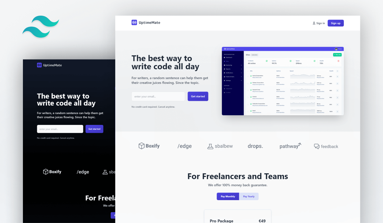
The following utility class variants are available for Blur Filter:
.blur-0
.blur-sm
.blur
.blur-md
.blur-lg
.blur-xl
.blur-2xl
.blur-3xl
Brightness Filter
You can control the amount of Brightness applied to the image with size modifiers like 0, 50, 200 e.t.c.
<img src="saas-landing-page.png" alt="Brightness filter applied" class="filter brightness-200" >
The following utility class variants are available for Brightness Filter:
.brightness-0
.brightness-50
.brightness-75
.brightness-90
.brightness-95
.brightness-100
.brightness-125
.brightness-150
.brightness-200
Contrast Filter
You can control the amount of Contrast applied to the image with size modifiers like 0, 50, 200 e.t.c.
<img src="saas-landing-page.png" alt="Contrast filter applied" class="filter contrast-50" >
The following utility class variants are available for Contrast Filter:
.contrast-0
.contrast-50
.contrast-75
.contrast-100
.contrast-125
.contrast-150
.contrast-200
Grayscale Filter
At the moment it looks like you can’t control the percentage of gray applied to the image.
<img src="saas-landing-page.png" alt="Grayscale filter applied" class="filter grayscale" >
The following utility class variants are available for Grayscale Filter:
.grayscale-0
.grayscale
Hue Rotate Filter
You can control the amount of Hue rotating applied to the image with size modifiers like 0, 30, 180 e.t.c.
<img src="saas-landing-page.png" alt="Hue rotate filter applied" class="filter hue-rotate-180" >
The following utility class variants are available for Hue Rotate Filter:
.hue-rotate-0
.hue-rotate-15
.hue-rotate-30
.hue-rotate-60
.hue-rotate-90
.hue-rotate-180
.-hue-rotate-180
.-hue-rotate-90
.-hue-rotate-60
.-hue-rotate-30
.-hue-rotate-15
Invert Filter
At the moment it looks like you can’t control the percentage of Invert effect applied to the image.
<img src="saas-landing-page.png" alt="Invert filter applied" class="filter invert" >
The following utility class variants are available for Invert Filter:
.invert-0
.invert
Saturate Filter
You can control the amount of Saturation applied to the image with size modifiers like 0, 50, 200 e.t.c.
<img src="saas-landing-page.png" alt="Saturate filter applied" class="filter saturate-50" >
The following utility class variants are available for Saturate Filter:
.saturate-0
.saturate-50
.saturate-100
.saturate-150
.saturate-200
Sepia Filter
At the moment it looks like you can’t control the percentage of Sepia effect applied to the image.
<img src="saas-landing-page.png" alt="Sepia filter applied" class="filter sepia" >
The following utility class variants are available for Sepia Filter:
.sepia-0
.sepia
CSS Backdrop Filters
Backdrop Filters follow the same principle as ‘normal’ CSS Filters. The following CSS Backdrop Filters are available in the Tailwind CSS 2.1 update. To enable a Backdrop filter you first need to add the class backdrop-filter to your element.
Backdrop Blur Filter
You can control the amount of Blur applied to the Backdrop with size modifiers like md, lg, xl e.t.c.
<div class="flex items-center justify-center w-full bg-cover h-96" style="background-image:url('saas-landing-page.png')">
  <div class="flex items-center h-full p-4 text-base font-semibold shadow backdrop-filter backdrop-blur-xl ">
    <span class="text-white bg-blue-600">
      backdrop-filter backdrop-blur-xl
    </span>
  </div>
</div>The following utility class variants are available for Backdrop Blur Filter:
.backdrop-blur-0
.backdrop-blur-sm
.backdrop-blur
.backdrop-blur-md
.backdrop-blur-lg
.backdrop-blur-xl
.backdrop-blur-2xl
.backdrop-blur-3xl
Backdrop Brightness Filter
You can control the amount of Brightness applied to the Backdrop with size modifiers like 0, 50, 200.
<div class="flex items-center justify-center w-full bg-cover h-96" style="background-image:url('saas-landing-page.png')">
  <div class="flex items-center h-full p-4 text-base font-semibold shadow backdrop-filter backdrop-brightness-110">
    <span class="text-white bg-blue-600">
      backdrop-filter backdrop-brightness-110
    </span>
  </div>
</div>The following utility class variants are available for Backdrop Brightness Filter:
.backdrop-brightness-0
.backdrop-brightness-50
.backdrop-brightness-75
.backdrop-brightness-90
.backdrop-brightness-95
.backdrop-brightness-100
.backdrop-brightness-105
.backdrop-brightness-110
.backdrop-brightness-125
.backdrop-brightness-150
.backdrop-brightness-200
Backdrop Contrast Filter
You can control the amount of Contrast applied to the Backdrop with size modifiers like 0, 50, 200.
<div class="flex items-center justify-center w-full bg-cover h-96" style="background-image:url('saas-landing-page.png')">
  <div class="flex items-center h-full p-4 text-base font-semibold shadow backdrop-filter backdrop-contrast-75">
    <span class="text-white bg-blue-600">
      backdrop-filter backdrop-contrast-75
    </span>
  </div>
</div>The following utility class variants are available for Backdrop contrast Filter:
.backdrop-contrast-0
.backdrop-contrast-50
.backdrop-contrast-75
.backdrop-contrast-100
.backdrop-contrast-125
.backdrop-contrast-150
.backdrop-contrast-200
Backdrop Grayscale Filter
At the moment it looks like you can’t control the percentage of gray applied to the backdrop.
<div class="flex items-center justify-center w-full bg-cover h-96" style="background-image:url('saas-landing-page.png')">
  <div class="flex items-center h-full p-4 text-base font-semibold shadow backdrop-filter backdrop-grayscale">
    <span class="text-white bg-blue-600">
      backdrop-filter backdrop-grayscale
    </span>
  </div>
</div>The following utility class variants are available for Backdrop grayscale Filter:
.backdrop-grayscale-0
.backdrop-grayscale
Backdrop Hue rotate Filter
You can control the percentage of Hue rotate applied to the Backdrop with size modifiers like 0, 60, 180.
<div class="flex items-center justify-center w-full bg-cover h-96" style="background-image:url('saas-landing-page.png')">
  <div class="flex items-center h-full p-4 text-base font-semibold shadow backdrop-filter backdrop-hue-rotate-90">
    <span class="text-white bg-blue-600">
      backdrop-filter backdrop-hue-rotate-90
    </span>
  </div>
</div>The following utility class variants are available for Backdrop contrast Filter:
.backdrop-hue-rotate-0
.backdrop-hue-rotate-15
.backdrop-hue-rotate-30
.backdrop-hue-rotate-60
.backdrop-hue-rotate-90
.backdrop-hue-rotate-180
.-backdrop-hue-rotate-180
.-backdrop-hue-rotate-90
.-backdrop-hue-rotate-60
.-backdrop-hue-rotate-30
.-backdrop-hue-rotate-15
Backdrop Invert Filter
At the moment it looks like you can’t control the percentage of invert applied to the backdrop.
<div class="flex items-center justify-center w-full bg-cover h-96" style="background-image:url('saas-landing-page.png')">
  <div class="flex items-center h-full p-4 text-base font-semibold shadow backdrop-filter backdrop-invert">
    <span class="text-white bg-blue-600">
      backdrop-filter backdrop-invert
    </span>
  </div>
</div>The following utility class variants are available for Backdrop Invert Filter:
.backdrop-invert-0
.backdrop-invert
Backdrop Saturate Filter
You can control the percentage of Saturation applied to the Backdrop with size modifiers like 0, 50, 150.
<div class="flex items-center justify-center w-full bg-cover h-96" style="background-image:url('saas-landing-page.png')">
  <div class="flex items-center h-full p-4 text-base font-semibold shadow backdrop-filter backdrop-saturate-200">
    <span class="text-white bg-blue-600">
      backdrop-filter backdrop-saturate-200
    </span>
  </div>
</div>The following utility class variants are available for Backdrop Saturate Filter:
.backdrop-saturate-0
.backdrop-saturate-50
.backdrop-saturate-100
.backdrop-saturate-150
.backdrop-saturate-200
Backdrop Sepia Filter
At the moment it looks like you can’t control the percentage of sepia applied to the backdrop.
<div class="flex items-center justify-center w-full bg-cover h-96" style="background-image:url('saas-landing-page.png')">
  <div class="flex items-center h-full p-4 text-base font-semibold shadow backdrop-filter backdrop-sepia">
    <span class="text-white bg-blue-600">
      backdrop-filter backdrop-sepia
    </span>
  </div>
</div>The following utility class variants are available for Backdrop Sepia Filter:
.backdrop-sepia-0
.backdrop-sepia
Mix blend mode in Tailwind CSS
Blende mode allows you to blend a element with it’s background. There are 16 different blend modes to choose from. No need to add a filter or backdrop-filter class to active them.
The following utility class variants are available for Mix blend mode:
.mix-blend-normal
.mix-blend-multiply
.mix-blend-screen
.mix-blend-overlay
.mix-blend-darken
.mix-blend-lighten
.mix-blend-color-dodge
.mix-blend-color-burn
.mix-blend-hard-light
.mix-blend-soft-light
.mix-blend-difference
.mix-blend-exclusion
.mix-blend-hue
.mix-blend-saturation
.mix-blend-color
.mix-blend-luminosity
Mix blend normal
Mix blend multiply
Mix blend screen
Mix blend overlay
Mix blend darken
Mix blend lighten
Mix blend color dodge
Mix blend color burn
Mix blend hard light
Mix blend soft light
Mix blend difference
Mix blend exclusion
Mix blend hue
Mix blend saturation
Mix blend color
Mix blend luminosity
How to upgrade?
Tailwind CSS 2.1 doesn’t introduce any braking changes. You are save to just upgrade to the latest version. Simply run the following command in your terminal.
npm install tailwindcss@latestAnd don’t forget. If you were previously using the @tailwindcss/jit package, please uninstall it via npm. It now comes with the default Tailwind Package.
npm uninstall @tailwindcss/jitWhat is your favorite new Tailwind CSS utility class?