themes.dev UI Pro Coming soon
The sections, on top of the free core
The free library gives you the primitives for every element type and a plain block of each kind. UI Pro adds the richer sections and pieces: 42 blocks with 453 variants, in the order The UI Index sees them most. Six tastes restyle them, from editorial to dev tool: pick one under Style. React, Astro and plain HTML from one source, restyled by any themes.dev UI or shadcn theme.
Early access · waitlist price
Get UI Pro before everyone else, for less
Pre-orders open to the list first, at a price only the list gets. One mail on the day, nothing before or after.
- 42 blocks, 453 variants
- 6 tastes over one markup
- React, Astro and plain HTML from one source
- Restyled by any shadcn theme
Same markup, 6 tastes. Try one:
- real sites studied in The UI Index
- 2,073
- real sites studied in The UI Index
- screens behind the choice of variants
- 8,782
- screens behind the choice of variants
- free components and blocks, open now
- 79
- free components and blocks, open now
Sections · 29 blocks
Footer 35 variants
99% of 259 about pages and 99% of 115 contact pages in The UI Index have a footer section.
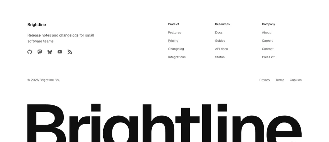
Wordmark
The name at display scale closes the page, link columns above it.
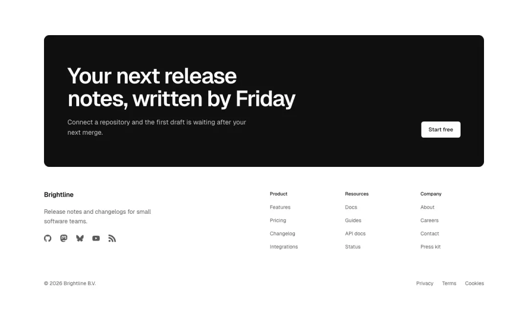
Closing call
A last call to act with one action, then the columns and legal row.
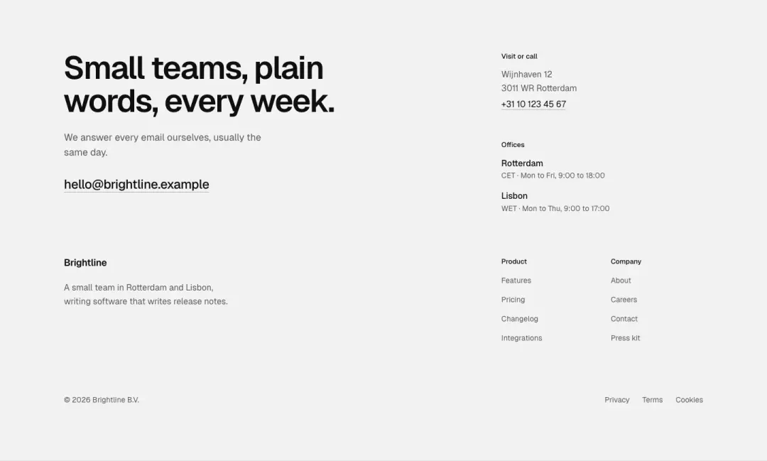
Editorial
A statement in large type beside the link columns.
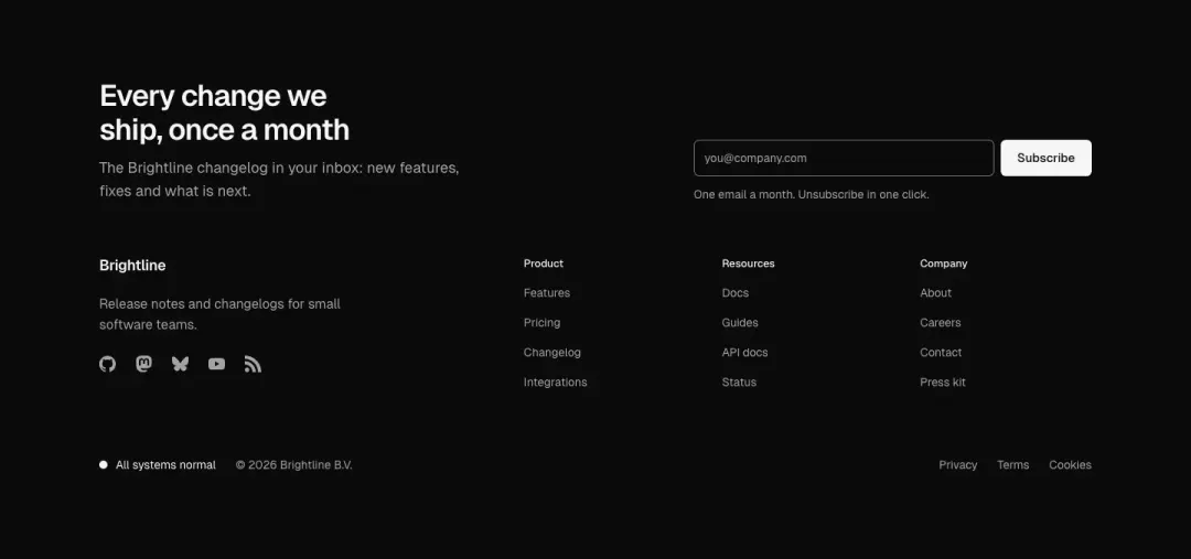
Product
Columns, a newsletter field and a status line, for a software site.
Show all 35 variantsShow fewer

Minimal
One row: brand, a few links, the legal line.
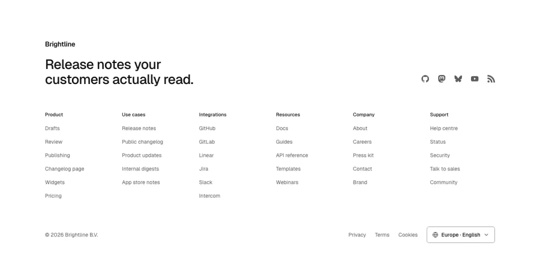
Mega
Six titled link columns and a region picker, for large sites.
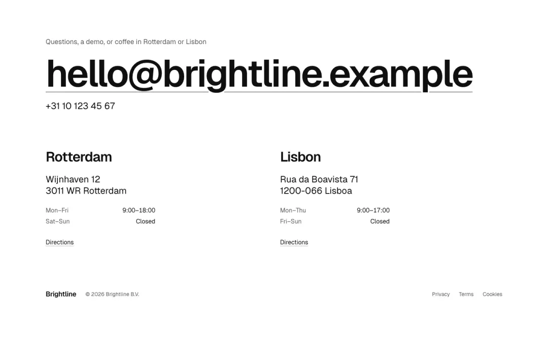
Studio
The address, hours and an email at large size, for agencies and local businesses.
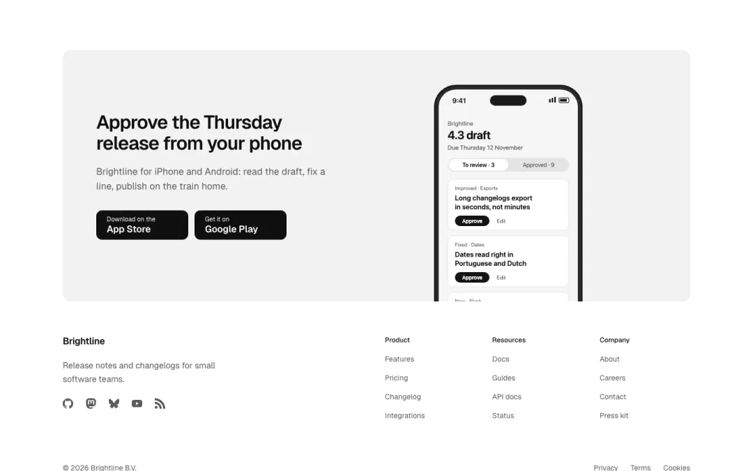
Apps
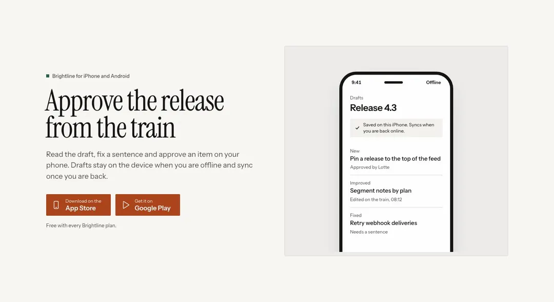
App-store badges and a phone picture above the link columns.

Centred
Brand, one row of links, social icons and the legal line, centred.
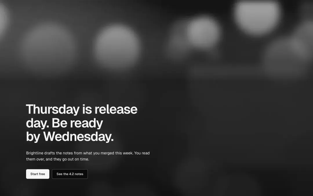
Over a picture
The footer set over a full-bleed picture with a closing line.
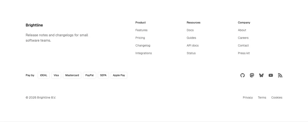
Footer with payments
Link columns plus a row of payment-method and carrier icons beside the socials.
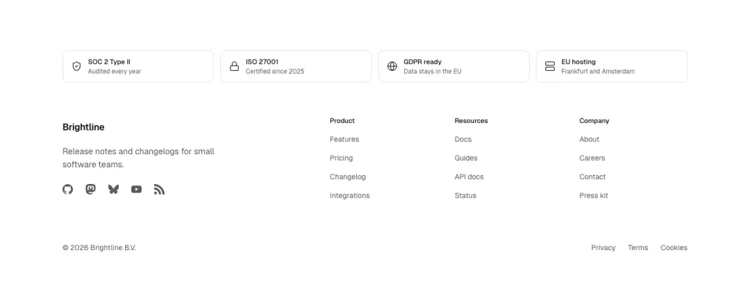
Accreditation footer
Link columns topped by a row of accreditation and certification badges.
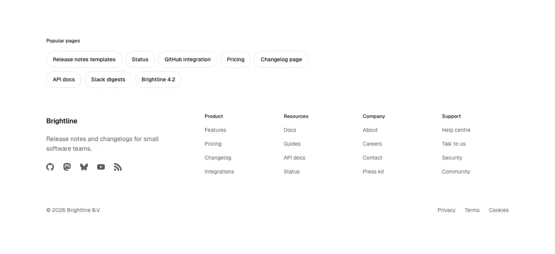
Chip link footer
Popular pages shown as a wrapped row of pill chips above compact link columns.
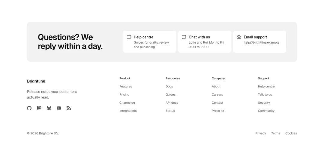
Help band footer
Top help band with quick-contact links, then a mega footer with grouped columns.
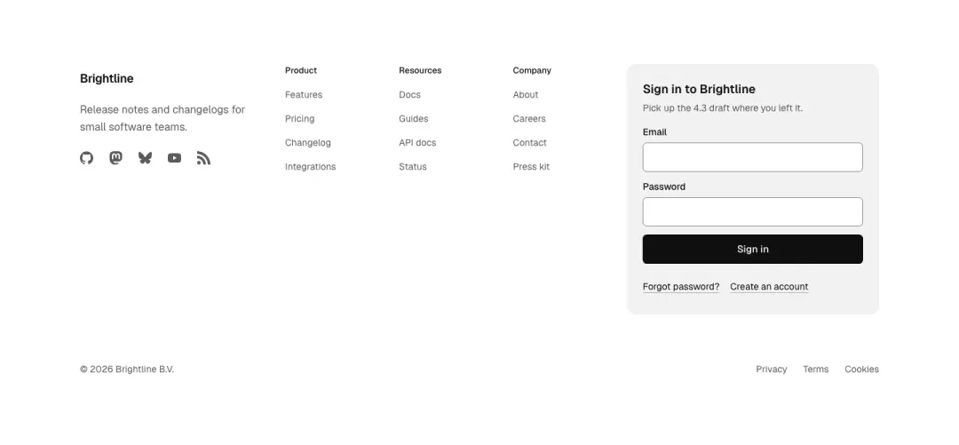
Footer with account card
Link columns with an account sign-in card in the last column.
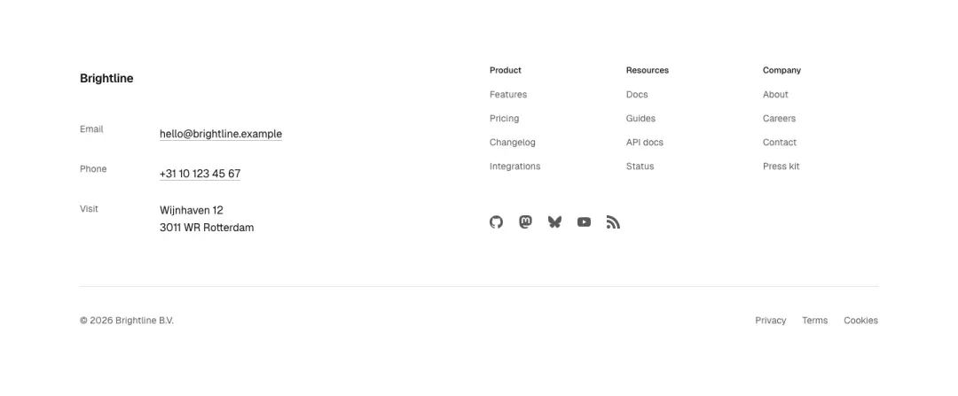
Contact details footer
Contact details and socials on one side, link lists on the other.
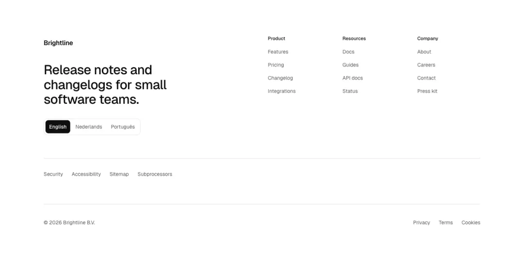
Footer with locale
Tagline and language selector left, link columns right, service links below.

Legal cookie bar
Dark legal bar with cookie-settings button, accessibility and legal links.
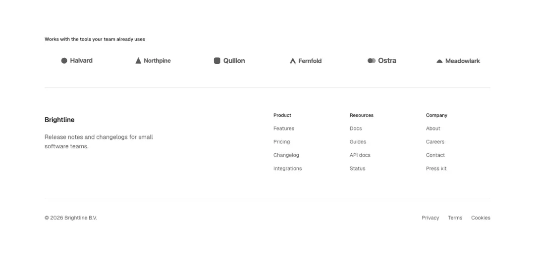
Footer with partners
Partner logo strip sits above the main link columns and the legal row.
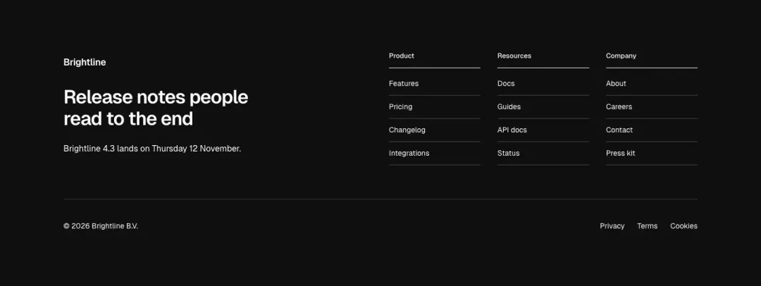
Accent split
Solid accent background, heading block left, three link columns right.
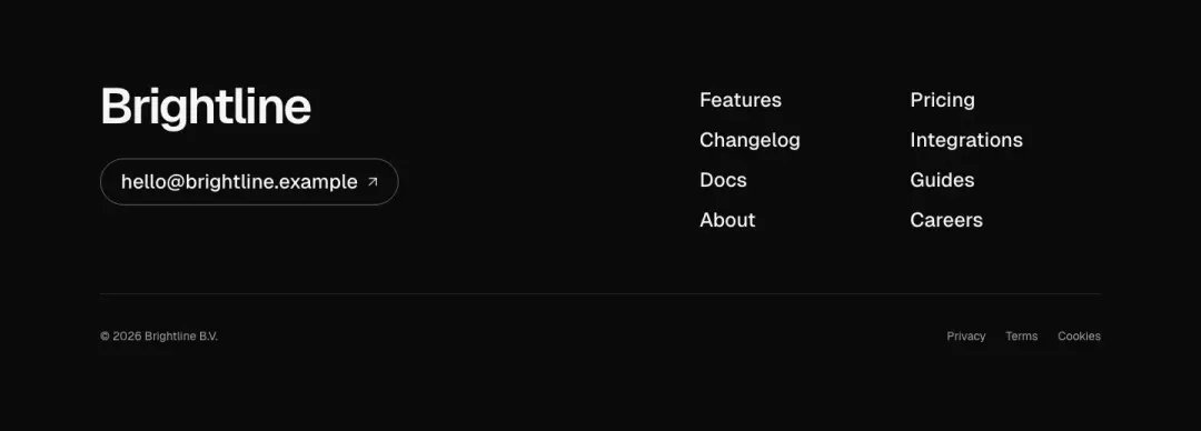
Email and menu footer
Large wordmark, two-column menu and a prominent email contact link on dark.
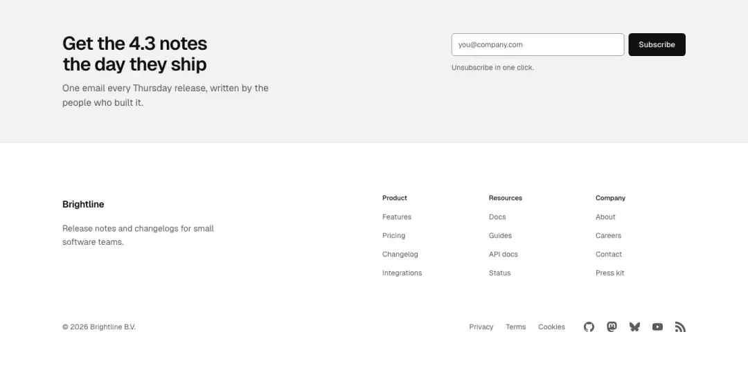
Newsletter band footer
Full-width newsletter band above the link columns, social icons in the bottom bar.
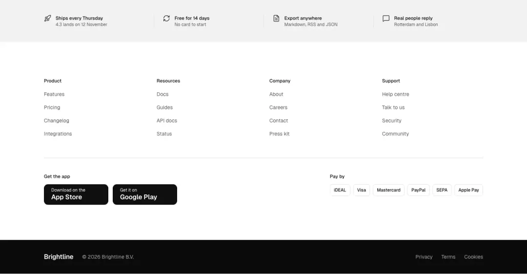
Multi-band footer
Several stacked bands: perks strip, link columns, apps and payments, legal bar.
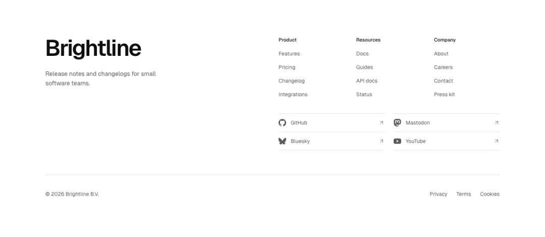
Wordmark and socials
Wordmark with social icons in the first column, three link columns beside it.
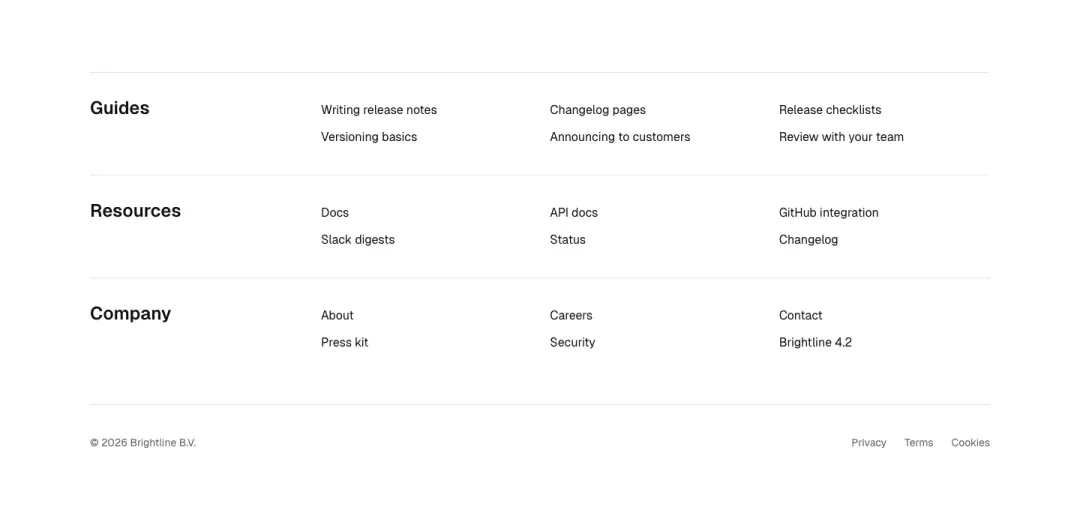
Resource lists footer
Plain text link lists grouped as guides, resources and company, no icons or logo.
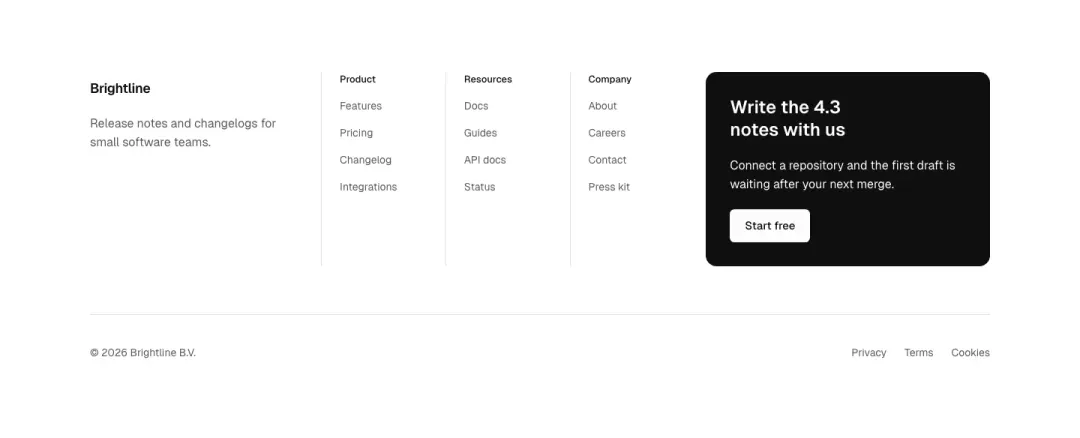
Footer with button
Link columns with logo, and a primary button in the final column.
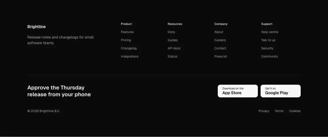
Dark app footer
Dark footer with link columns and app store badges in a closing row.
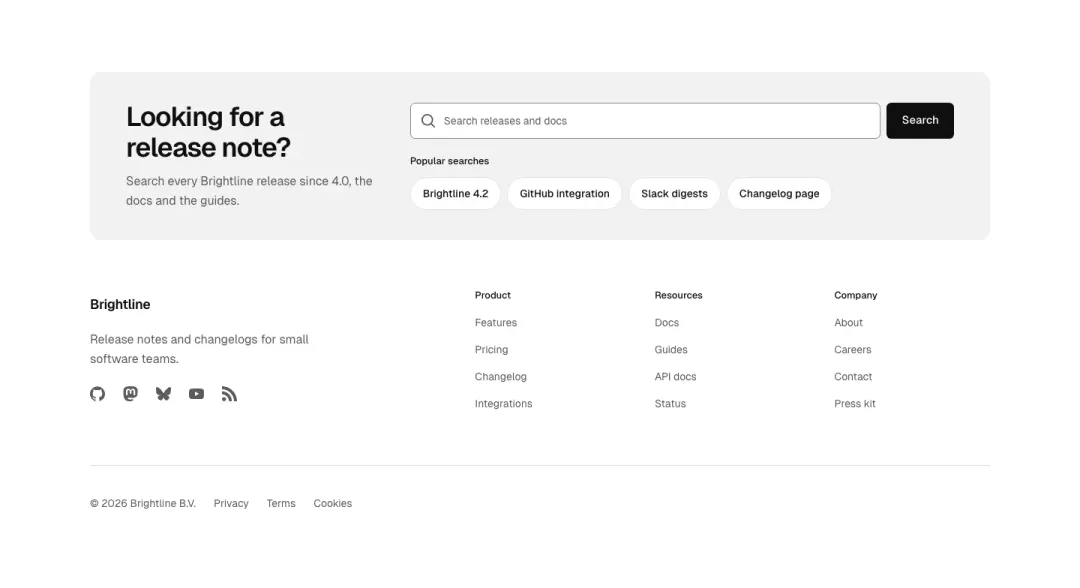
Search band
A wide search field with popular searches above the link columns and legal row.
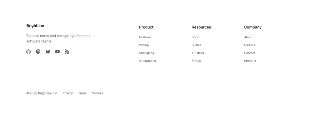
Disclosure columns
Each link column is a native details block that opens on tap, social row and legal line below.
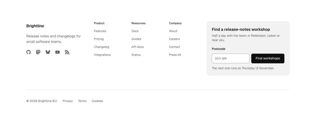
Locator card
Link columns beside a card with a postcode or store-finder field and a find action.
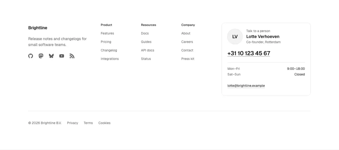
Advisor card
A named contact person with portrait, phone and opening hours beside the link columns.
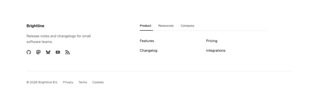
Tabbed links
Link groups behind a small tab row, one panel of links visible at a time.
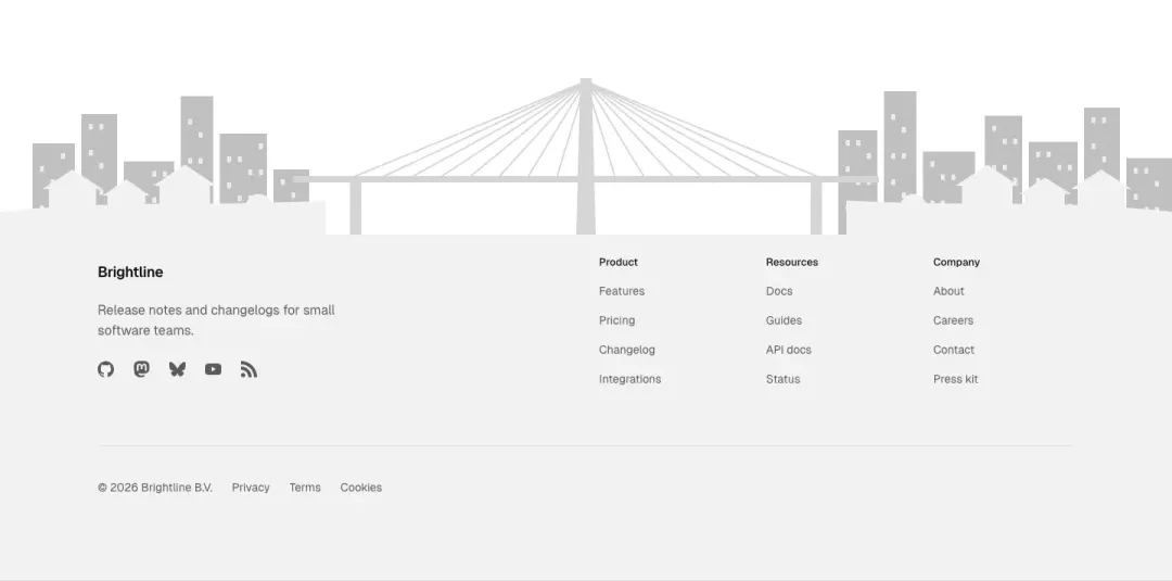
Illustration
A drawn scene sits along the top edge of the footer with columns and legal row on it.
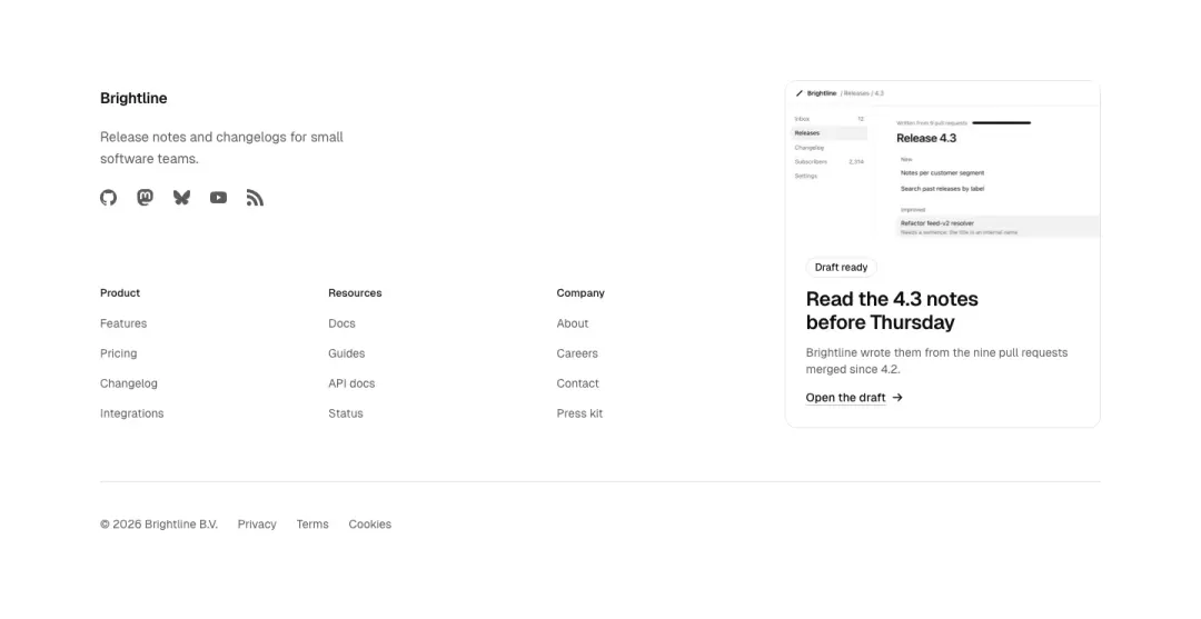
Promo tile
Link columns plus one tile with a picture, award or campaign line in the last column.
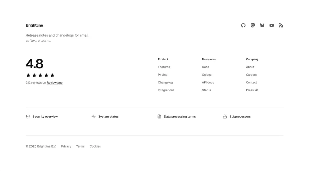
Rating and trust
A review score with star row and source beside the link columns, trust links below.
Hero 31 variants
98% of 259 about pages and 94% of 663 home pages in The UI Index have a hero (or page header).
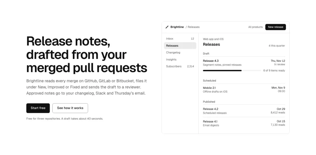
Split
Text beside a product picture.
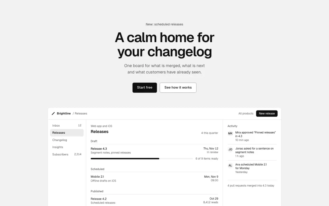
Stacked
Text, then a wide product screen under it.
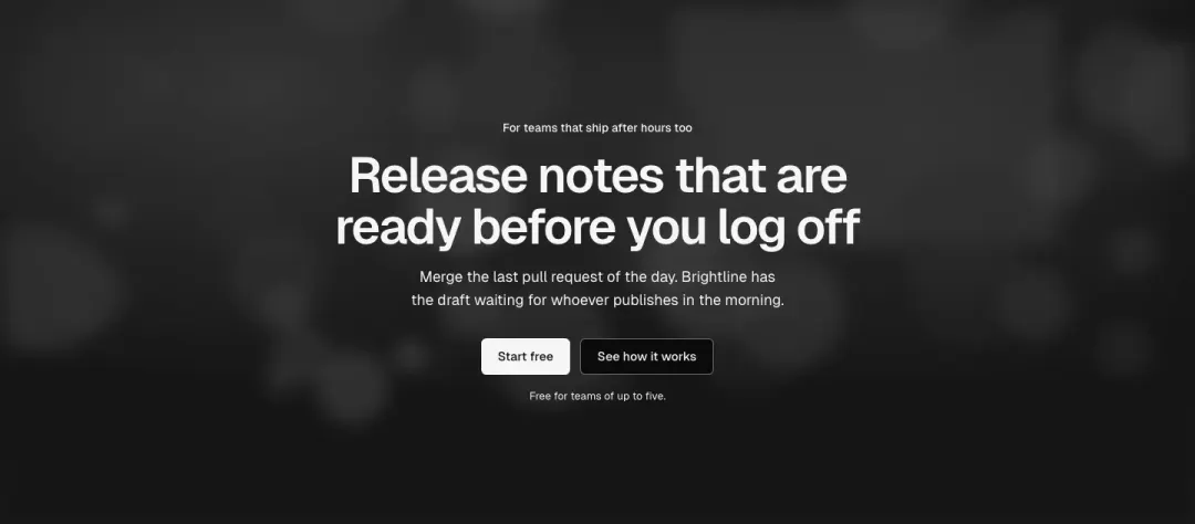
Photo overlay
The heading on a full-bleed photo, safe to 3840px.
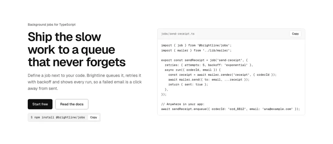
Code
A code window and an install command, for developer tools.
Show all 31 variantsShow fewer
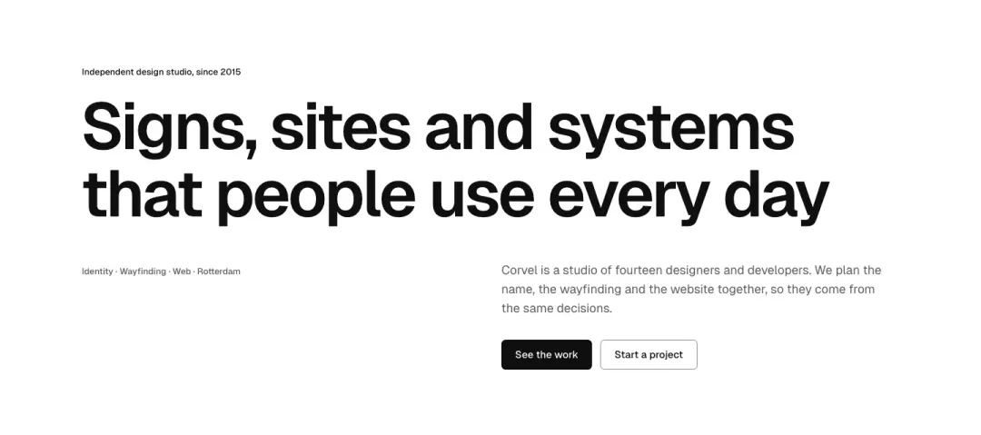
Poster
Display type as the picture.
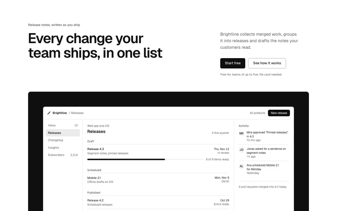
Panel
The hero in an inset panel on its own ground.
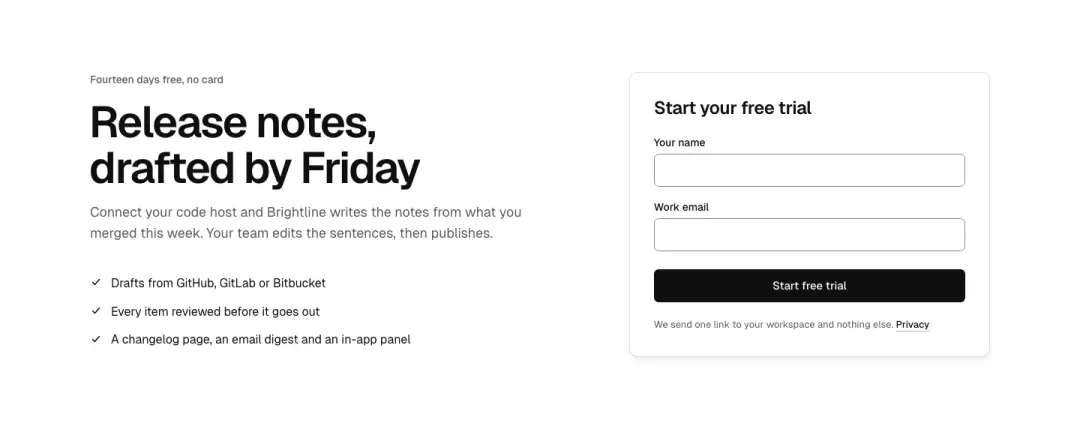
With a sign-up form
The heading beside a short trial or waitlist form, the form as the main action.
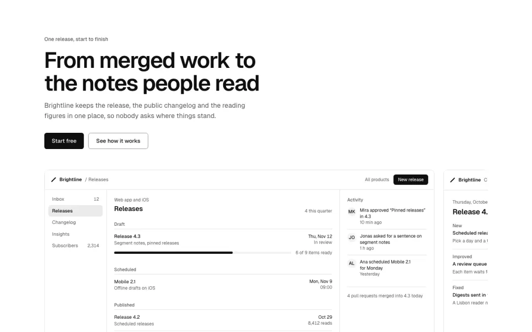
Carousel
Product views one at a time with paged controls; the heading and actions stay put.
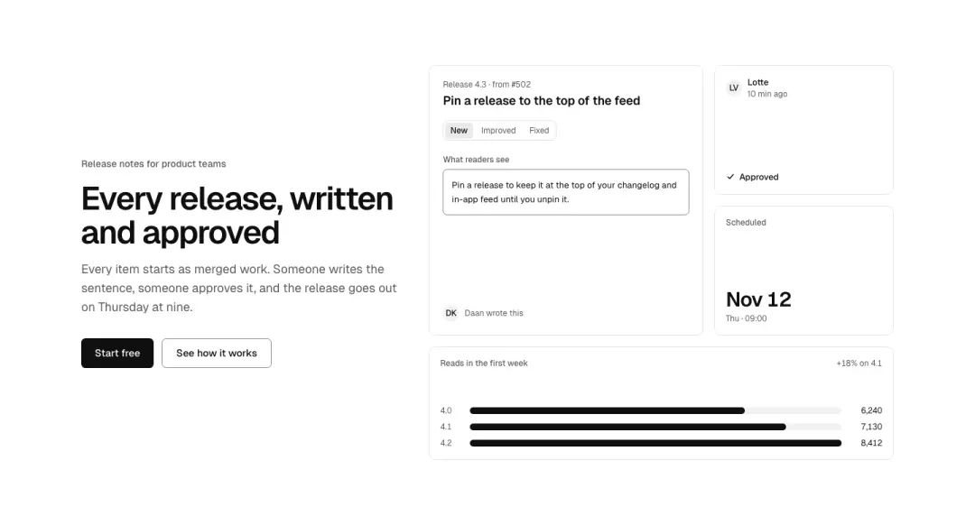
Mosaic
The heading beside a mosaic of four product crops of different sizes.
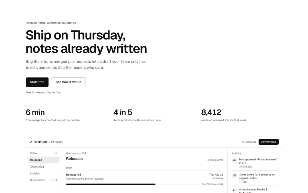
With figures
Heading and actions, then three proof figures in a row before the picture.
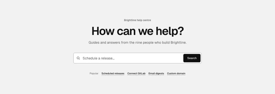
Search
A search field is the main action, for help centres, docs and directories, with suggested queries.
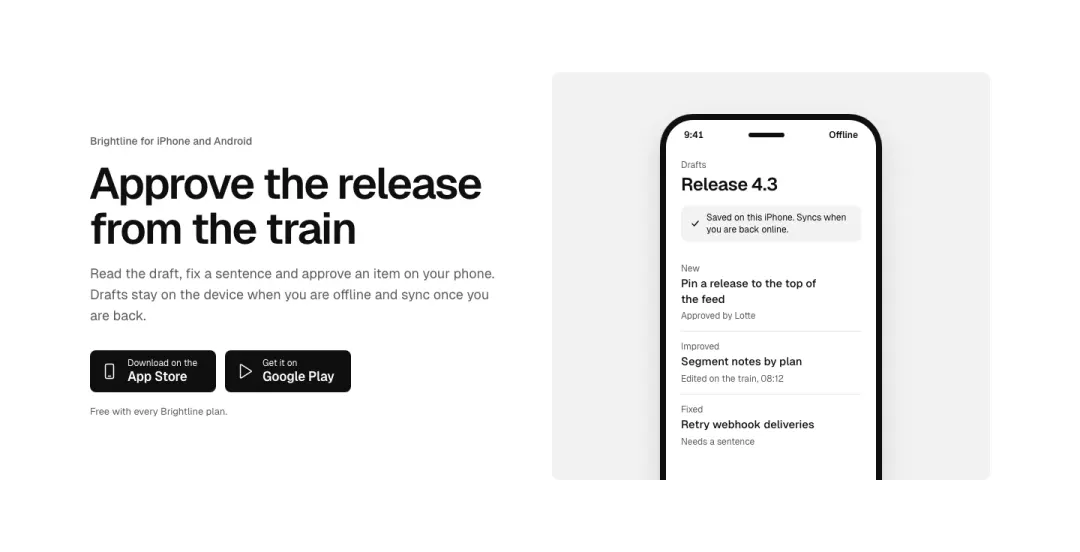
App
The heading beside a phone screen, with app-store badges as the actions.
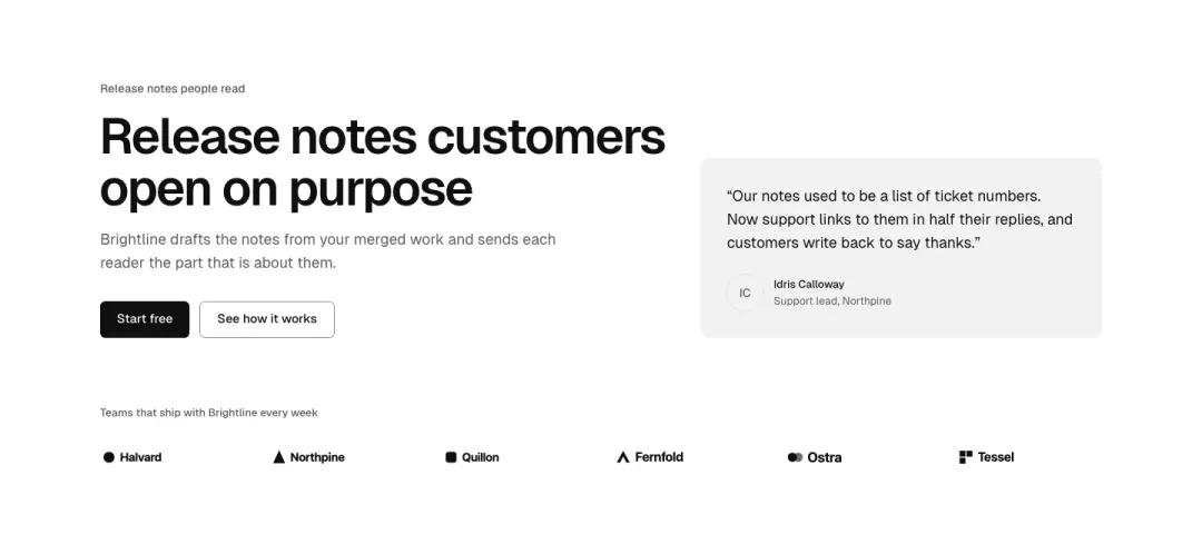
With a quote
The heading beside a customer quote with a monogram and a row of logos under it.
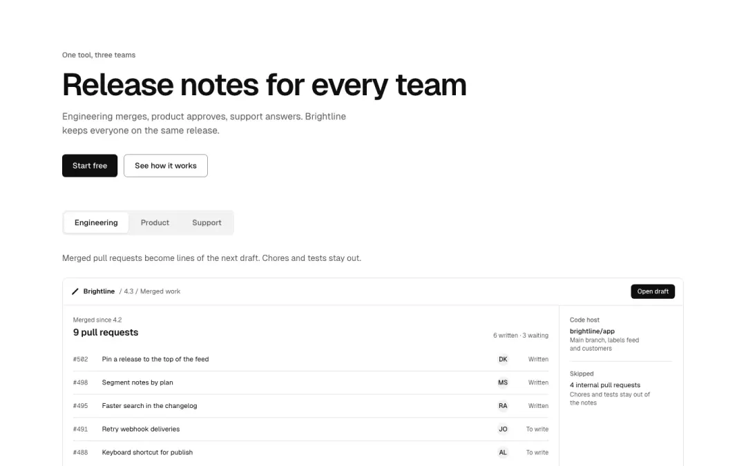
Tabs
A wide product screen switched by tabs, one per use case, under the heading.
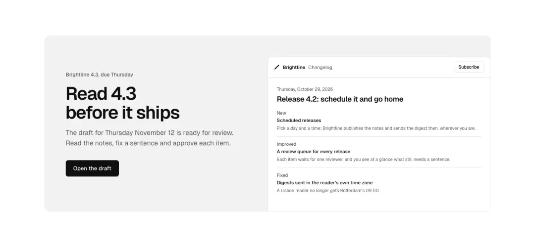
Promo panel
A rounded promo panel inside the page: heading, short copy and button on one side, a picture filling the other.
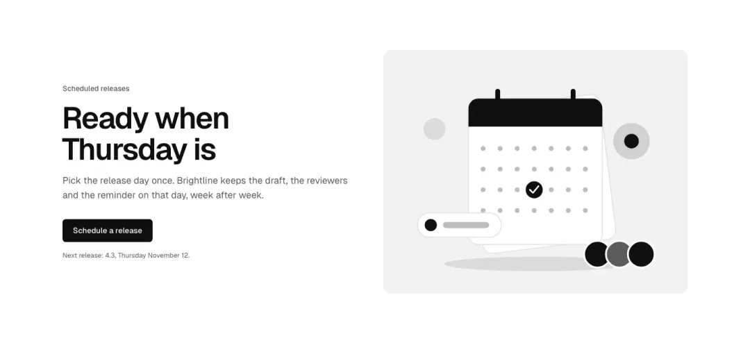
Illustration
The heading and button beside a drawn illustration made of token shapes (no photo).
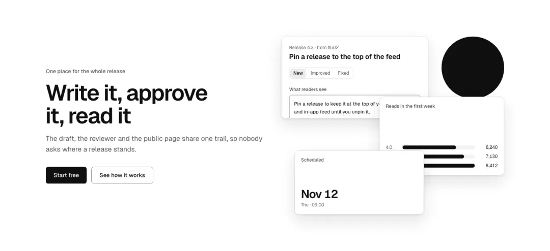
Collage
The heading beside a collage of two or three overlapping pictures and a drawn shape.

Compact
A short hero: an eyebrow, the heading and one line of intro, little vertical space.
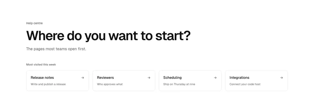
With quick links
The heading and intro over a row of quick links to the most visited pages.

Gradient field
A centred heading with two buttons on a soft gradient field drawn with tokens.

Picture band
A short full-bleed picture band with the page title and one link over it, not a full-height hero.
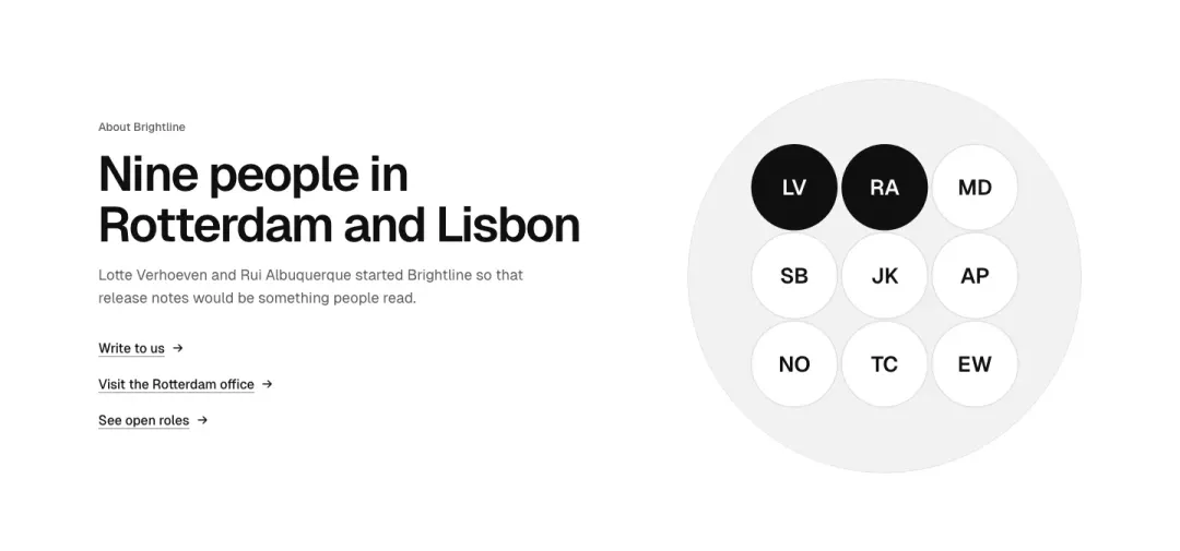
Round picture
The heading, intro and text links beside one large round picture, for contact or about pages.
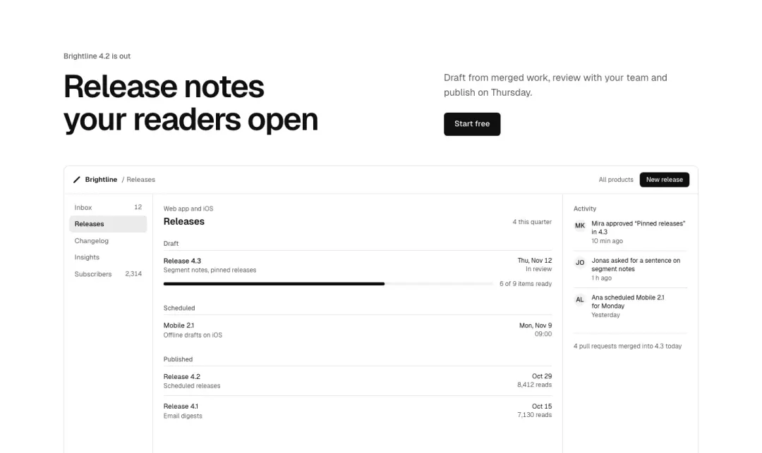
Picture below
Heading, intro and button over one wide picture under the text, cut by the bottom edge.

Statement
One large statement in display type, nothing else but a small byline: no picture, no buttons.
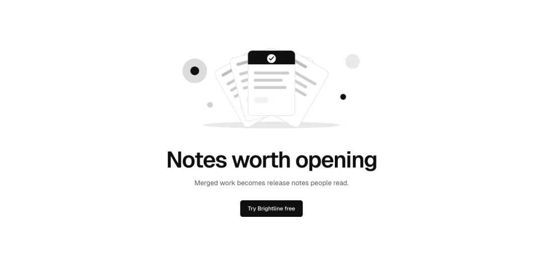
Art above
A centred drawn illustration (token shapes) above the heading and intro.
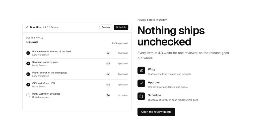
With checklist
The heading, a three-point checklist with icons and a button beside a picture.

Overlay with links
Full-bleed picture with the headline over a scrim and two text links, no button.

Lead-in
Large headline with one text link and no picture; a quiet opening for docs and journals.

Button only
Centred headline and one primary button, no picture and no links.
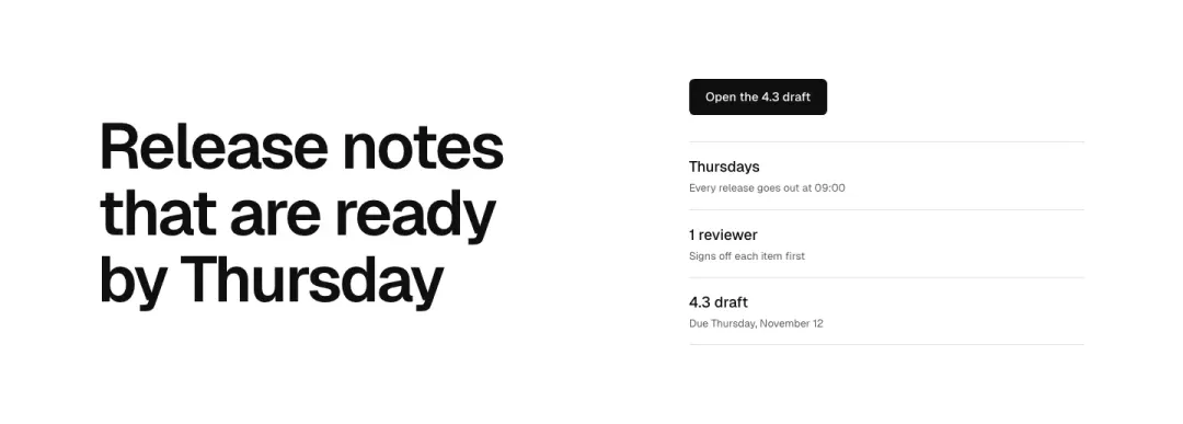
Action stack
Headline, then a primary button above a stacked block of three short facts; no picture.
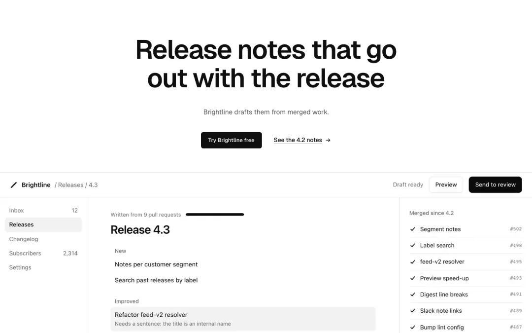
Banner image
Centred headline, a primary button and a text link, with one wide picture below.
Features 17 variants
81% of 259 about pages and 79% of 663 home pages in The UI Index have a features section.
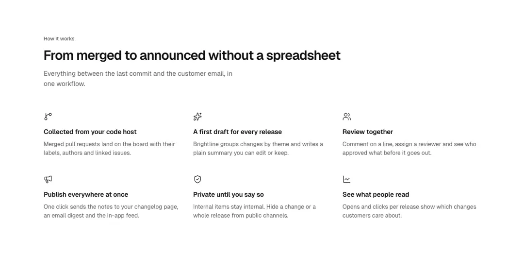
Grid
Three or four features a row, icon, title and a line.
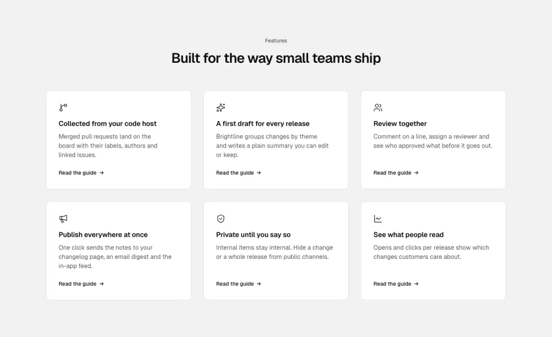
Cards
The same in cards, each optionally a link.
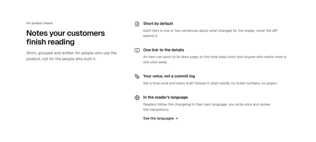
Heading beside list
The heading holds a column, the features run beside it.
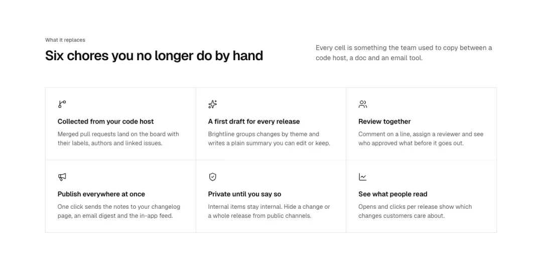
Ruled board
Cells in one ruled board, like a spec sheet.
Show all 17 variantsShow fewer
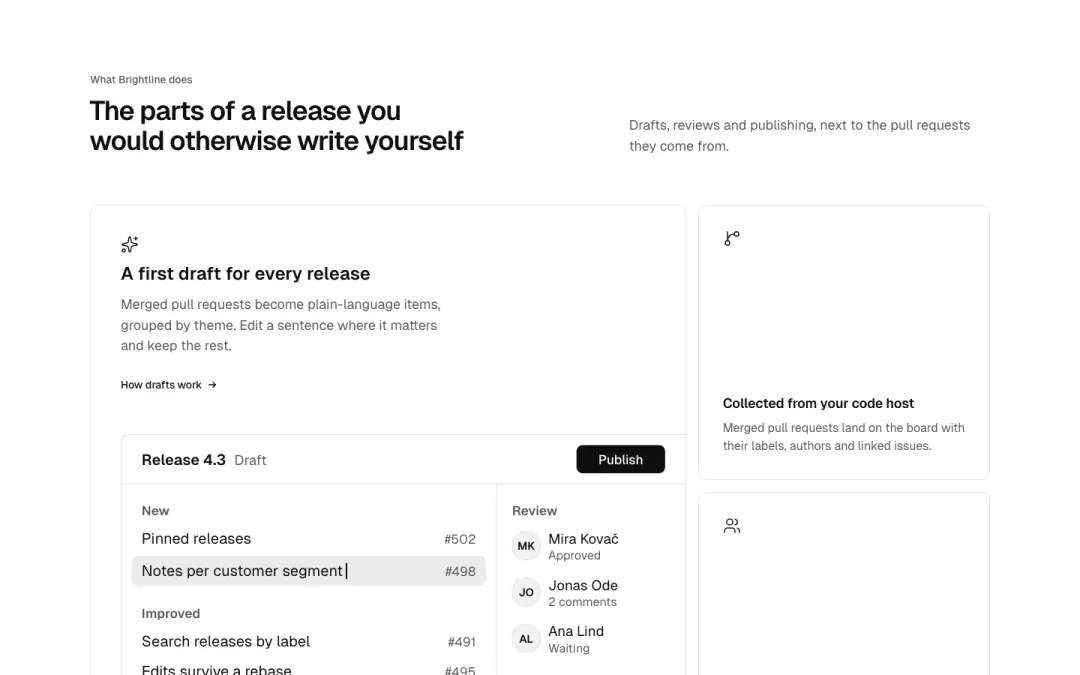
Bento
Cells of different sizes, one lead cell with a picture.
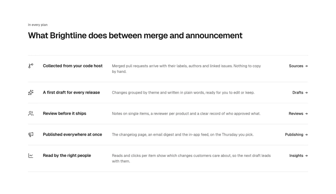
List
One feature per row: icon, title, a line and a link, on one axis.
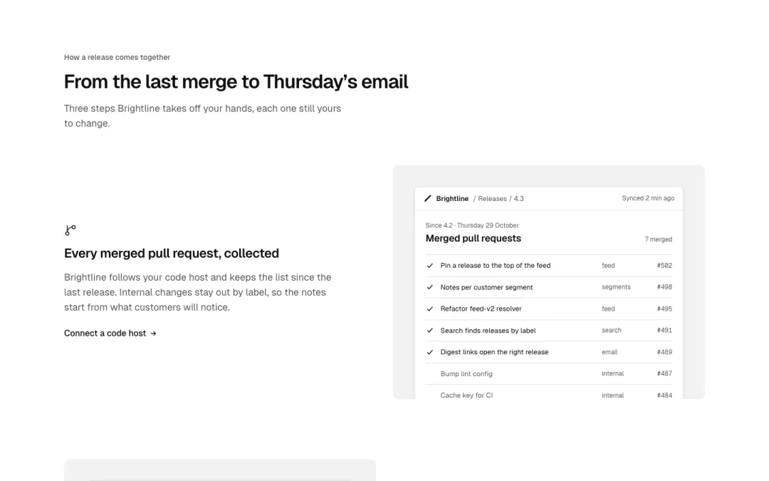
Alternating
Rows of picture and text that swap sides, one feature per row.
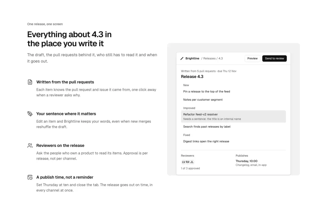
Sticky picture
A picture holds still while the features scroll beside it.
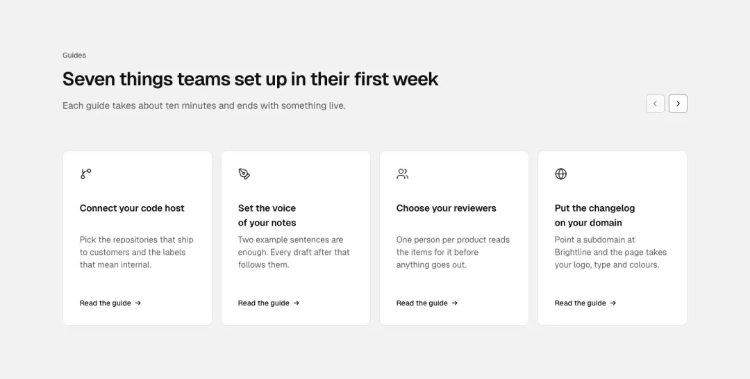
Carousel
Feature cards in a scrolling row with previous and next buttons.
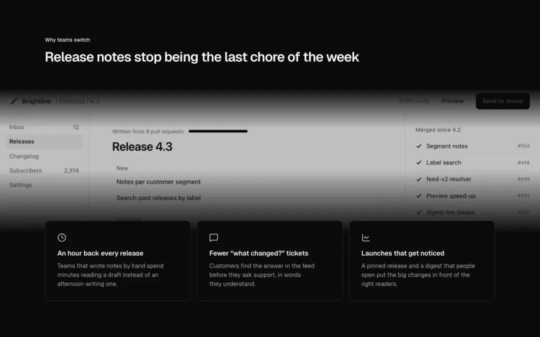
Over a picture
Feature cards set over a full-bleed picture.
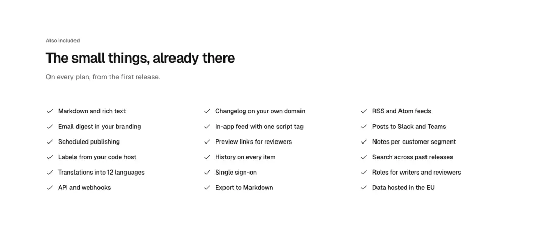
Checklist
A short heading over a long list of checked features in columns.
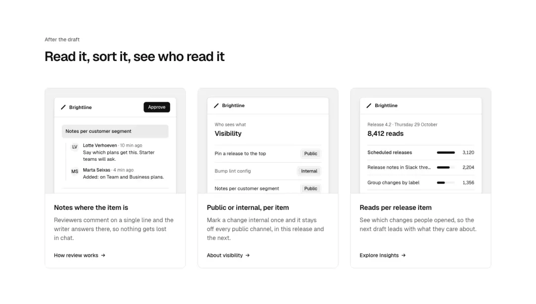
Picture cards
Cards with a product crop on top, title and line under it.
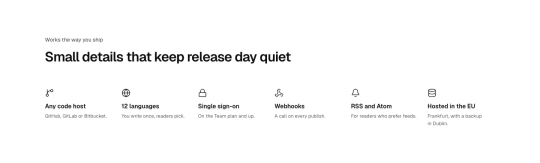
Row
Five or six small features in one row under a centred heading.
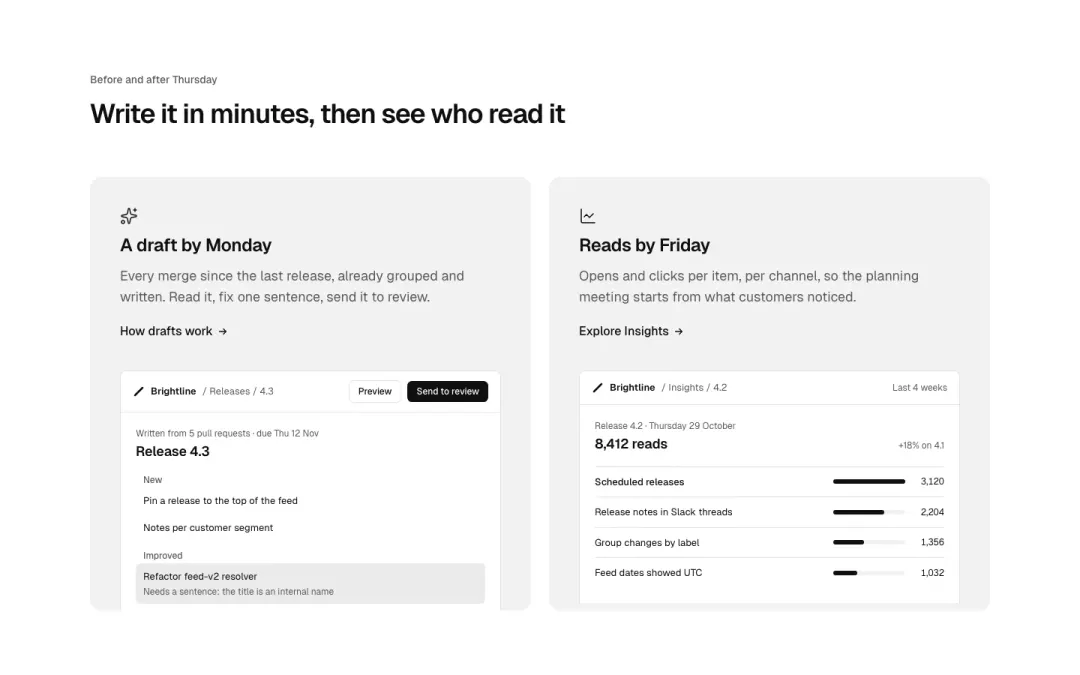
Pair
Two large feature panels side by side, each with its own picture.
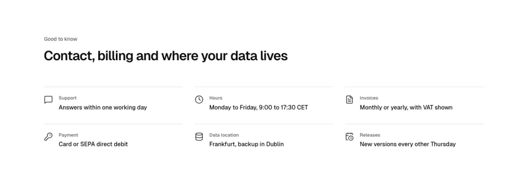
Icon facts
Compact grid of icon, label and one line for contact, payment and shipping facts.
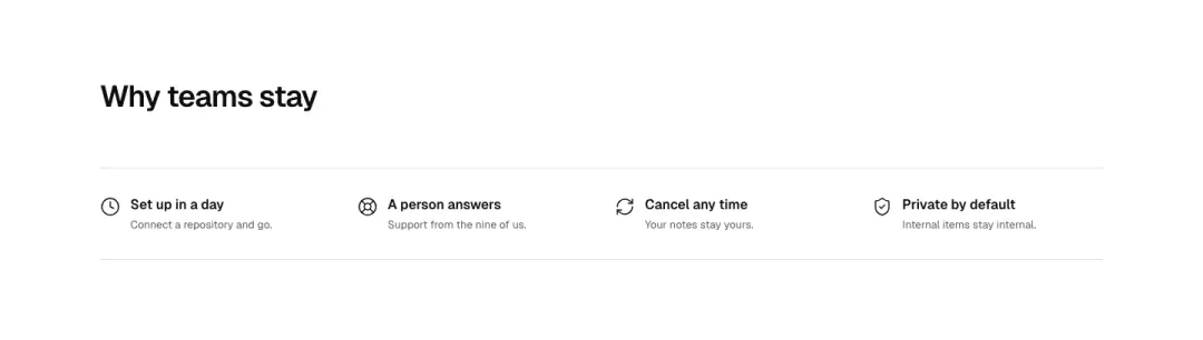
Promise bar
Four-up service bar with small icons and one-line promises, no cards.
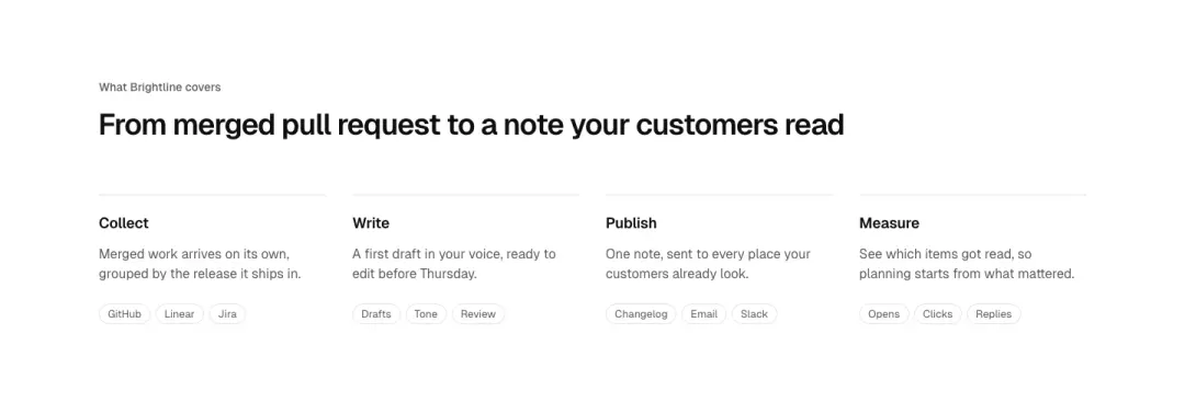
Tagged list
Four columns of capability, a line of description and tag chips that name what it covers.
FAQ 16 variants
68% of 607 pricing pages and 58% of 126 help pages in The UI Index have an FAQ section.
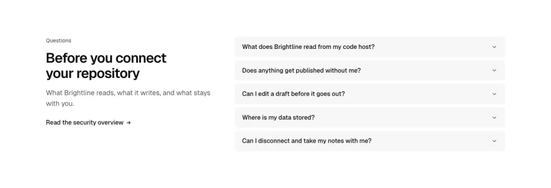
Heading beside questions
The heading and a contact line hold a column.
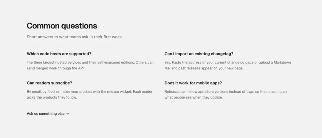
Open grid
Every answer open, two columns.
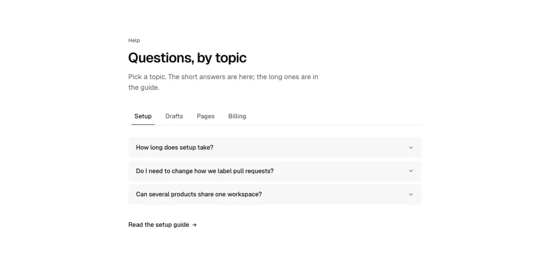
By topic
Questions grouped by topic behind tabs.
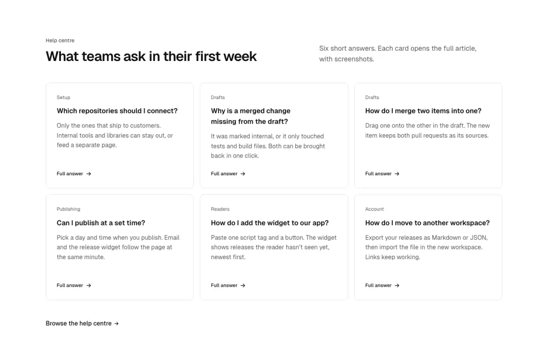
Cards
Each question in a card with a short answer and a link to the full one.
Show all 16 variantsShow fewer
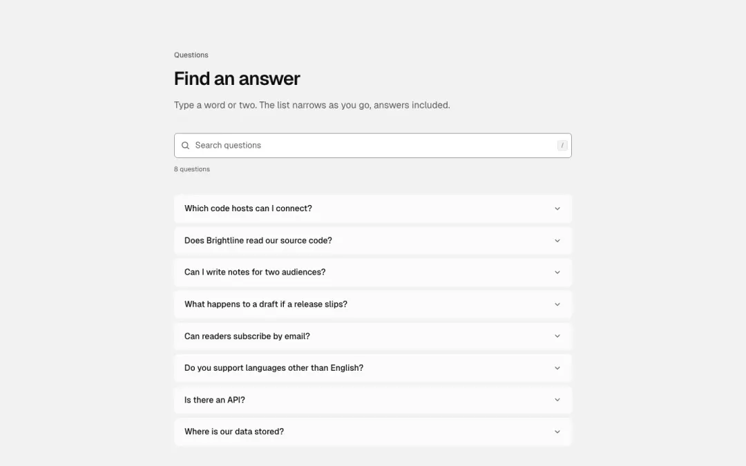
Search
A filter field above the questions narrows them as you type.
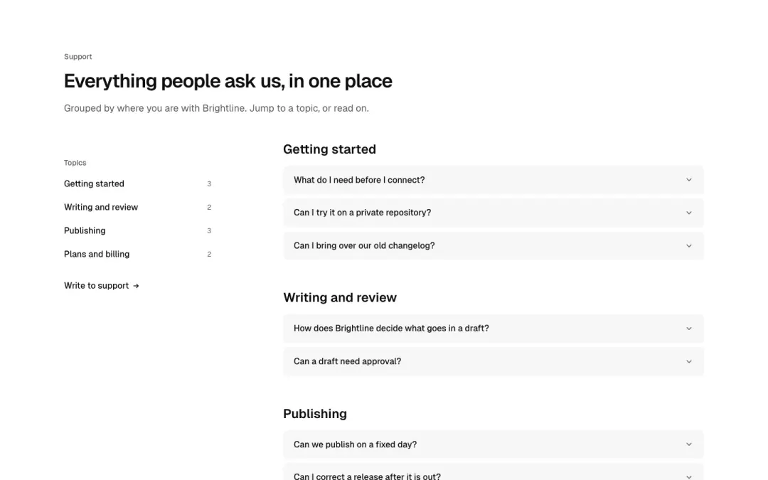
Topics
A list of topics beside the questions, grouped and linked.
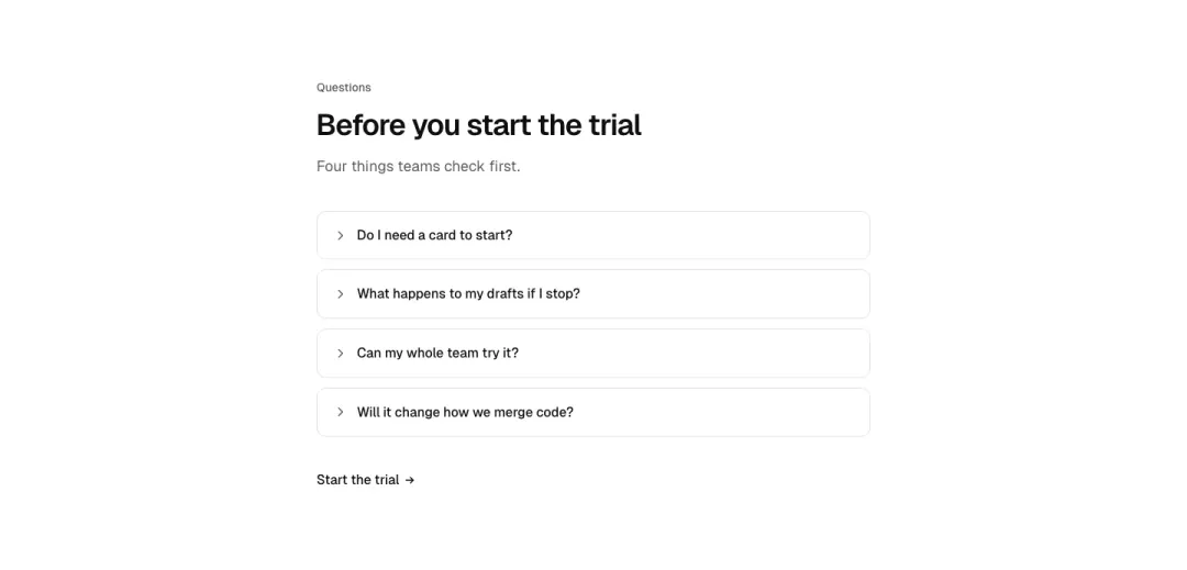
Single details
One narrow native details block per question, spaced as separate cards.
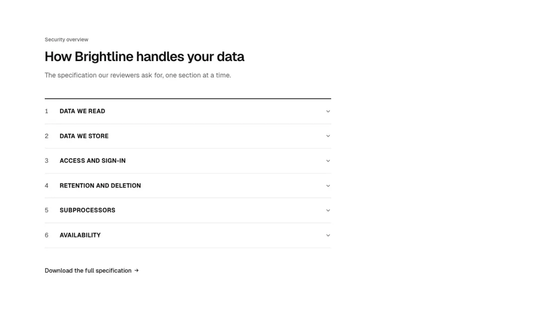
Spec accordion
Numbered section accordion for long specifications, section titles in bold caps.
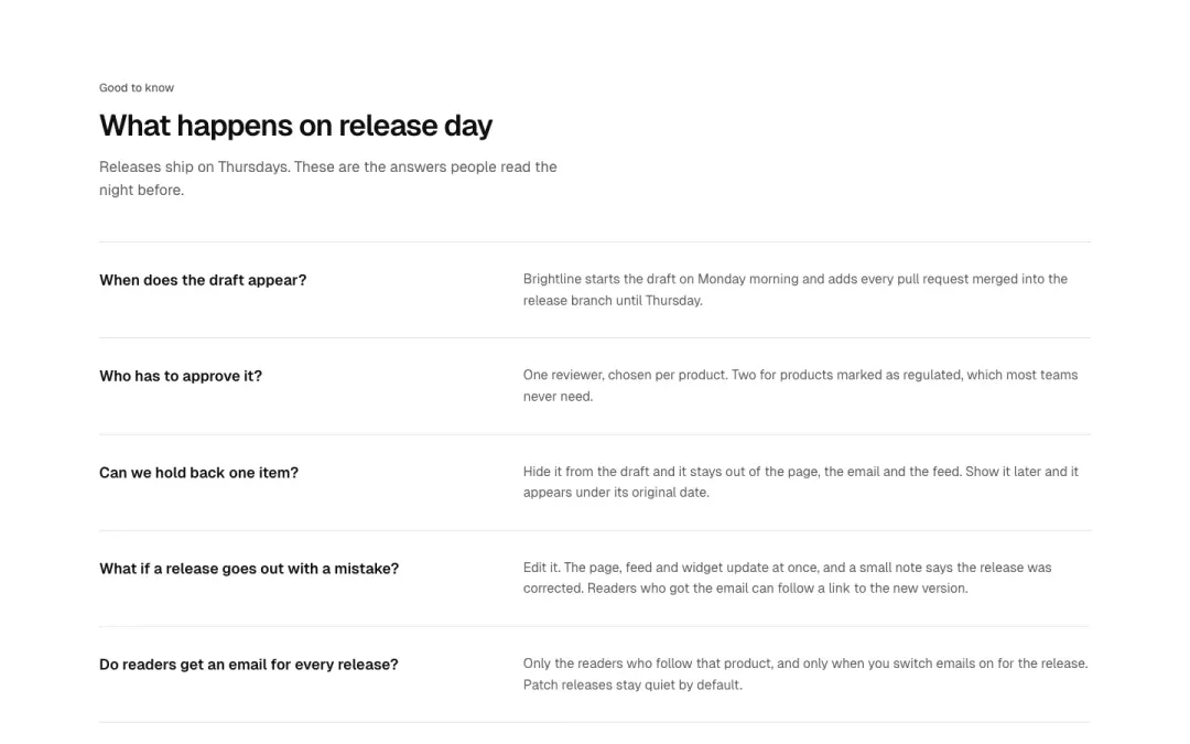
Question answer list
Questions with answers always visible, divided by hairlines, no toggle.
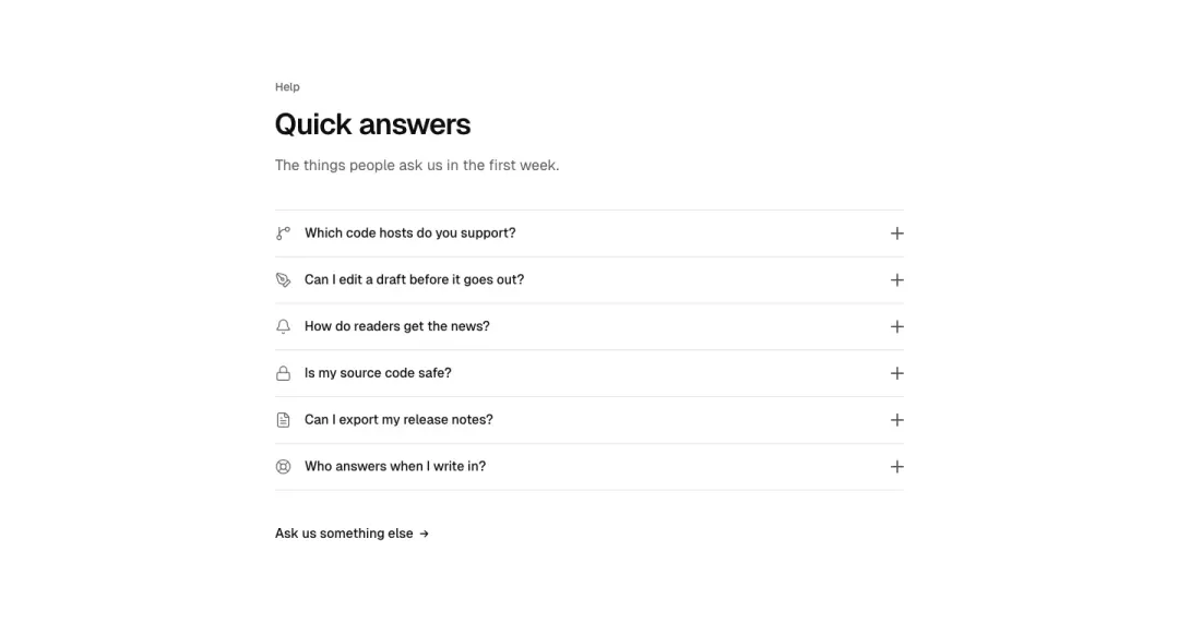
Toggle rows
Compact rows with an icon on the left and a plus toggle on the right.
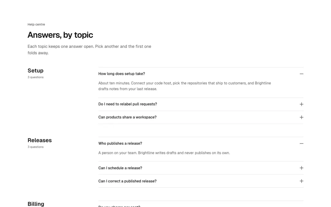
Grouped accordion
Accordion split into labelled groups with one expanded item per group.
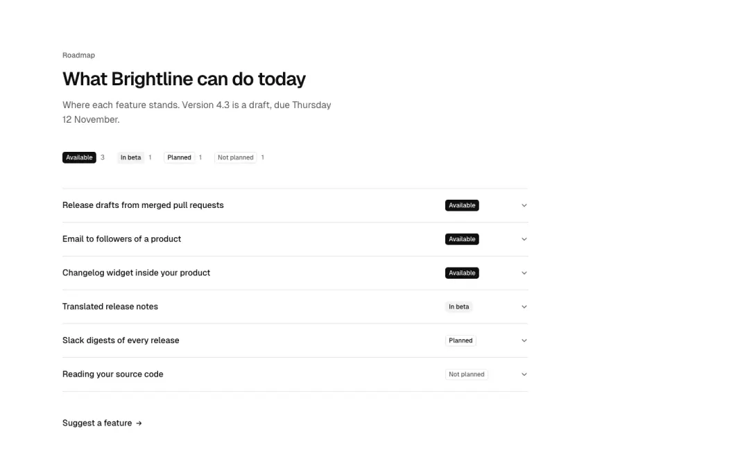
Status rows
Accordion rows with a small status badge, such as available or planned.
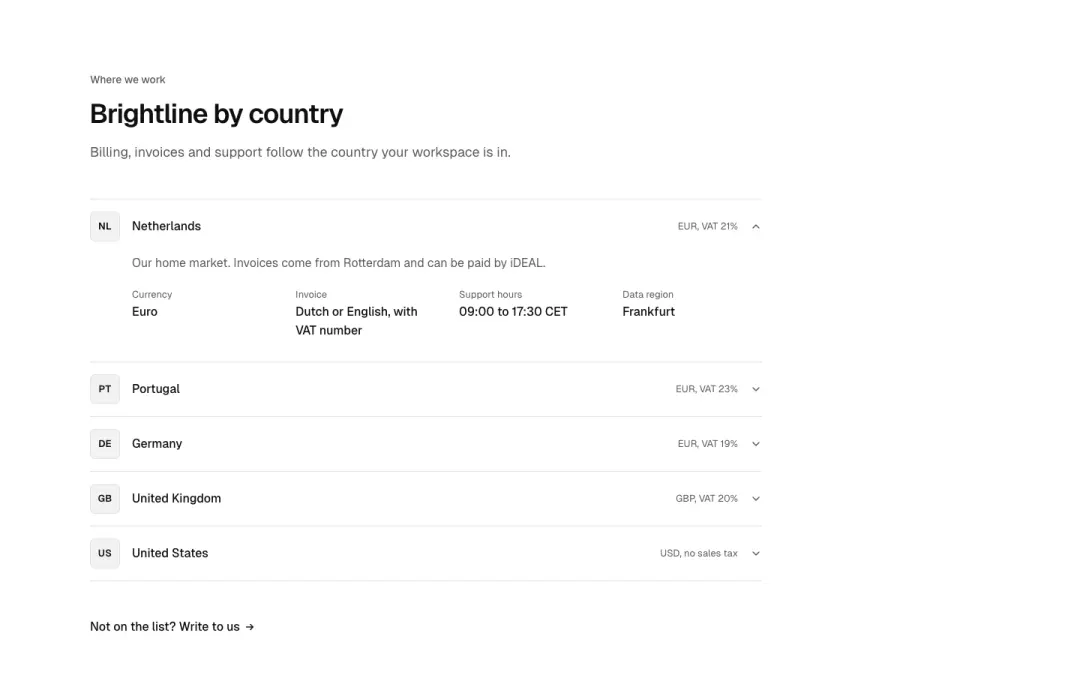
Country rows
Region or country rows that expand into a short list of local details.
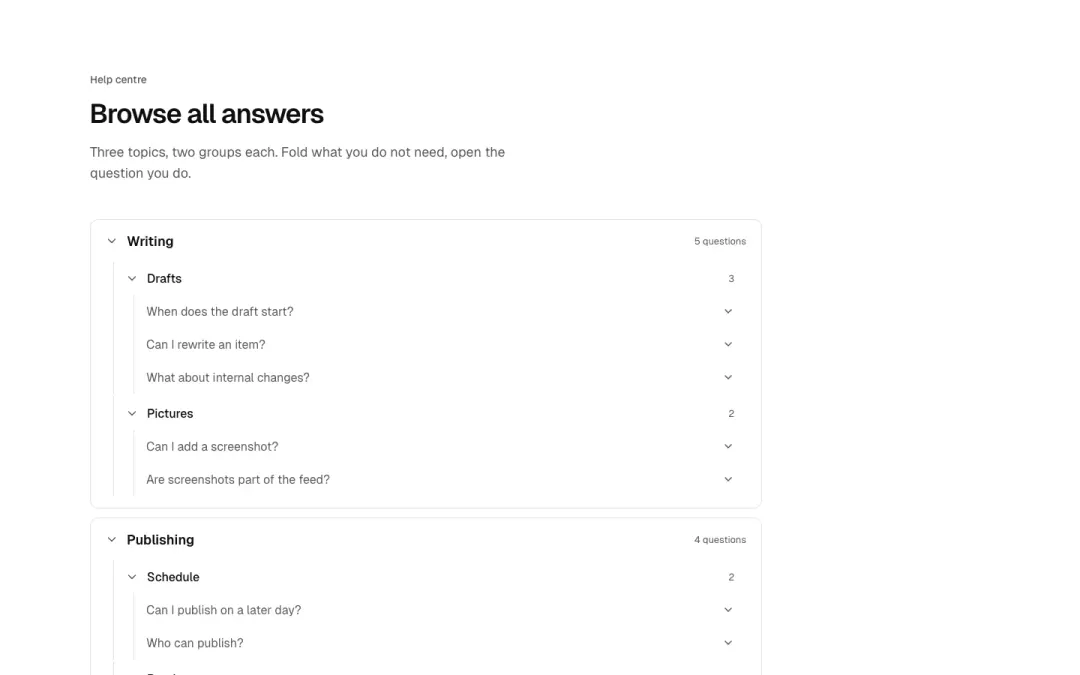
Category tree
Three-level expandable category tree with counts, built on details.
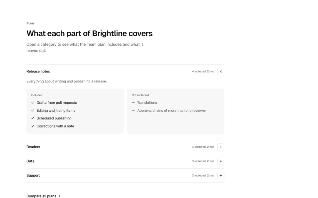
Coverage rows
Category rows with plus toggle that open an included and excluded list.
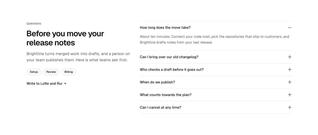
Intro and chips
A short intro paragraph with topic chips beside the accordion.
Call to action 10 variants
38% of 663 home pages and 37% of 150 landing pages in The UI Index have a call-to-action section.

Centred

Split
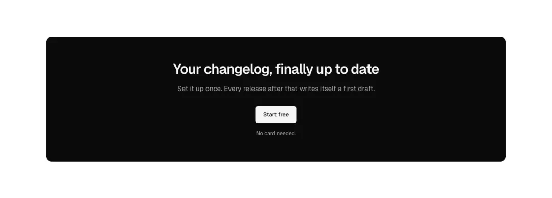
Panel

Row
Show all 10 variantsShow fewer

Over a picture
The call to act over a full-bleed picture.
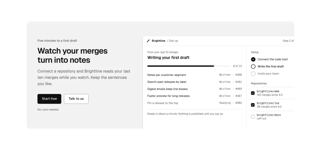
With a screen
The call beside a product screen cropped at the panel edge.
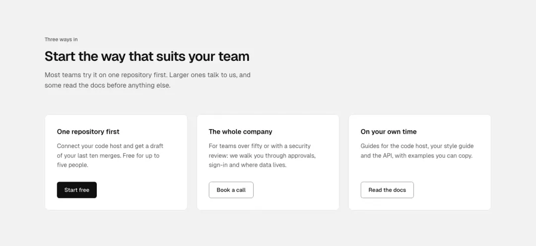
Paths
Two or three ways forward as cards: start, talk to sales, read the docs.
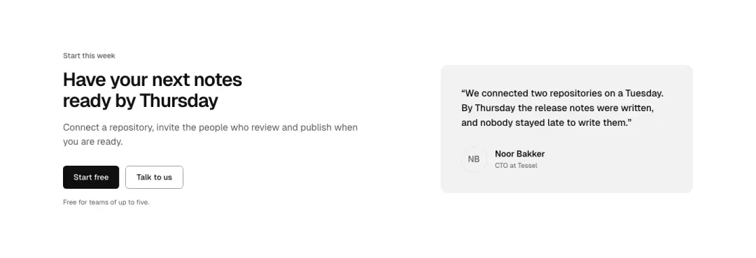
With a quote
The call beside a customer quote.

Install
An install command to copy is the action, for developer tools.
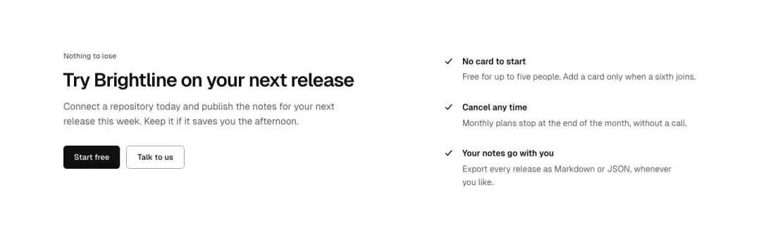
With checks
The call with three reassurances beside it: no card, cancel any time, data export.
Content 13 variants
43% of 178 service pages and 41% of 150 landing pages in The UI Index have a content section.
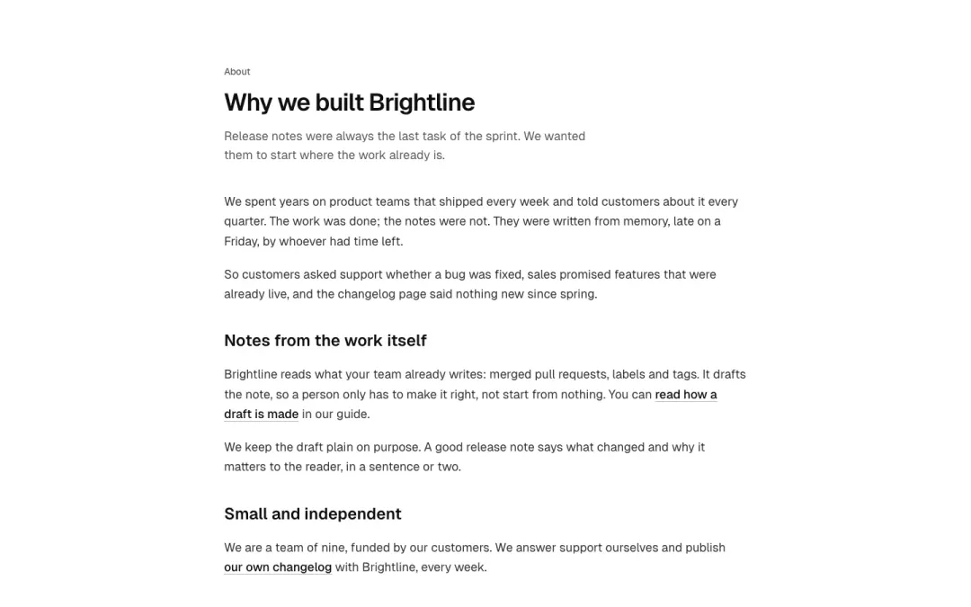
One column
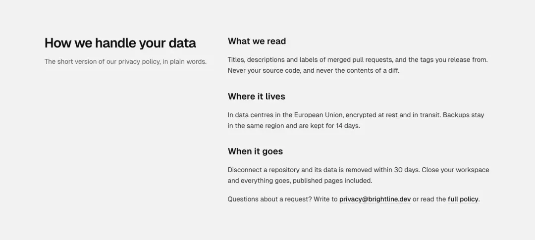
Heading beside prose
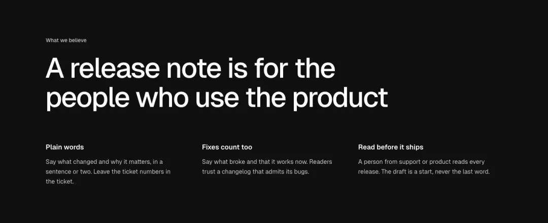
Statement
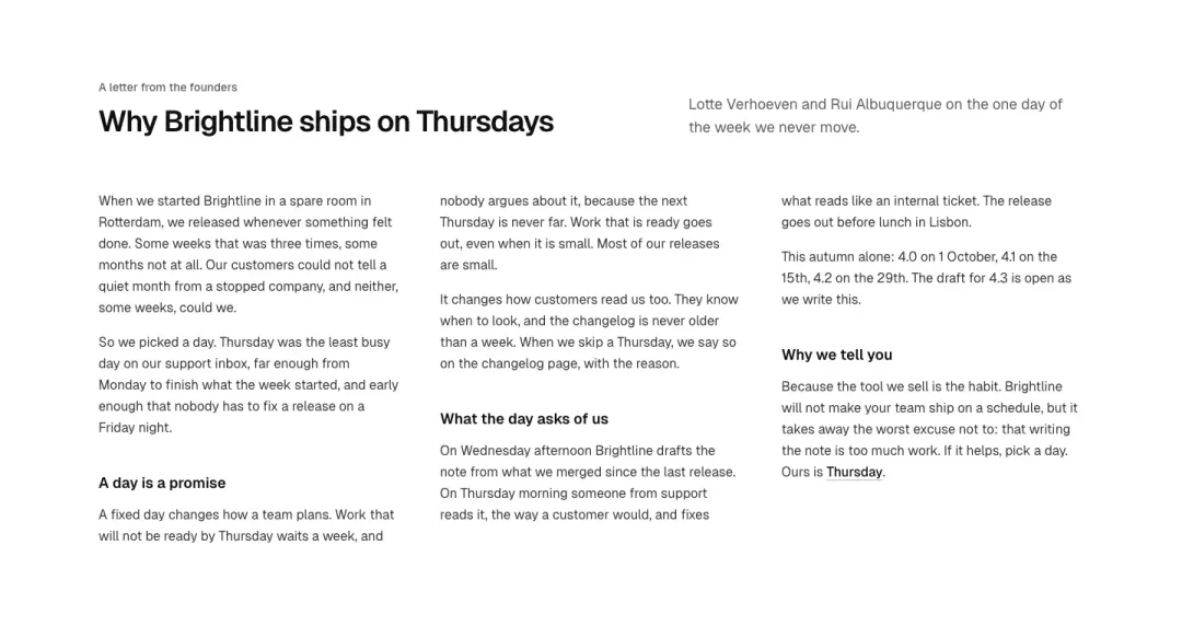
Columns
Long text set in two or three columns, editorial.
Show all 13 variantsShow fewer
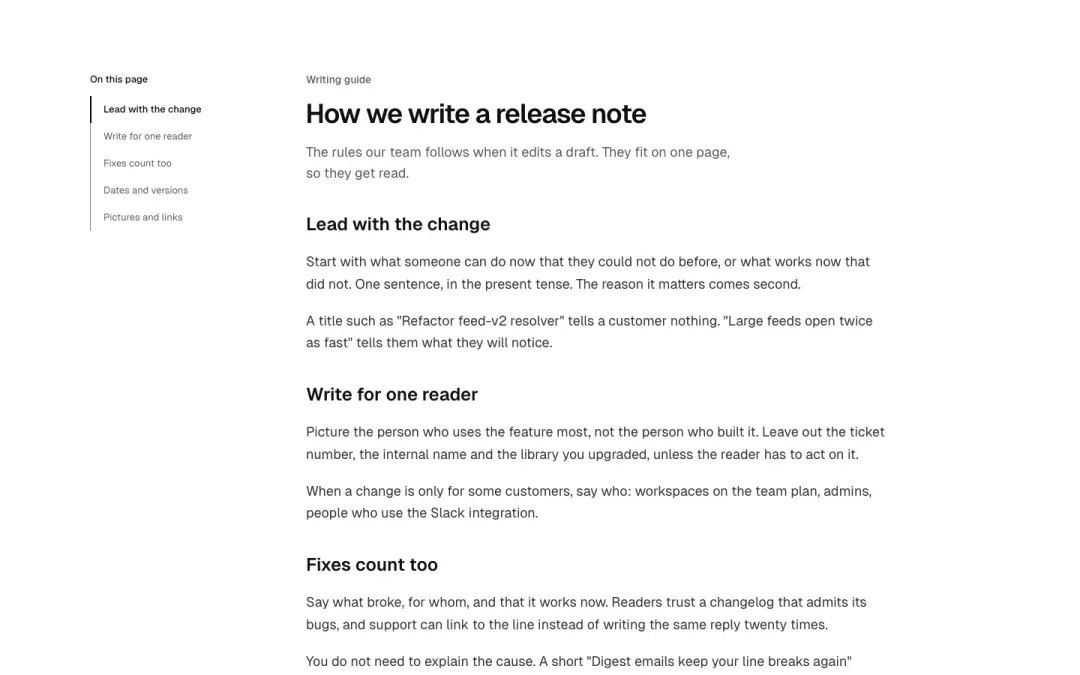
With contents
Prose beside a sticky table of contents that marks the current heading.
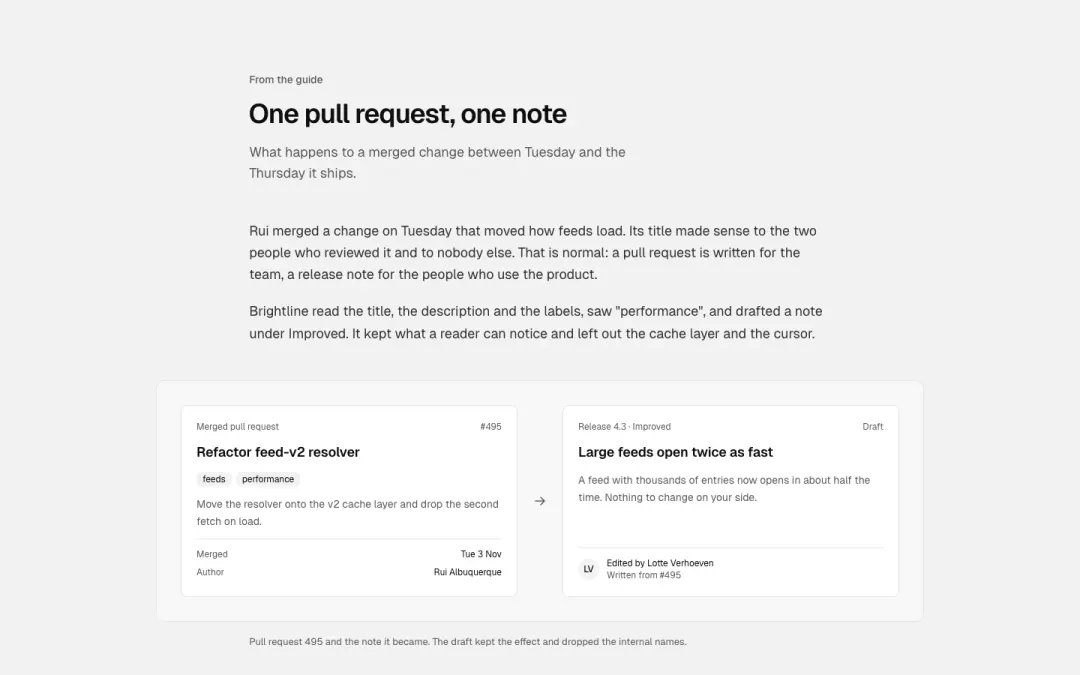
With a figure
Prose with a wide figure and caption in the middle of the measure.
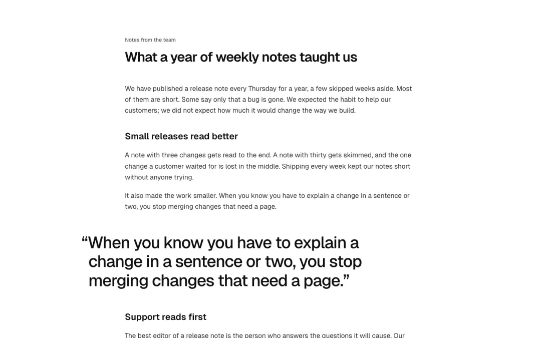
Pull quote
Prose with a pull quote set out of the measure.
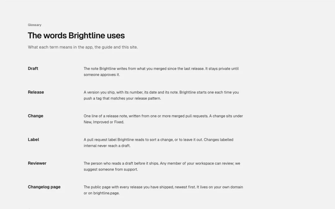
Glossary
Terms in one column, their meaning beside, like a definition list.
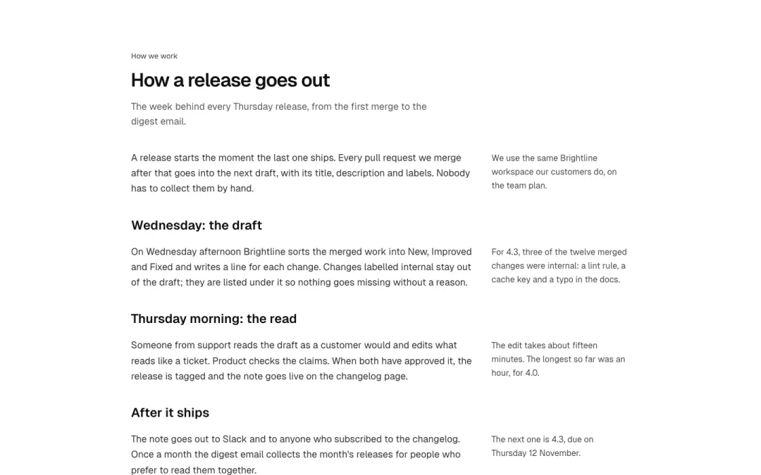
Side notes
Prose with notes in the margin, each beside the paragraph it belongs to.
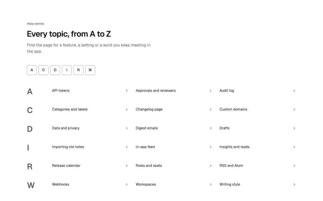
Topic index
A to Z index: letter row, then chevron link list of topic pages.
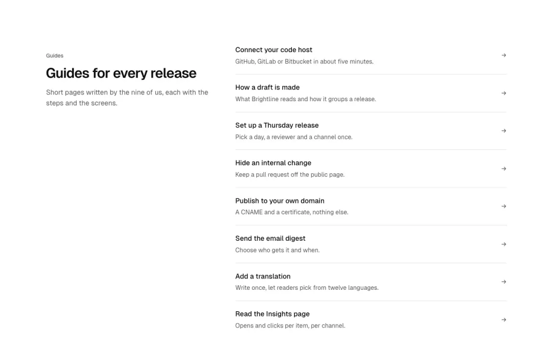
Link rows
Long single-column list of link rows, divided by hairlines, with trailing arrows.
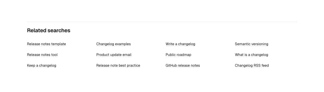
Related searches
Related search keywords as a wrapped grid of text links with a small heading.
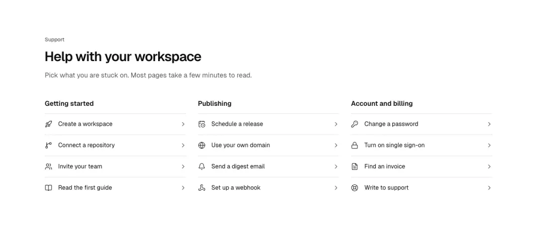
Service link list
Help links with icon and chevron, grouped under a short service heading.
Pricing 14 variants
80% of 607 pricing pages and 38% of 178 service pages in The UI Index have a pricing section.
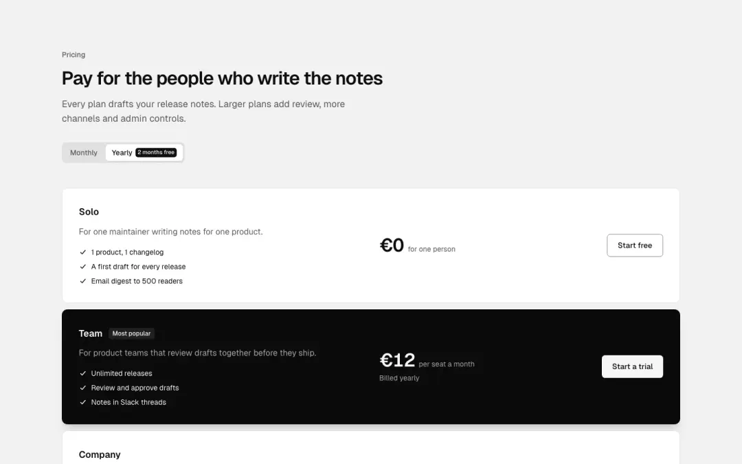
Rows
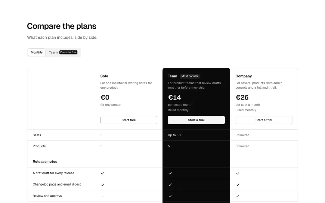
Comparison table
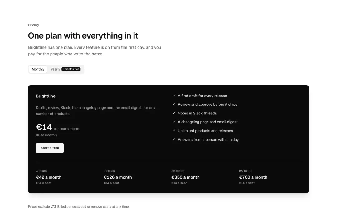
One plan
One plan, one price, everything included, with what it costs per seat.
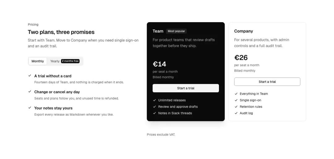
Beside the heading
The heading and three guarantees beside two plan cards.
Show all 14 variantsShow fewer
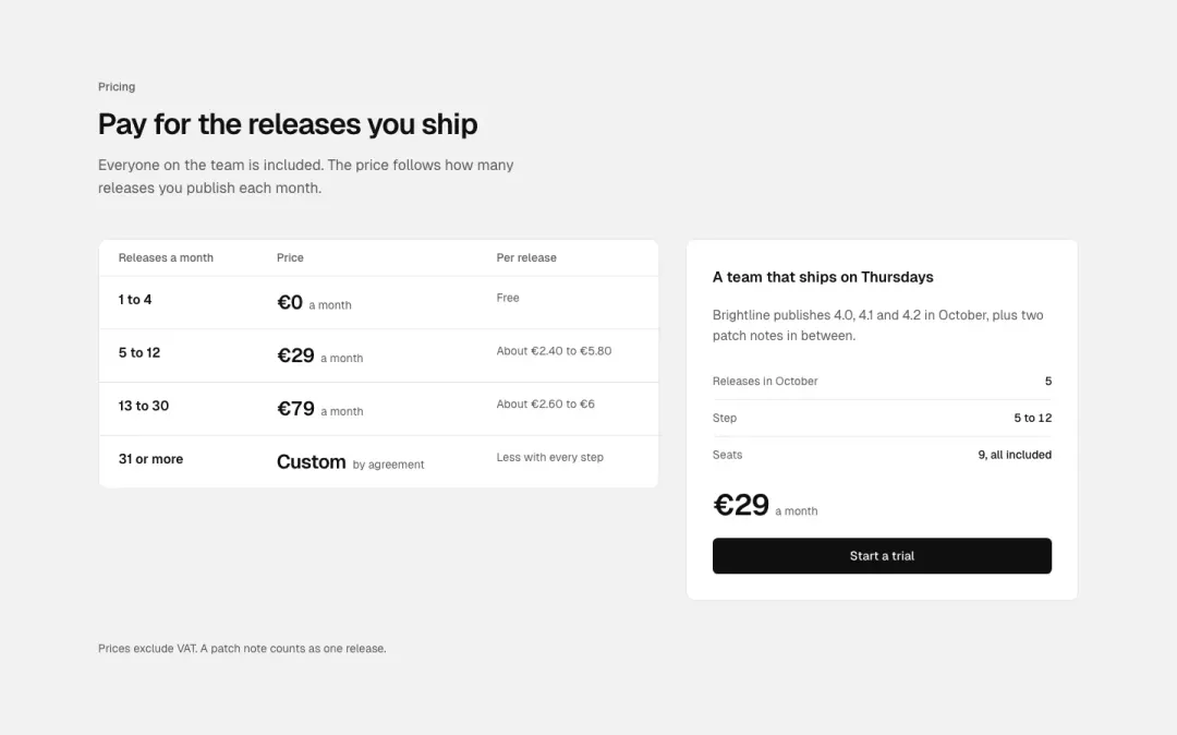
By usage
A price per step of volume (releases a month) in a short table, with a worked example.
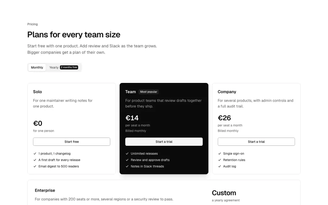
With a company band
The plans in a row, then a wide band for the company plan with a contact action.
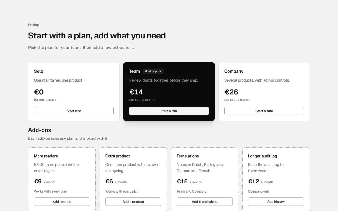
With add-ons
The base plans, then add-on cards that can join any plan.
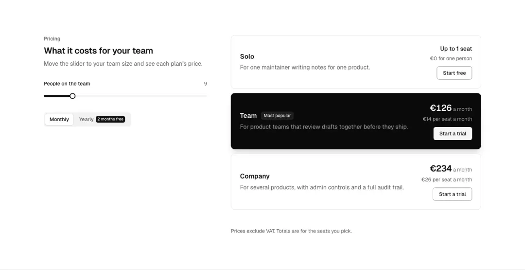
Calculator
Pick a team size and see the price per plan update.
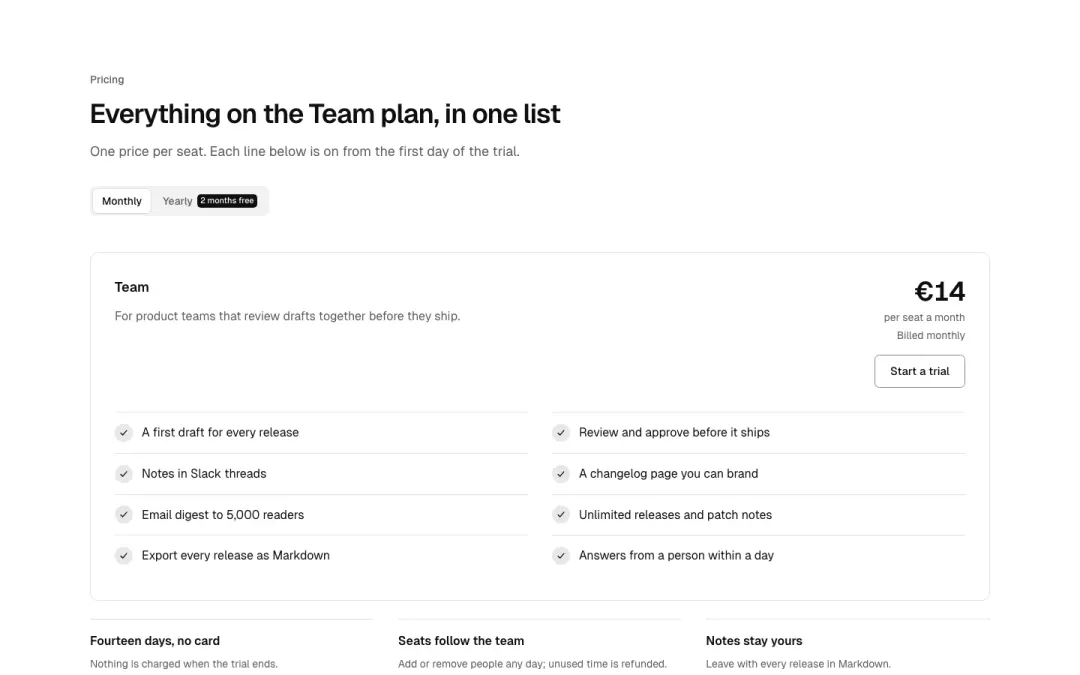
Plan checklist
Single plan card with a ticked feature checklist and highlights beneath.
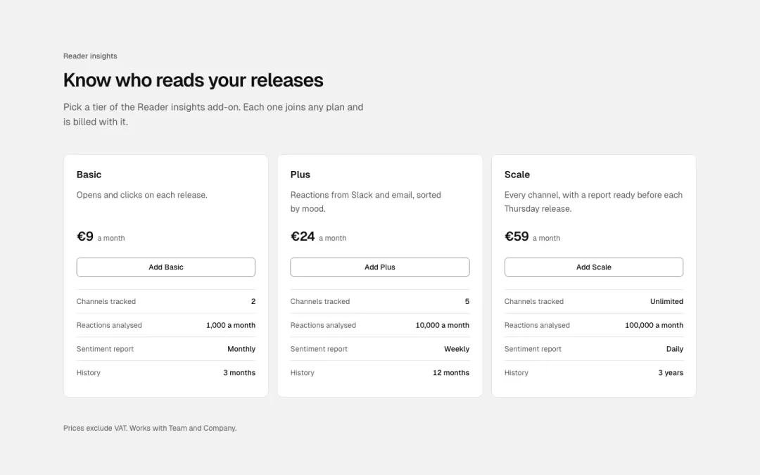
Add-on tier card
Add-on card with channel and sentiment limits listed as paired rows.
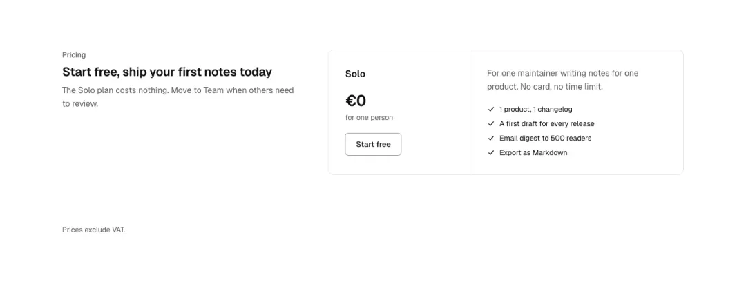
Starter plan card
One starter card: price, short description, button and a few ticked features.
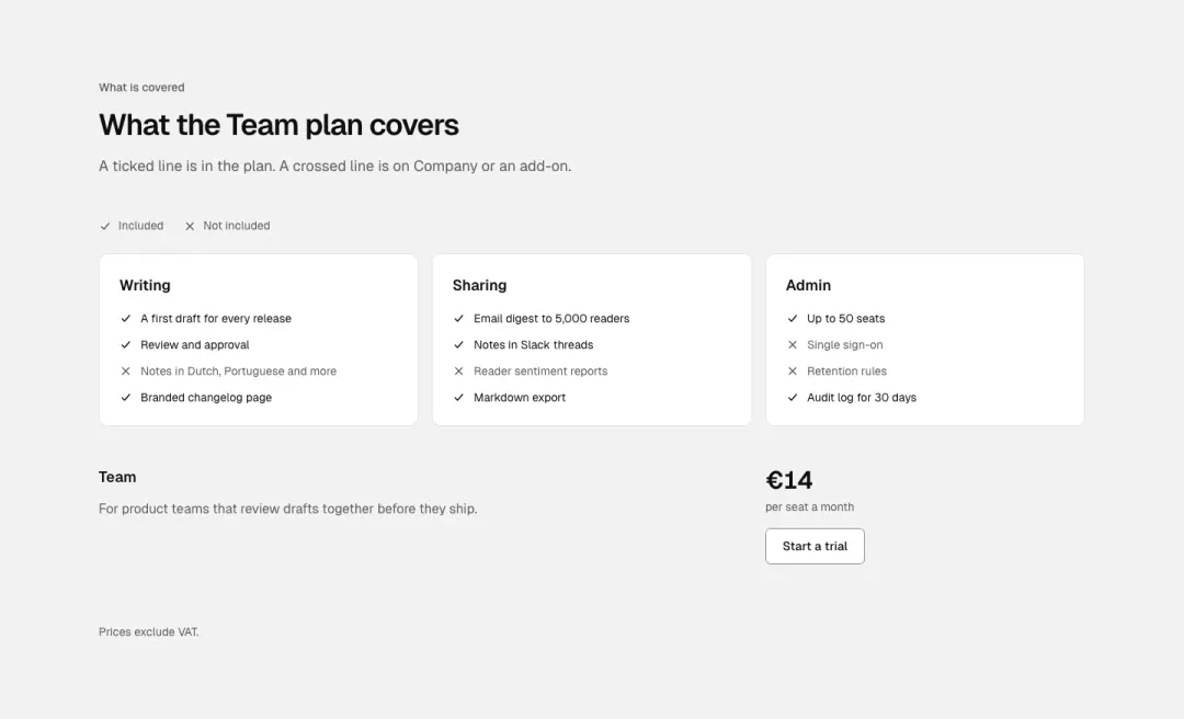
Coverage checklist
Included and excluded checklist with ticks and crosses, grouped by area.
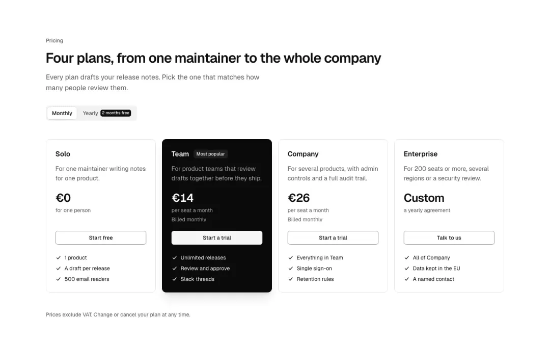
Four plans
Four plan columns in a row: one badge on the recommended plan, price, button and a feature list.
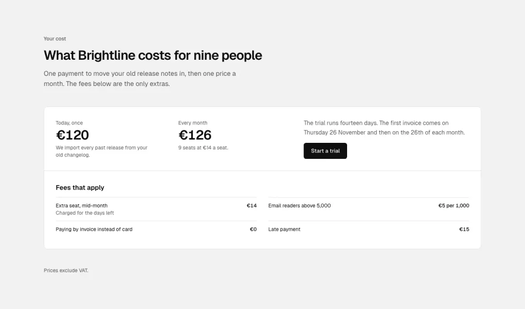
Cost summary
A compact cost summary: one-off and monthly price with a billing note and the fees that apply, no plan cards.
Split 8 variants
32% of 663 home pages and 31% of 259 about pages in The UI Index have a split section.
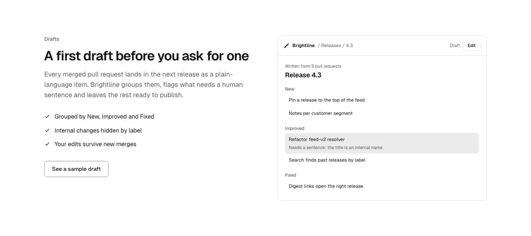
Image after text
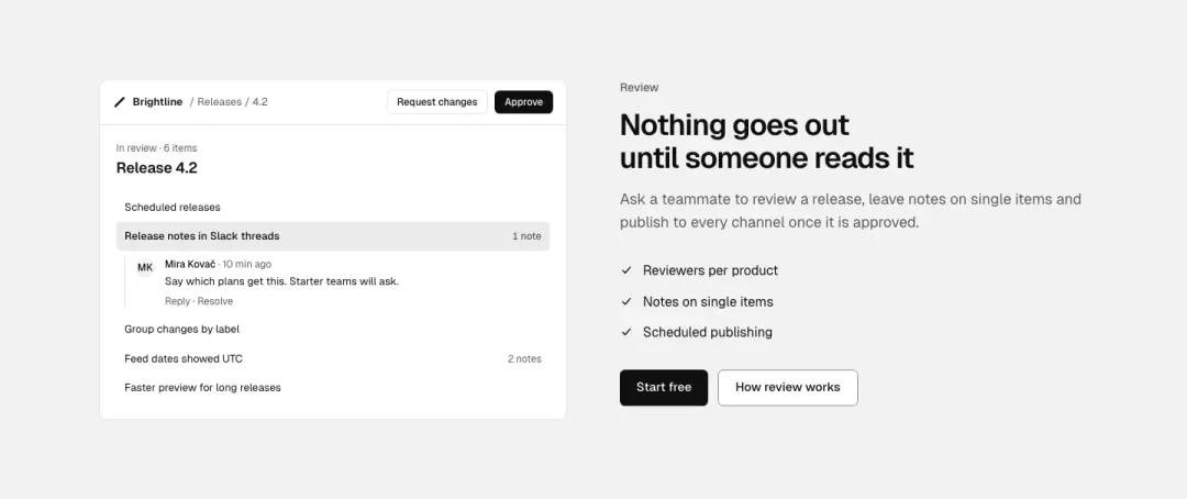
Image before text
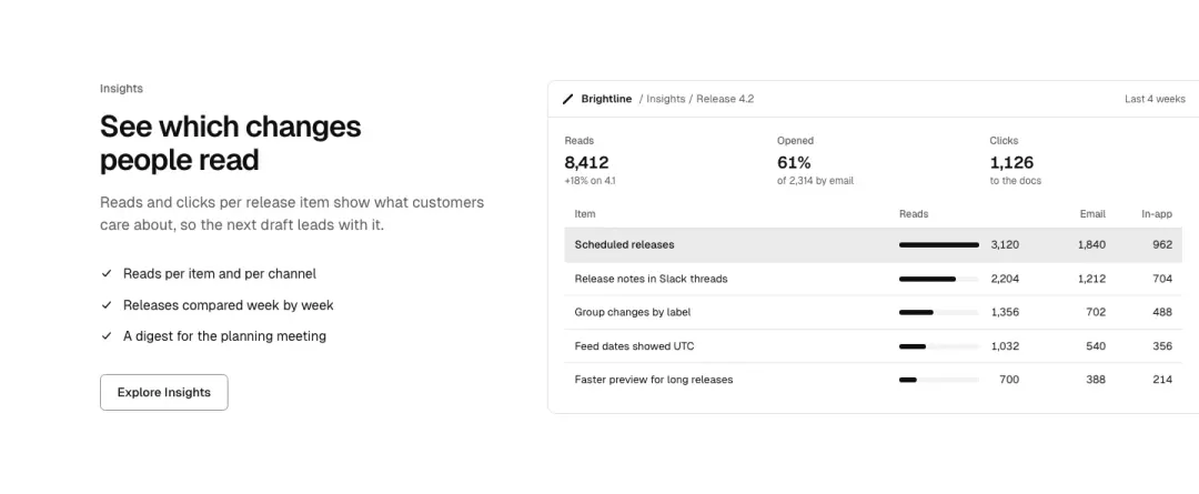
Screen to the edge
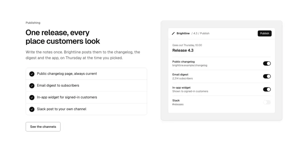
With a checklist
Text with a short checked list beside a picture.
Show all 8 variantsShow fewer
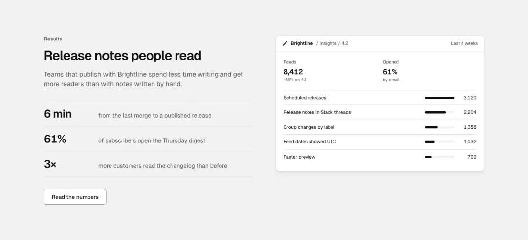
With figures
Text with two or three figures beside a picture.
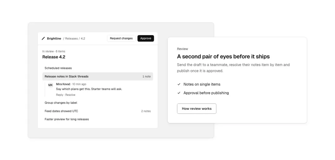
Overlapping card
A picture with a card that overlaps its edge, holding the text.
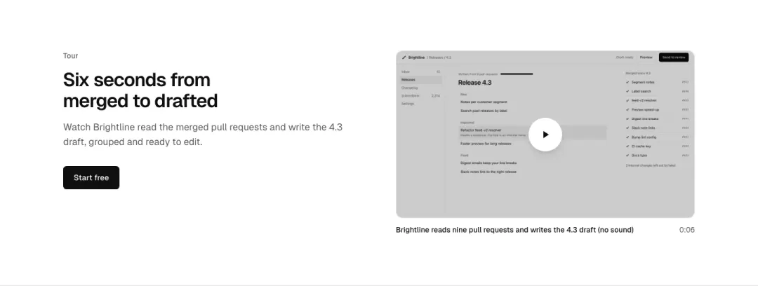
With a video
Text beside a video player with its poster.
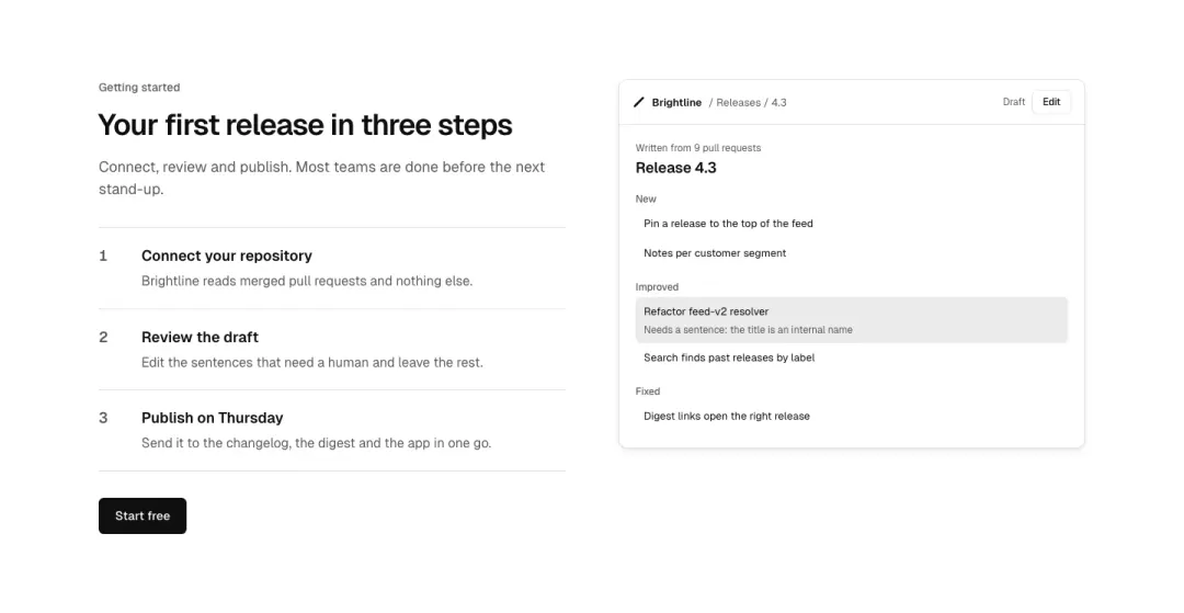
With steps
Text with three ordered steps beside a picture.
Logo wall 9 variants
33% of 663 home pages and 28% of 607 pricing pages in The UI Index have a logo wall.
Grid
Marquee
Beside the heading
The heading and a count beside a logo grid.
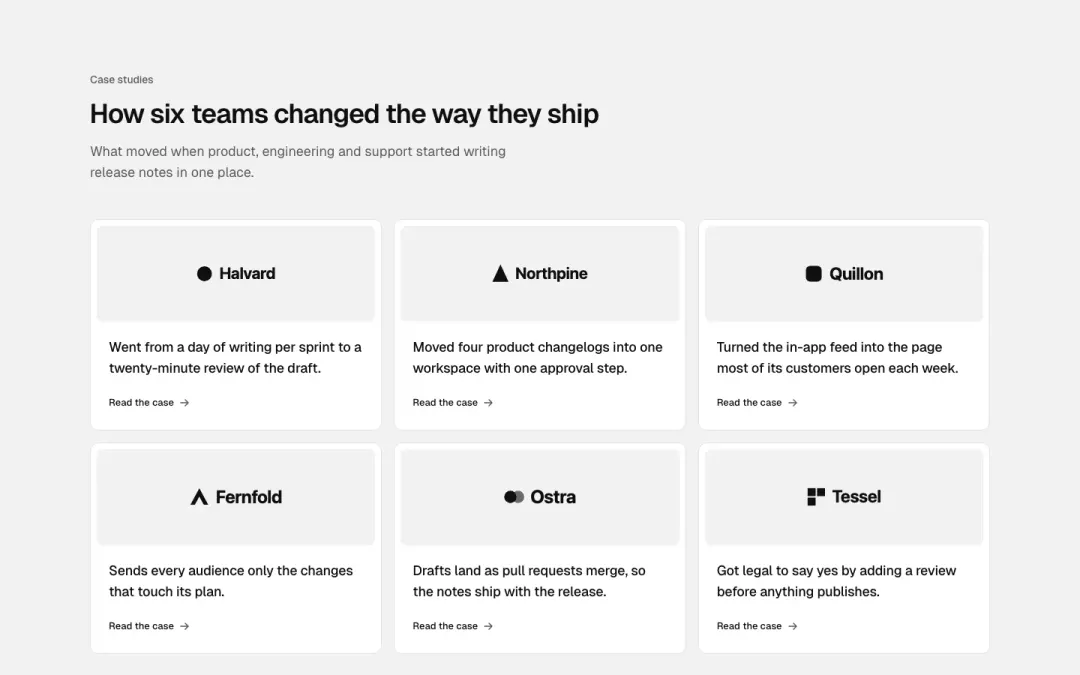
Cards
Logos in cards, each with a line and a link to its case.
Show all 9 variantsShow fewer
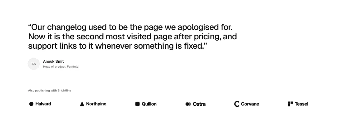
With a quote
One featured quote above a row of logos.
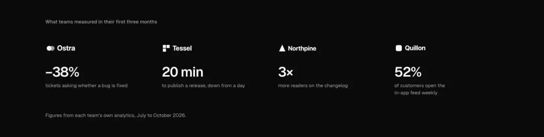
With figures
Logos each with the figure they measured.

Partner strip
Single row of greyscale partner logos with a short caption, light or dark.
Funding logos
Even grid of public funder logos on a neutral panel with a one-line credit.

Compliance badges
Certification and standards marks in one row, each with its short name underneath.
Stats 8 variants
27% of 259 about pages and 20% of 663 home pages in The UI Index have a stats section.
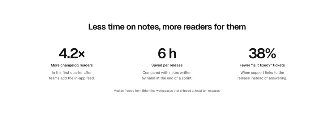
Row
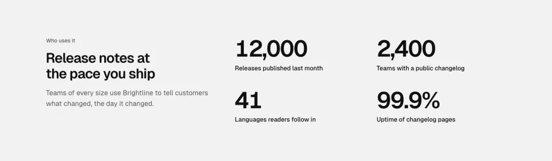
Beside the heading
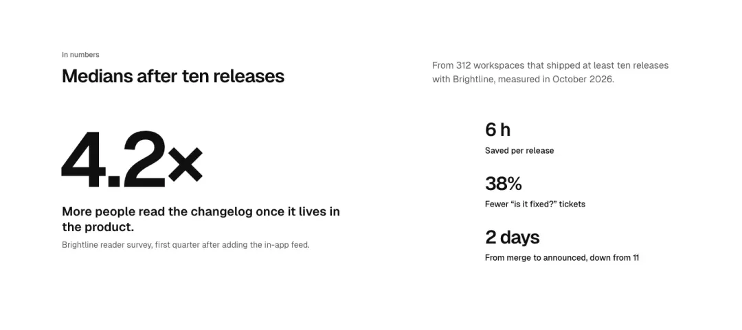
Lead figure

Band
Show all 8 variantsShow fewer
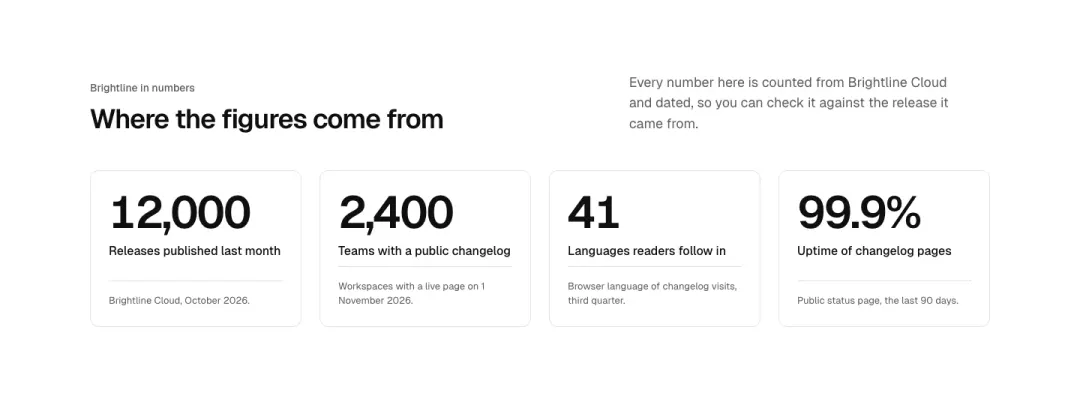
Grid
Figures in cards, each with a label and a note on where it comes from.
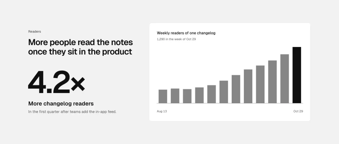
With a chart
One figure beside a small drawn chart of how it moved.
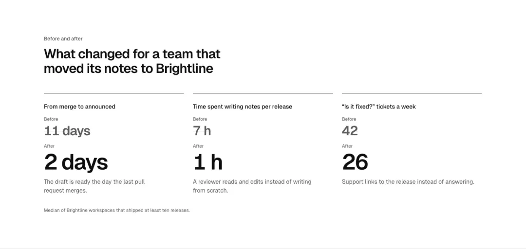
Before and after
Pairs of figures: before and after.
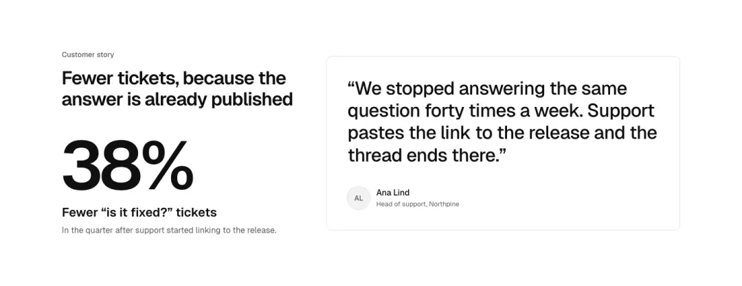
With a quote
One large figure beside the customer quote it comes from.
Media 7 variants
21% of 663 home pages and 17% of 150 landing pages in The UI Index have a media section.
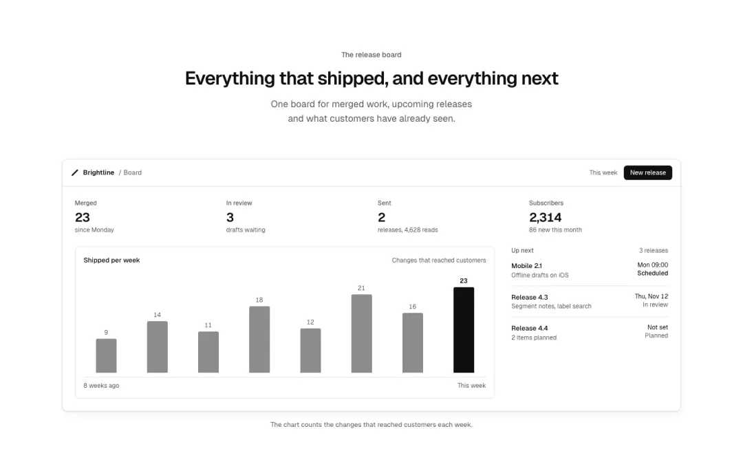
Image
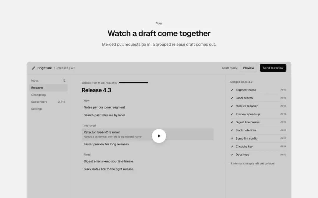
Video
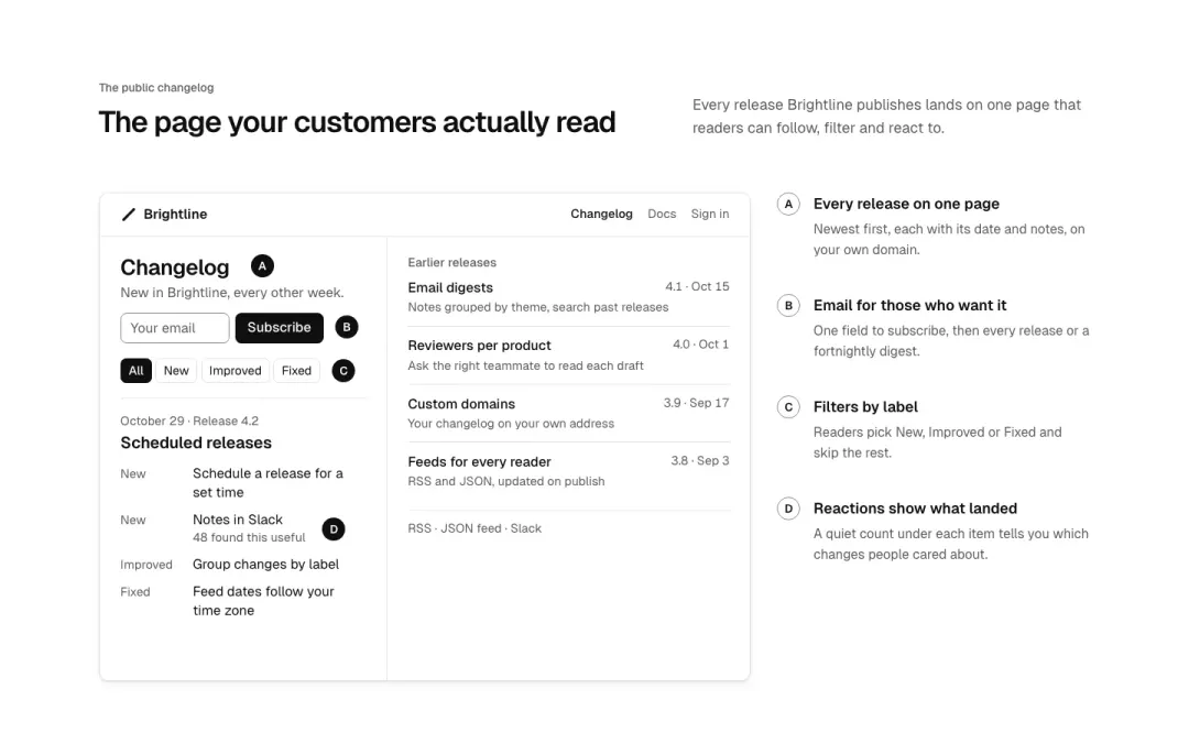
Annotated screen
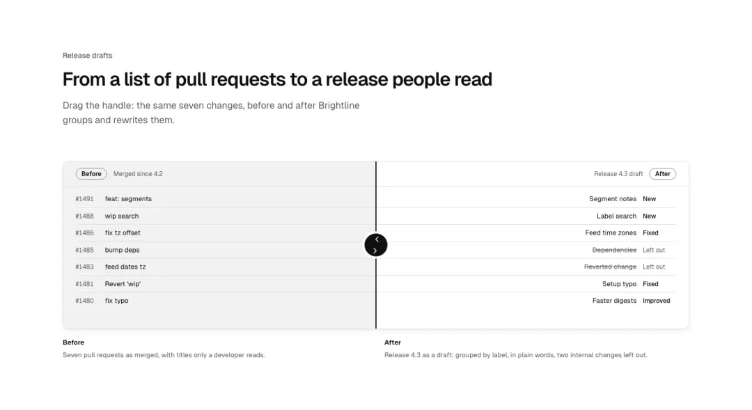
Before and after
Two screens behind one slider: drag to compare.
Show all 7 variantsShow fewer
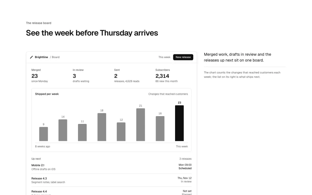
Captioned
A picture with its caption in a column beside it.
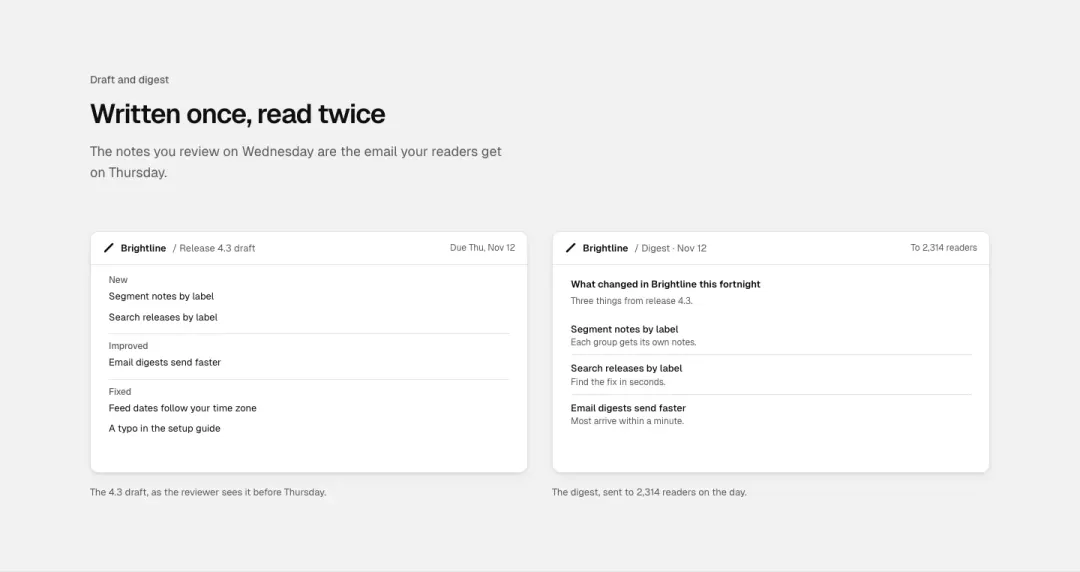
Pair
Two pictures side by side, each with a caption.
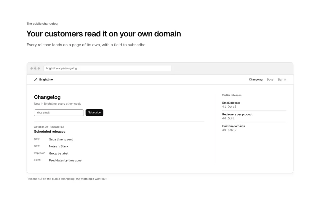
In a browser
A screen in a browser frame with an address bar and a caption.
Testimonials 9 variants
16% of 663 home pages and 15% of 150 landing pages in The UI Index have a testimonials section.

Single quote
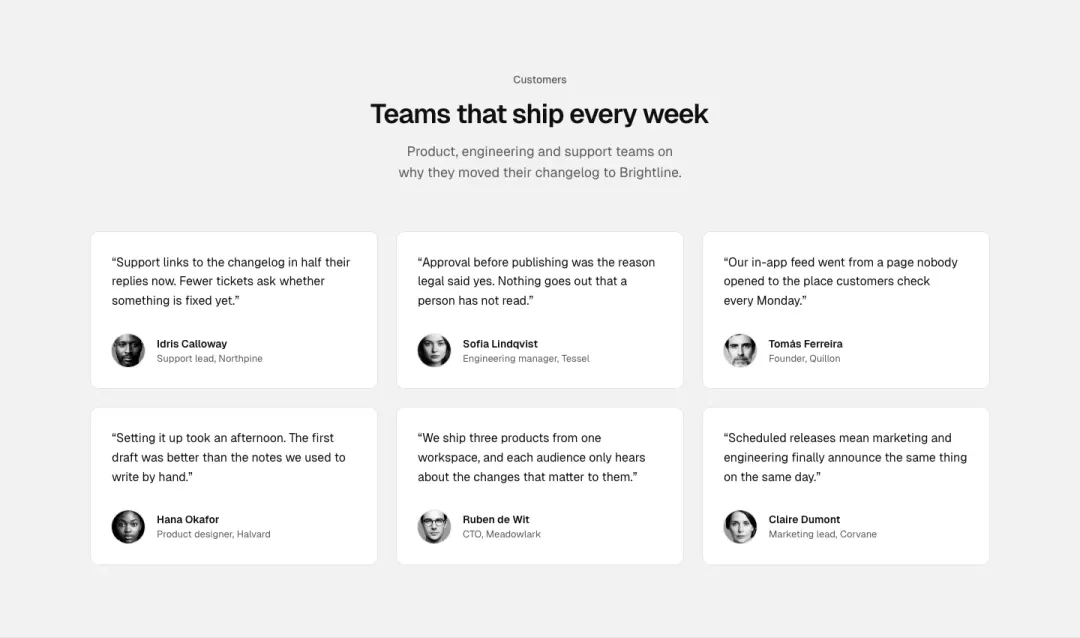
Grid
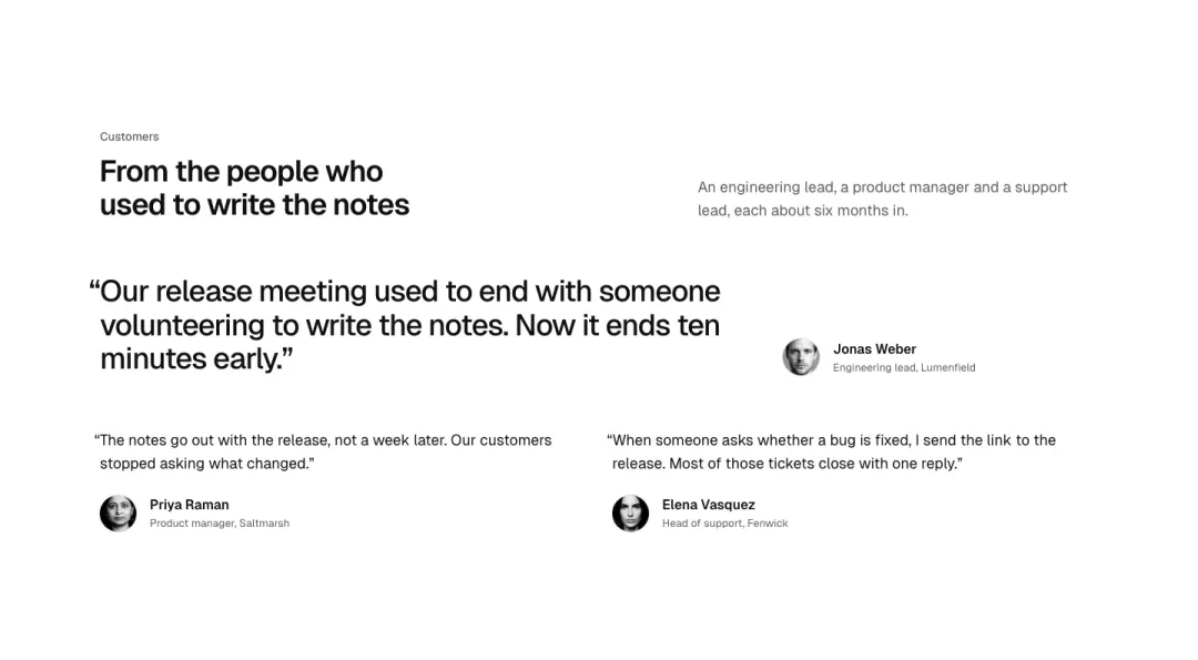
Lead quote and pair
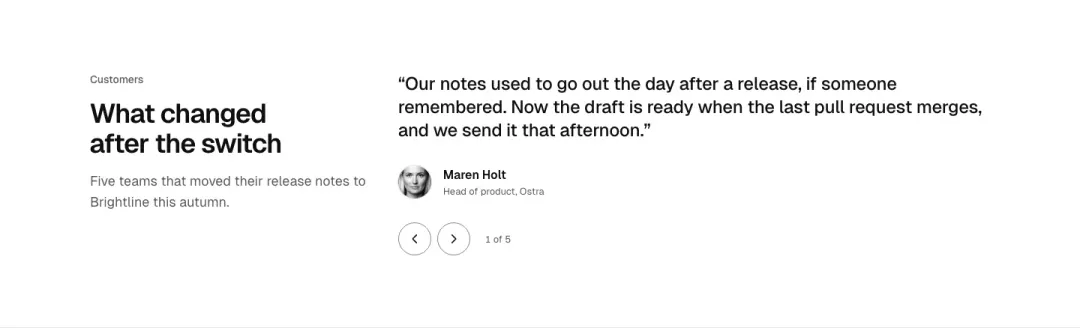
Carousel
One quote at a time with previous and next.
Show all 9 variantsShow fewer
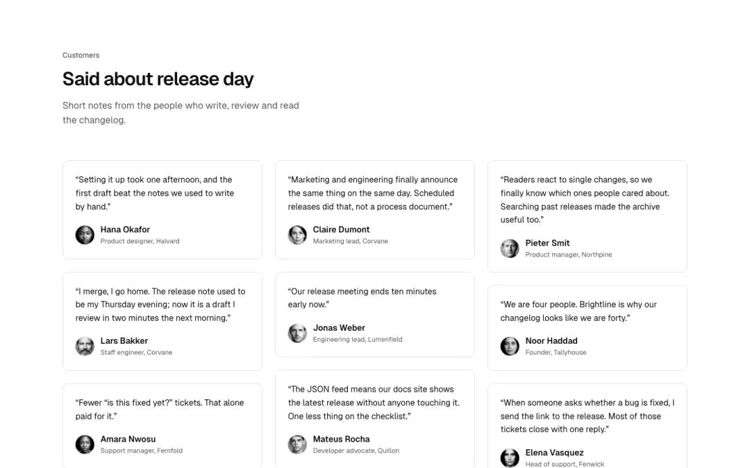
Wall
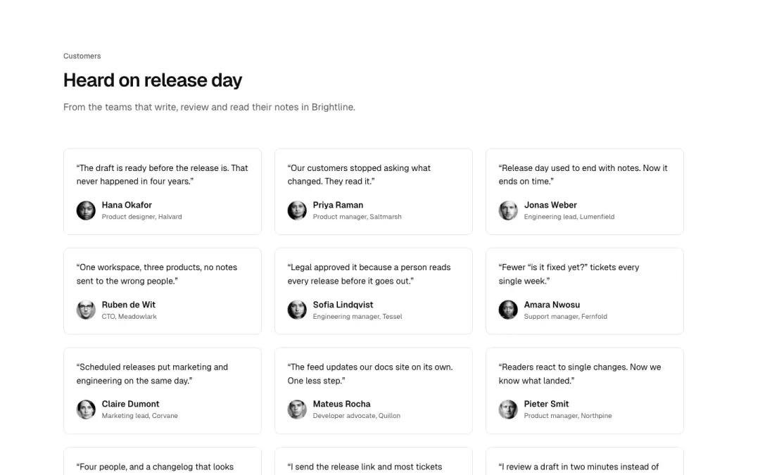
Many short quotes in columns of uneven height.
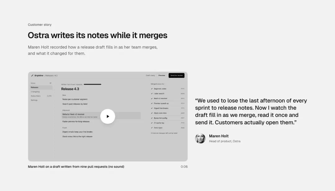
Video
A video poster beside the quote it comes from.
By company
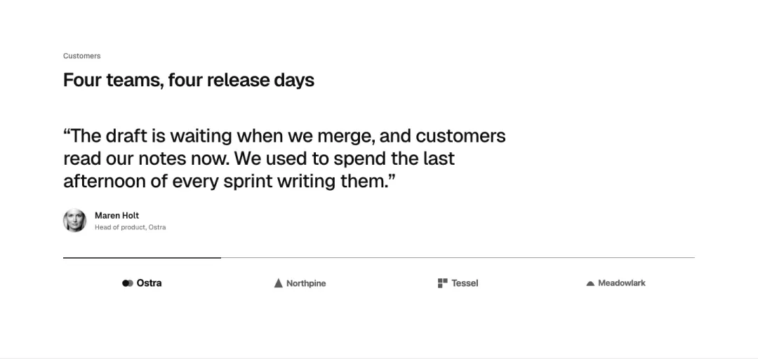
Company logos as a switch, the quote of the chosen one above.
Results
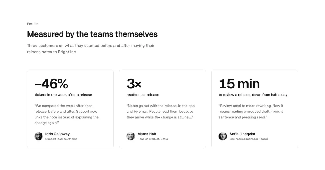
Quotes with the result each customer measured.
Marquee
Rows of quote cards that move slowly, still under reduced motion.
Posts 12 variants
37% of 100 news overviews and 16% of 663 home pages in The UI Index have a posts or changelog section.
Grid
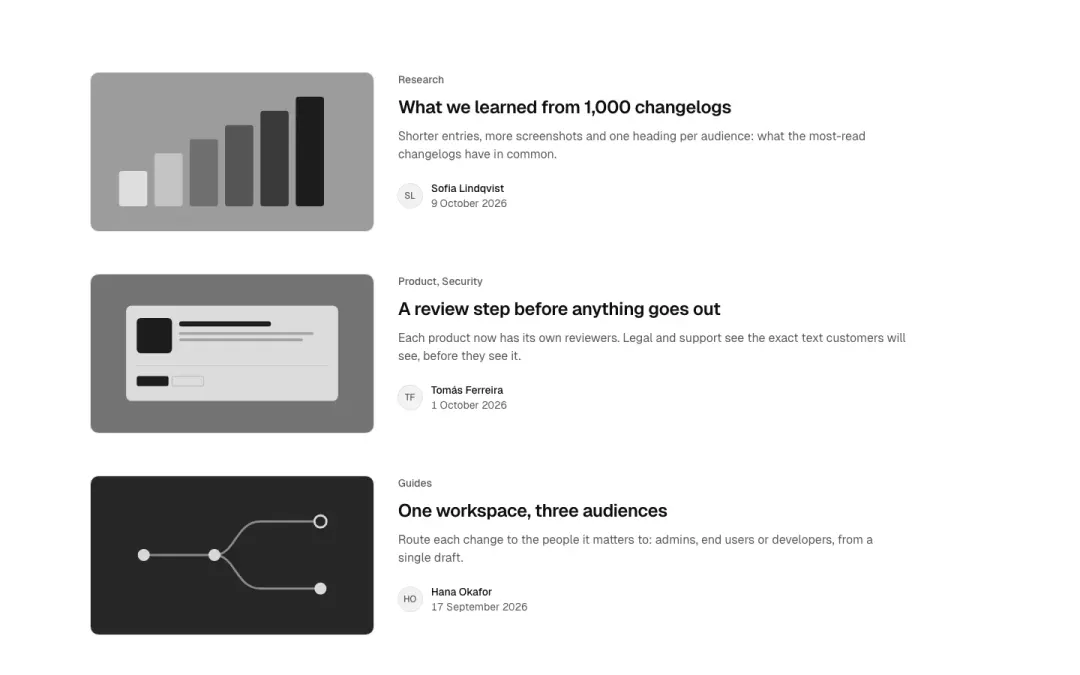
List
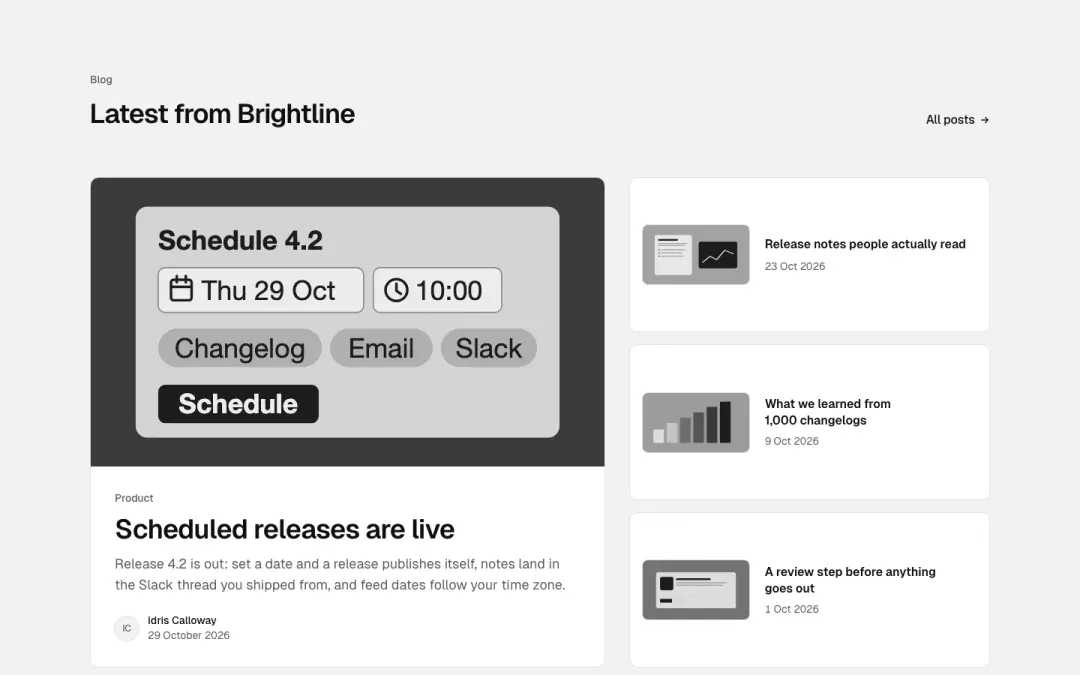
Featured
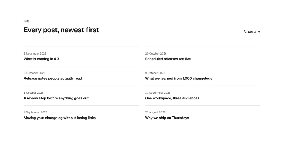
Compact
Titles and dates in two columns, no pictures.
Show all 12 variantsShow fewer
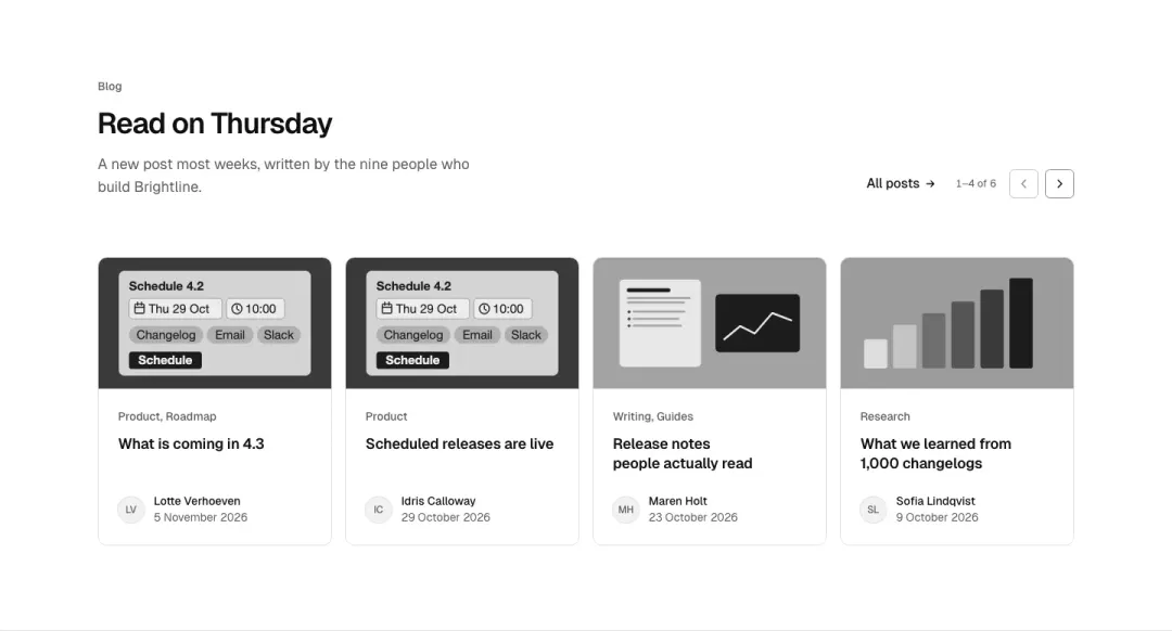
Carousel
Post cards in a scrolling row with previous and next.
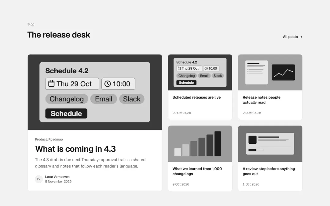
Magazine
One large post beside four small ones.
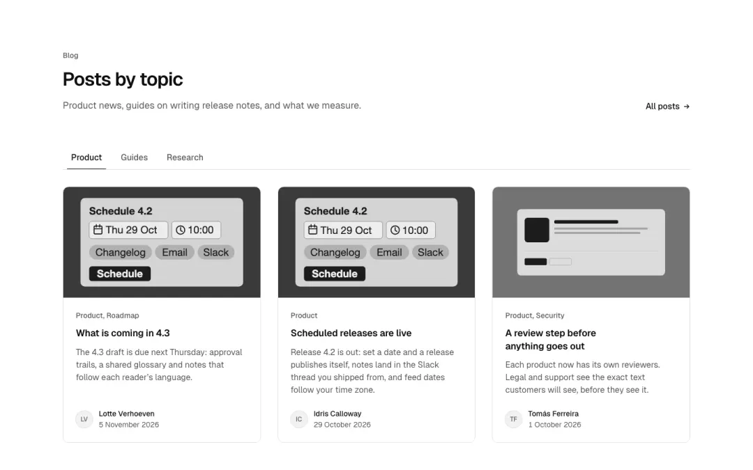
By category
Category tabs above the posts.
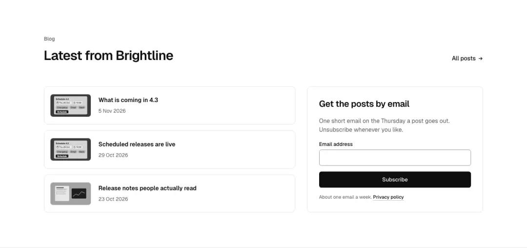
With a subscribe box
The latest posts beside a box to get them by email.
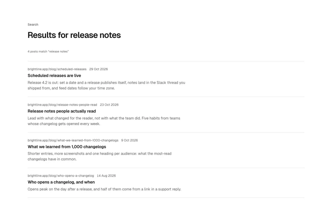
Search results
Posts as search results: a search field summary line, then result rows with path, title, summary.
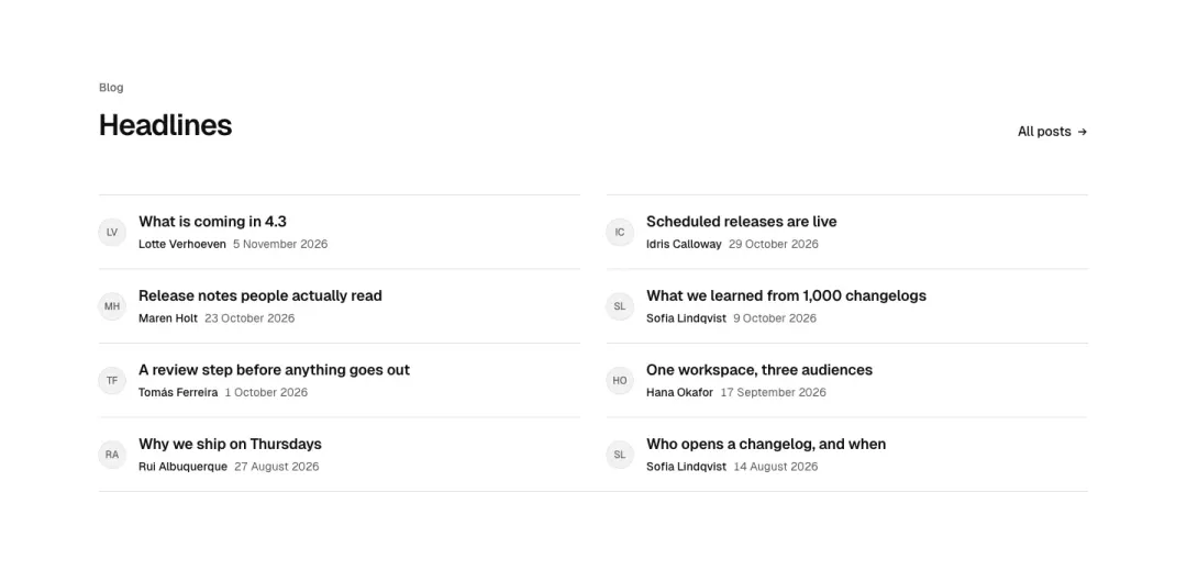
Headlines
Compact headline list with author monogram and date, no pictures.
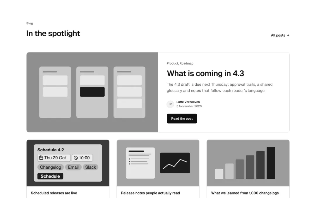
Spotlight
One featured post as a split card with picture and a primary button, three small cards beneath.
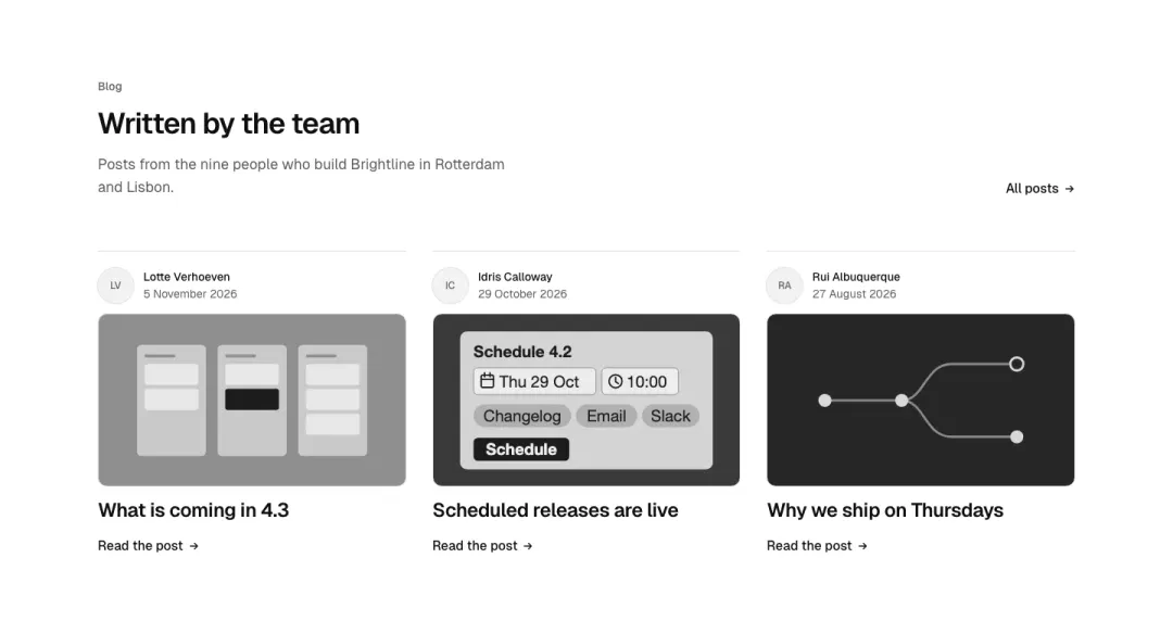
With bylines
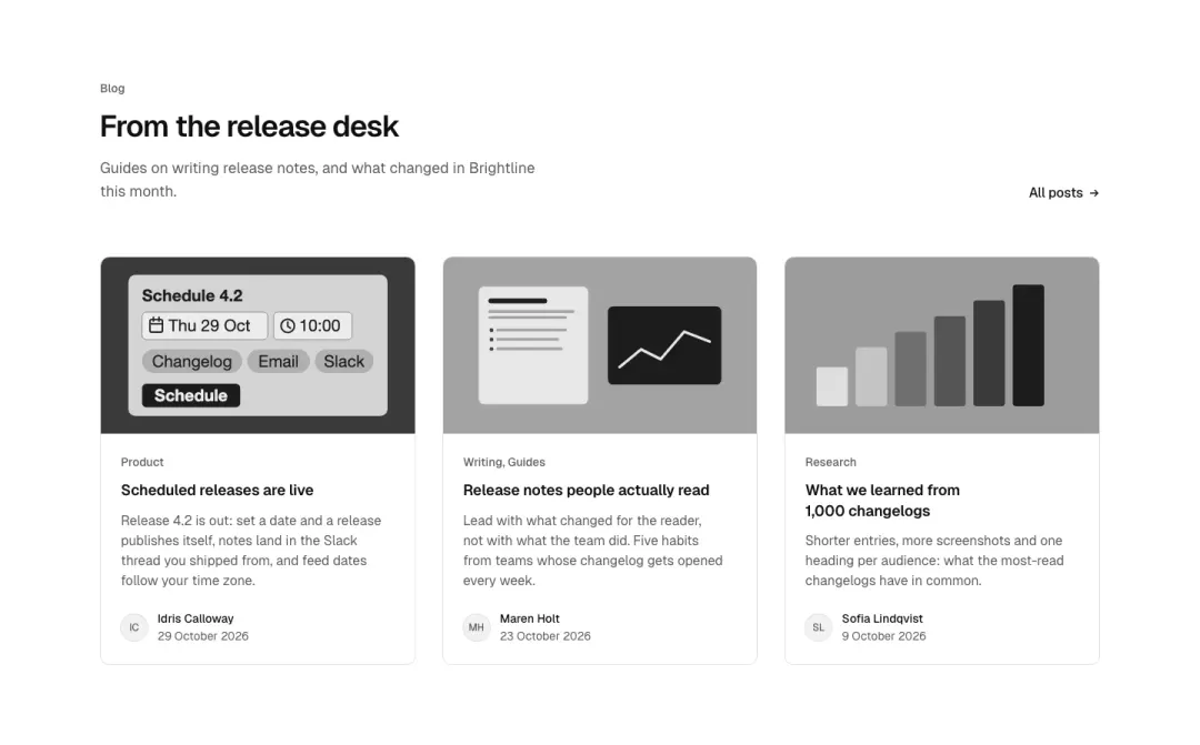
Three picture cards with a monogram byline and a read link.
Changelog 4 variants
37% of 100 news overviews and 16% of 663 home pages in The UI Index have a posts or changelog section.
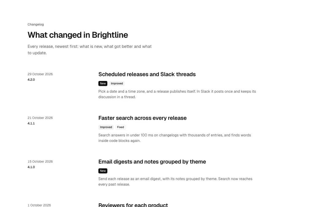
List
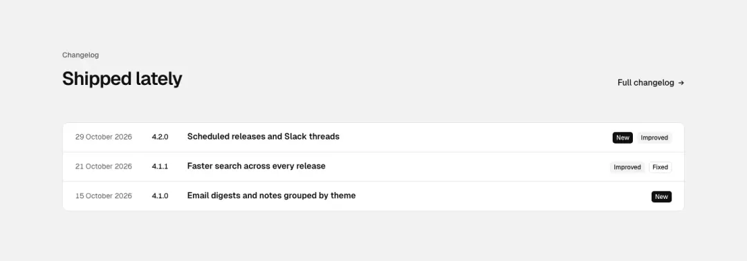
Compact
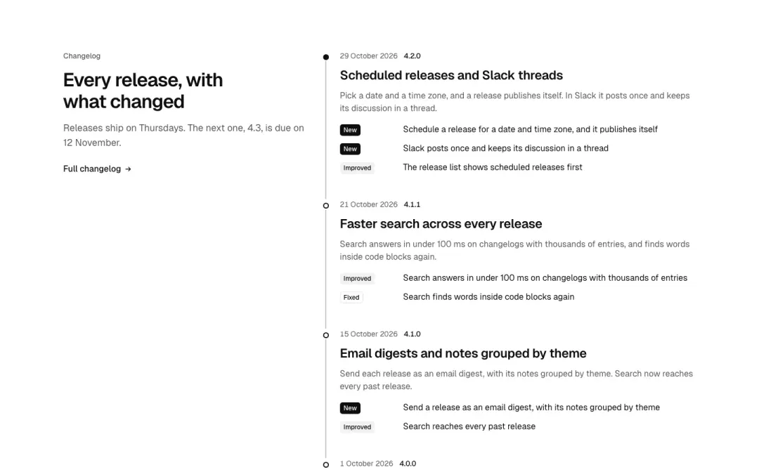
Timeline
Releases on a date rail, each with its changes.
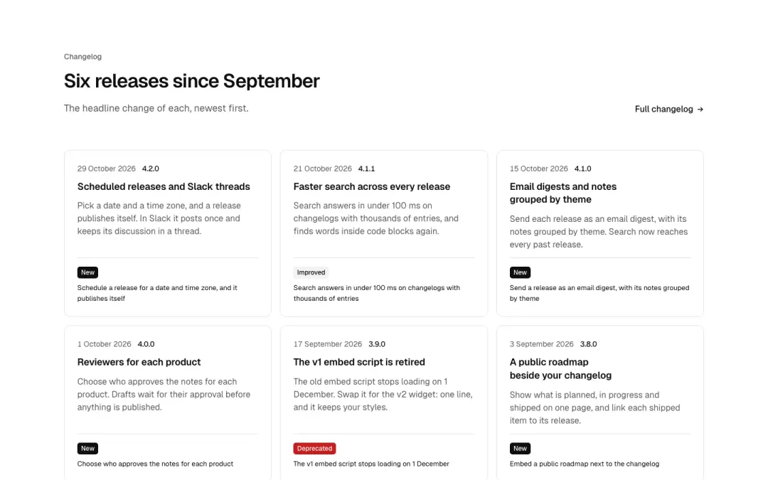
Cards
Releases as cards with their headline change.
Form section 22 variants
9% of 115 contact pages and 9% of 663 home pages in The UI Index have a form section.
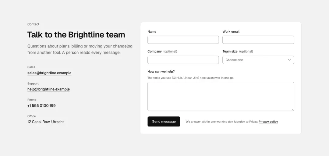
Split
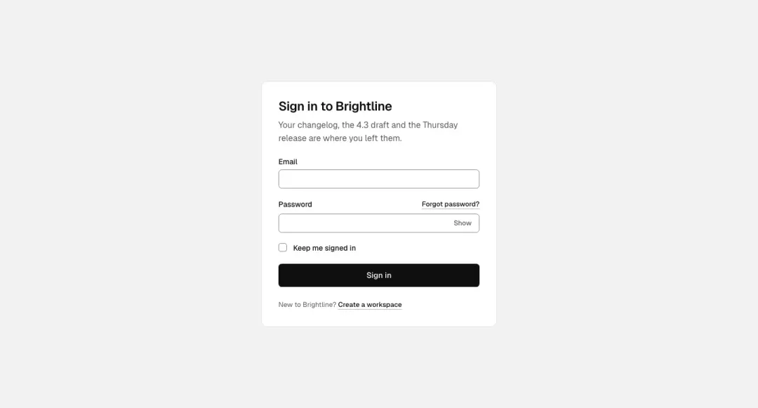
Sign in card
A narrow card: email, password with a show toggle, remember-me checkbox, forgot-password link and one full-width button; a sign-up link below.
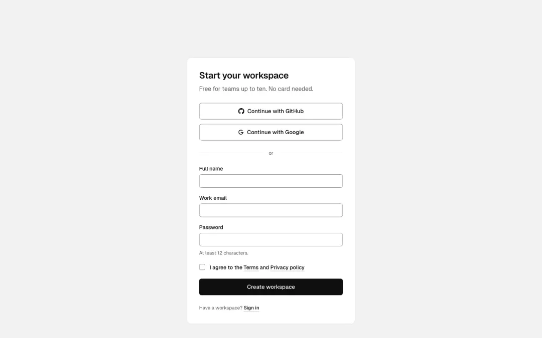
Sign up with providers
Two provider buttons with icons, an 'or' rule, name, email and password fields, a terms checkbox and the button.
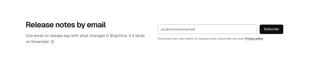
One-line signup
Heading and a single email field with the button on the same row (stacks at 390), a fine-print line under it.
Show all 22 variantsShow fewer
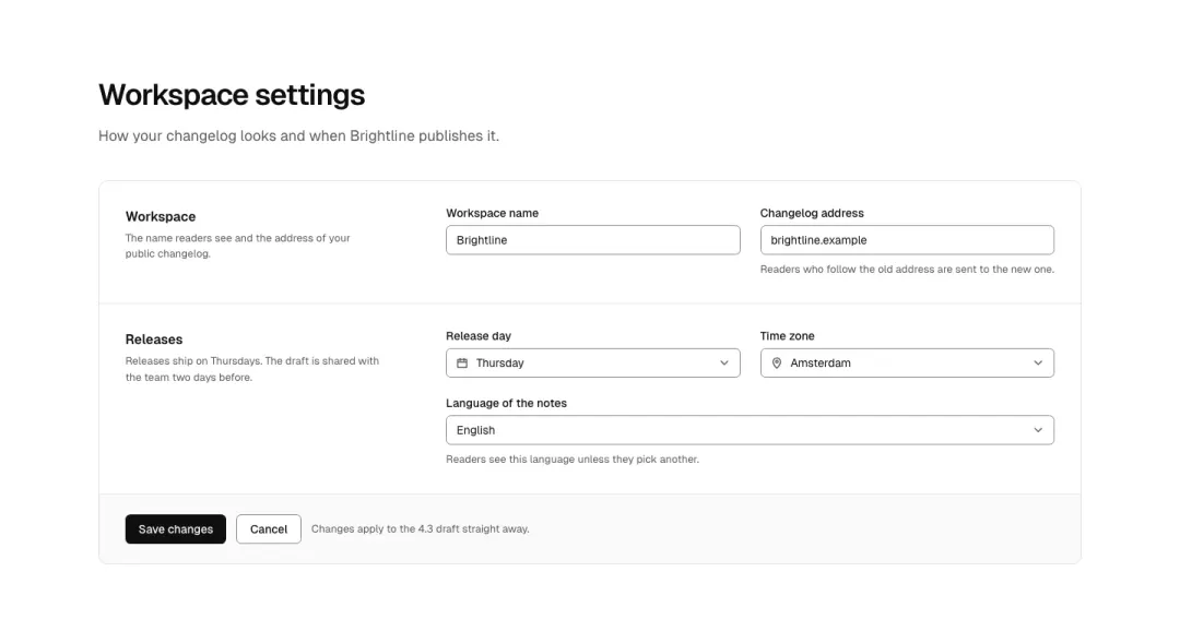
Settings panel
A settings form in sections: text inputs, a select, a select with a leading icon, helper text and a save/cancel row.
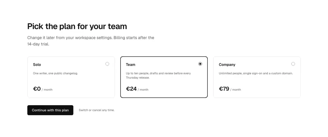
Radio choice
A plan or option picker as radio cards in a row (stacks at 390), each with a title, one line and a price, then the button.
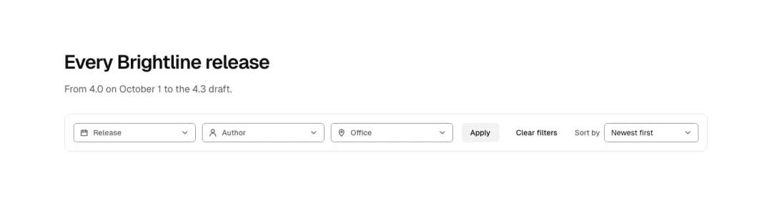
Filter bar
A row of dropdown filter buttons with icons, a sort select on the right and a clear link; the open state of one dropdown is not needed.
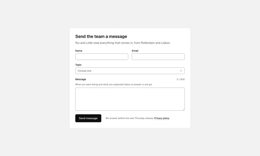
Message
A message form: name and email in a row, a textarea with a live character count, a topic select and a send button.
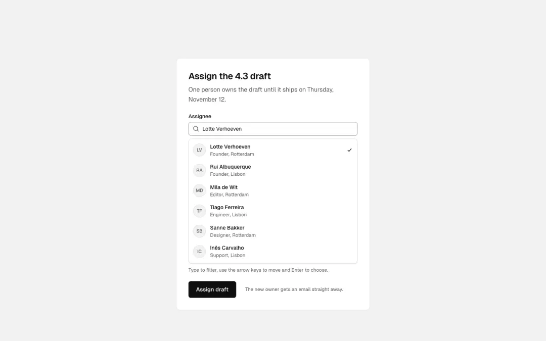
Searchable select
An assignee picker: a combobox field with a filtered listbox of people (monograms), shown open in the demo; full keyboard.
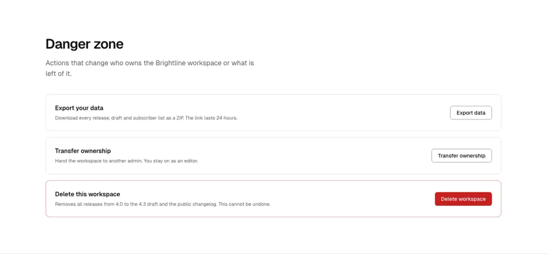
Danger zone
Settings cards that each end in one action: export data, transfer ownership, delete workspace (destructive), with a line of explanation each.
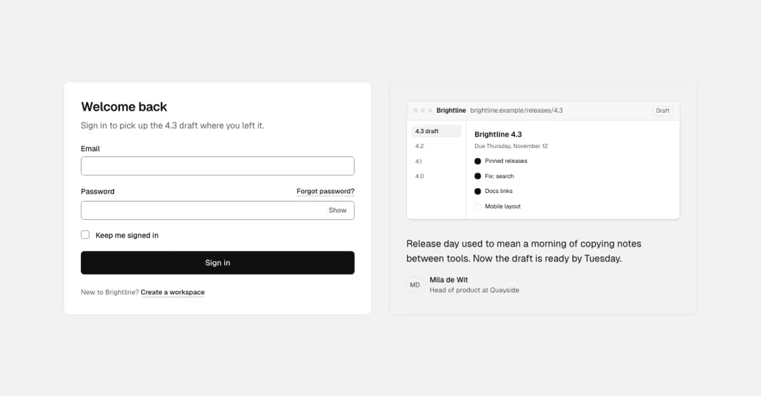
Sign in beside a story
The sign-in card beside a panel with a drawn product screen and a customer quote; the panel drops below 768.
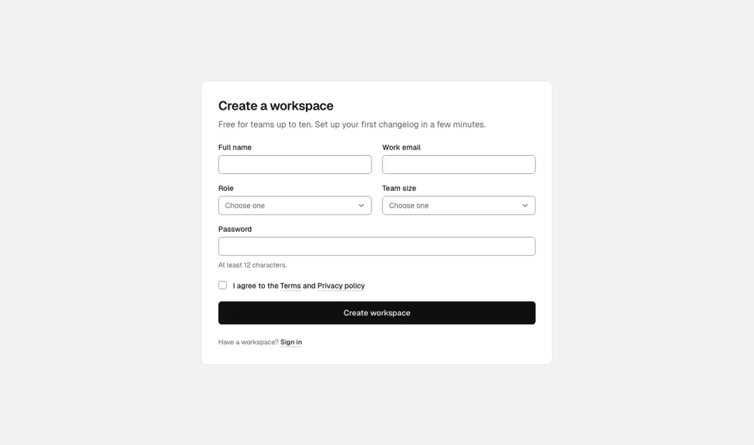
Create account
Name, work email, role select, team size select, password, a consent checkbox and the button, with a sign-in link.
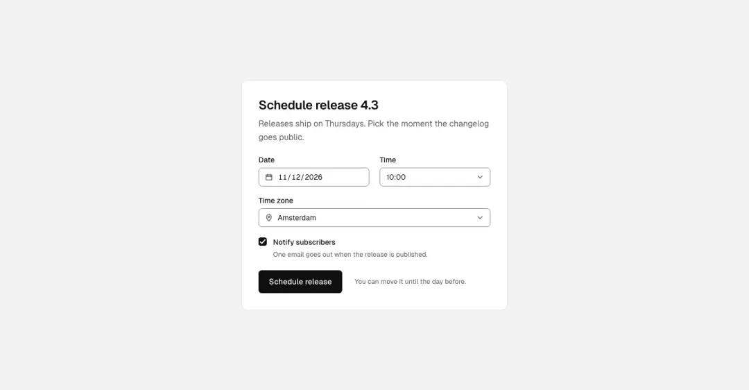
Schedule
Schedule a release: a date field with a calendar icon, a time select, a timezone select and a 'notify subscribers' checkbox.
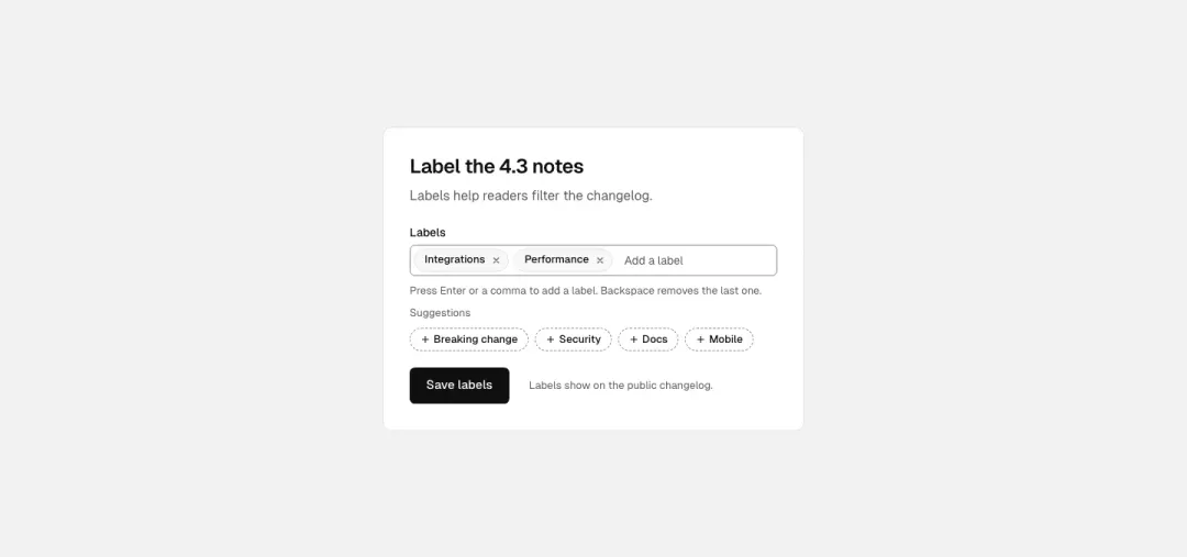
Tag input
Labels as removable chips inside a field, typing adds one on Enter or comma, suggestions as chips below.
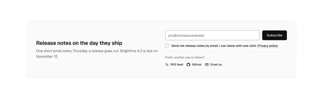
Newsletter band
Email field and subscribe button in a band with a short promise; optional consent line or social icons.
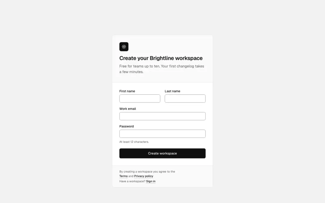
Sign-up panel
Logo or heading, name/email/password fields, one primary button and a terms line.
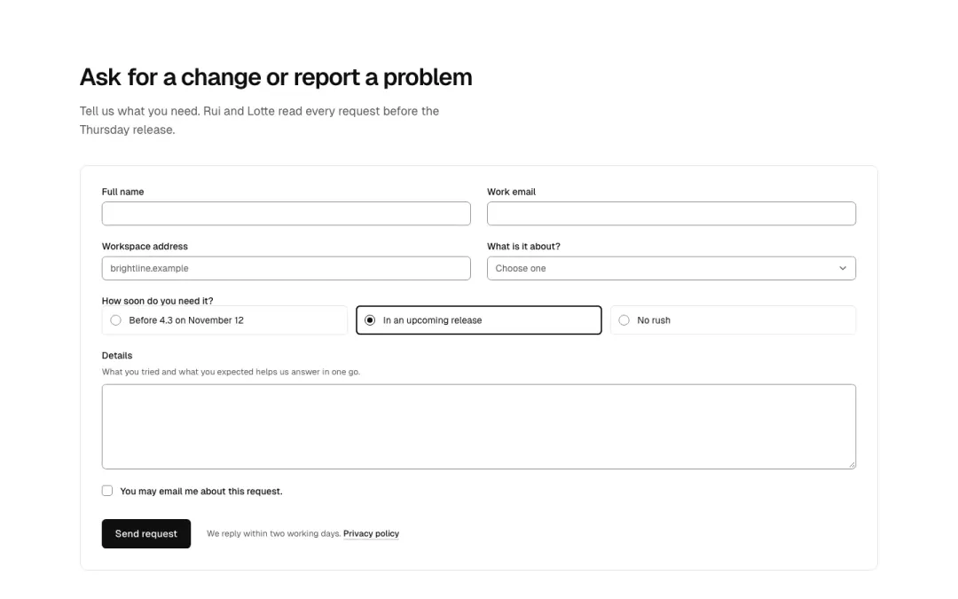
Request form
Multi-field request or complaint form: text fields in a grid, radio choice, select, consent checkbox, submit.
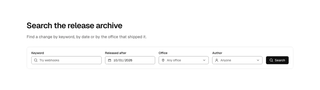
Search form
Several search fields in one row (place, dates, guests, radius) with a search button; stacks on phones.
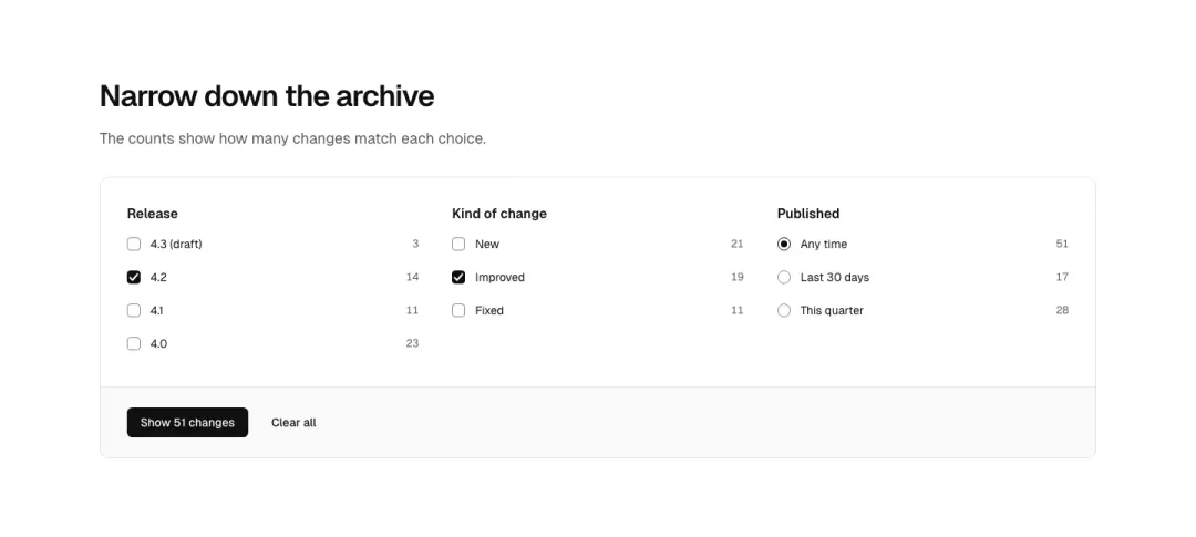
Filter list
Checkbox or radio list with result counts for a filter sidebar, with a grouped variant.
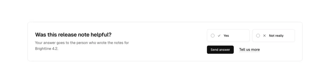
Feedback prompt
Short yes/no or star feedback prompt with radios and a link, and a choice-card pair.
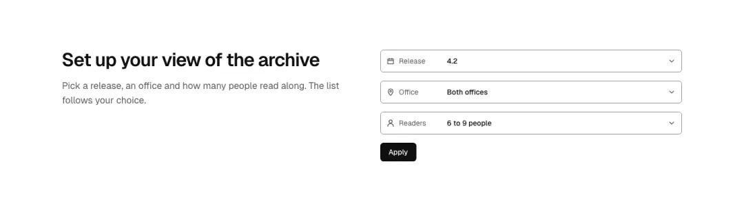
Select field
Single select or dropdown field with an icon and inline label (sort, currency, party size).
Input field
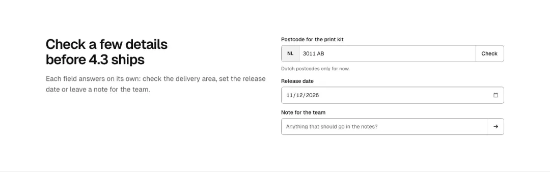
Single text field with a leading icon or badge and an optional trailing button (date, plate, postcode, chat).
Gallery 9 variants
8% of 663 home pages and 7% of 259 about pages in The UI Index have a gallery section.
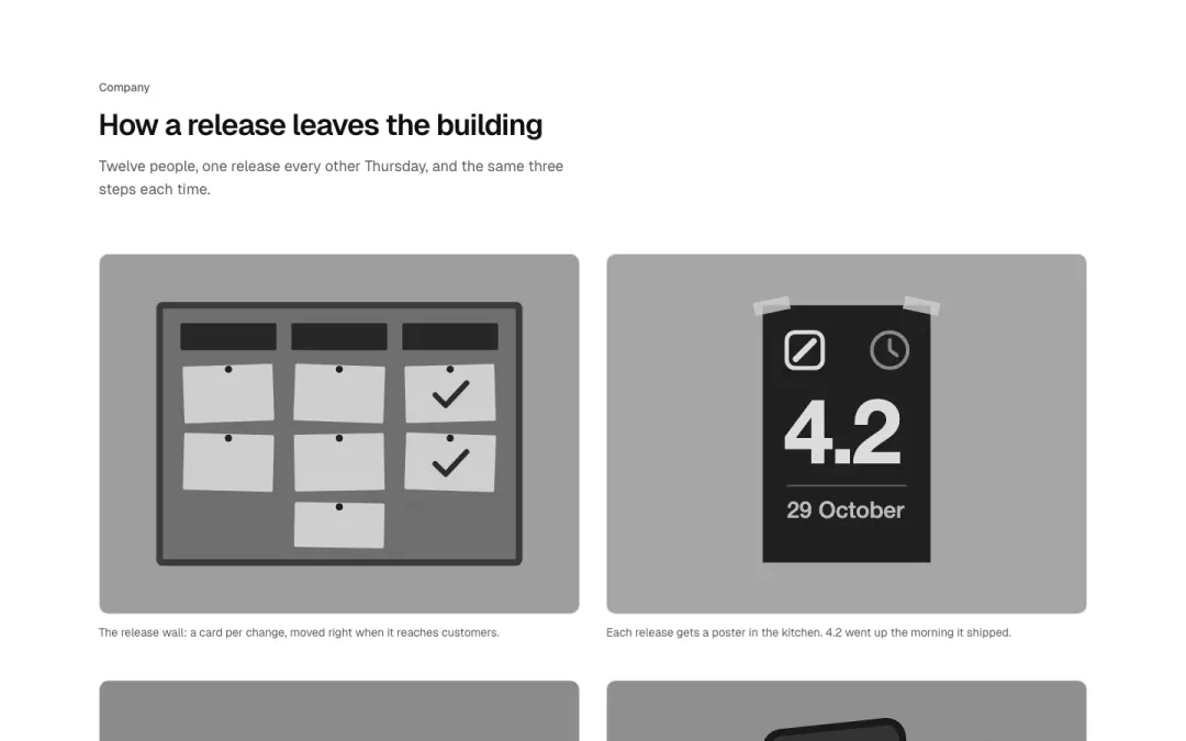
Grid
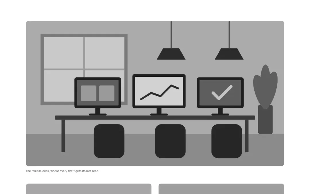
Mosaic
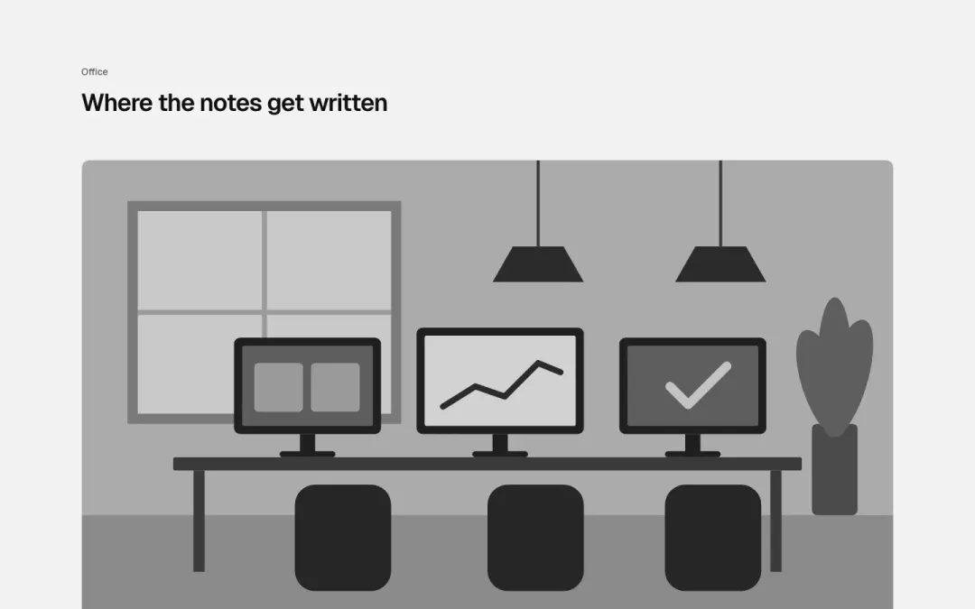
Stack
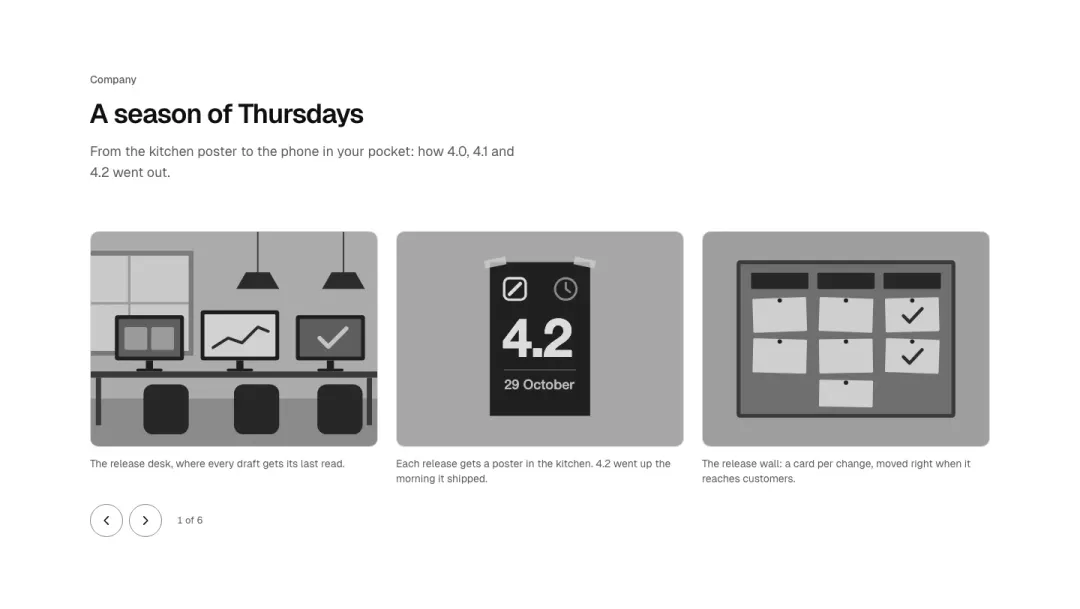
Carousel
Pictures in a scrolling row with previous and next.
Show all 9 variantsShow fewer
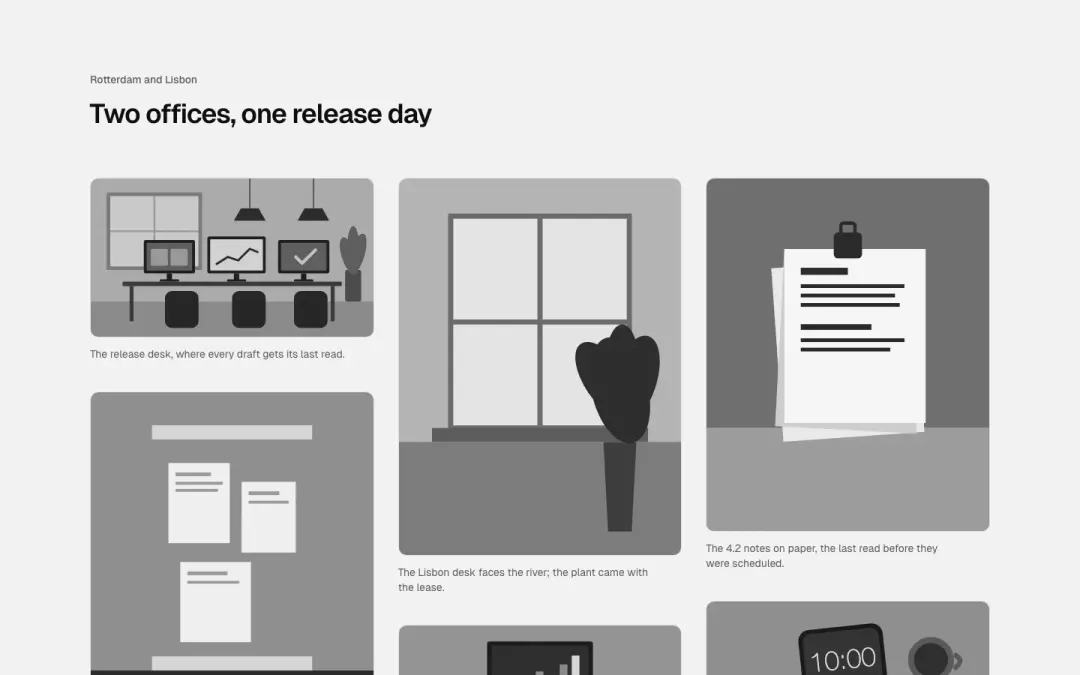
Masonry
Pictures of different heights in columns.
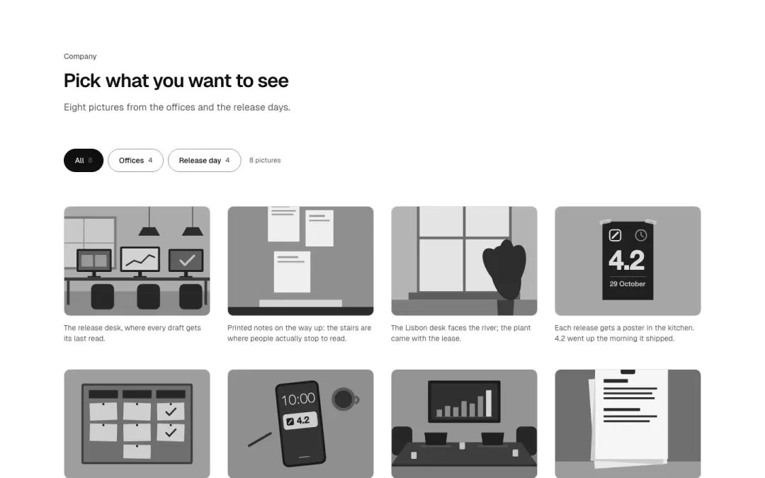
Filter
Category buttons above the grid narrow the pictures.
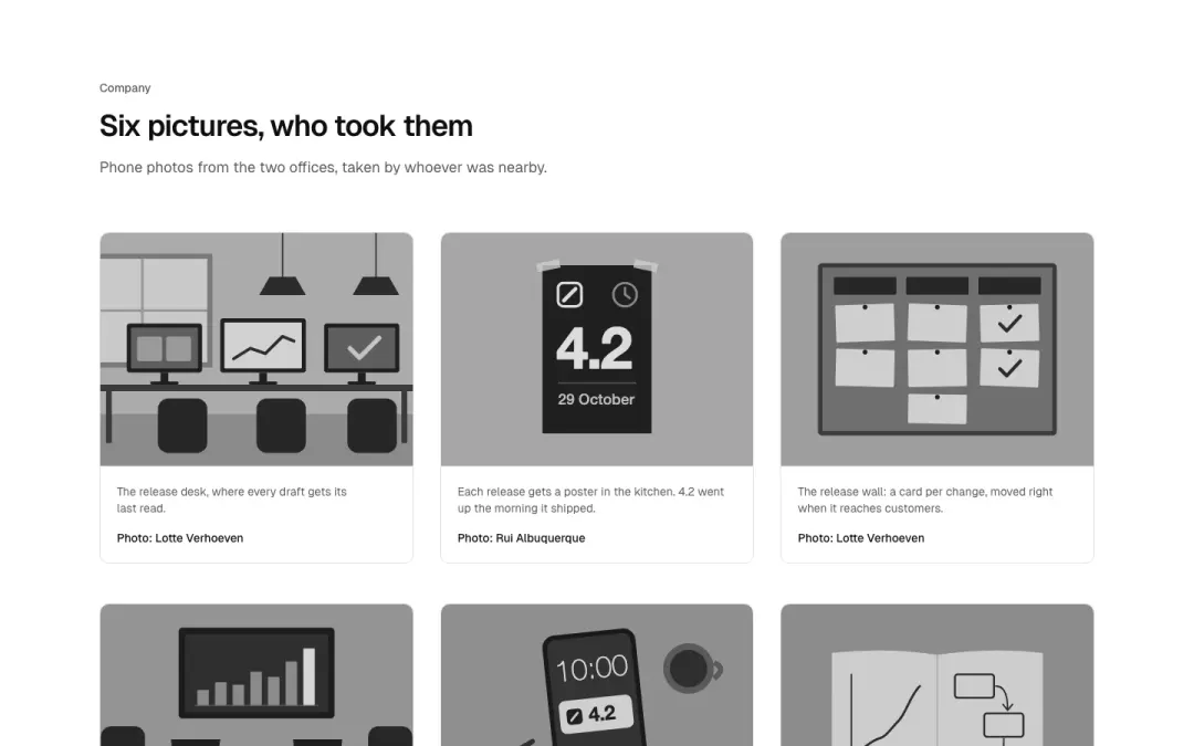
Captioned
Gallery tiles with a caption and a credit under each picture.
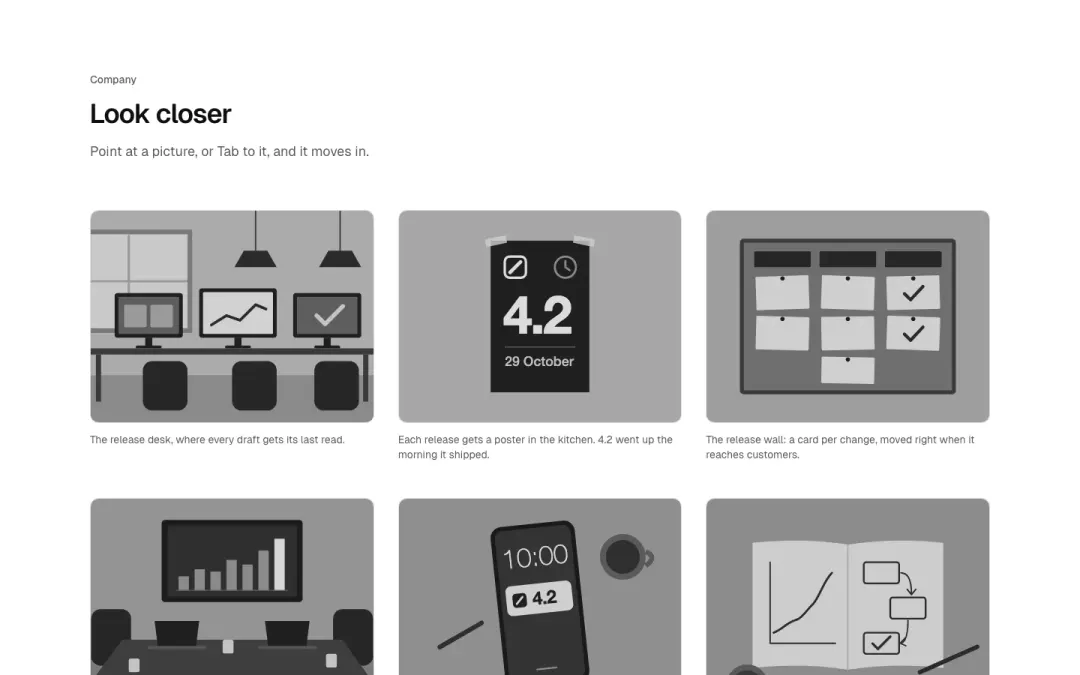
Hover zoom
Pictures that zoom gently inside their frame on hover/focus, with a caption below.
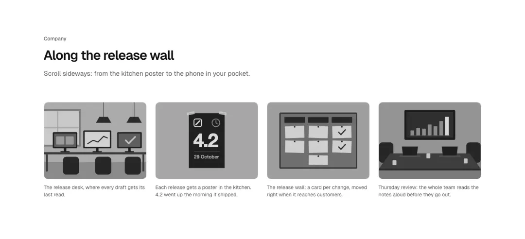
Strip
One row of pictures that scrolls sideways with snap and visible scrollbar on small screens.
Team 9 variants
26% of 259 about pages and 4% of 663 home pages in The UI Index have a team section.
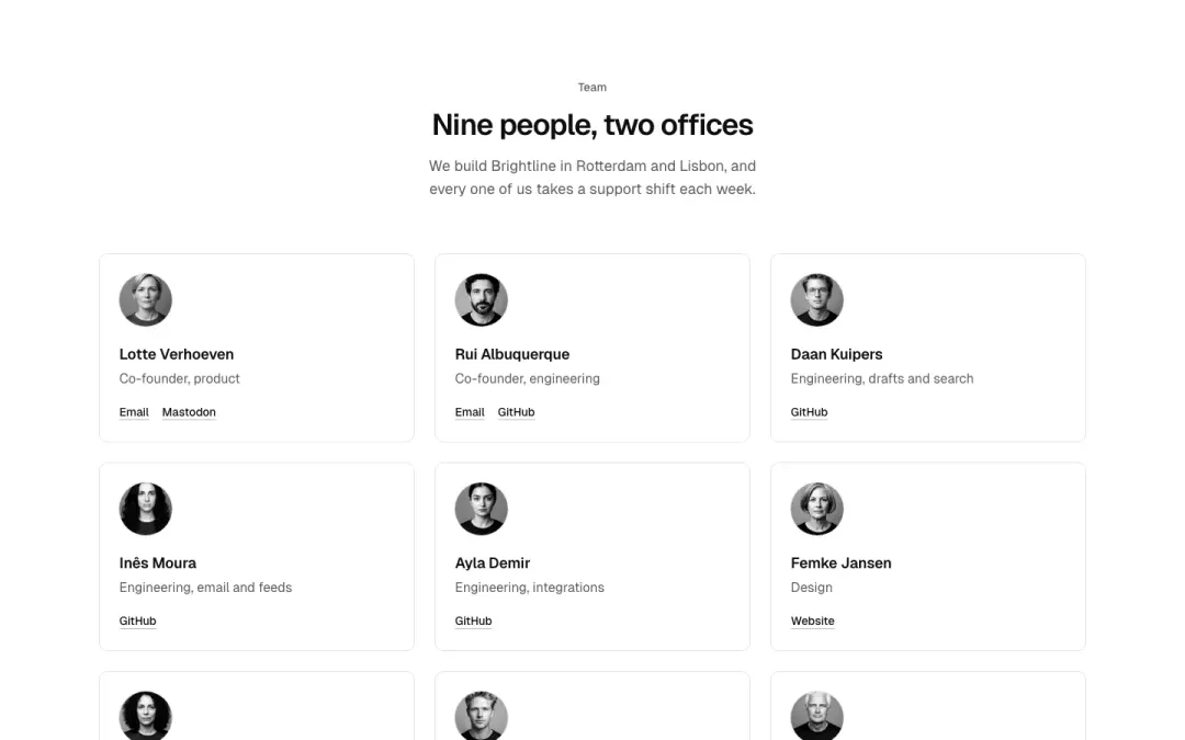
Grid
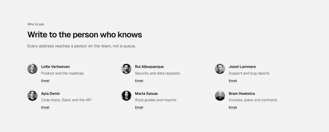
Compact list
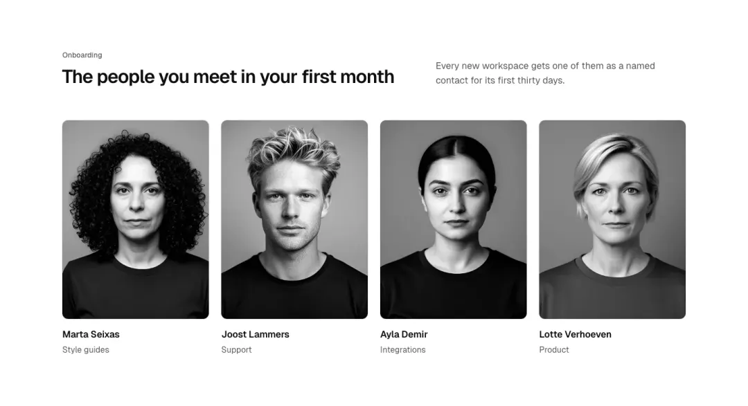
Portraits
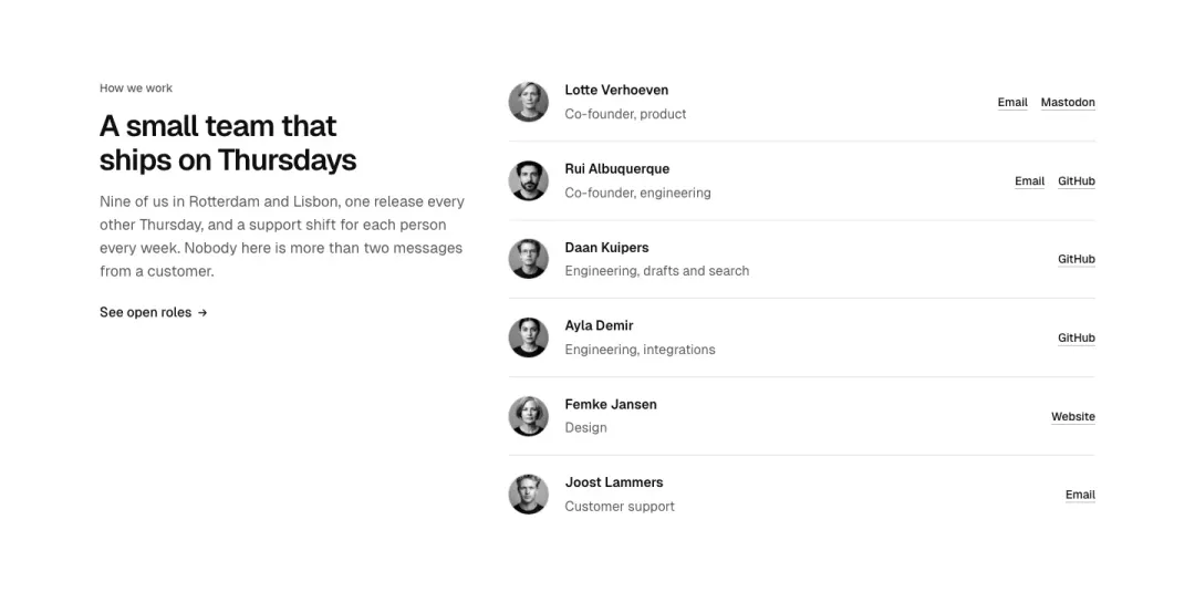
Beside the heading
The heading and a line on how the team works beside the people.
Show all 9 variantsShow fewer
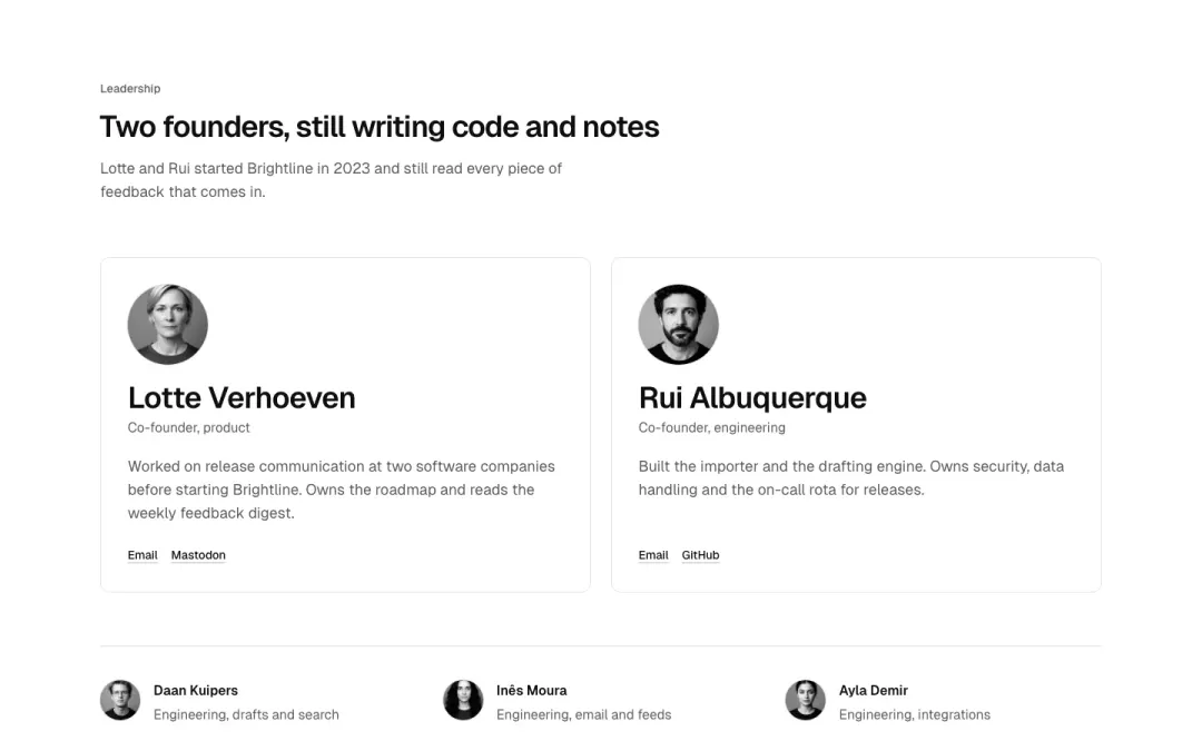
Leadership
The founders large, everyone else smaller below.
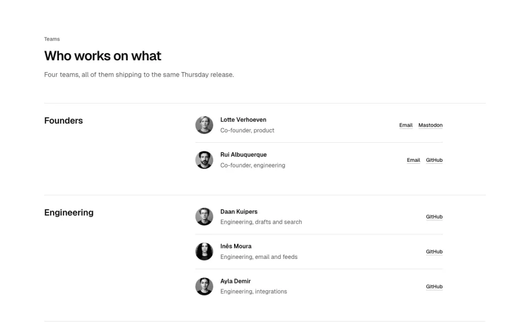
By team
People grouped under their team.
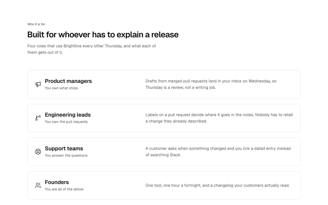
Fit cards
Persona fit cards: who it is for, an icon, short text; Brightline roles.
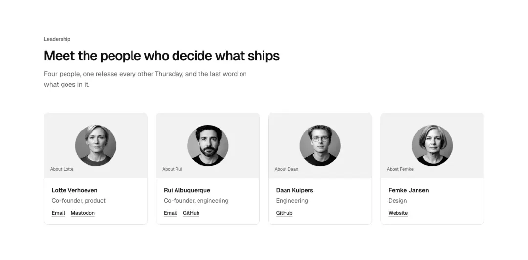
Hover bios
Leadership cards whose short bio reveals on hover and focus, always visible on touch.
Contact cards
Two or three people cards with monogram, role, email and phone links.
Services 10 variants
7% of 663 home pages and 3% of 259 about pages in The UI Index have a services section.
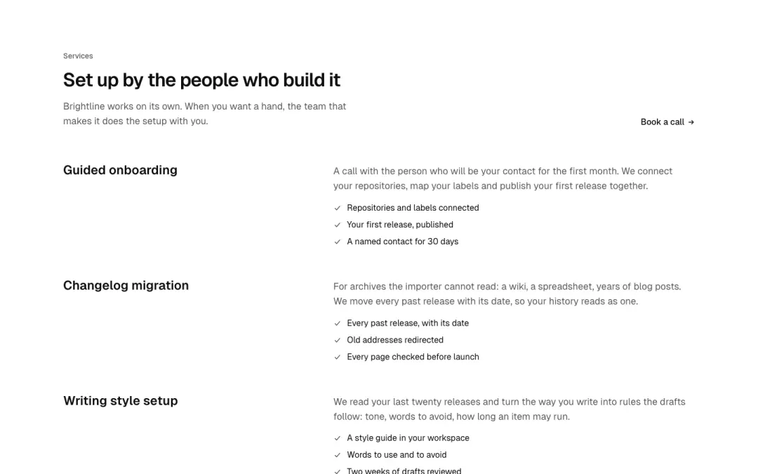
List
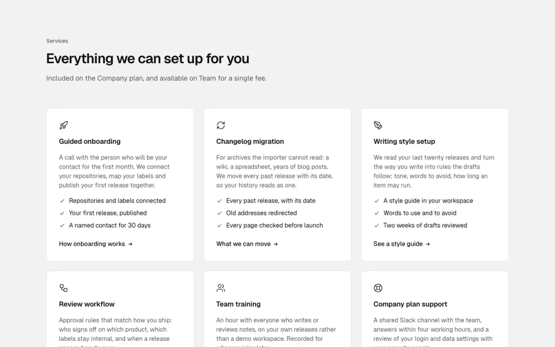
Grid
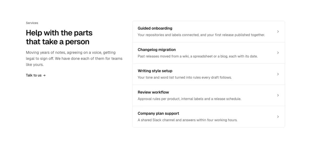
Heading beside list
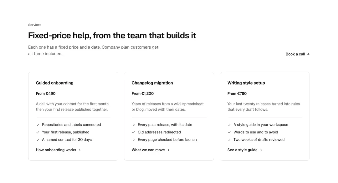
Cards
Service cards with what is included and a price from.
Show all 10 variantsShow fewer
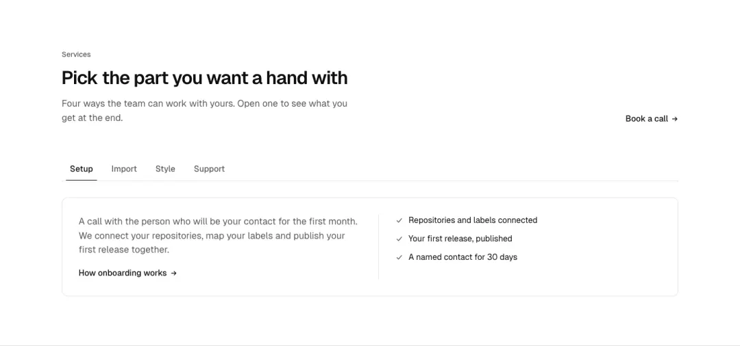
Tabs
Services as tabs, each with its detail.
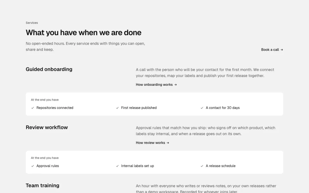
Deliverables
Each service with the things you get at the end.
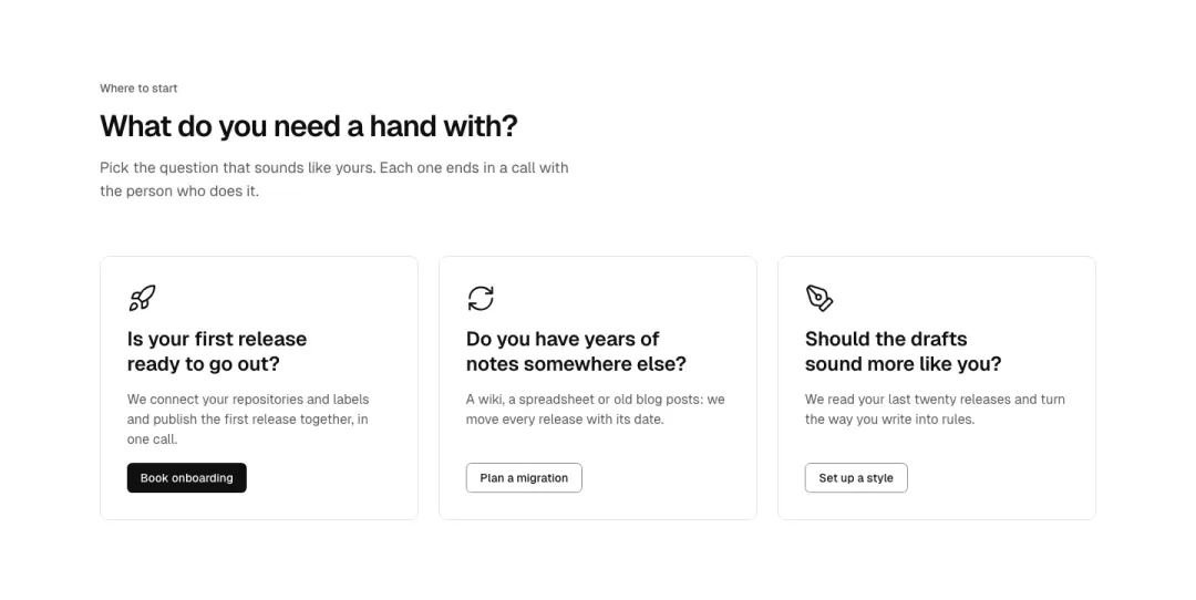
Action cards
Two or three large action cards (icon, question-style heading, text, button) side by side.
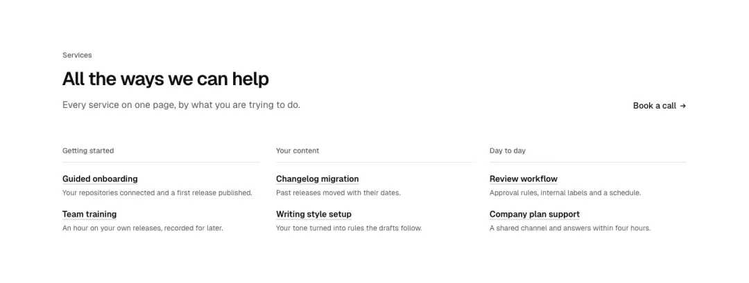
Directory
A services directory: grouped columns of service names with one line each and a link.
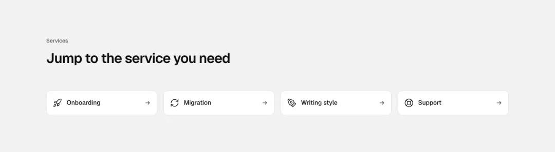
Quick links
A row of compact icon-and-title quick links to each service.
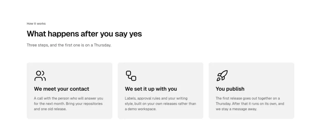
Explainer cards
Three explainer cards with a large number or icon, heading and text, no links.
Steps section 6 variants
10% of 178 service pages and 5% of 150 landing pages in The UI Index have a steps section.
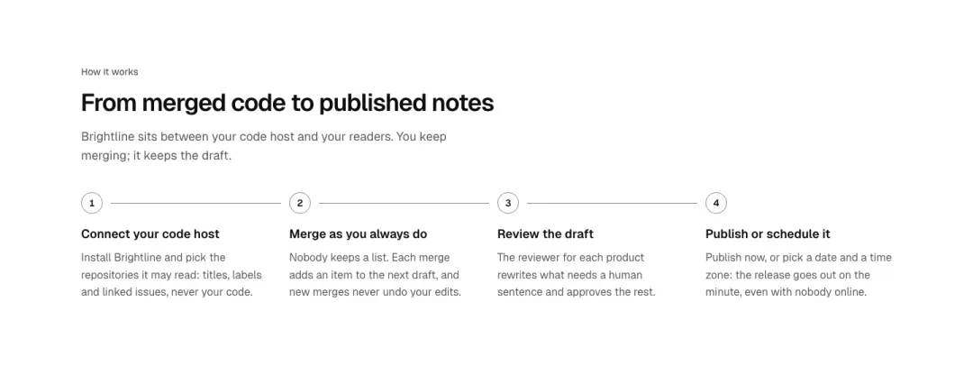
Row
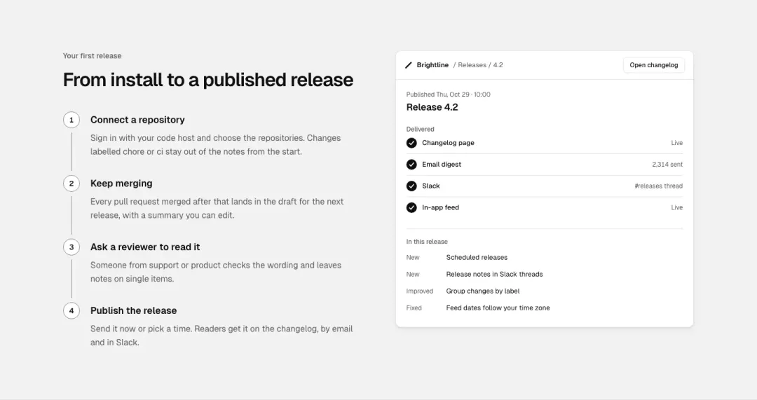
Vertical with image
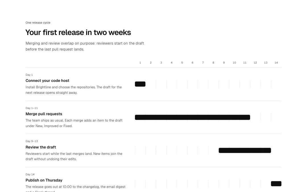
Track
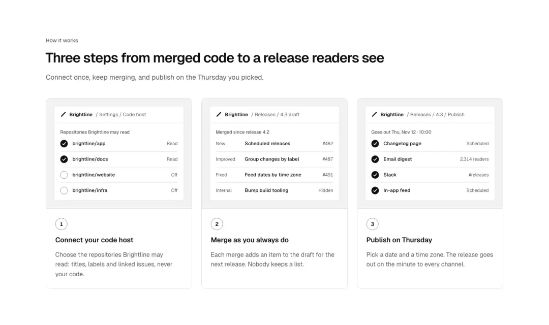
Cards
Steps as cards, each with a small screen of that step.
Show all 6 variantsShow fewer
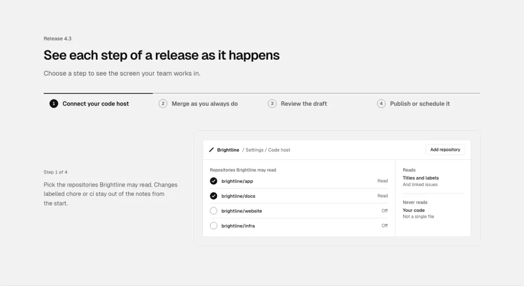
Tabs
Steps as tabs that switch one screen.
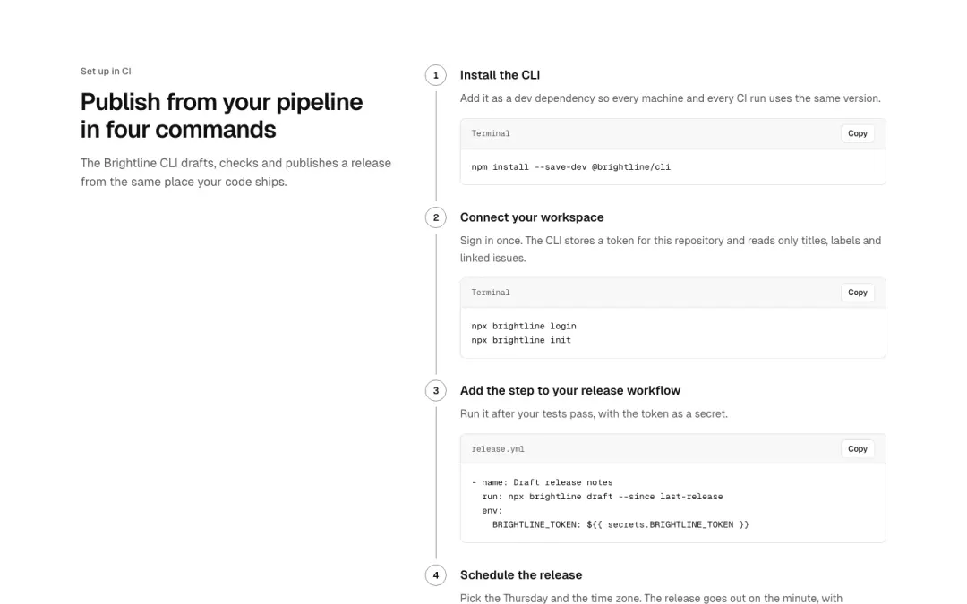
With code
Setup steps, each with the command or snippet to run.
Work 10 variants
6% of 663 home pages and 1% of 607 pricing pages in The UI Index have a work section.
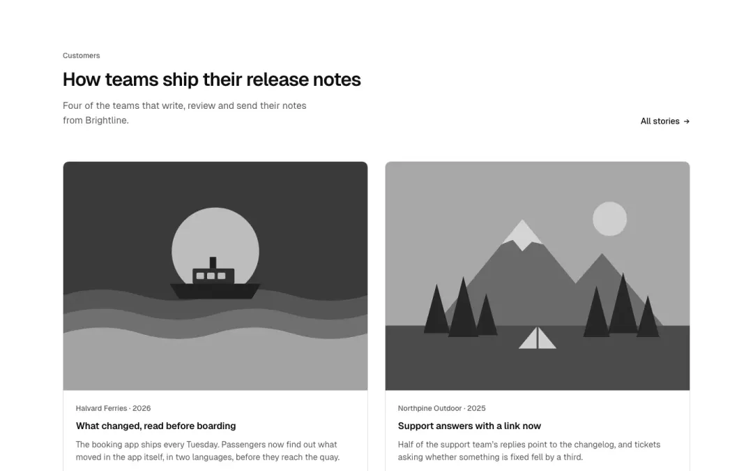
Grid
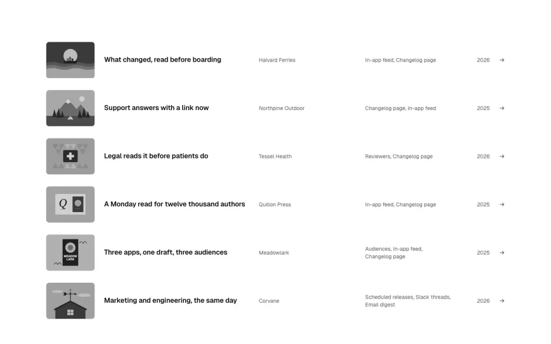
List
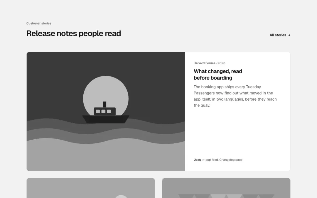
Featured
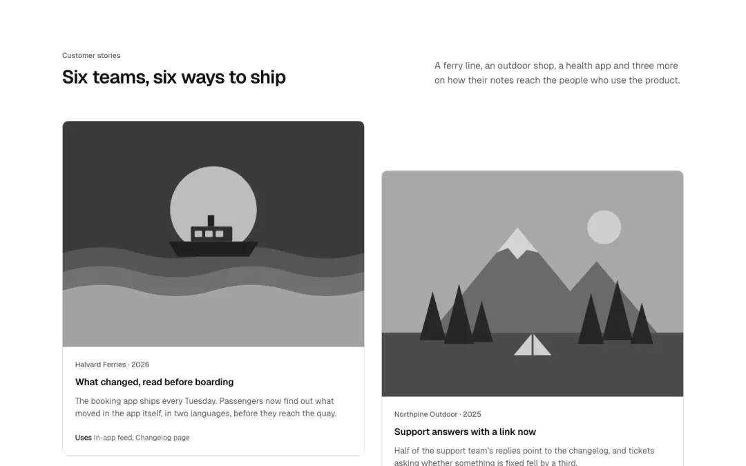
Staggered
Show all 10 variantsShow fewer
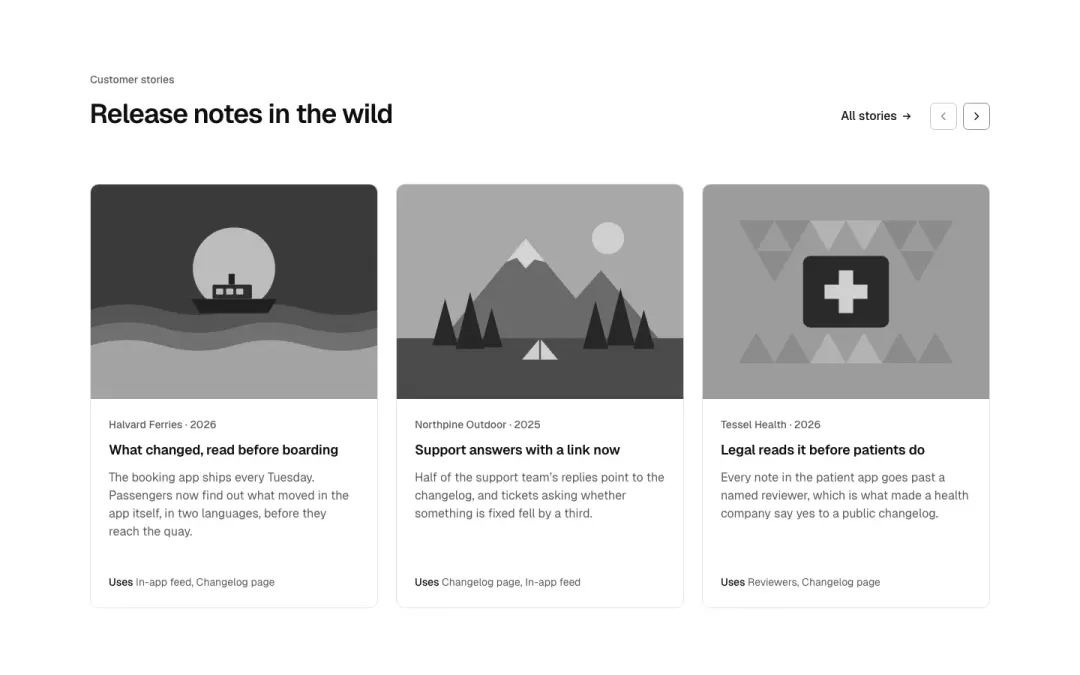
Carousel
Case cards in a scrolling row with previous and next.
Filter
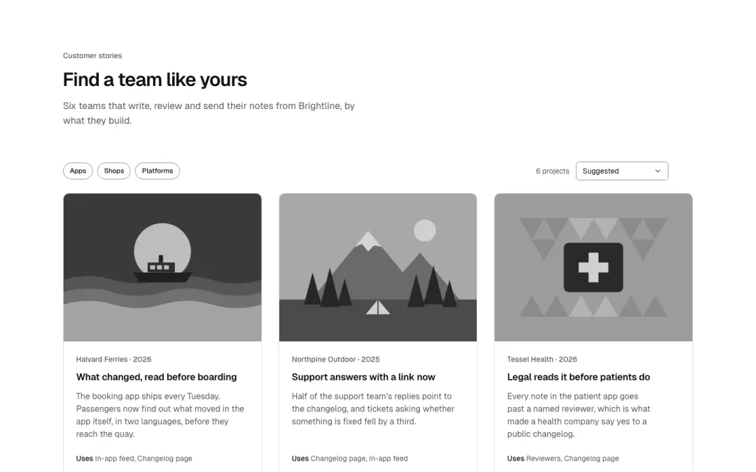
Category buttons above the cases narrow them.
One case
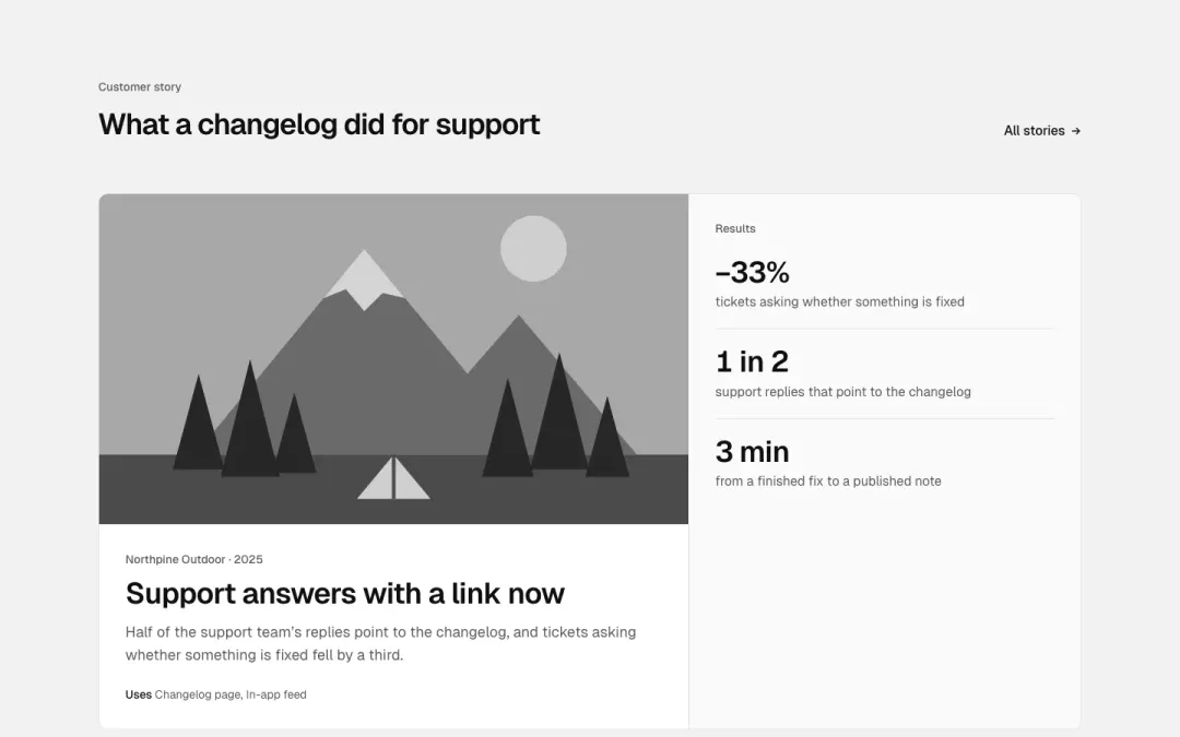
One case beside its results in figures.
Wide rows
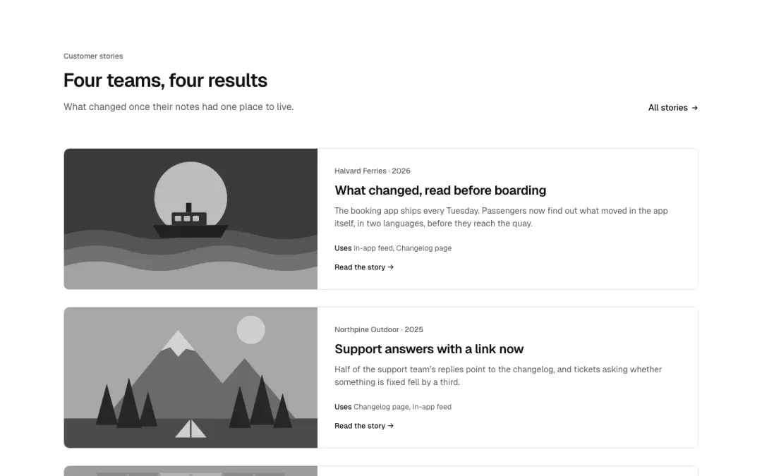
Projects as wide horizontal cards: picture left, client, title, outcome and link.
Caption overlay
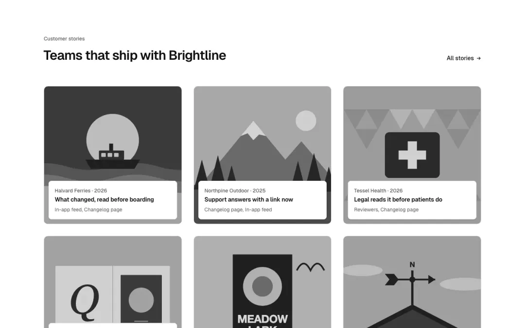
Project tiles with the caption on a panel over the picture.
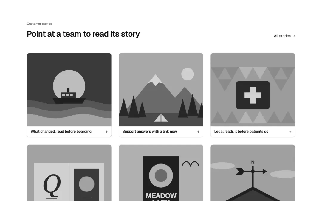
Hover reveal
Project tiles whose summary slides up on hover/focus, visible on touch.
Page header 9 variants
98% of 259 about pages and 94% of 663 home pages in The UI Index have a hero (or page header).

Stacked

Centred
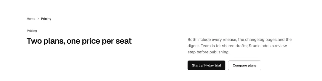
Beside the heading
The heading on the left, the lead and actions beside it.
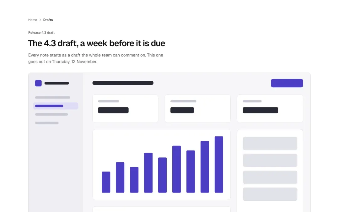
With a picture
The heading, then a wide picture under it.
Show all 9 variantsShow fewer

Article
Breadcrumb, heading, author, date and reading time: the head of an article.

With search
The heading with a search field, for help and docs.

With tag
A small tag chip above the title and intro: the compact head of a section or guide.

Dark with accent
A dark page head with one accent-coloured word in the title and two actions.

With anchors
Title and intro over a row of in-page anchor links to the sections below.
Case header 3 variants
98% of 259 about pages and 94% of 663 home pages in The UI Index have a hero (or page header).
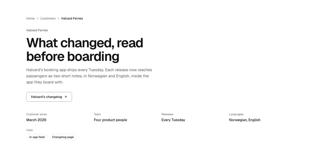
Stacked
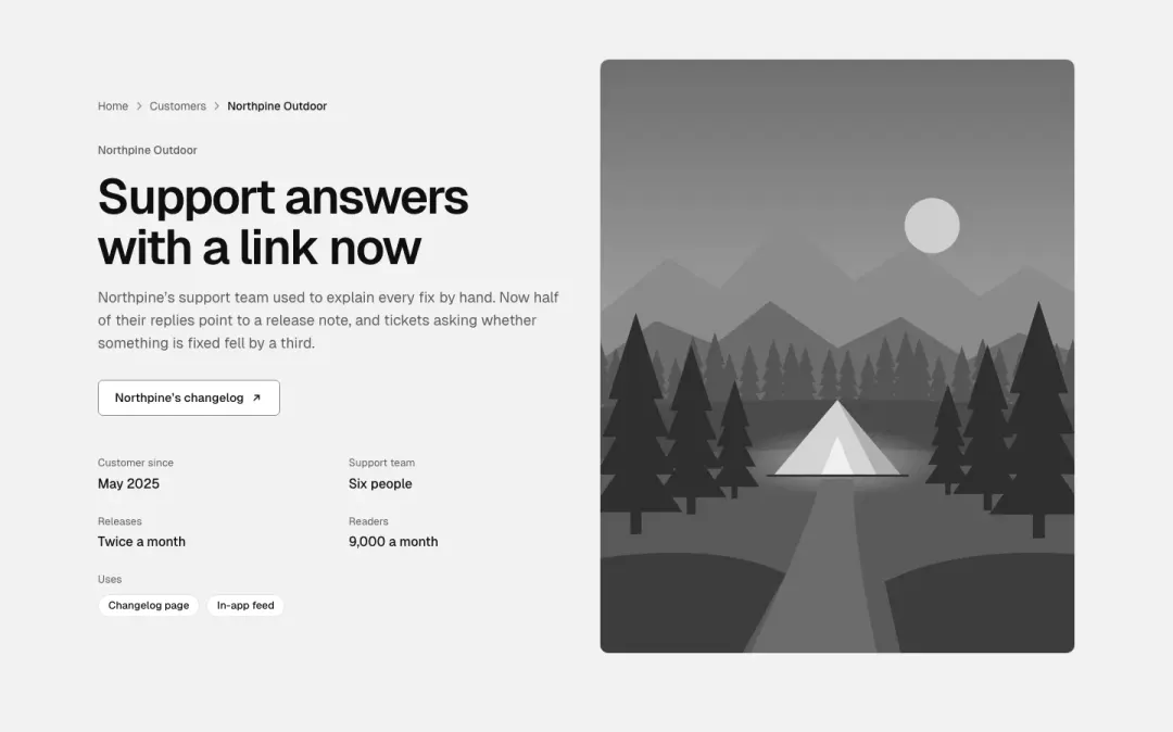
Split
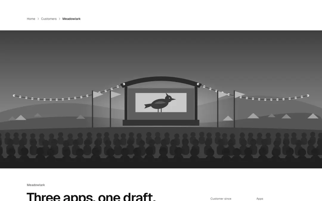
Cover
Integrations 2 variants
6% of 150 landing pages and 3% of 663 home pages in The UI Index have an integrations section.
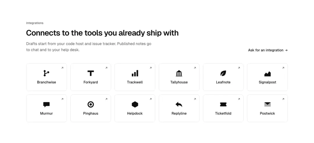
Grid
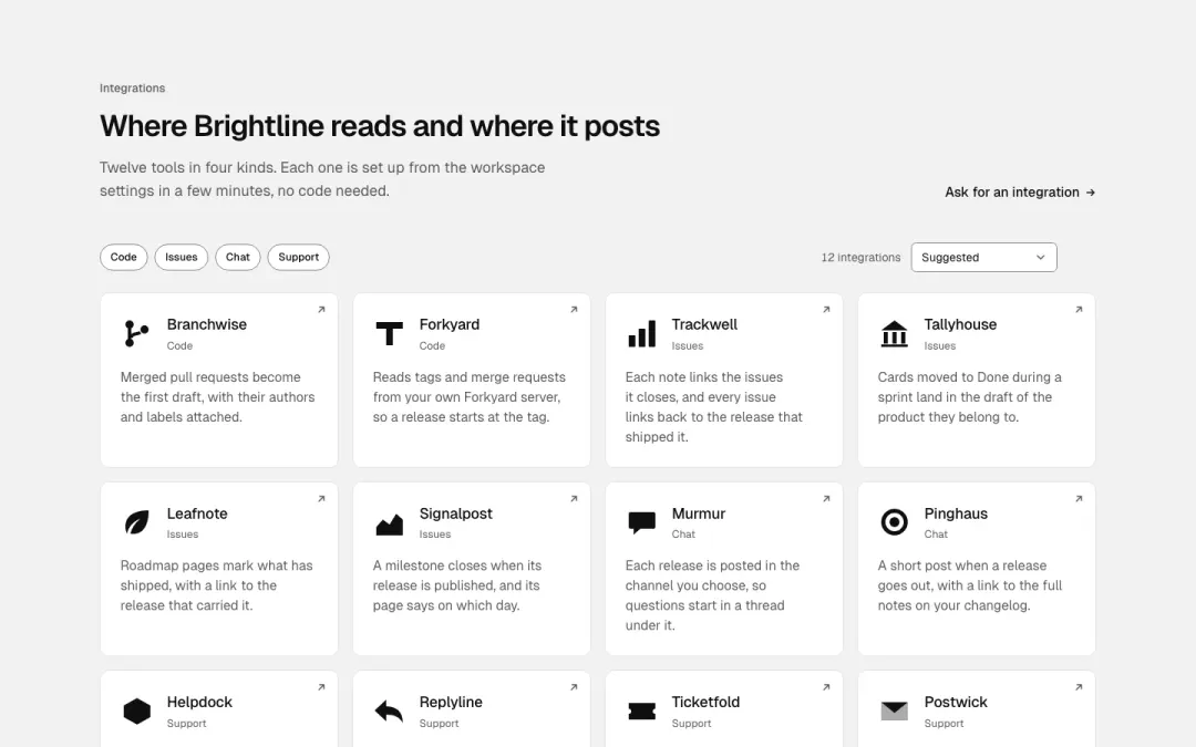
Cards
Newsletter section 2 variants
5% of 100 news overviews and 3% of 193 category pages in The UI Index have a newsletter section.
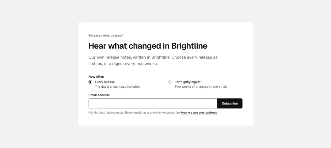
Card
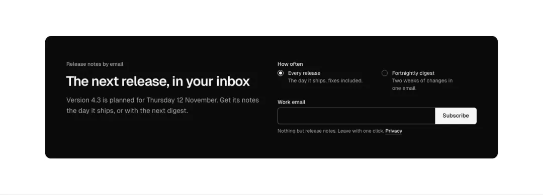
Band
Feature tabs 7 variants
Not measured as a section kind of its own in The UI Index yet.
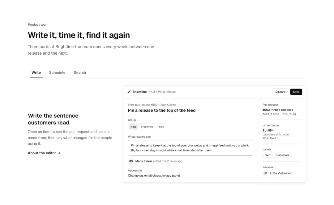
Text beside image
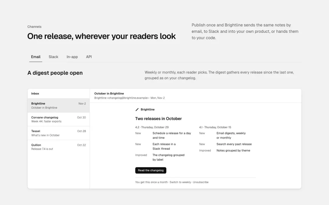
Text above image
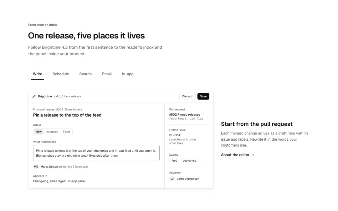
Underline tabs
A row of underlined tabs above a panel of text and a screen; tabs scroll sideways at 390.
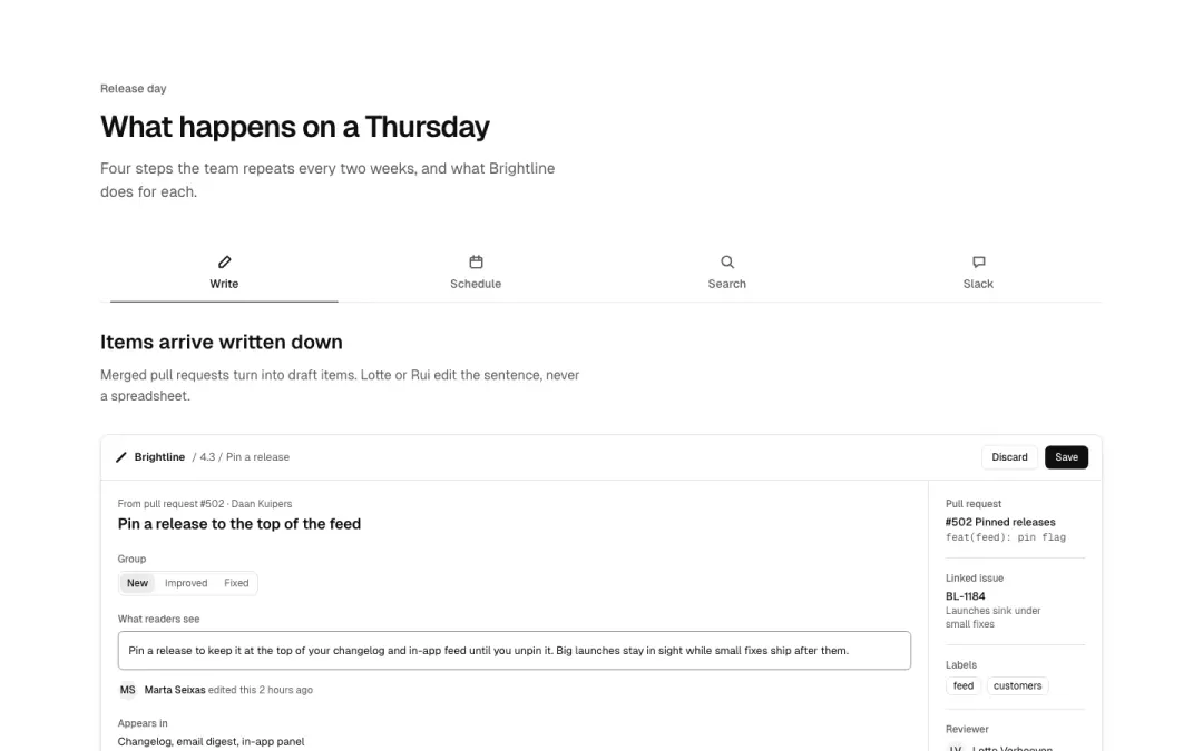
Icon tabs
Tabs with an icon above or before each label, each with its own panel.
Show all 7 variantsShow fewer
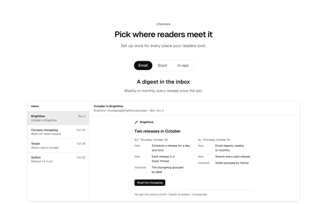
Pill tabs
Segmented pill tabs centred above the panel.
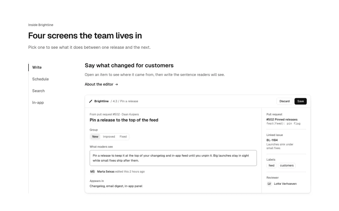
Vertical tabs
Tabs as a vertical list beside the panel at 1440, a horizontal row at 390.
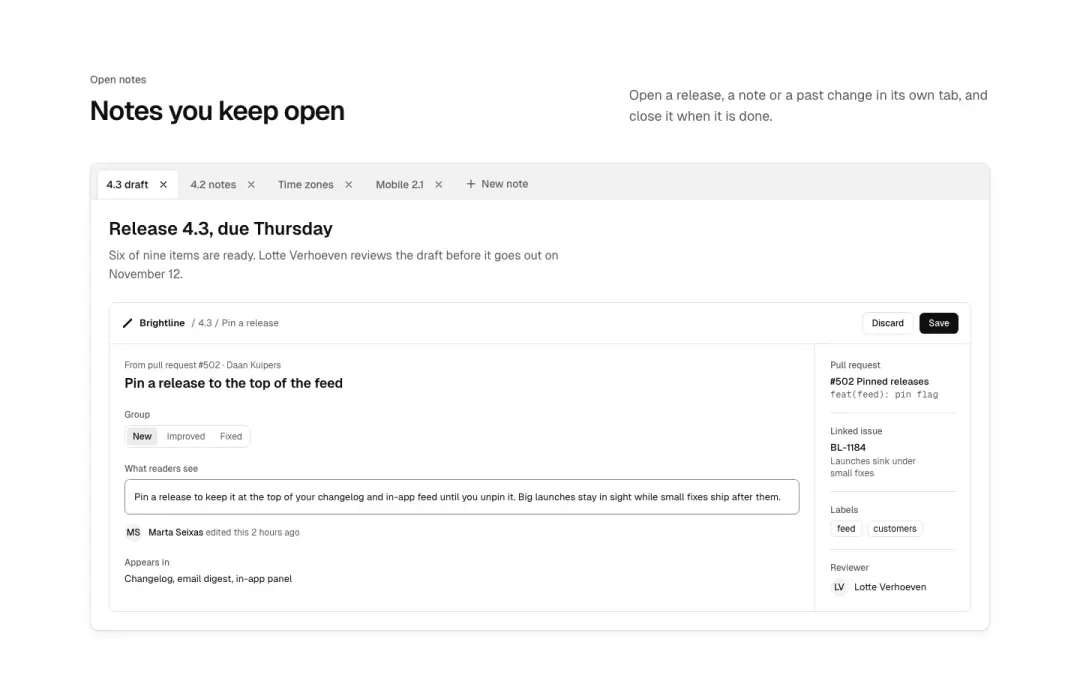
Closable tabs
Editor-style tabs with a close button each and an add button; closing moves selection to the neighbour.
Timeline 3 variants
Not measured as a section kind of its own in The UI Index yet.
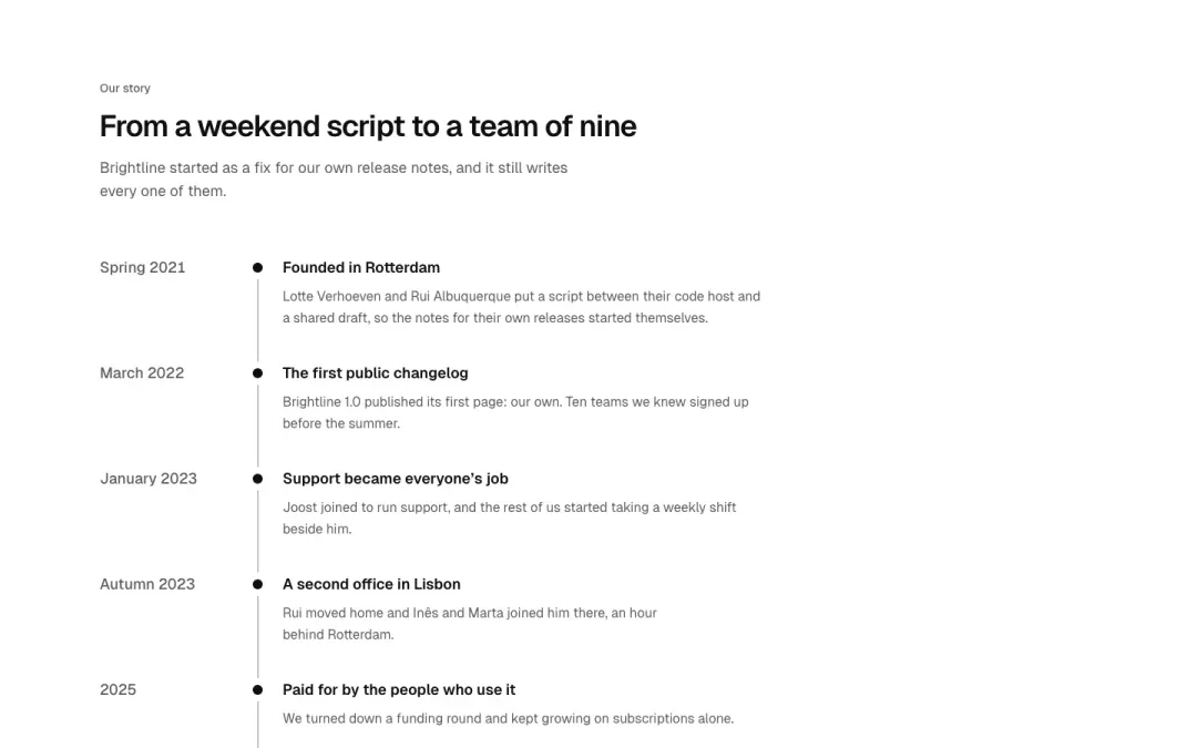
Vertical
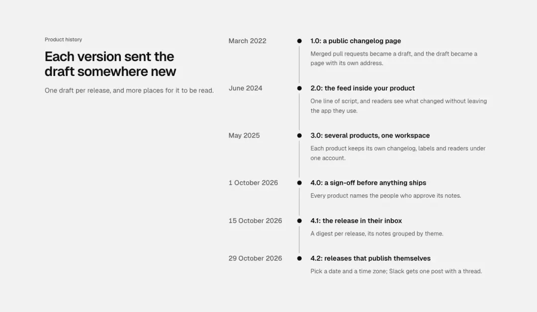
Heading beside line
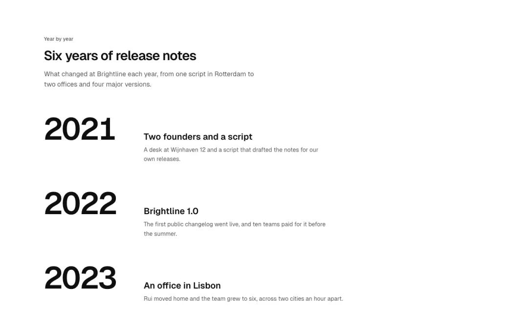
Years
Values 5 variants
Not measured as a section kind of its own in The UI Index yet.
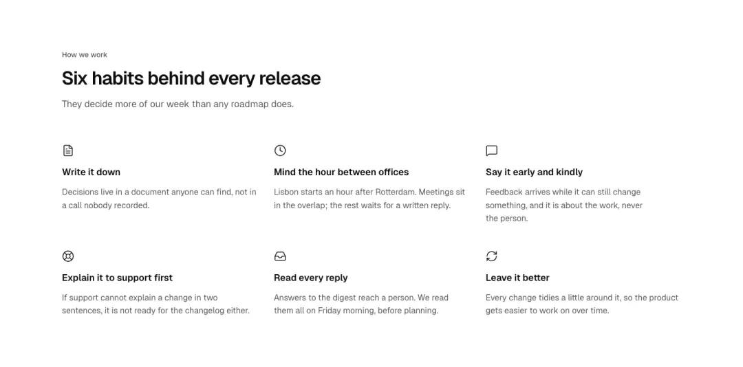
Grid
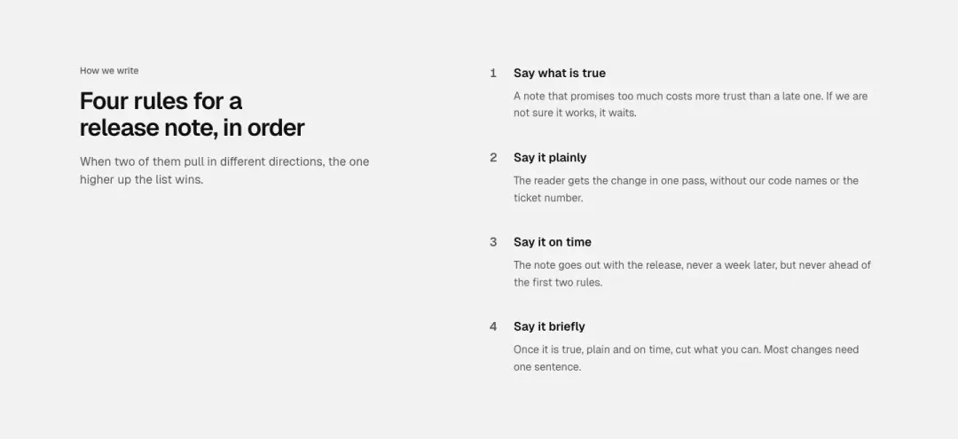
Numbered
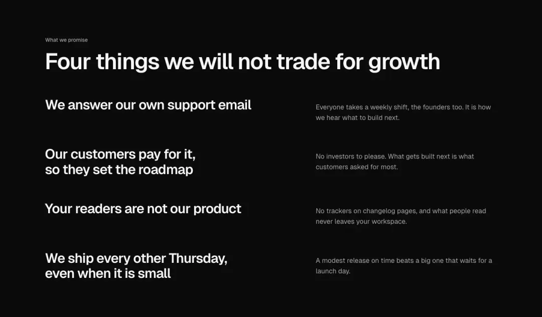
Manifesto
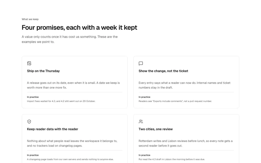
Cards
Values as cards, each with an example of it in practice.
Show all 5 variantsShow fewer
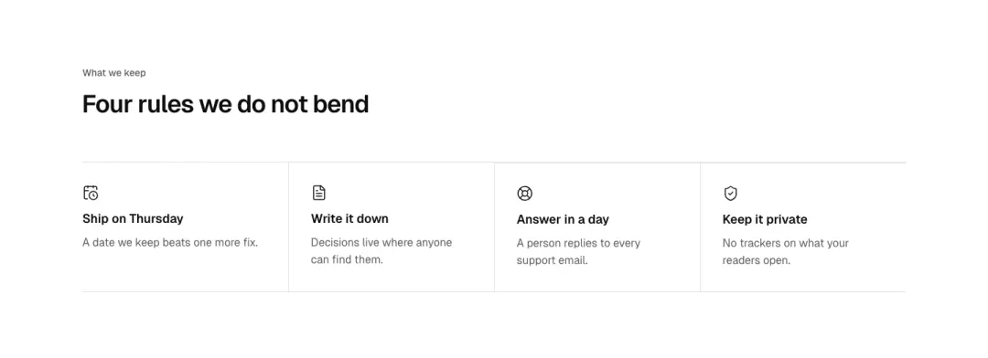
Values row
Four or five values in a single ruled row: icon, short name and a one-line meaning.
Careers 5 variants
Not measured as a section kind of its own in The UI Index yet.
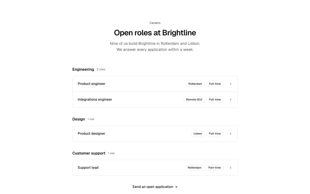
List
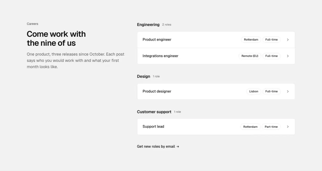
Heading beside list
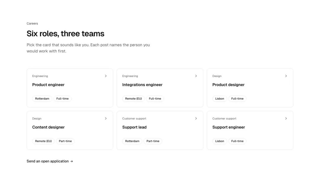
Cards
Openings as cards with team, place and type.
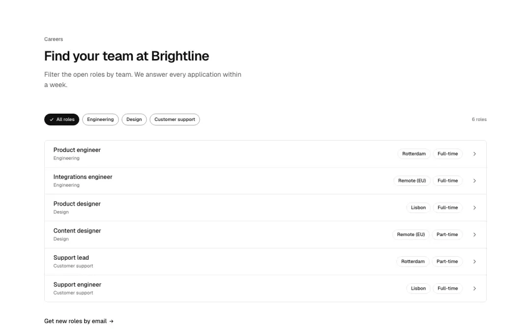
By team
A team filter above the openings.
Show all 5 variantsShow fewer
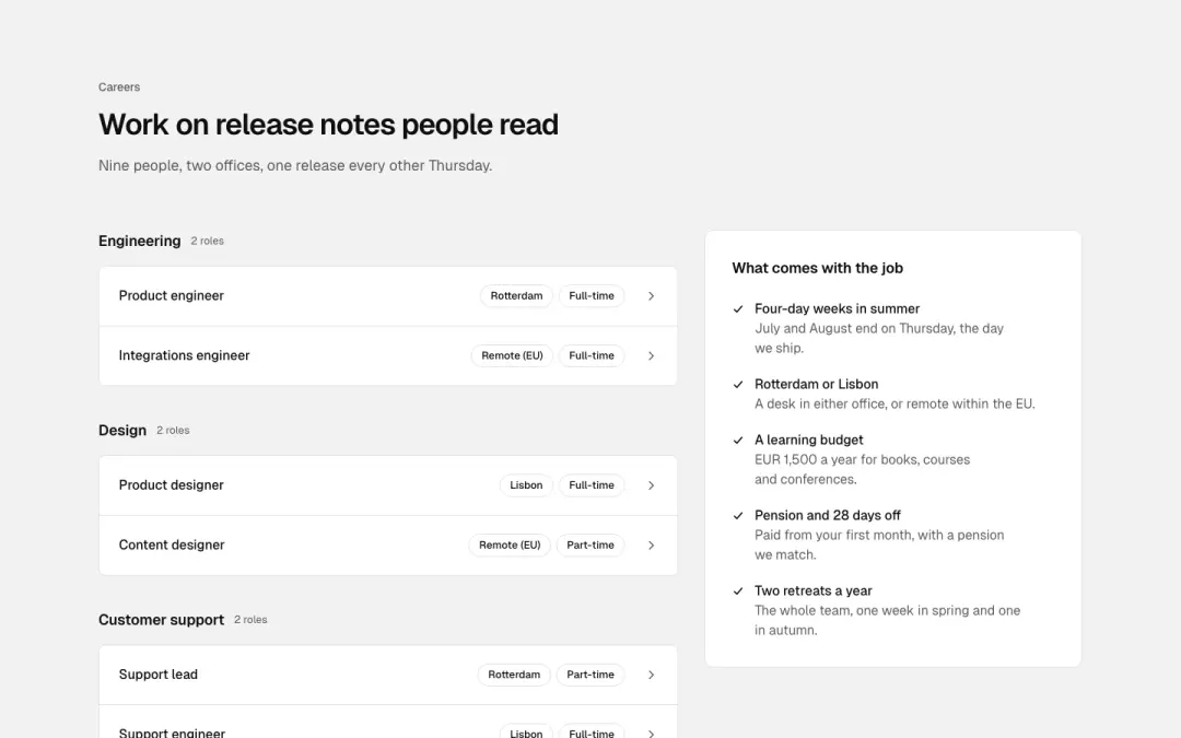
With benefits
Openings beside what working here comes with.
Comparison 3 variants
10% of 607 pricing pages and 6% of 126 help pages in The UI Index have a comparison section.
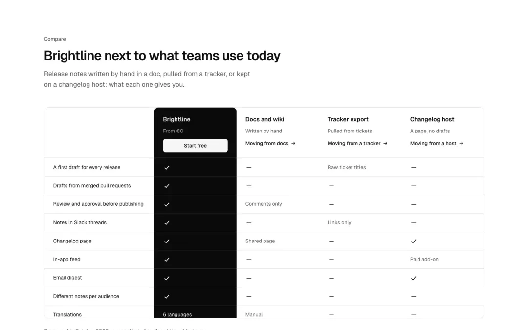
Comparison table
Product versus alternatives table with ticks, highlighted first column, sticky header.
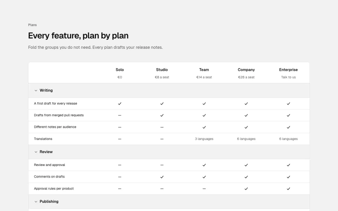
Grouped matrix
Feature groups as collapsible bands across five plan columns with ticks.
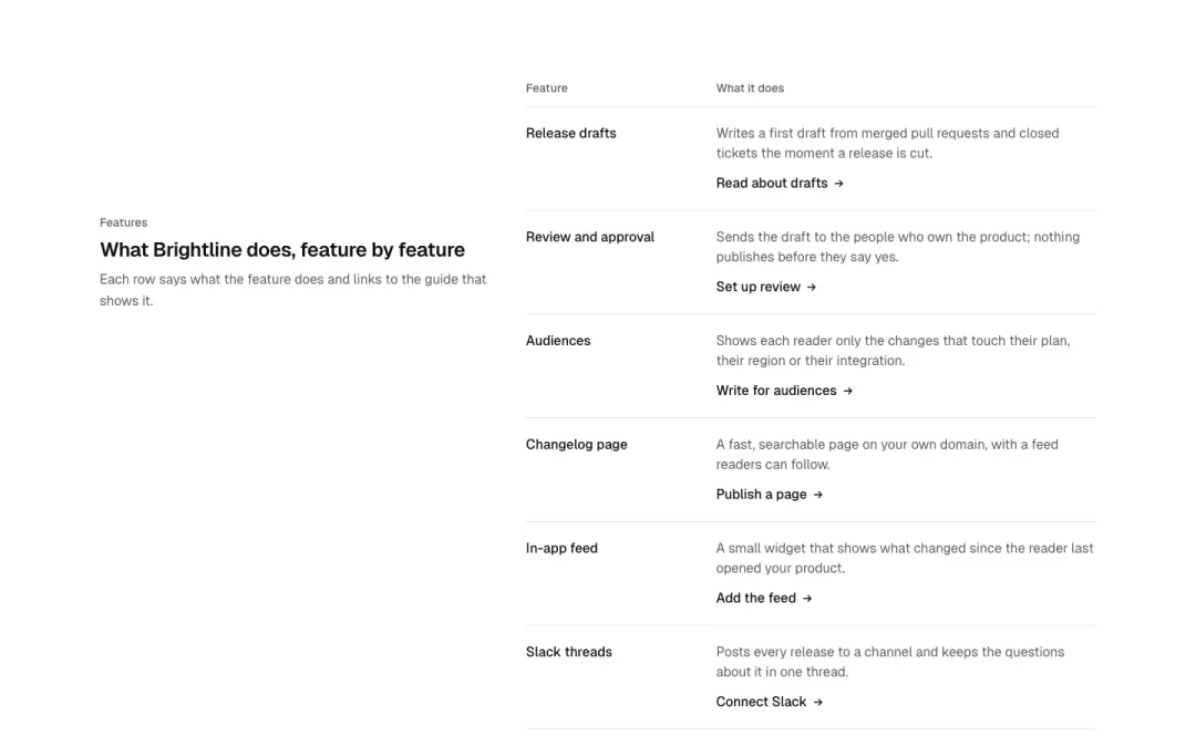
Feature table
Two-column feature table with short descriptions and a link per row.
Navigation · 3 blocks
Header 30 variants
98% of 178 service pages and 97% of 115 contact pages in The UI Index have a header section.

Bar
Logo, a row of links and one primary button on the right; the menu folds into a disclosure under 768.

With search
Logo, a search field taking the middle and a few links on the right.

Search and action
Logo, links, a compact search field and a primary button in one row.

With menus
Links that open dropdown panels of grouped links (disclosure buttons), plus a sign-in link and a button.
Show all 30 variantsShow fewer

With chips
Logo and links over a second line of category chips that scrolls sideways on small screens.

Two tiers
A thin utility row (status, docs, sign in) above the main bar with logo, links and button.

Centred logo
The logo in the middle with links split to either side and the action on the right.

With badge
The bar with a release badge beside the logo (4.2 shipped) and a New tag on one link.

Signed in
The app side: logo, workspace links, a notifications button with a count and the monogram of the signed-in person.

Plain
A wordmark in text and a few quiet text links, no button: the head of a docs page or a personal site.

With tabs
Logo and actions over a row of product tabs with an underline on the current one.

Store
Logo, a wide search, account and saved icons over a row of category chips: a catalogue head.

Utility and menus
A utility row, then logo, search and sign in, then a row of dropdown menus: three tiers for big sites.

With rating
The bar with a compact rating (stars, 4.8, review count) as social proof beside the action.

With promo
The bar with a small picture and a one-line promo (the 4.3 webinar) between the links and the action.

Inline sign-up
Logo, links and an inline email field with a subscribe button in the bar.

Split title
A page title on the left and a row of text links on the right, no logo: a section head inside an app.

Utility strip
Slim strip above the bar with a badge and two small links; the main bar below carries logo, search and links.

Split bar
Links on the left, logo centred, search and a button on the right; folds to logo plus menu under 768.

Link tiers
Two or three stacked rows of plain text links, no logo; the quiet index-style header.

Badge and search
Release badge, logo, a search field and links in one bar; badge and search fold first under 1024.

Chips and search
Logo, a search field and a row of filter chips beneath; chips scroll-free, wrapping 3+3 on phones.

Action bar
Links on the left and a primary button with an icon link on the right, no logo.

Search and tiers
Top row with logo, search field and an icon link; a second row of plain text links beneath.

Logo only
A centred wordmark between hairlines and nothing else; the quietest masthead.

Menus and search
Logo, two dropdown menus, a search field and links; menus and search fold into the panel under 1024.

Illustrated
Logo with a small drawn illustration mark, links and an icon link; no button.

Single action
A bar with one primary button and one text link, no logo or menu; for campaign and landing pages.

Chips and button
Logo, a release badge, a row of filter chips and one primary button; chips wrap 3+3 on phones.

Icon bar
A row of icon-only buttons with accessible names under a logo row; the toolbar style header.
Navigation 16 variants
15% of 100 news overviews and 12% of 193 category pages in The UI Index have a nav section.

Links
A row of text links with a clear current marker (aria-current), wrapping to a scroll row on small screens.

With icons
Each link an icon above or beside its label, like a product section switcher.
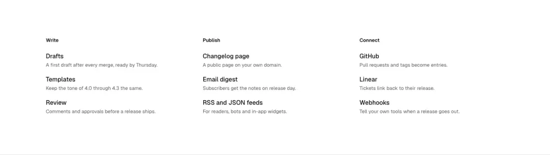
Link grid
Groups of links in columns with a short description per link: the open state of a mega menu, shown flat.
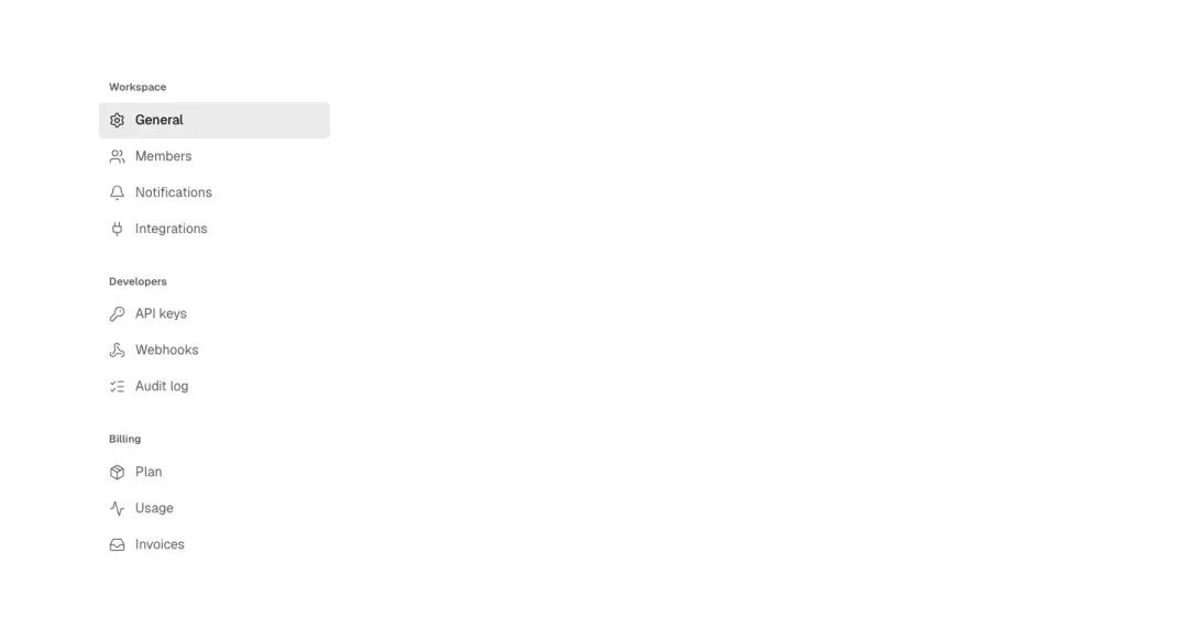
List
A vertical list of links with icons and a current item, the side navigation of docs or settings.
Show all 16 variantsShow fewer

Social
A row of social and channel icon links with visible accessible names.

With menus
Text links where some open a dropdown of sub-links (disclosure buttons, Escape closes).

Floating pill
A rounded pill bar floating over the page: logo, links and a button, centred with space around.

Stacked
Large stacked links, one per line with a short count or arrow, the open state of a full-screen menu.

With search
Category links with dropdowns and a compact search field at the end of the row.

Tabs
Links styled as underline tabs across a hairline, the current one marked.

With action
A row of text links followed by one primary button, no logo.

Previous and next
Previous and next links with the neighbouring page titles, and a page count between them.

Collapsible groups
Groups of links in details/summary that open and close, works without JavaScript.

Chips
Links as pill chips with the current one filled, wrapping cleanly.
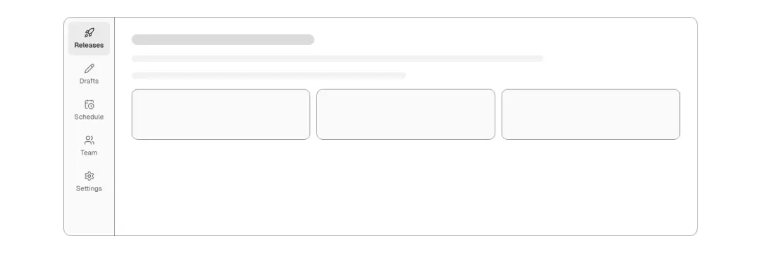
Rail
Vertical icon-and-label links in a narrow rail that becomes a bottom bar of the demo frame at 768 and below (icons only under about 290px).

Social grid
A grid of icon tiles for social profiles with short labels, 3 by 2 on phones.
Breadcrumb 4 variants
15% of 100 news overviews and 12% of 193 category pages in The UI Index have a nav section.

Trail
Home icon and the levels on one line; a long current page truncates with an ellipsis instead of wrapping.

Collapsed
First and last two levels shown, the middle levels behind a "…" disclosure menu.

Chips
Levels as small chips with the current page highlighted, home as an icon.

Toolbar
A back link and the trail on the left, a share or action button on the right, on one row.
Cards · 4 blocks
Content card 16 variants
Not measured as a section kind of its own in The UI Index yet.
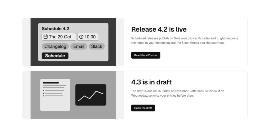
Split with image
Photo on one side, heading, short text and a primary button on the other; flips on mobile to photo on top.
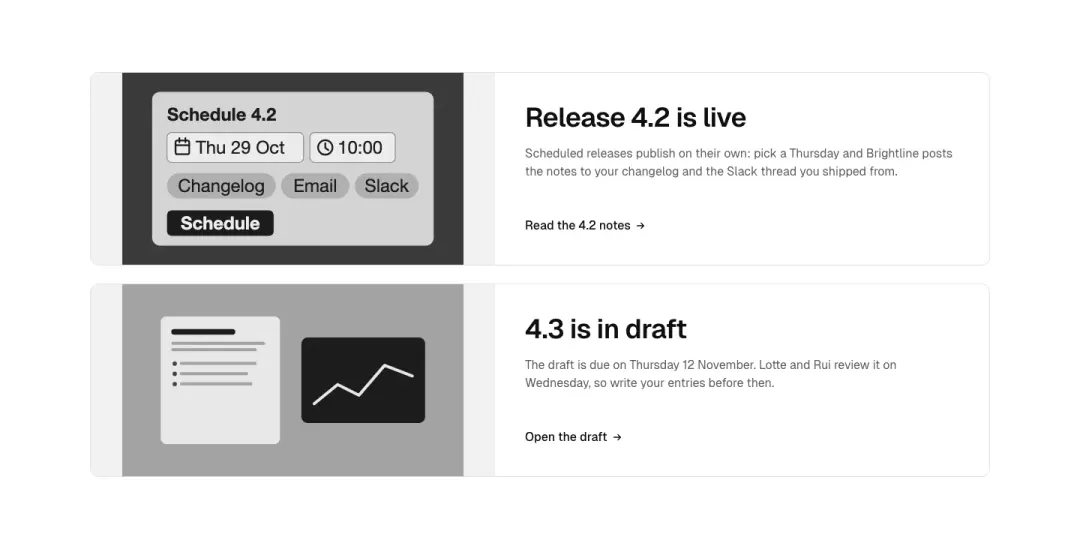
Split with text link
Photo beside heading and text that ends in an arrow text link instead of a button.
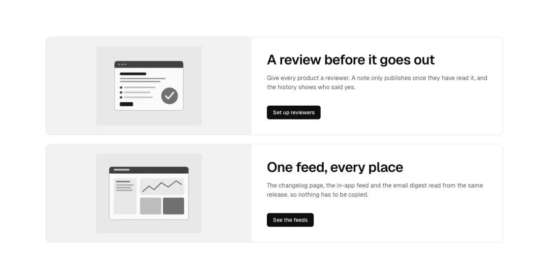
With an illustration
A drawn token illustration (no photo) beside heading, text and a primary button.
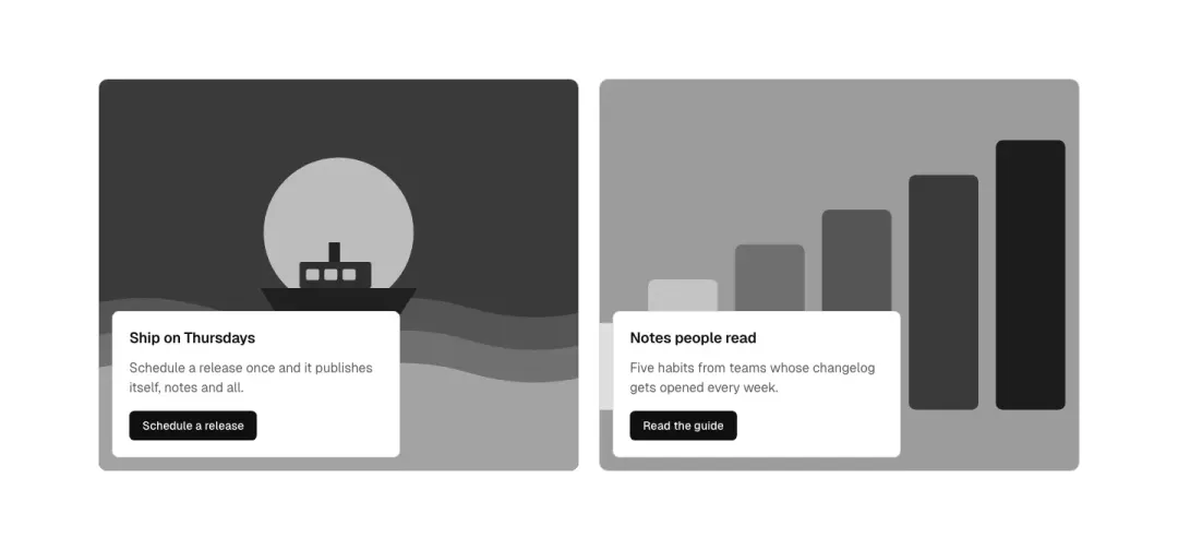
Text over a photo
Full-bleed photo with a solid text panel over its lower corner: heading, text, primary button; text stays legible in both themes.
Show all 16 variantsShow fewer
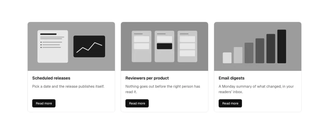
Photo on top
Photo on top, then heading, text and a primary button, in a grid of three.
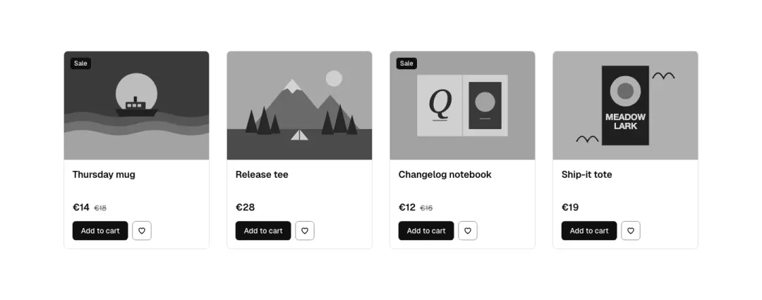
Product card
Picture, name, price with an old price and a sale badge, a wishlist icon button and an add button, in a row of four.
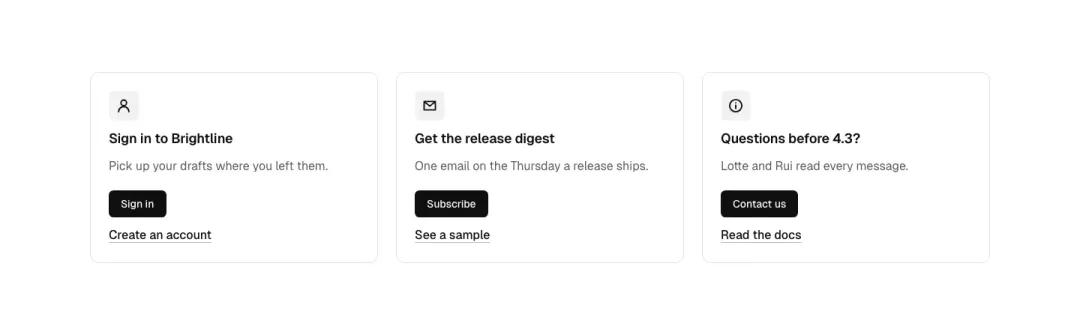
Account aside
A narrow aside card: icon, heading, one line, primary button and a secondary text link (e.g. sign in / create account).
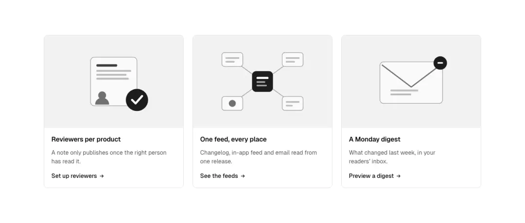
Illustration on top
A drawn token illustration on a tinted ground at the top, then heading, text and an arrow text link; three across.
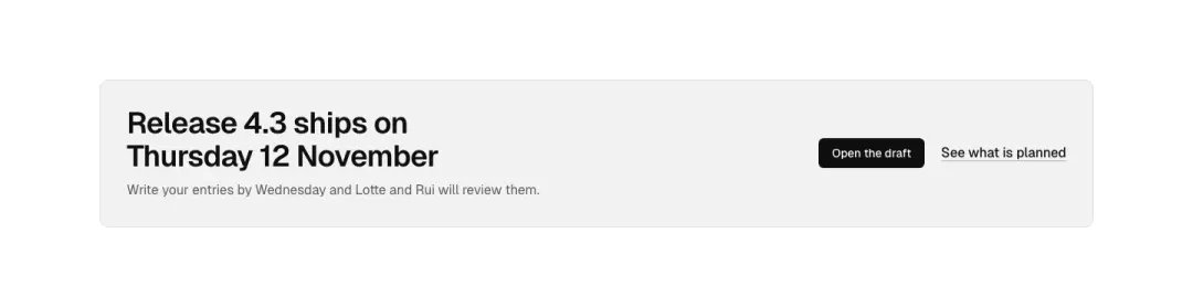
Banner
A wide tinted banner card without a picture: heading and one line on the left, a primary button and a text link on the right; stacks on phones.
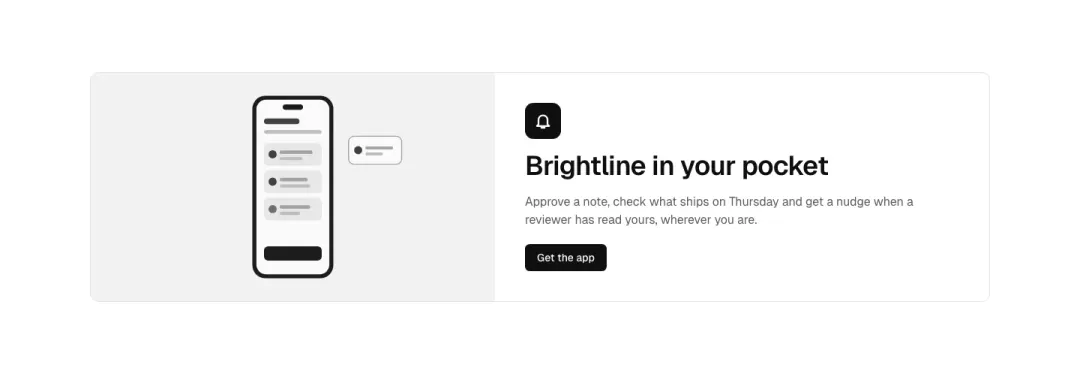
App promotion
A drawn phone screen (token illustration) beside an app icon, heading, text and a primary button.
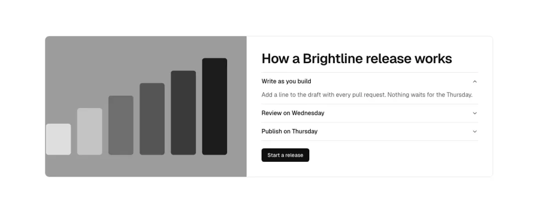
With points
Photo beside a heading and an accordion of three short points (one open), with a primary button under it.
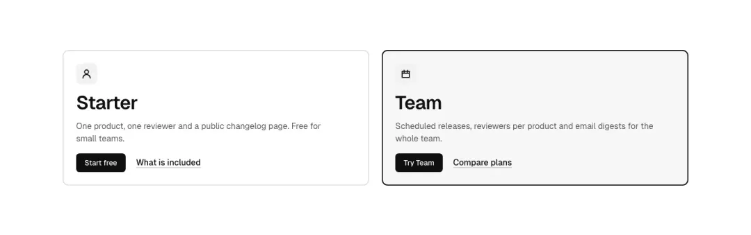
Plan card
A highlighted offer card: icon, name, two-line pitch, primary button and a secondary text link; two or three side by side.

Sign-in card
A compact sign-in card: heading, email field, continue button, a divider and a text link to create an account.
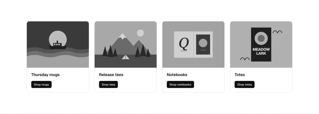
Promo row
Four picture cards in a row, each with a heading and a small primary button; 2×2 at mid widths.
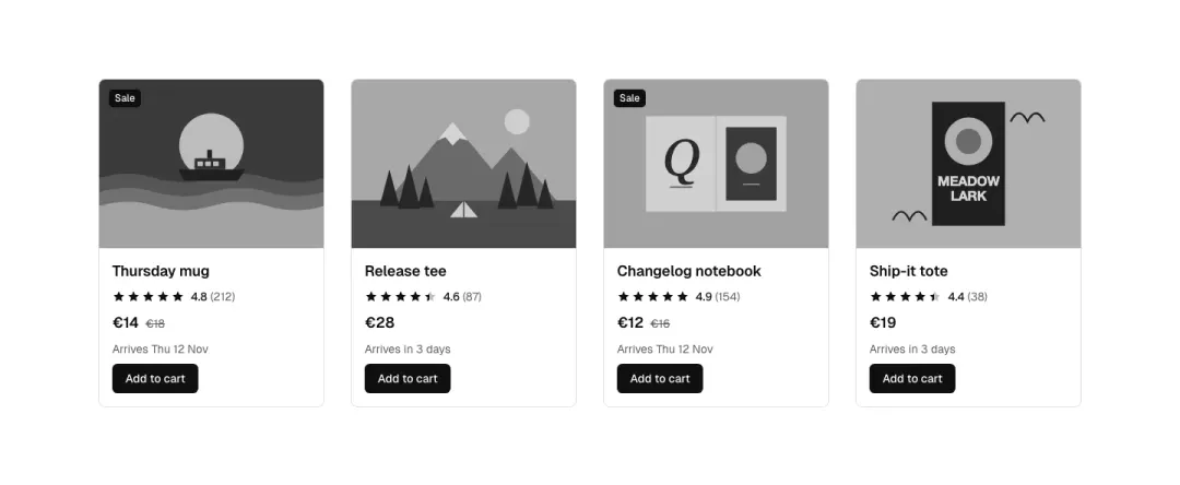
Rated product
Picture, badge, name, star rating with count, price with old price, delivery note and an add button; four across.
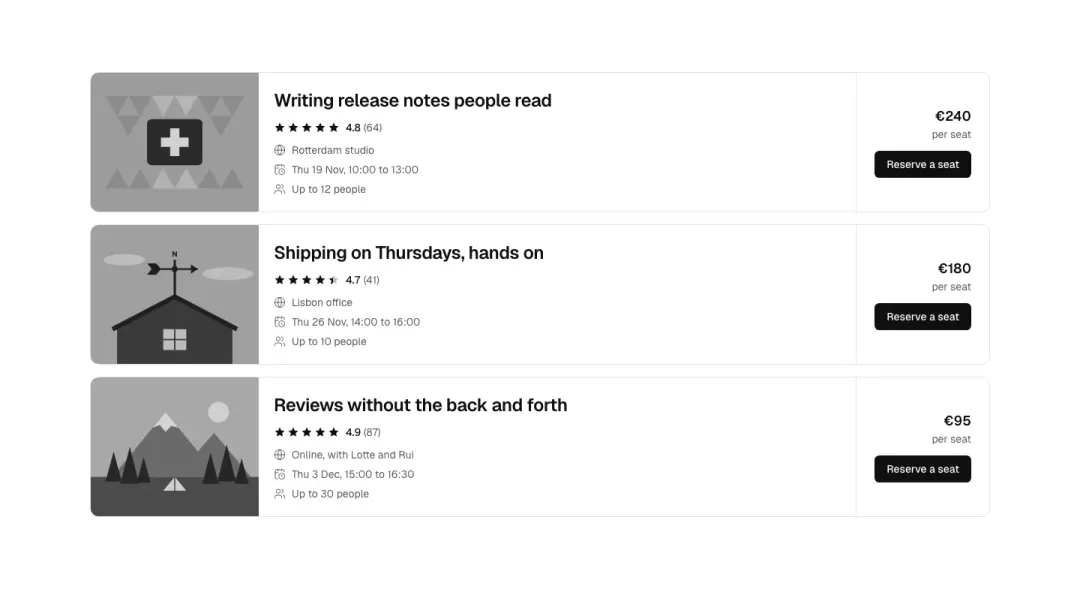
Listing row
A horizontal listing: picture left, name, rating, three facts, price and a primary button right; a stack of three.
Story card 22 variants
Not measured as a section kind of its own in The UI Index yet.

Plain tile
Heading and two lines of text on a quiet surface, nothing else; three across.
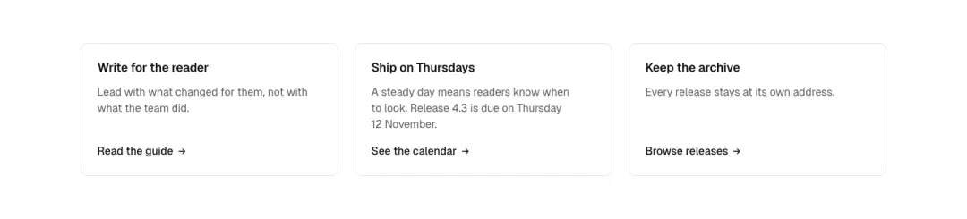
With a text link
Heading, text and an arrow text link at the foot, links aligned across the row.
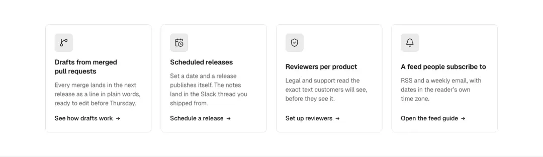
Icon on top
Icon chip, heading, text and a text link, stacked; three or four across.
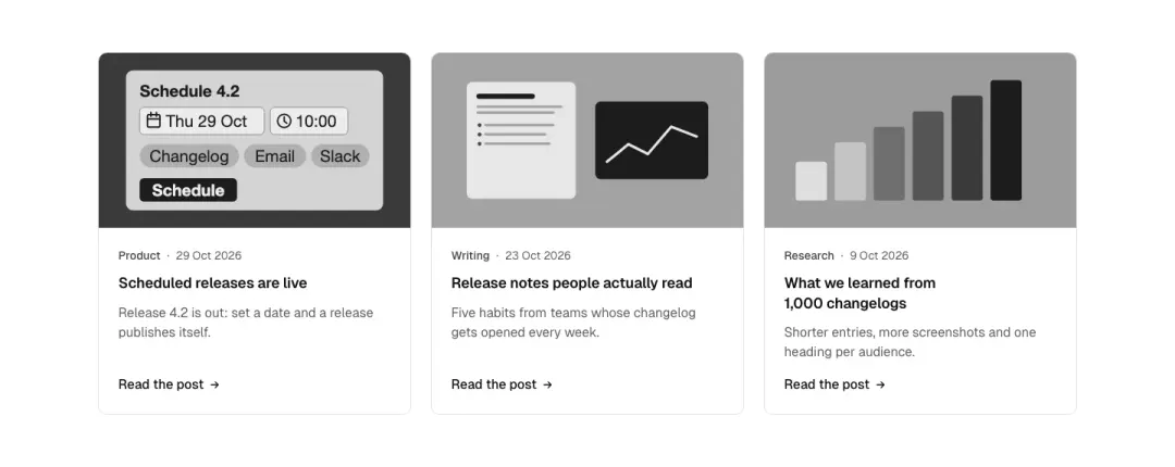
Article card
Picture, category and date meta, title, summary, read link; an article element.
Show all 22 variantsShow fewer
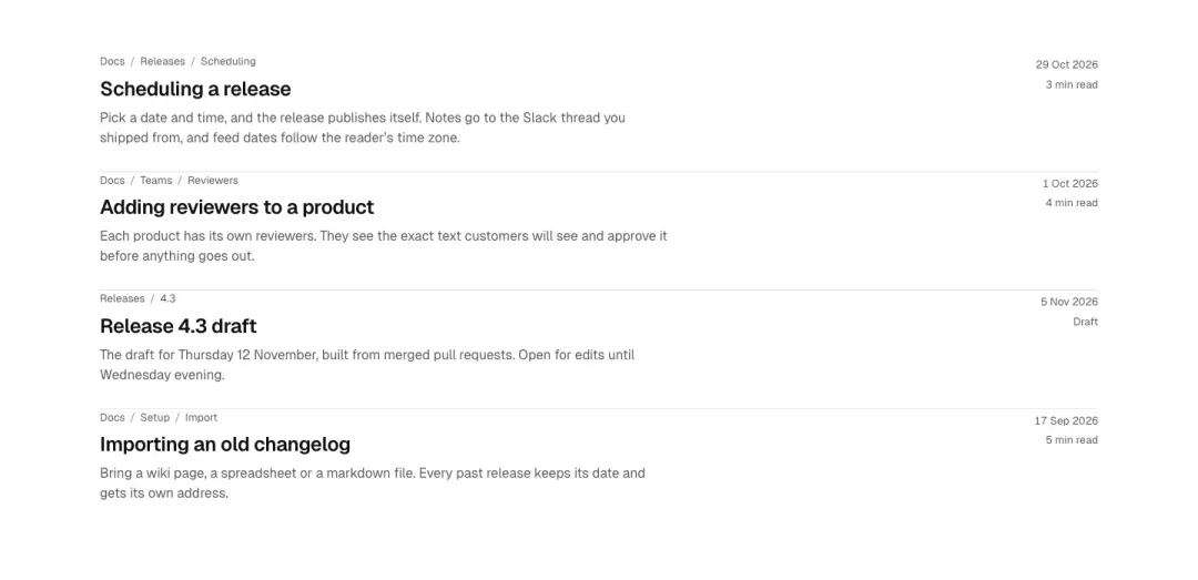
Search result
Search result rows: breadcrumb path, linked title, two-line summary, meta; a list of four.
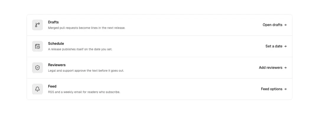
Icon row
A list of rows with an icon on the left, heading and text in the middle and a link at the right.
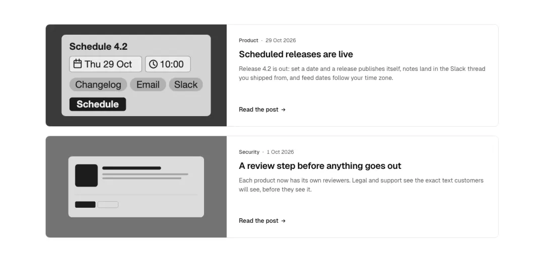
Wide with picture
Horizontal card: picture on the left third, meta, title, summary and link on the right.
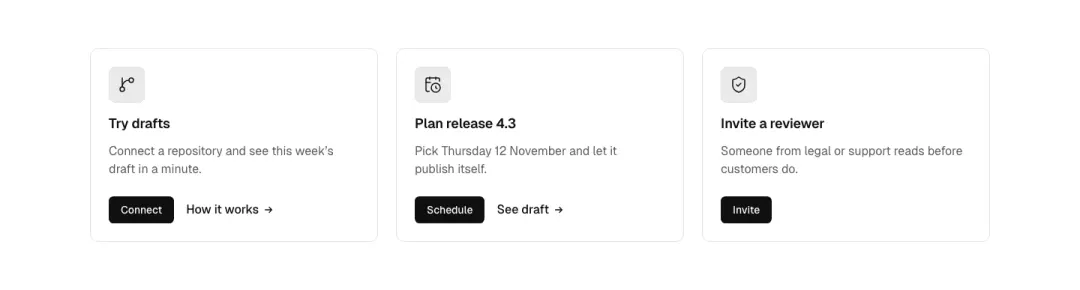
With an action
Icon, heading, text and a primary button, plus an optional text link beside it.
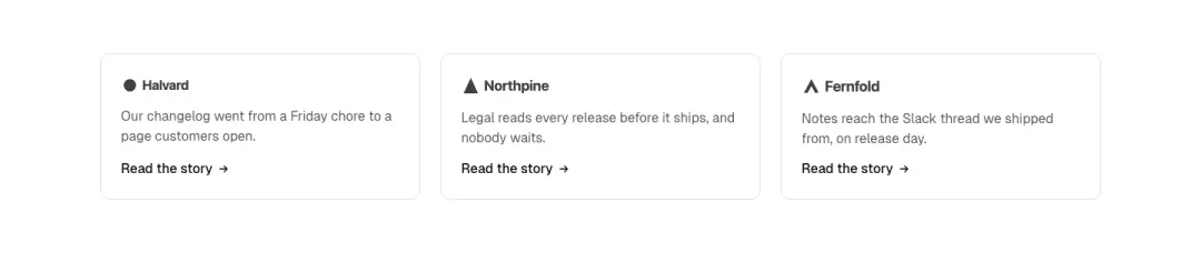
With a logo
A customer logo (drawn wordmark) on top, a one-line quote or summary and a text link to the story; three across.
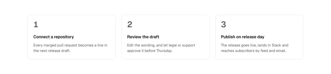
Numbered
A large step number, heading and text, no links; an ordered list of three.
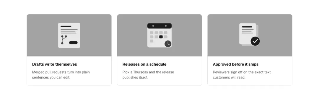
Illustration on top
A small drawn illustration on top, heading and text; three across.
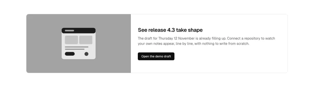
Illustration beside
A drawn illustration beside heading, text and a primary button: one wide story row.
Big figure
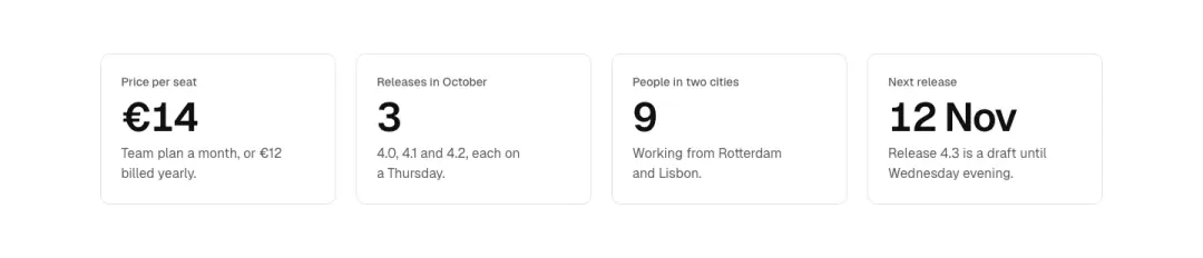
A large figure (price or stat) with a label and one line of context; four across, 2×2 at mid widths.
Plan card
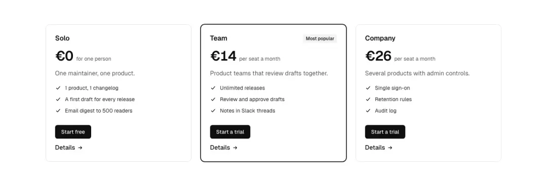
A pricing plan card: name, price per month, a short list of points with check icons, a primary button and a text link; three plans, the middle one marked.
Versus pair
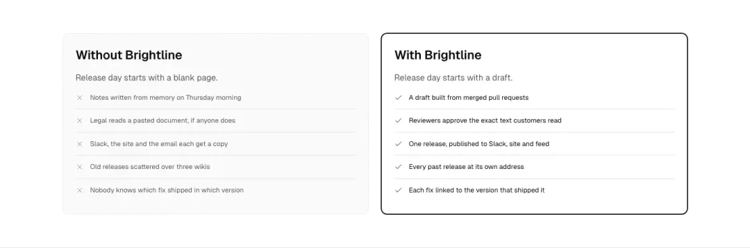
Two cards side by side, Without and With: a muted one with crossed rows and a highlighted one with check rows.
Contact channel
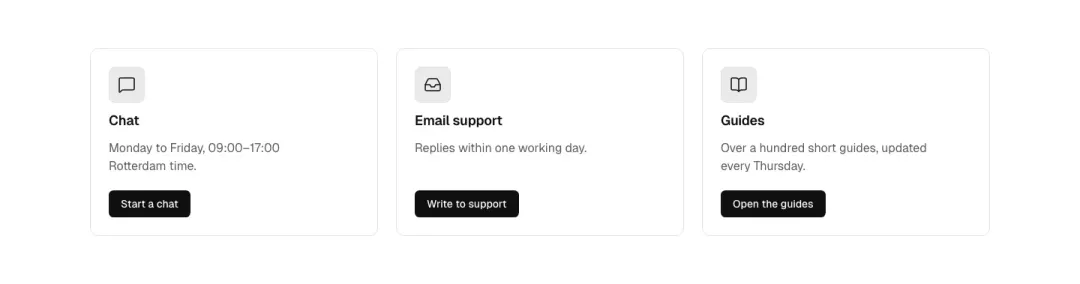
Icon, channel name, one line of detail (hours or number) and a primary button or text link; three across.
News with author
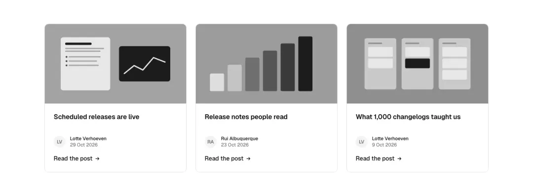
Picture, headline, a monogram author line with date and a read link; three across.
Article overlay
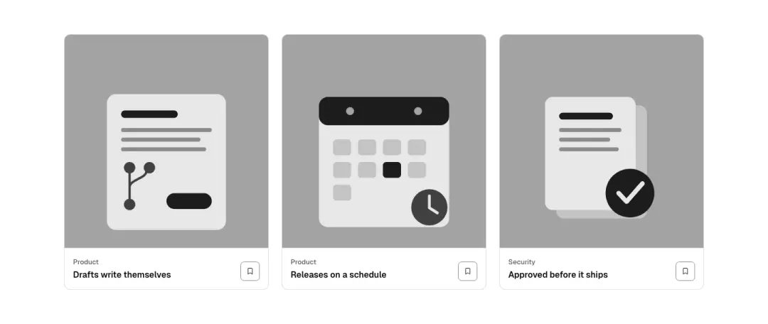
Full-bleed picture with a solid label panel at the foot: category, title and a bookmark icon button; the whole card links.
Link list card
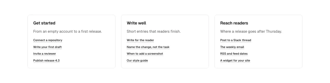
A headed card with a short list of underlined links; three cards across.
Tag chips
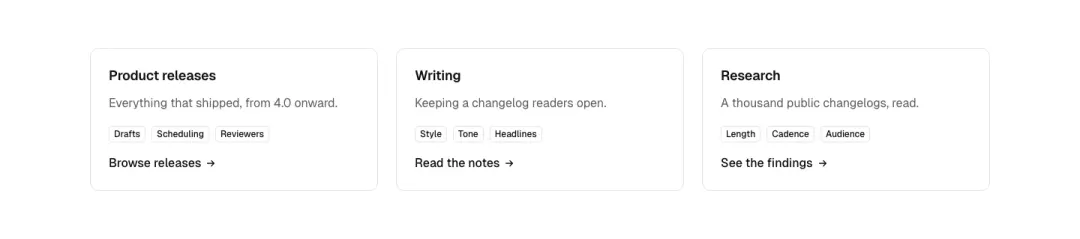
Heading, a line of text and a wrapping row of tag chips, with a text link at the foot.
Review card
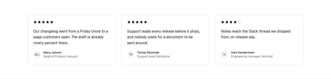
A star rating, a short quote, and a monogram name line; three across.
Benefits panel
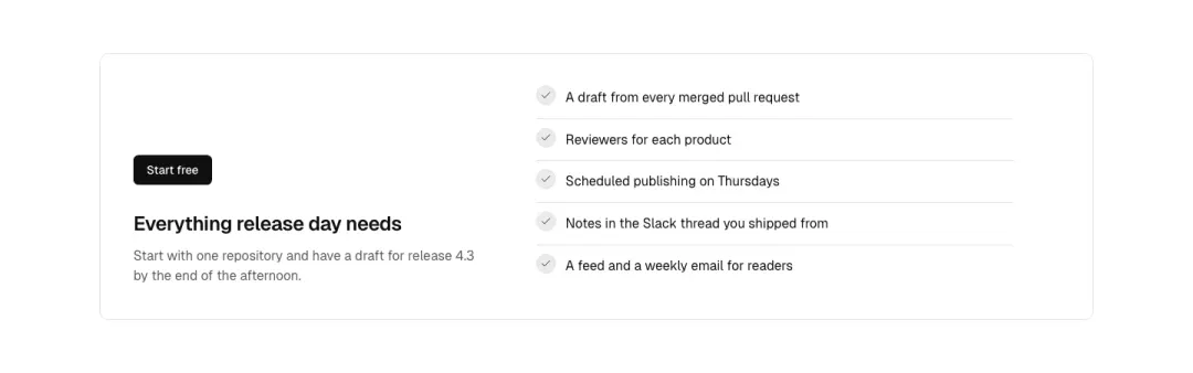
One panel: heading, five rows with check icons and a short line each, and a primary button under them.
Collection card 13 variants
Not measured as a section kind of its own in The UI Index yet.
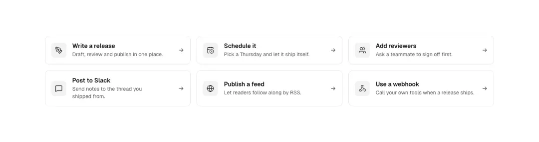
Link card
The whole card is one link: icon, title, a one-line description and an arrow that moves on hover.
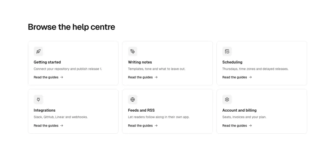
Topic grid
A grid of six icon topic cards with a title and a text link each, under a short section heading.
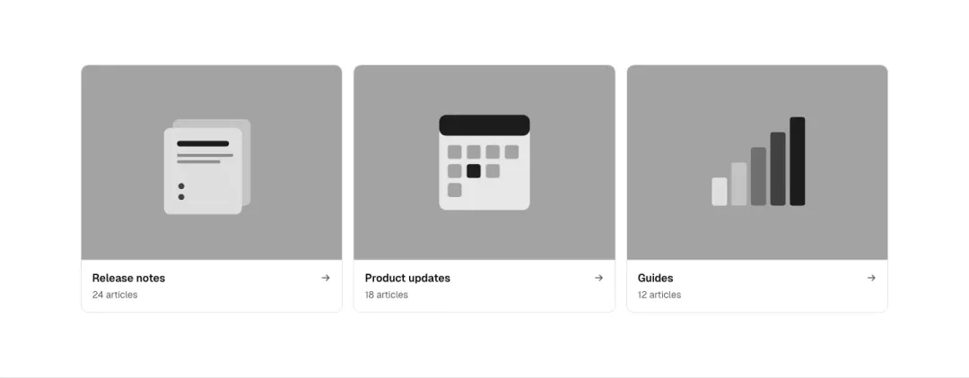
Picture tile
Category tile: picture with a caption and arrow beneath it; whole tile is the link.
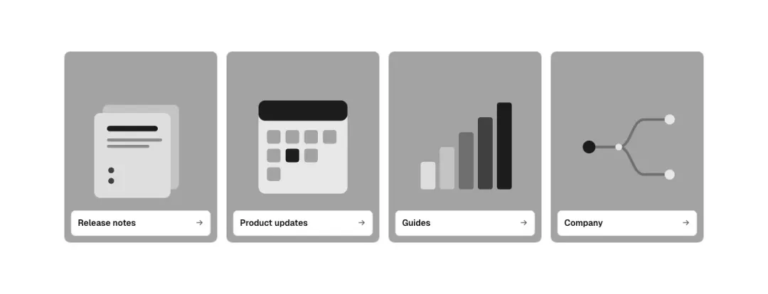
Caption over picture
Picture tile with the caption set on a solid panel over the picture; whole tile links.
Show all 13 variantsShow fewer
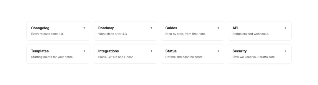
Text index
A four-column grid of text-only link cards: title and one line, a quiet border, no icons.
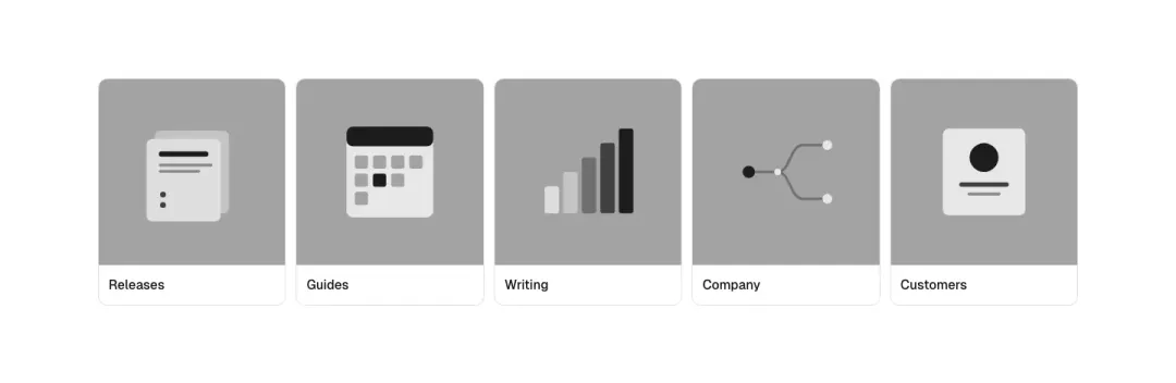
Picture strip
A ul row of five small picture tiles with a label each that scrolls sideways on mobile.
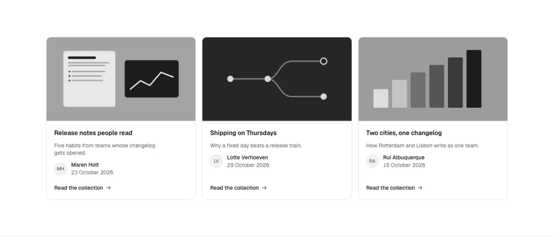
With a byline
Picture, title, a monogram byline (person and date) and a link: an editorial collection card.
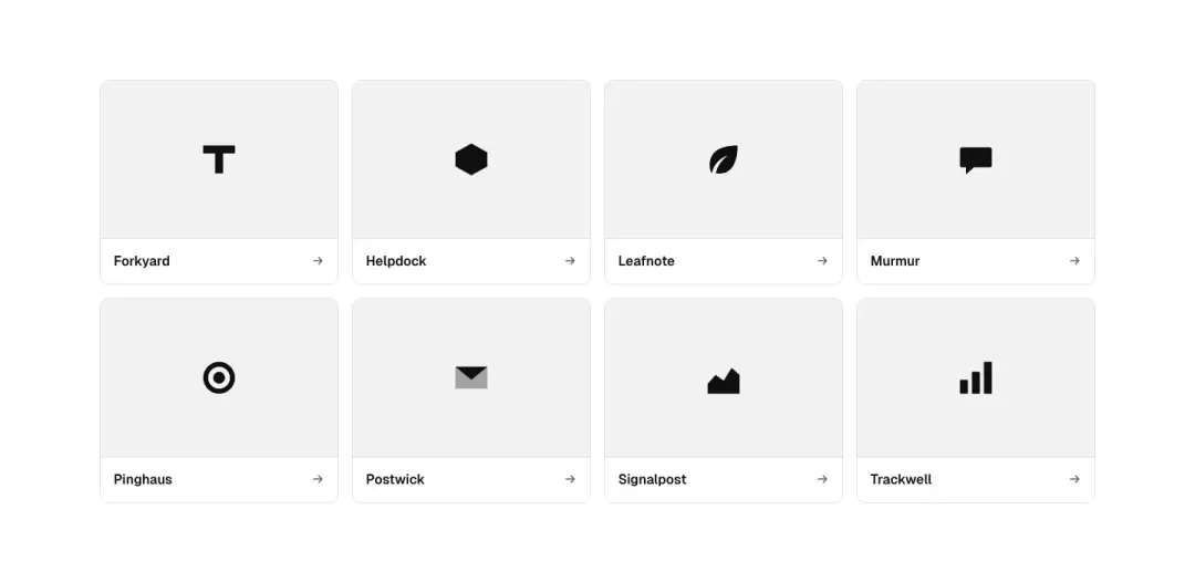
Logo tile
The whole tile links to a brand or integration: a drawn logo mark centred on a quiet surface with its name below; eight tiles, four across.
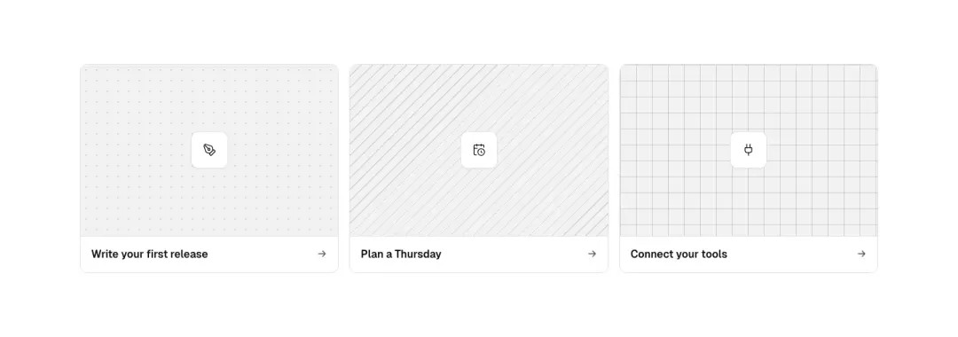
Illustrated tile
A tile with a patterned token illustration ground, a title and an arrow; whole tile links; three across.
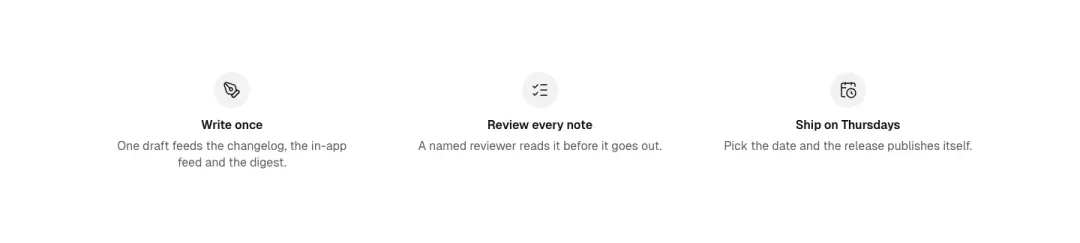
Icon pillars
A ul row of three or four centred icon pillars with a title and one line, no links, no borders.
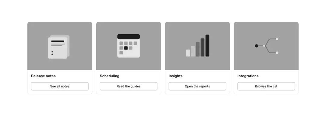
Photo with button
Four photo tiles, each with a title and an outline button below; 2×2 at mid widths.
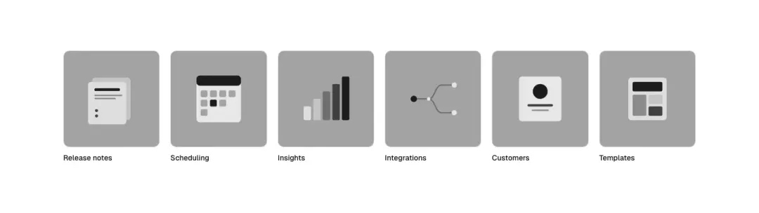
Photo shortcuts
A grid of square photo shortcuts with a label under each; whole tile links; six across, 3×2 on tablet.
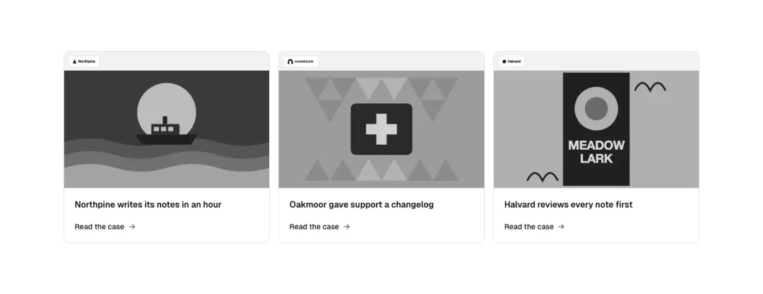
Case study tile
Photo on top with a logo mark over its lower corner, then the title and an arrow text link.
Hover card 6 variants
Not measured as a section kind of its own in The UI Index yet.
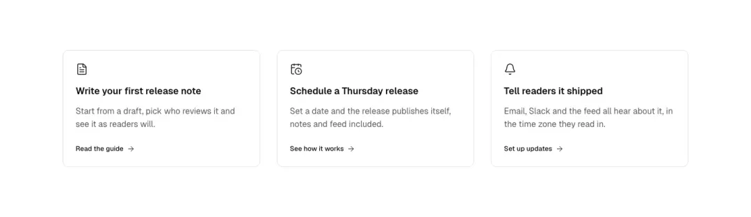
Lift and arrow
Icon, title, text; on hover and focus the card lifts and the arrow slides; the whole card is one link.
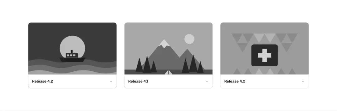
Reveal on hover
Picture tile; a description panel slides up on hover and on focus-visible; on touch it is always visible.
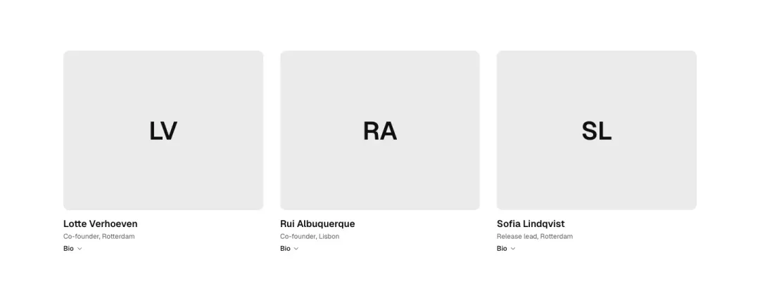
Portrait with bio
Portrait (monogram picture), name and role; a short bio shows on hover/focus; button element opens nothing, it is a disclosure.
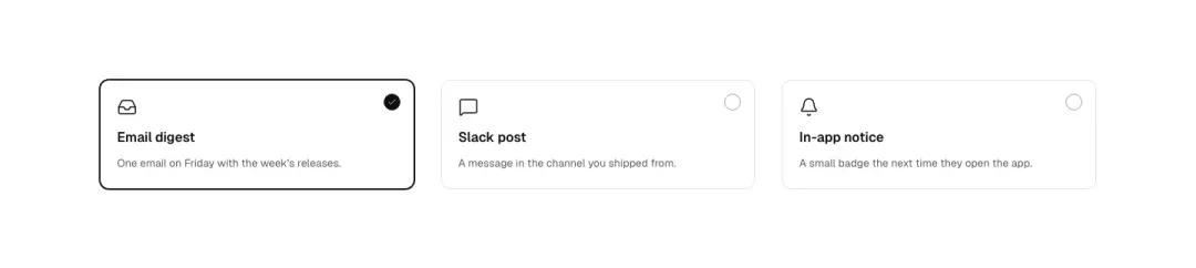
Selectable card
Button cards (aria-pressed) with icon, name and line; hover tint, a pressed state with a check; one row of three.
Show all 6 variantsShow fewer
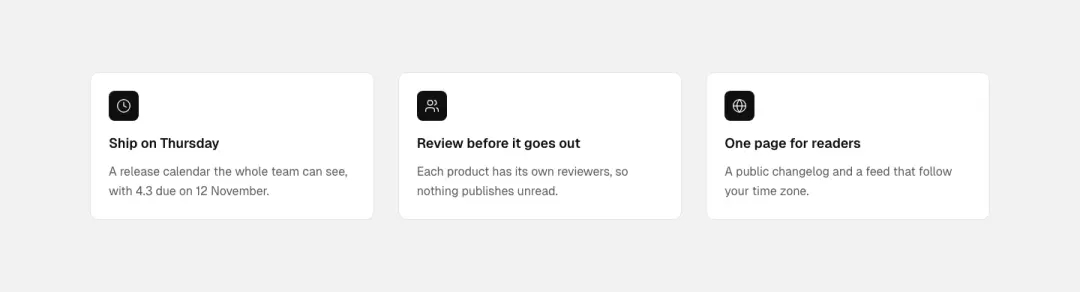
Tint fill
Benefit tiles: icon, heading, text; on hover the surface fills with the accent tint and the icon inverts.
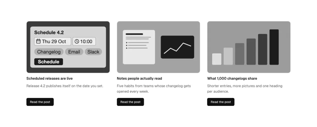
Picture zoom
Picture zooms slightly inside its frame on hover, with title, text and a button below.
Interactive · 6 blocks
Search 7 variants
Not measured as a section kind of its own in The UI Index yet.

Search field
A search input with a leading icon, a placeholder and a clear button; a label for screen readers.

Search launcher
A button styled as a search field with a keyboard hint (⌘K) that opens the search; demo shows it in a toolbar.
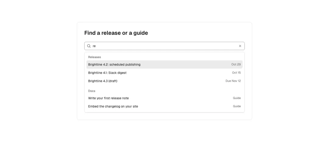
Suggestions
A combobox: field with a listbox of suggestions below, grouped (Releases, Docs), the active option highlighted; full keyboard (arrows, Enter, Escape).

Field and button
A wide search field with a primary search button beside it (stacks at 390).
Show all 7 variantsShow fewer

Scoped search
A search field with a scope select in front (All, Releases, Docs) and a toggle 'include drafts'.
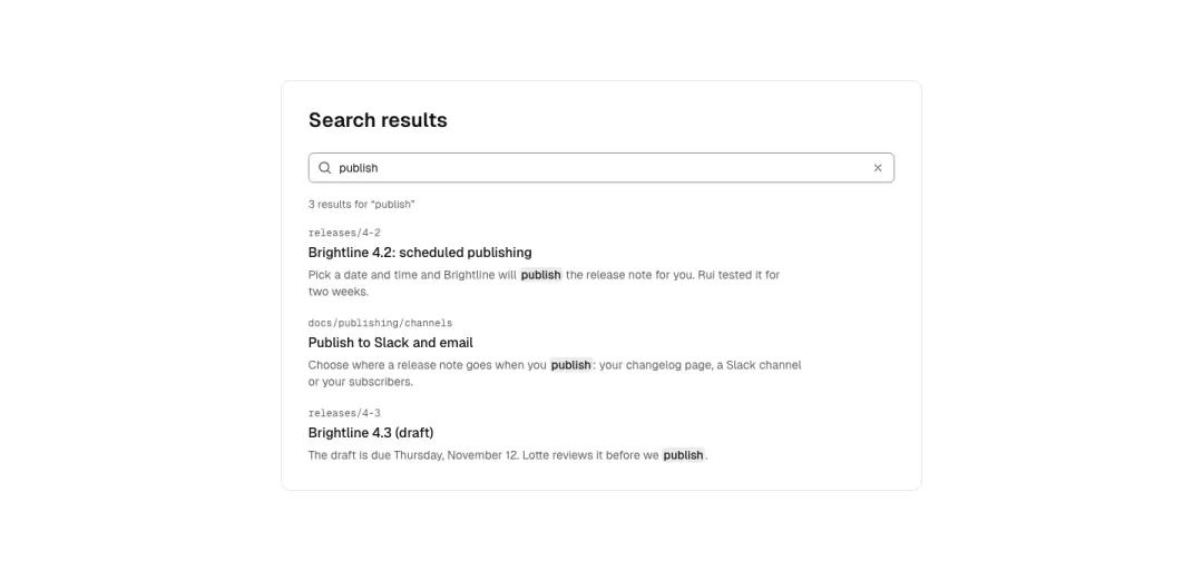
With results
A search field above a short results list with titles, snippets with the match marked, and a result count.
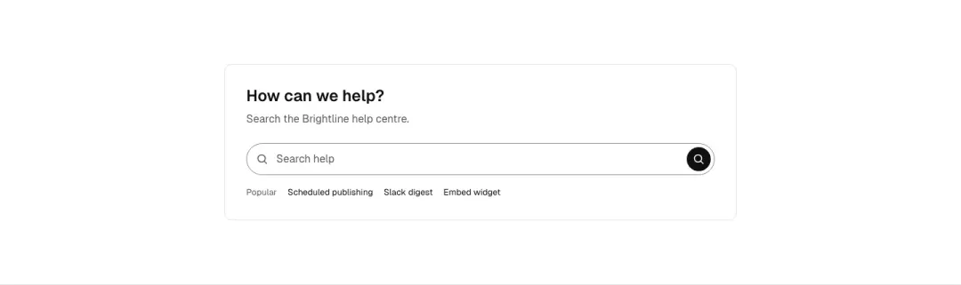
Search bar
One search field with a magnifier and a round or labelled button; header, help-centre and clearable variants.
Dialog 11 variants
Not measured as a section kind of its own in The UI Index yet.
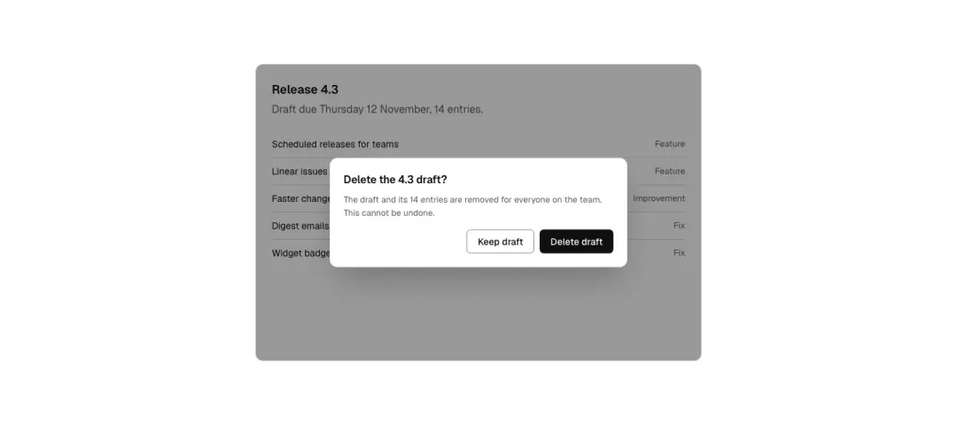
Modal
A confirm dialog shown open in the demo frame over a dimmed backdrop: title, one paragraph, cancel and primary buttons; real dialog element with focus trap and Escape.
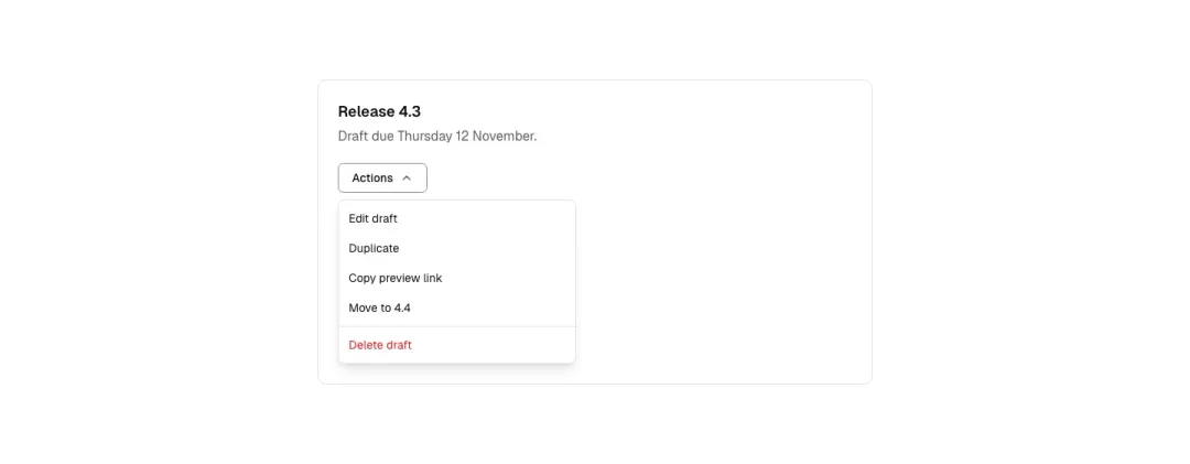
Dropdown menu
A button that opens a menu of text links with a divider and a destructive item; demo frame shows it open.
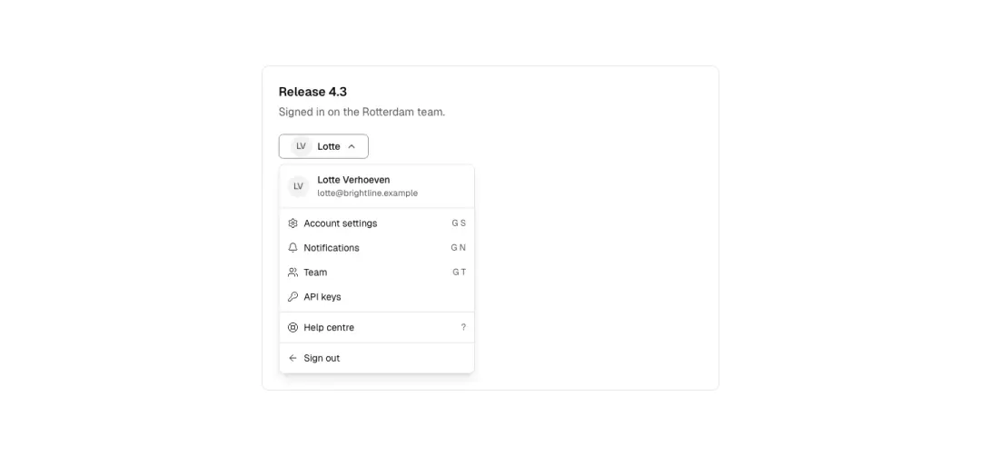
Menu with icons
An account menu: header with monogram and email, items with leading icons and shortcuts, sign-out at the bottom.
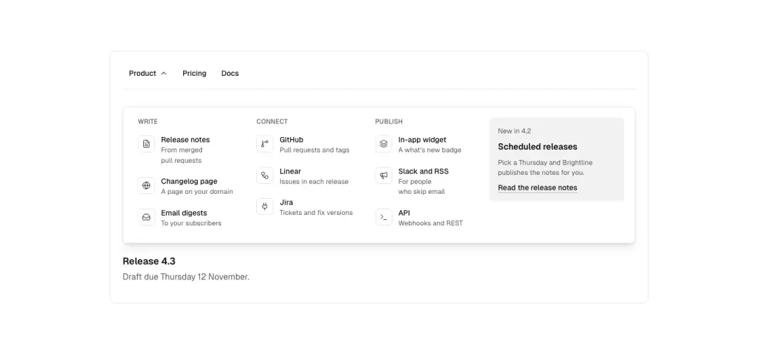
Mega panel
A wide panel from a nav item: three columns of links with icons and one-line descriptions, a featured card on the right.
Show all 11 variantsShow fewer
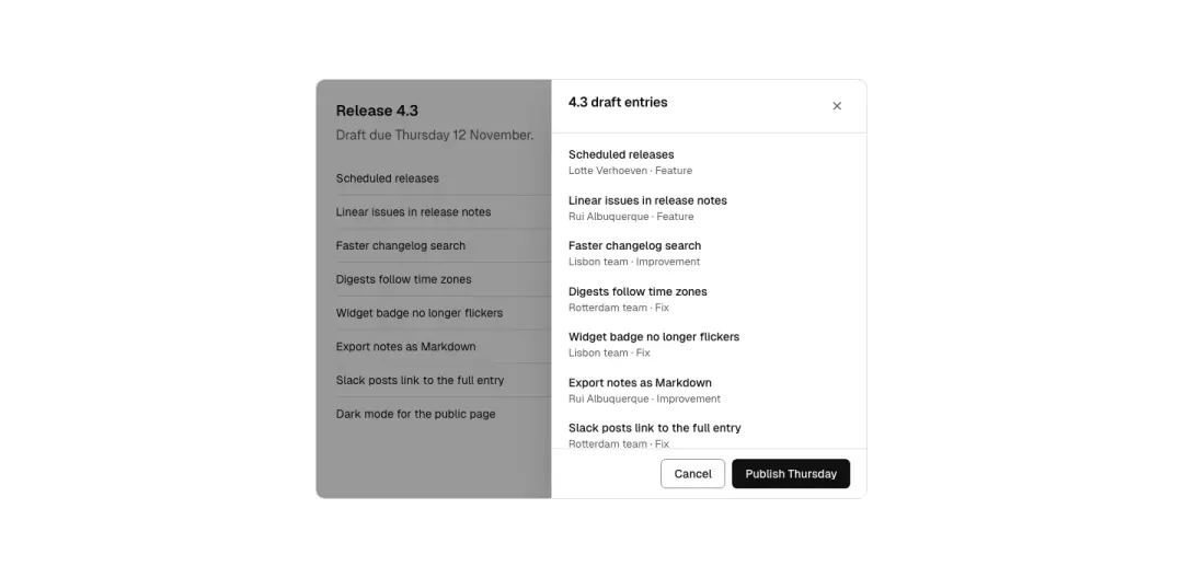
Side drawer
A side sheet from the right with a heading, close button, content and a sticky footer with actions.

Popover
A small popover anchored to a button with an arrow: a short text and a link, plus a dismiss.
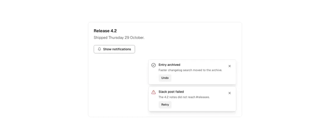
Toasts
A stack of notifications at the frame's corner: success with an undo button, an error with a retry, each with an icon and a close button; polite live region.

Split button
A primary 'Publish' button joined to a chevron button that opens a menu of publish options (schedule, save draft).
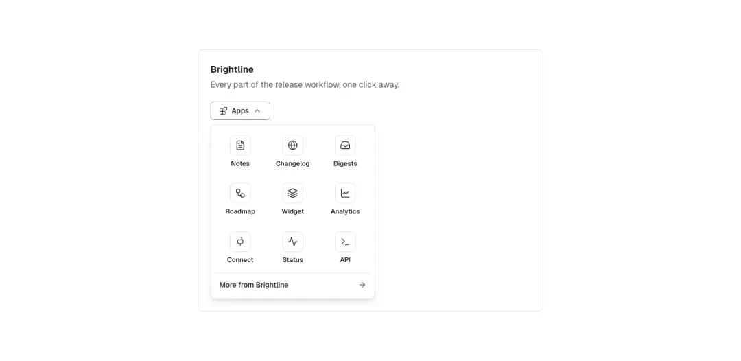
App switcher
A grid panel of product apps with icons from a launcher button, plus a 'more' link.
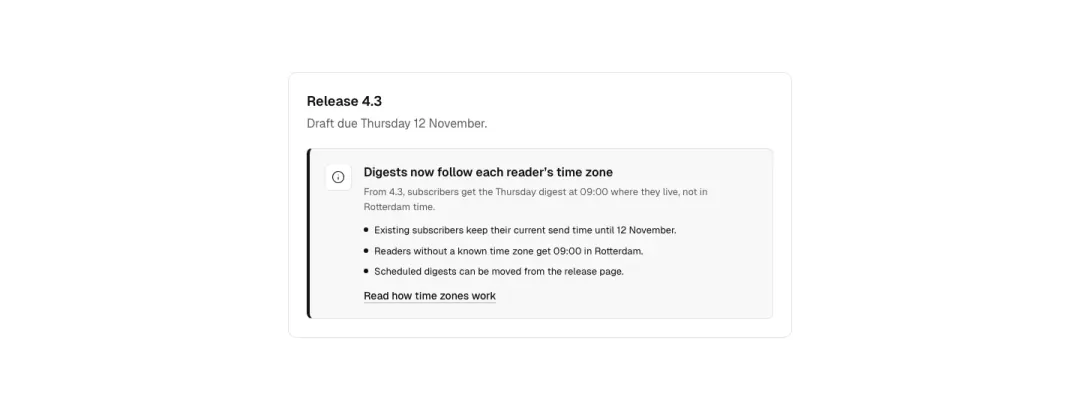
Callout
Notice callout or banner strip with icon, bullet list and link.
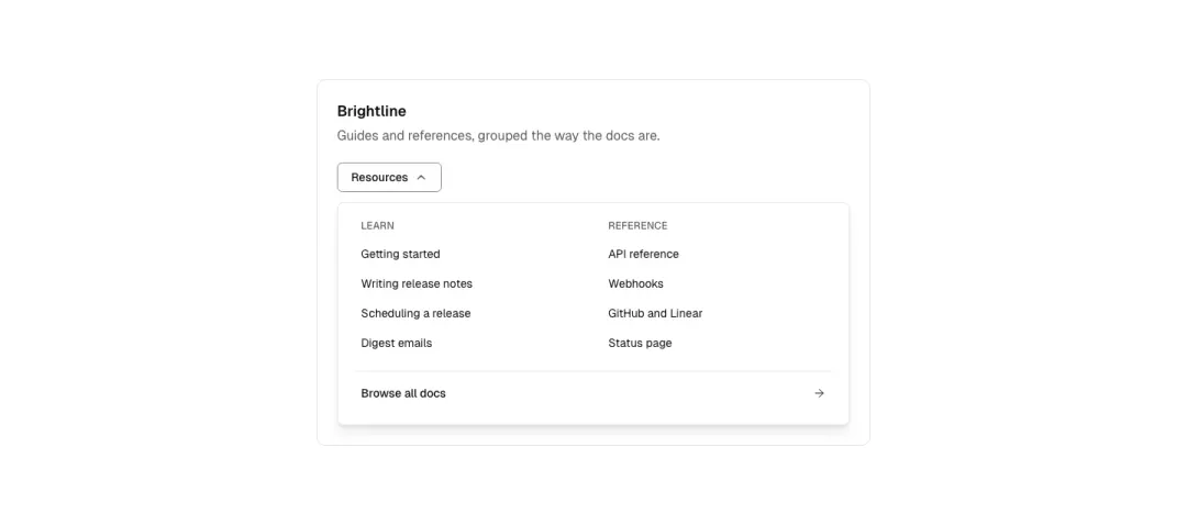
Link list panel
Mega-menu category link list or footer-style link column.
Sidebar navigation 9 variants
Not measured as a section kind of its own in The UI Index yet.
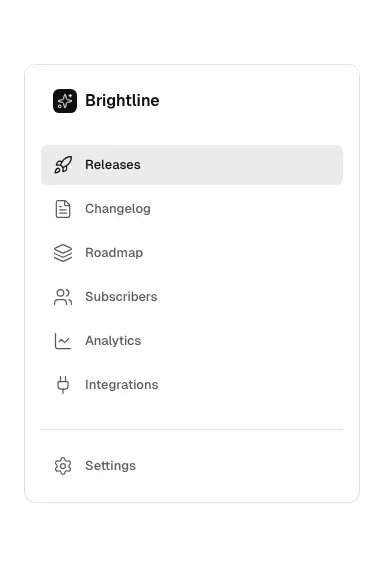
Icon list
An app sidebar: product mark, a list of links with icons, the current one marked, a settings link at the bottom.
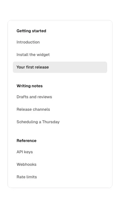
Grouped links
Text-only docs sidebar with group headings and the current page marked.
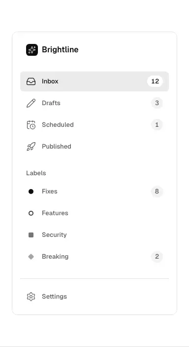
With counts
Links with icons and count chips (Inbox 12, Drafts 3), plus a small labels group with colour dots.
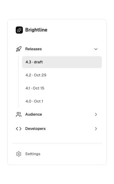
Collapsible groups
Groups that expand and collapse (disclosure buttons), nested links, one group open.
Show all 9 variantsShow fewer
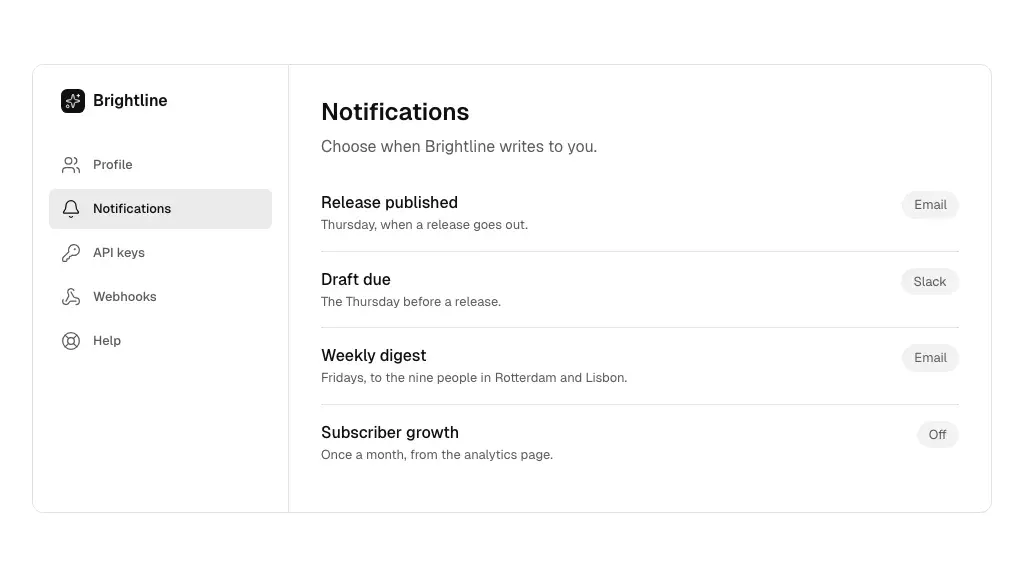
Beside content
The sidebar beside a page of content at 1440; at 390 it becomes a select or a disclosure above the content.
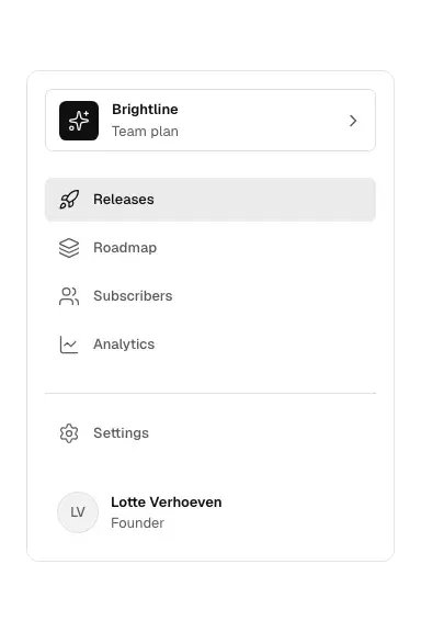
Workspace switcher
A workspace header with picture and switcher, the nav list, and a user row with monogram at the bottom.
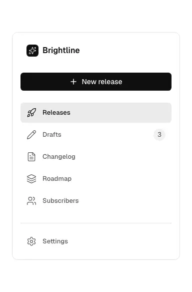
With a primary action
A sidebar with a full-width 'New release' button above the links.
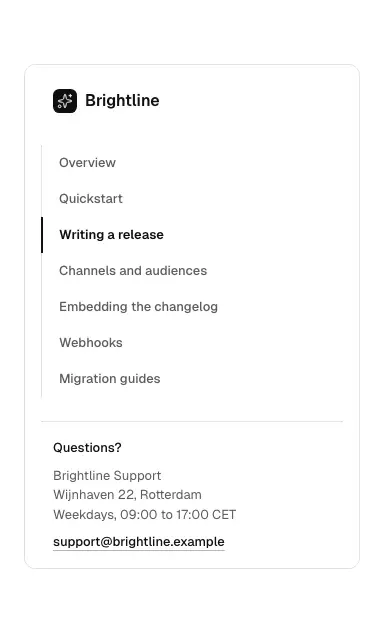
Docs link list
Plain link list or docs navigation with indicator, address/contact block or logo.
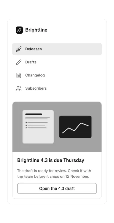
Promo box
A sidebar promo or caption box: heading, text, button, optional photo.
Pagination 6 variants
Not measured as a section kind of its own in The UI Index yet.
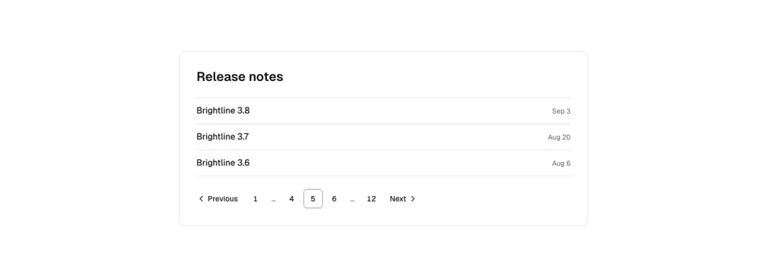
Numbered
Previous/next with icons, page numbers with ellipsis, the current one marked.
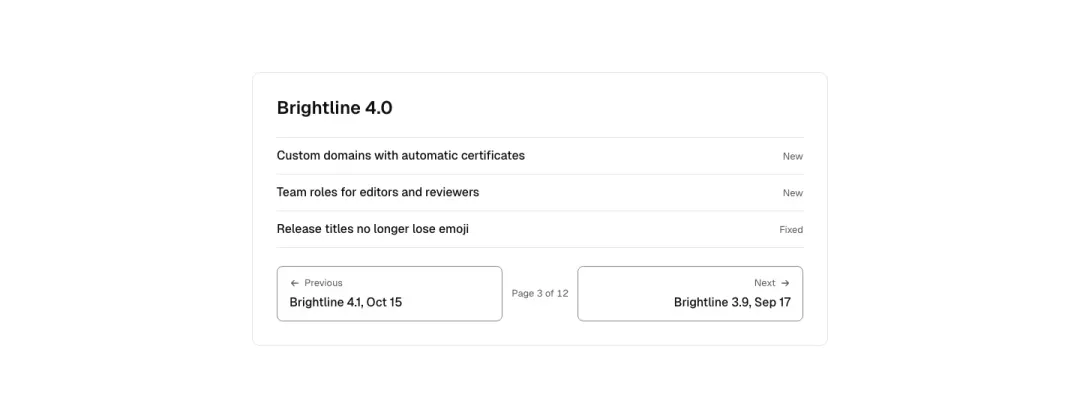
Previous and next
Previous and next links with the titles of the neighbouring pages and 'Page 3 of 12'.
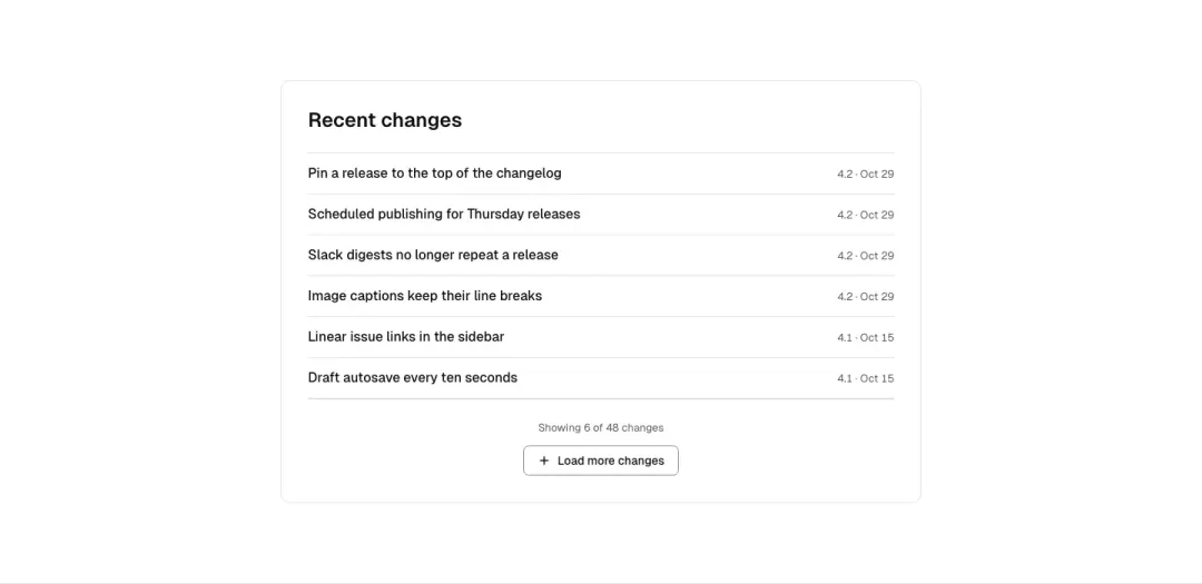
Load more
A list end with 'Showing 6 of 48' and a load-more button that appends items.
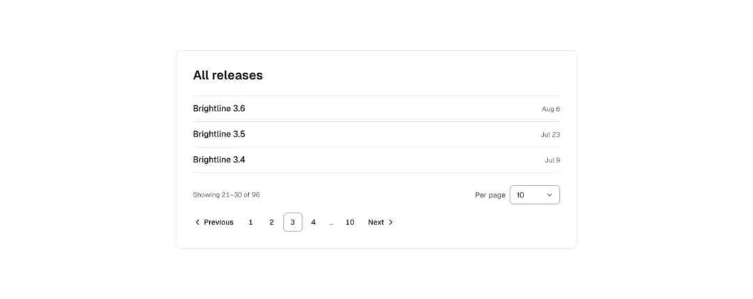
With page size
Results range and a page size select on one line, numbered pages under them.
Show all 6 variantsShow fewer
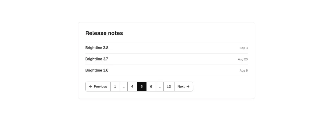
Pager
Page numbers with previous/next arrows or a next button, also a top results pager.
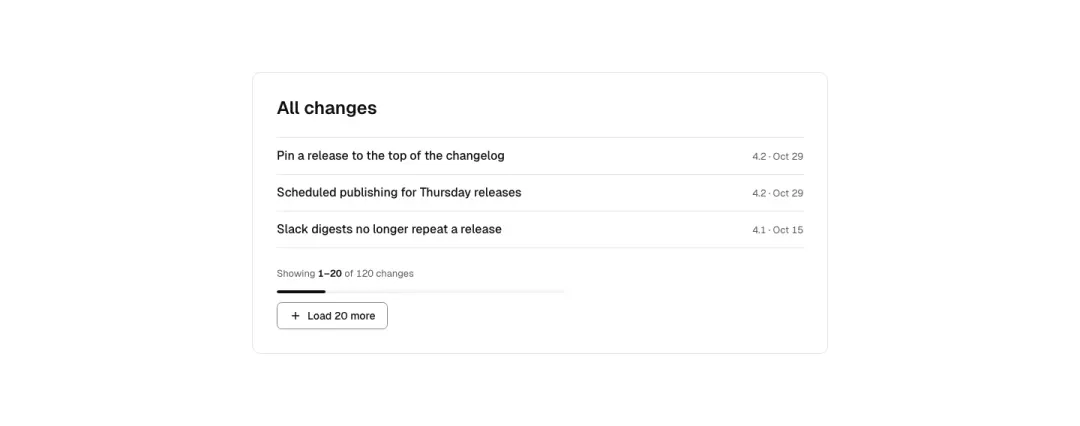
Results count and load more
A "1-20 of 3,038" counter above a load-more button.
Carousel 9 variants
Not measured as a section kind of its own in The UI Index yet.
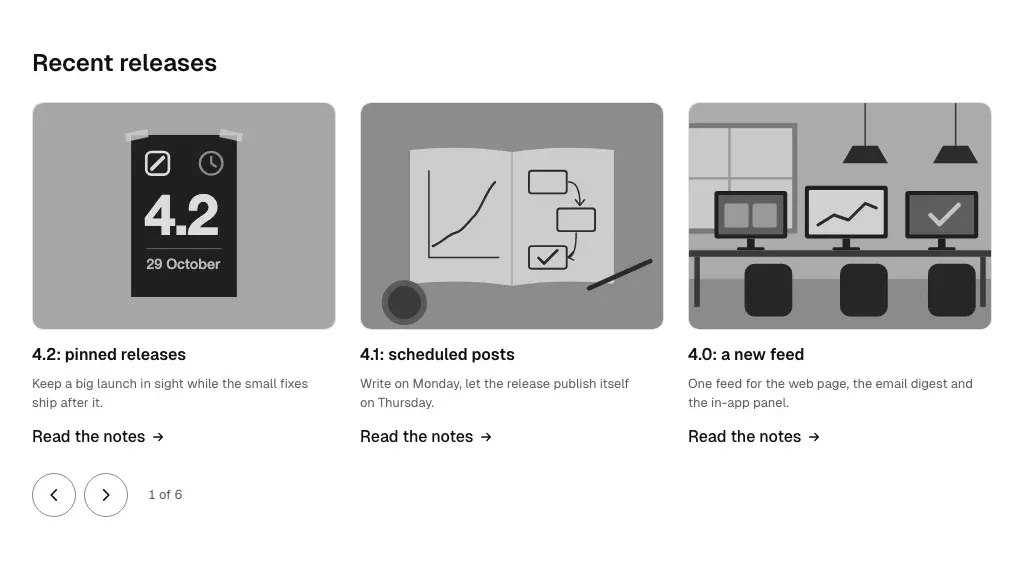
Card row
A row of image cards with titles and links that scrolls sideways, with previous/next buttons.
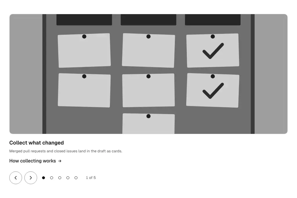
Slides with dots
One slide at a time with a caption, dots and arrows; keyboard arrows move between slides.
Logo strip
A slowly moving strip of customer logos that pauses on hover and respects reduced motion. Still grid (reduced motion): marks must not clip at 320–600 (min-w-0 on logo).
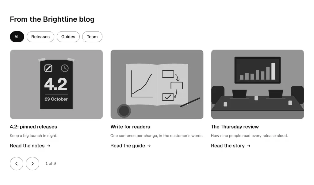
With filter chips
Category chips above a card carousel; a chip filters the cards.
Show all 9 variantsShow fewer
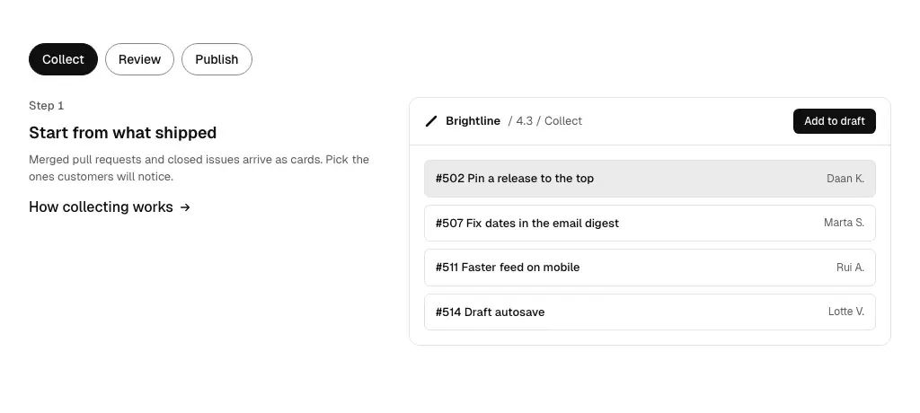
Feature slides
Slides that pair a drawn screen with a heading and short text, with step tabs.
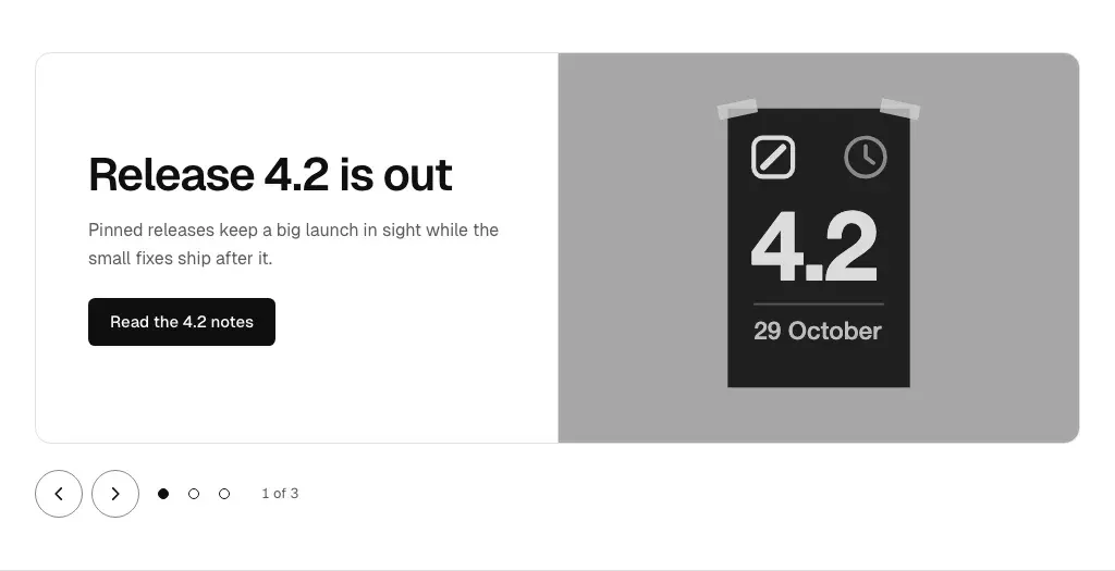
Hero slides
Large slides with a heading, a line and a primary button each, with arrows and dots below.
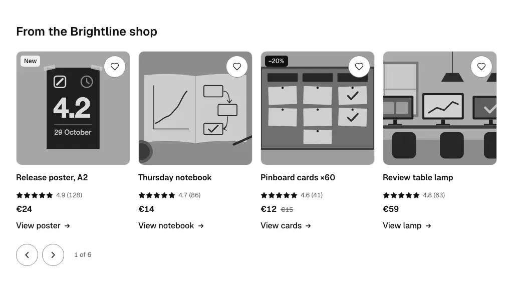
Product card row
Product cards with badge, rating, price and wishlist in a scrolling row with arrows.
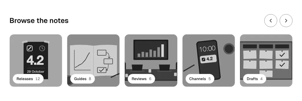
Image tiles
Image tiles or round category images with labels and a next arrow.
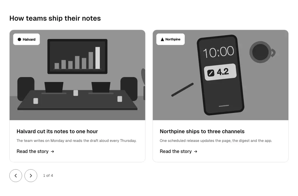
Photo cards
Photo cards with heading, caption and prev/next arrows or dots; case-study and feature slides.
Data table 6 variants
Not measured as a section kind of its own in The UI Index yet.
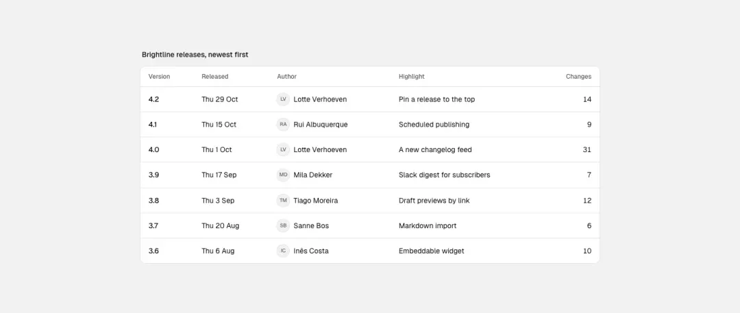
Simple table
A table of releases: version, date, author monogram, changes; a caption and sticky header; scrolls sideways at 390.
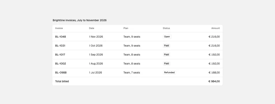
Amounts
A billing table with right-aligned tabular amounts, a total row and a status chip.
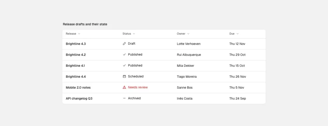
Status icons
A table with a status column of icons and labels, sortable column headers.
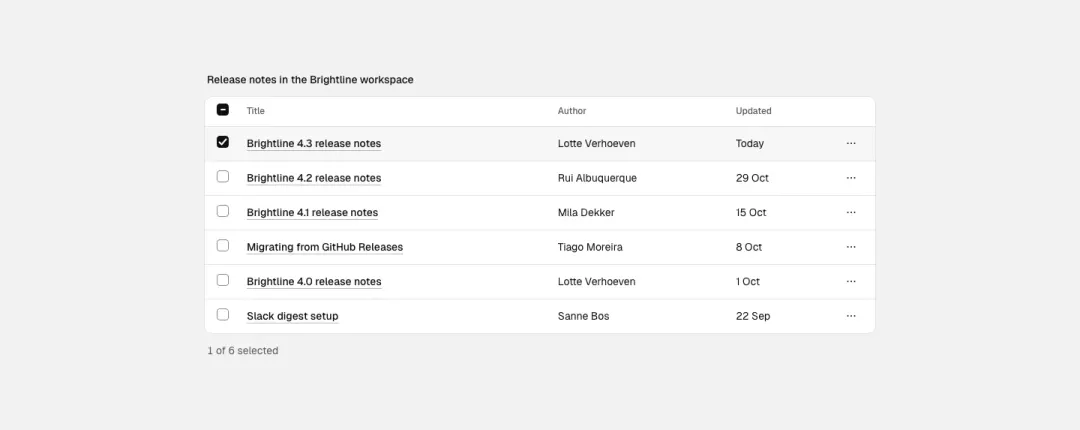
Row actions
A table with a checkbox column, row links and an actions menu button per row.
Show all 6 variantsShow fewer
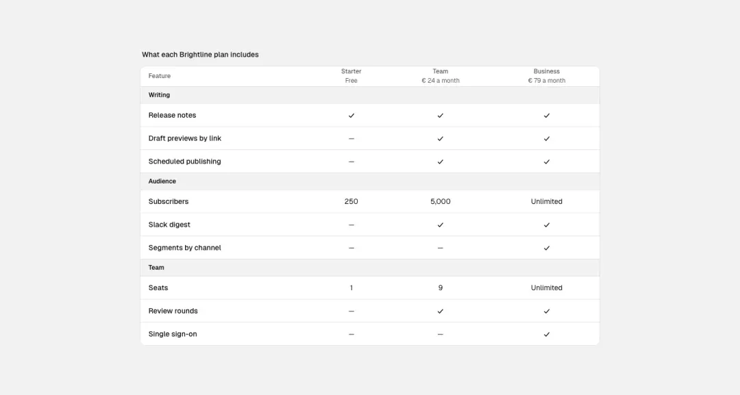
Comparison table
Feature or plan comparison with ticks and row groups.
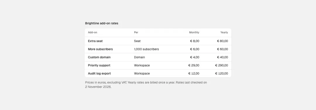
Rates table
Compact rates table with a disclaimer line.