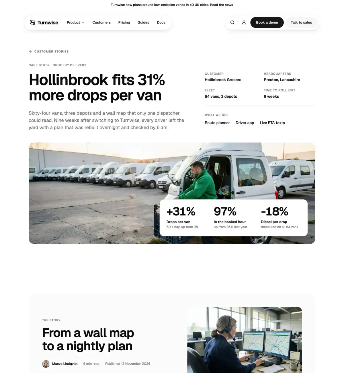
shadcn hero section examples: 12 layouts and when to use each
 Frank SpinFounder of themes.dev
Published 8 min read
On this page
The hero is the part of a page people judge in a few seconds, and it's also the part most templates get wrong in the same way: a centered headline, two buttons, a gradient blob and a screenshot floating in space. That layout is fine for a developer tool. It is the wrong shape for a restaurant delivery app, a holiday-home site or a municipality, and visitors notice.
This post walks through twelve hero layouts built on shadcn/ui, each for a different kind of business, with what makes it work and when to pick it. They're all ours: they come from the hero category of UI Pro, so we can show the screenshots and tell you exactly which shadcn components each one uses. At the end there's a table to compare them and a short list of other places to look for shadcn hero sections. How the components themselves work is in our shadcn/ui guide.
What a hero section needs to do#
Before the examples, the three things every good hero does, whatever it looks like:
- Say what it is in one line. "Dinner from local kitchens at your door" beats "The future of food". If someone has to read the paragraph to understand the headline, the headline isn't done.
- Offer the first real step. For a shop that's search. For a booking site it's the booking form. For software it's a trial or a demo. A "Learn more" button is rarely the first real step.
- Show the thing. A photo of the product, the place or the people, or a slice of the actual interface. Abstract shapes don't show anything.
Each layout below makes a different choice about which of those three gets the most room.
1. Split with a working form (Bordje)#
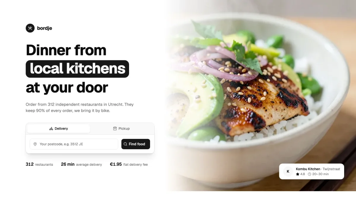
A food delivery service in Utrecht. The left half has the headline and an address field with Delivery and Pickup tabs; the right half is a photo that runs to the edge of the screen. Below the fold of the hero sit three numbers: restaurants, average delivery time, delivery fee.
Use it when the first thing a visitor does is type something: an address, a postcode, a date. Putting the form in the hero saves a click and tells people right away that the service covers them. shadcn parts: Button, Card, Input, Label, Tabs.
2. Full-bleed photo with search (Dunehouse)#
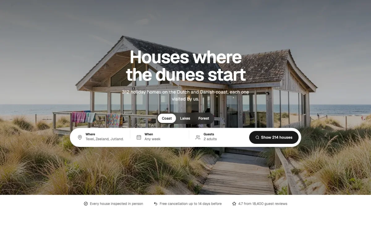
Holiday homes on the North Sea coast. One photo fills the screen and a single search bar (where, check-in, guests) sits on top of it. There's almost no copy, because the photo does the selling.
Use it when the product is a place or an experience and you have a photo good enough to carry the page. It falls apart with a mediocre stock photo, so be honest about that before you choose it. shadcn parts: Button, Input, Label, Separator.
3. Statement type, no image (Gantry)#
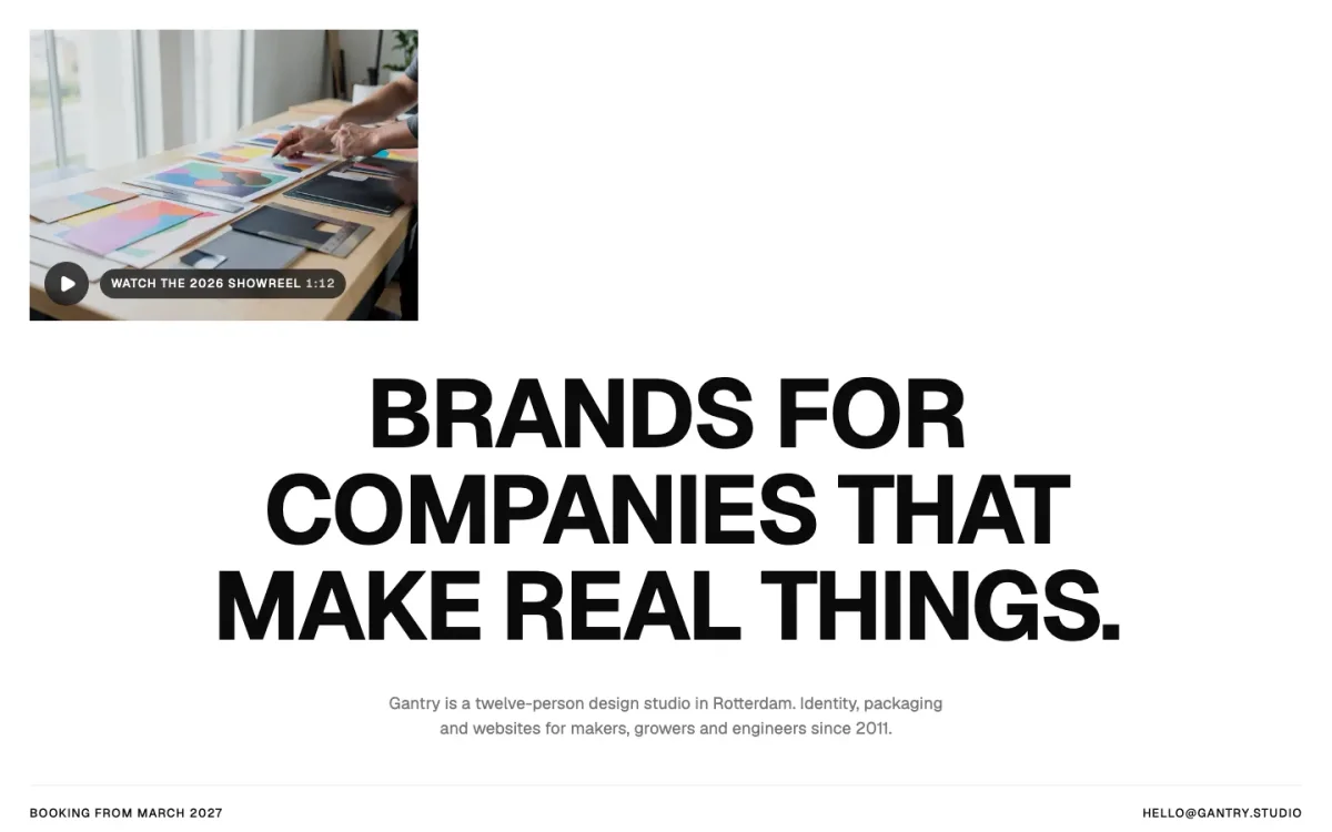
A twelve-person design studio. The hero is mostly one big uppercase sentence. A small video thumbnail of recent work sits in the corner, and the contact line is in the footer of the hero.
Use it when you're selling taste or a point of view (studios, agencies, consultancies) and the sentence is strong enough to stand alone. It's the cheapest hero to build and the hardest to write. It uses no shadcn components at all: it's type and spacing.
4. Wordmark and programme rows (Hallway)#
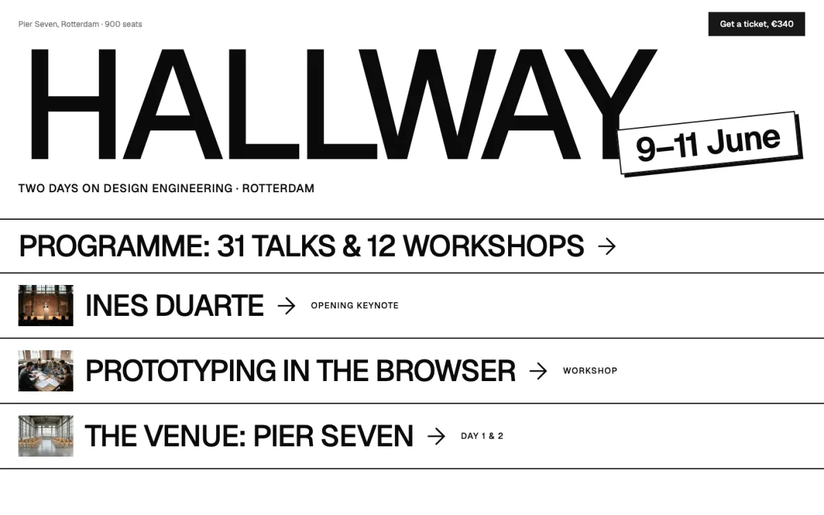
A design-engineering conference. The name is set huge, the dates sit on a tilted label, and the rest of the hero is a list of rows: the programme, the opening keynote, a workshop, the venue. Each row is a link.
Use it when people come back to the page with a specific question (who's speaking, where is it, when). Events, festivals and venues fit. The rows answer those questions before anyone scrolls. shadcn parts: Button.
5. Centered prompt box (Halyard)#
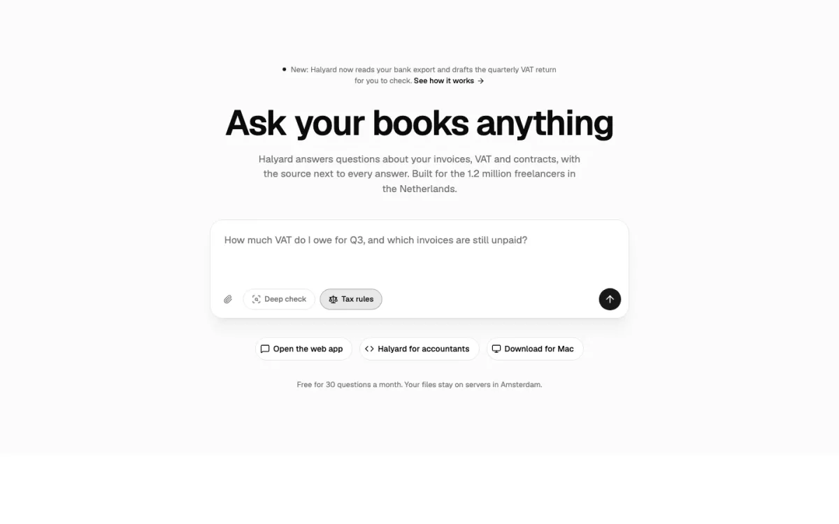
An AI assistant for freelancers' bookkeeping. The hero is the product's own input: a large text box with a few example questions under it, so the visitor can see what kind of thing to ask.
Use it when the product is a prompt. Showing the box is more honest than describing it, and the example questions do the job a feature list would otherwise do. shadcn parts: Button, Label, Textarea.
6. Split with code (Switchyard)#
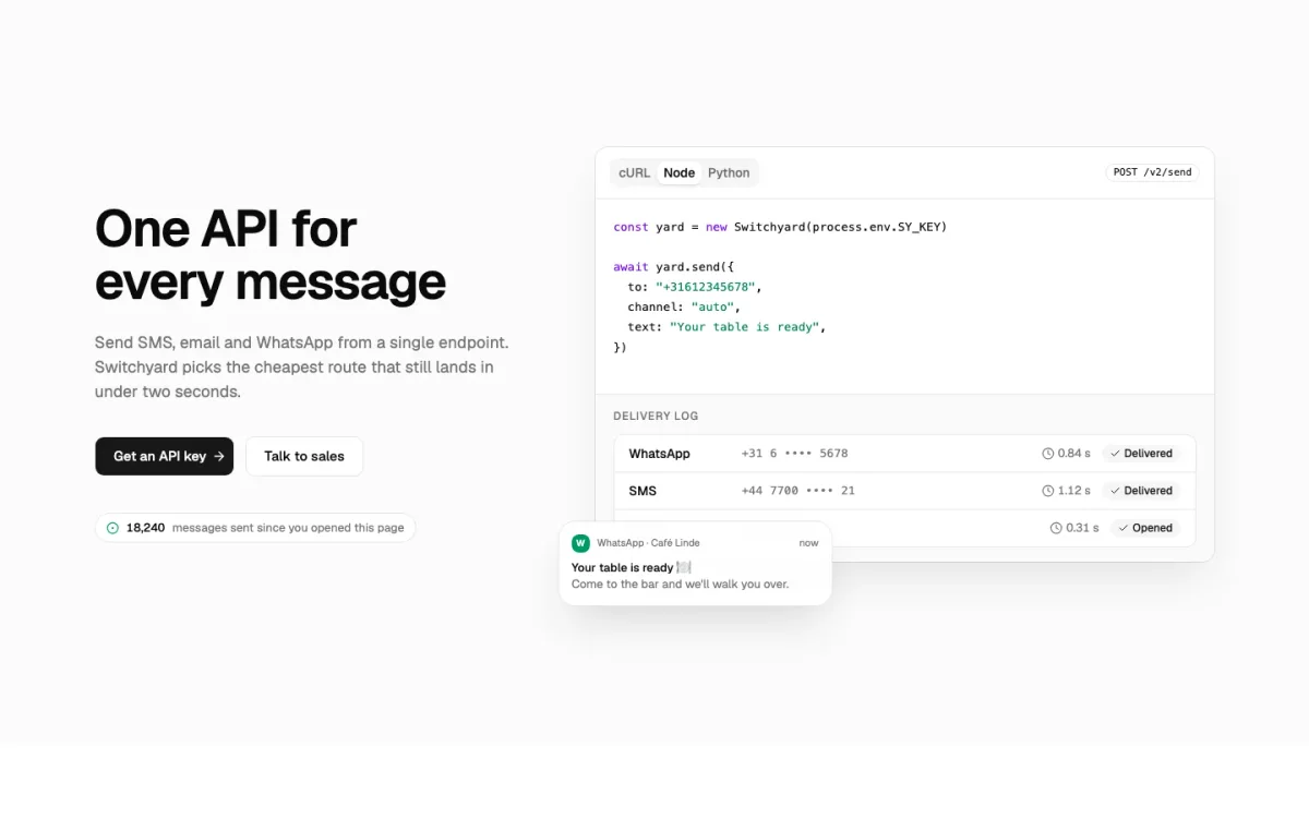
One API for SMS, email and WhatsApp. The right side is a code sample with language tabs and, under it, a small log of messages being delivered, so you see the request and the result.
Use it when your buyer is a developer and the API is the product. Show the shortest real call, not a pretend one, and make sure the tabs are keyboard-accessible (shadcn's Tabs are). shadcn parts: Badge, Button, Card, Tabs.
7. Centered with the product underneath (Tallyboard)#
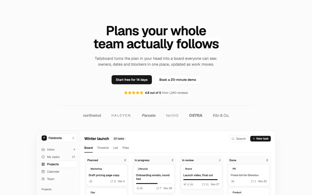
Project planning software. This is the classic SaaS hero done straight: centered headline, a trial button and a demo button, a logo row, and then the actual board, built from real components instead of a screenshot.
Use it when you sell software and the interface is your best argument. Building the preview from components means it stays sharp, follows dark mode and never goes out of date with a redesign. shadcn parts: Avatar, Badge, Button, Card, Progress, Separator.
8. Search band with a row of tiles (Kraam)#
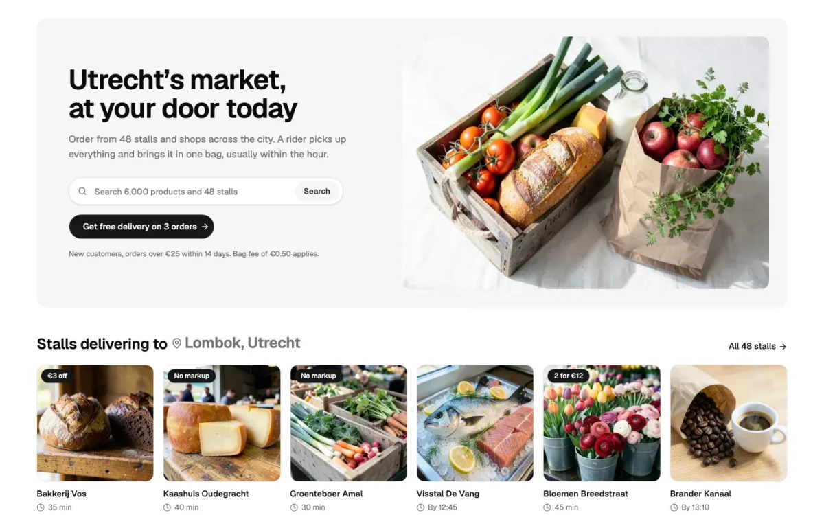
Grocery delivery from 48 market stalls. The top half is a headline, a search field and a photo; the bottom half is a row of the stalls, each with a photo and a name.
Use it when people come to browse a catalogue: shops, marketplaces, directories. The tiles let someone start without knowing what to search for. shadcn parts: Badge, Button, Input, Label.
9. Photo with a form card on top (Veldstroom)#
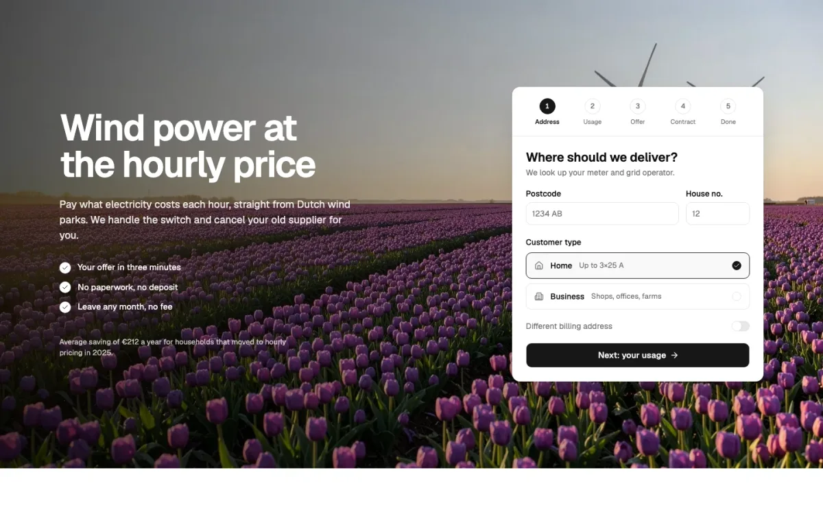
An energy supplier with hourly prices. A landscape photo fills the hero, the headline and a few bullet points sit on the left, and a white card on the right asks for a postcode and usage to give a price.
Use it when the conversion is a quote. The card keeps the form readable on any photo, and on a phone it simply stacks under the headline. shadcn parts: Button, Card, Input, Label, Switch.
10. Split with a trust strip (Quietroom)#
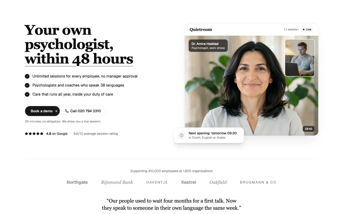
Online psychologists for employees. The left side has the promise and three short checks; the right side is a card with a psychologist's photo and their next free slot. A row of employer logos and a quote close the hero.
Use it when the decision is personal and people need to trust you before they click: health, legal, finance. A real face and a real next appointment do more than a claim. shadcn parts: Avatar, Badge, Button, Card, Separator.
11. Editorial grid (Rijnpost)#
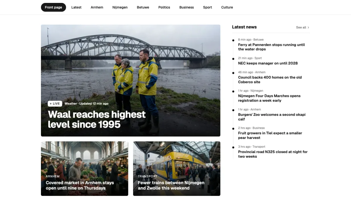
A regional newsroom. There's no headline about the company at all: the hero is the lead story, two smaller ones and a "Latest news" column.
Use it when the content is the product, as with news, magazines and busy blogs. Anyone arriving wants today's stories, not a pitch. shadcn parts: Badge.
12. Display type over a photo band (Tessel)#
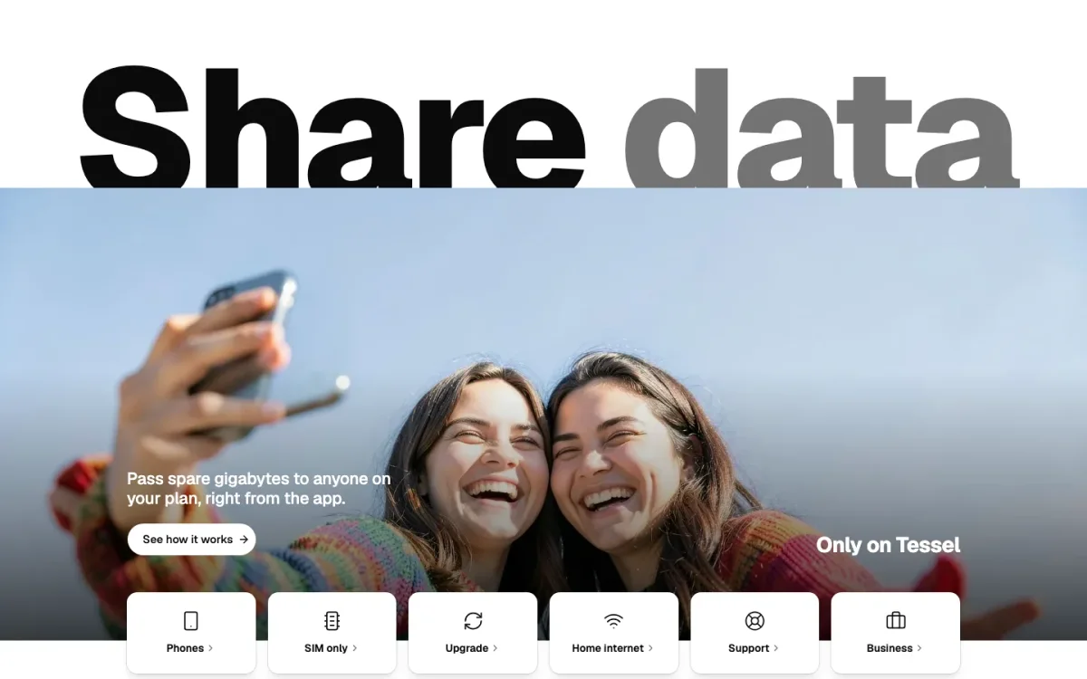
A mobile and home internet provider. Two words in very large type, a wide photo of people under them, and a row of quick links (check coverage, top up, upgrade) along the bottom for existing customers.
Use it when you're a consumer brand with a short message and lots of returning customers. The big type is the brand; the quick links serve the people who already pay you. shadcn parts: Button, Card.
The twelve layouts compared#
| Layout | Best for | First step in the hero | shadcn parts |
|---|---|---|---|
| Split with a form | Delivery, local services | Address field | Button, Card, Input, Label, Tabs |
| Full-bleed photo with search | Travel, stays, venues | Search bar | Button, Input, Label, Separator |
| Statement type | Studios, agencies | Contact line | None |
| Wordmark and programme | Events, festivals | Ticket button, programme rows | Button |
| Centered prompt | AI products | Prompt box | Button, Label, Textarea |
| Split with code | APIs, developer tools | Get an API key | Badge, Button, Card, Tabs |
| Centered with product | SaaS | Free trial | Avatar, Badge, Button, Card, Progress, Separator |
| Search band with tiles | Shops, marketplaces | Search, category tiles | Badge, Button, Input, Label |
| Photo with form card | Energy, insurance, quotes | Quote form | Button, Card, Input, Label, Switch |
| Split with trust strip | Health, legal, finance | Book a session | Avatar, Badge, Button, Card, Separator |
| Editorial grid | News, magazines | The lead story | Badge |
| Display type over photo | Consumer brands, telecom | Quick links | Button, Card |
Tips for building your own#
- Pass the words and photos in as props. Write the hero as a component that takes its headline, text, image and buttons as props. Then the same layout works for the next project, and nobody has to edit JSX to change a sentence.
- Keep it a server component where you can. Most heroes don't need state. Only the parts that do (tabs, a carousel, a form with validation) need
"use client", or aclient:directive if you use them as islands in Astro. - Give the photo a real
altand real dimensions. Setwidthandheighton the image so the page doesn't jump while it loads, and load the hero image eagerly: it's usually the largest thing on the screen. - Check it at 390 pixels wide. A split hero becomes a stack on a phone. Decide what comes first in the stack (usually the headline and the form, then the photo) instead of letting the order fall out of the markup.
- Watch the contrast on photos. Text over a photo needs a scrim, a card or a quiet part of the image behind it. Check the worst spot, not the average.
Where to find more shadcn hero sections#
We have a free hero in the free library (MIT licence, free account needed to install), and the twelve above plus 24 more are in UI Pro, from €199 once. Each installs with the shadcn CLI into your own components/ folder; all our shadcn hero sections are on one page.
Other libraries have hero sections too, in very different styles. Our comparison of shadcn block libraries lists them with their prices and licences, and if you're putting a whole page together, shadcn landing page templates covers complete pages rather than single sections.
FAQ#
Does shadcn/ui have a hero component?
No. shadcn/ui ships primitives such as Button, Card, Input and Tabs, and its blocks page focuses on app pieces like dashboards, sidebars and login screens. A hero section is something you build from those primitives or install from a block library.
How do I add a hero section to a shadcn/ui project?
Either write it yourself as a component using shadcn's Button and your own layout, or install a ready block with the shadcn CLI, for example npx shadcn@latest add followed by the block's registry URL. The block lands in your components folder as source code you can edit.
What is the best hero layout for a landing page?
The one that puts your visitor's first real step in view. For software that's usually a centered or split hero with the product shown underneath; for a shop it's search; for a booking or quote it's the form itself. The layout follows from what people came to do.