Components · Display
Story card
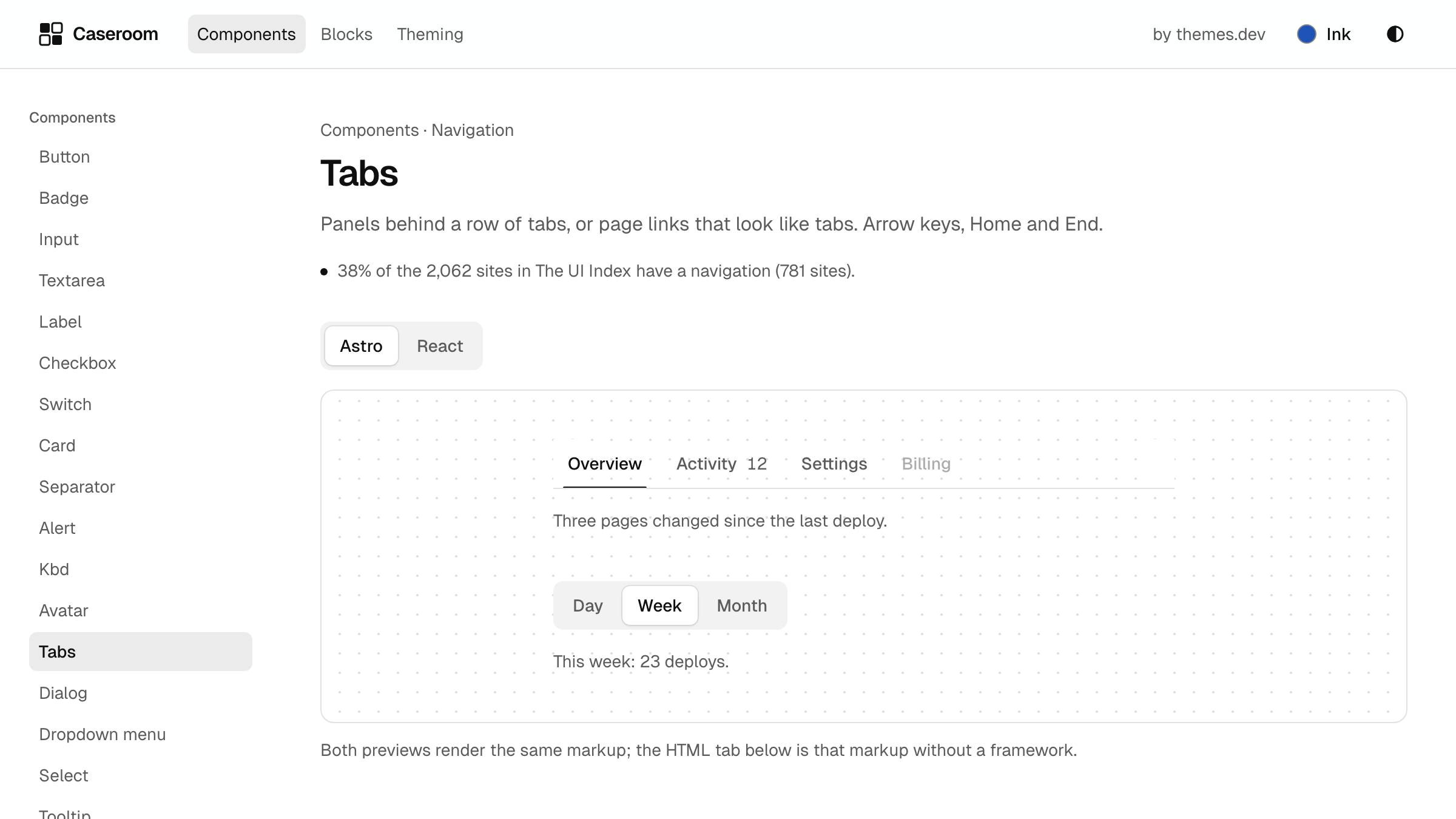
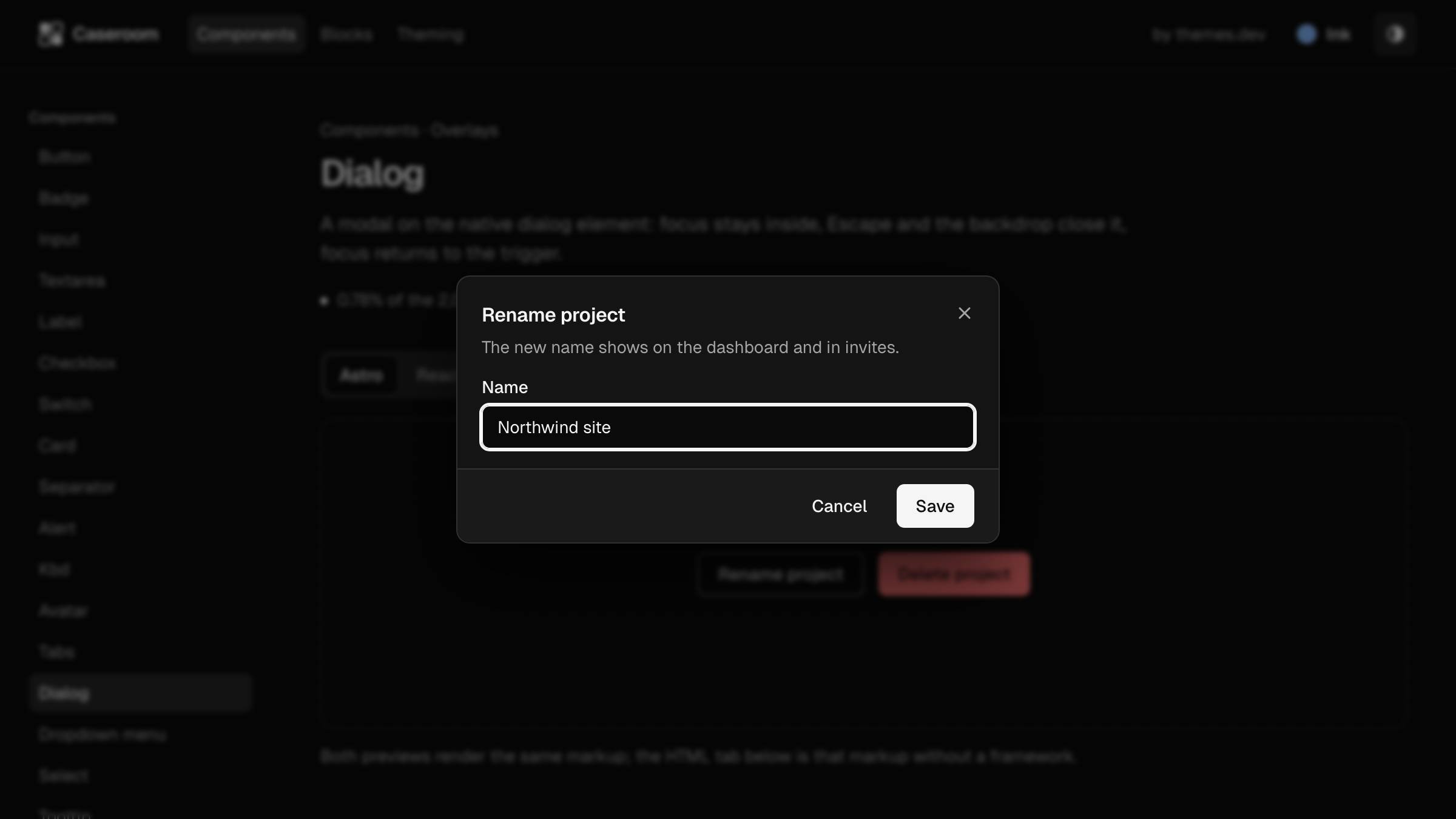
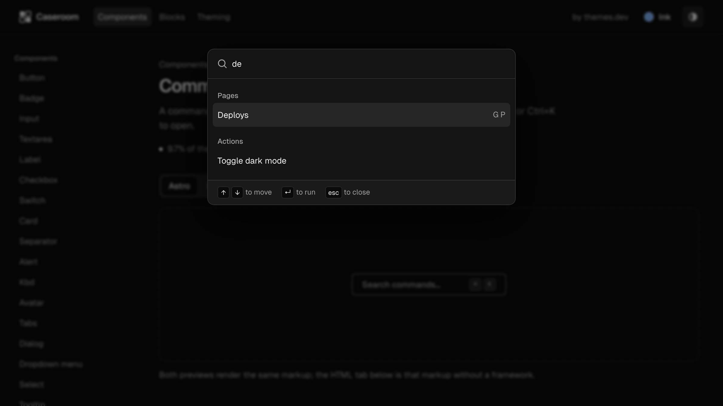
Picture, kicker, the title as the one link, a line and the meta; standard, compact, wide and feature.
74% of the 2,073 sites in The UI Index have a card (1,540 sites).
Data
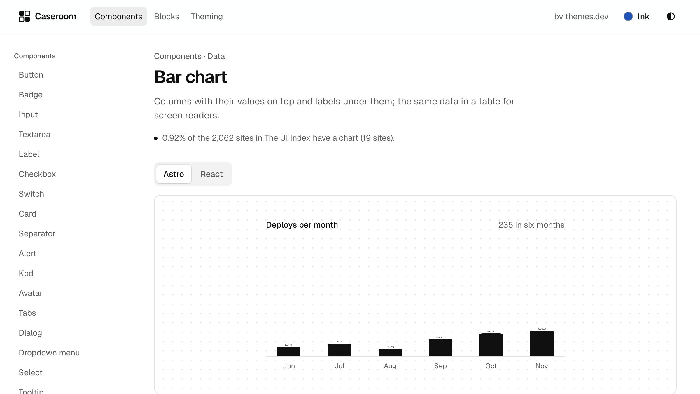
Charts you can read without colour
Values on the bars, and a table for screen readers.
Nov 2 · 5 min
Data
Charts you can read without colour
Values on the bars, and a table for screen readers.
Nov 2 · 5 min
Both previews render the same markup; the HTML tab below is that markup without a framework.
Install
- React
- npx shadcn@
latest add https:// www.themes.dev/ ui/ r/ story-card.json - Astro
- npx shadcn@
latest add https:// www.themes.dev/ ui/ r/ astro/ story-card.json
Or copy the files below into your project. They need clsx, tailwind-merge, and the themes.dev UI theme. The HTML needs only the compiled CSS.
import { cn } from '@/lib/utils';
import { story, storyCard, type StoryContent, type StoryVariant } from './story-card.variants';

export type StoryCardProps = StoryContent & { variant?: StoryVariant; className?: string };

/** A story card: picture, kicker, the title as the one link (the whole card is the target), a line and the meta. */
export function StoryCard({ title, href, kicker, description, meta, image, variant = 'standard', className }: StoryCardProps) {
  return (
    <article className={cn(storyCard({ variant }), className)}>
      {image && <div className={cn(story.media, story.mediaRatio[variant])}><img src={image.src} alt={image.alt} loading="lazy" decoding="async" className={story.img} /></div>}
      <div className={story.body[variant]}>
        {kicker && <p className={story.kicker}>{kicker}</p>}
        <h3 className={story.title[variant]}><a href={href} className={story.link}>{title}</a></h3>
        {description && variant !== 'compact' && <p className={story.description}>{description}</p>}
        {meta && <p className={story.meta}>{meta}</p>}
      </div>
    </article>
  );
}import { cva, type VariantProps } from 'class-variance-authority';
/** A story card (the most common card in The UI Index): a picture, a kicker (the topic, in words), a title that is
* the link, a line, and the meta. The whole card is the target (the title's link stretches over it), so there is
* one link per card. standard: picture on top. compact: a small picture beside the text. wide: picture beside the
* text from a wide container. feature: a larger title, for the lead story. */
export const storyCard = cva('group relative isolate grid overflow-hidden rounded-xl border bg-card text-card-foreground transition-[border-color,box-shadow] hover:border-foreground/30 hover:shadow-md has-[a:active]:bg-pressed/40 @container', {
variants: {
variant: {
standard: '',
compact: 'grid-cols-[auto_1fr] items-center gap-0',
wide: '@xl:grid-cols-[1.2fr_1fr]',
feature: '',
},
},
defaultVariants: { variant: 'standard' },
});
export const story = {
media: 'relative overflow-hidden bg-muted',
mediaRatio: { standard: 'aspect-[16/9]', compact: 'my-3 ml-3 size-20 shrink-0 rounded-lg border', wide: 'aspect-[16/9] @xl:aspect-auto @xl:h-full', feature: 'aspect-[16/9]' },
img: 'size-full object-cover transition-transform duration-500 group-hover:scale-[1.03] motion-reduce:transition-none',
body: { standard: 'flex flex-col gap-2 p-5', compact: 'flex flex-col gap-1 p-4', wide: 'flex flex-col justify-center gap-2 p-5 @xl:p-8', feature: 'flex flex-col gap-3 p-6' },
kicker: 'text-xs font-medium text-muted-foreground',
title: { standard: 'text-lg leading-snug font-semibold tracking-[-0.02em] text-balance', compact: 'text-sm leading-snug font-semibold text-balance', wide: 'text-xl leading-snug font-semibold tracking-[-0.02em] text-balance', feature: 'text-2xl leading-tight font-semibold tracking-[-0.03em] text-balance @md:text-3xl' },
// The title's link stretches over the card (after:inset-0); the focus ring stays on the title itself.
link: 'rounded-sm underline decoration-transparent underline-offset-4 transition-[text-decoration-color] after:absolute after:inset-0 after:z-10 after:rounded-xl group-hover:decoration-foreground/40 hover:decoration-foreground active:bg-accent active:decoration-2',
description: 'text-sm text-pretty text-muted-foreground',
meta: 'mt-auto pt-2 text-xs text-muted-foreground tabular-nums',
};
export type StoryVariant = NonNullable<VariantProps<typeof storyCard>['variant']>;
export type StoryContent = { title: string; href: string; kicker?: string; description?: string; meta?: string; image?: { src: string; alt: string } };---
import { cn } from '@/lib/utils';
import { story, storyCard, type StoryContent, type StoryVariant } from './story-card.variants';
type Props = StoryContent & { variant?: StoryVariant; class?: string };
const { title, href, kicker, description, meta, image, variant = 'standard', class: className } = Astro.props;
---
<article class={cn(storyCard({ variant }), className)}>
{image && <div class={cn(story.media, story.mediaRatio[variant])}><img src={image.src} alt={image.alt} loading="lazy" decoding="async" class={story.img} /></div>}
<div class={story.body[variant]}>
{kicker && <p class={story.kicker}>{kicker}</p>}
<h3 class={story.title[variant]}><a href={href} class={story.link}>{title}</a></h3>
{description && variant !== 'compact' && <p class={story.description}>{description}</p>}
{meta && <p class={story.meta}>{meta}</p>}
</div>
</article>import { cva, type VariantProps } from 'class-variance-authority';
/** A story card (the most common card in The UI Index): a picture, a kicker (the topic, in words), a title that is
* the link, a line, and the meta. The whole card is the target (the title's link stretches over it), so there is
* one link per card. standard: picture on top. compact: a small picture beside the text. wide: picture beside the
* text from a wide container. feature: a larger title, for the lead story. */
export const storyCard = cva('group relative isolate grid overflow-hidden rounded-xl border bg-card text-card-foreground transition-[border-color,box-shadow] hover:border-foreground/30 hover:shadow-md has-[a:active]:bg-pressed/40 @container', {
variants: {
variant: {
standard: '',
compact: 'grid-cols-[auto_1fr] items-center gap-0',
wide: '@xl:grid-cols-[1.2fr_1fr]',
feature: '',
},
},
defaultVariants: { variant: 'standard' },
});
export const story = {
media: 'relative overflow-hidden bg-muted',
mediaRatio: { standard: 'aspect-[16/9]', compact: 'my-3 ml-3 size-20 shrink-0 rounded-lg border', wide: 'aspect-[16/9] @xl:aspect-auto @xl:h-full', feature: 'aspect-[16/9]' },
img: 'size-full object-cover transition-transform duration-500 group-hover:scale-[1.03] motion-reduce:transition-none',
body: { standard: 'flex flex-col gap-2 p-5', compact: 'flex flex-col gap-1 p-4', wide: 'flex flex-col justify-center gap-2 p-5 @xl:p-8', feature: 'flex flex-col gap-3 p-6' },
kicker: 'text-xs font-medium text-muted-foreground',
title: { standard: 'text-lg leading-snug font-semibold tracking-[-0.02em] text-balance', compact: 'text-sm leading-snug font-semibold text-balance', wide: 'text-xl leading-snug font-semibold tracking-[-0.02em] text-balance', feature: 'text-2xl leading-tight font-semibold tracking-[-0.03em] text-balance @md:text-3xl' },
// The title's link stretches over the card (after:inset-0); the focus ring stays on the title itself.
link: 'rounded-sm underline decoration-transparent underline-offset-4 transition-[text-decoration-color] after:absolute after:inset-0 after:z-10 after:rounded-xl group-hover:decoration-foreground/40 hover:decoration-foreground active:bg-accent active:decoration-2',
description: 'text-sm text-pretty text-muted-foreground',
meta: 'mt-auto pt-2 text-xs text-muted-foreground tabular-nums',
};
export type StoryVariant = NonNullable<VariantProps<typeof storyCard>['variant']>;
export type StoryContent = { title: string; href: string; kicker?: string; description?: string; meta?: string; image?: { src: string; alt: string } };<div class="@container grid w-full max-w-4xl gap-6">
<article class="group relative isolate grid overflow-hidden rounded-xl border bg-card text-card-foreground transition-[border-color,box-shadow] hover:border-foreground/30 hover:shadow-md has-[a:active]:bg-pressed/40 @container">
<div class="relative overflow-hidden bg-muted aspect-[16/9]">
<img src="/ui/demo/stories/tabs.jpg" alt="The themes.dev UI tabs page in light mode" loading="lazy" decoding="async" class="size-full object-cover transition-transform duration-500 group-hover:scale-[1.03] motion-reduce:transition-none">
</div>
<div class="flex flex-col gap-3 p-6">
<p class="text-xs font-medium text-muted-foreground">Guide</p>
<h3 class="text-2xl leading-tight font-semibold tracking-[-0.03em] text-balance @md:text-3xl">
<a href="#" class="rounded-sm underline decoration-transparent underline-offset-4 transition-[text-decoration-color] after:absolute after:inset-0 after:z-10 after:rounded-xl group-hover:decoration-foreground/40 hover:decoration-foreground active:bg-accent active:decoration-2">
Tabs that keep their place
</a>
</h3>
<p class="text-sm text-pretty text-muted-foreground">Arrow keys, Home and End, and a panel that follows.</p>
<p class="mt-auto pt-2 text-xs text-muted-foreground tabular-nums">Nov 4 · 4 min</p>
</div>
</article>
<div class="grid gap-4 @lg:grid-cols-2">
<article class="group relative isolate grid overflow-hidden rounded-xl border bg-card text-card-foreground transition-[border-color,box-shadow] hover:border-foreground/30 hover:shadow-md has-[a:active]:bg-pressed/40 @container">
<div class="relative overflow-hidden bg-muted aspect-[16/9]">
<img src="/ui/demo/stories/dialog.jpg" alt="A rename dialog open over the themes.dev UI docs in dark mode" loading="lazy" decoding="async" class="size-full object-cover transition-transform duration-500 group-hover:scale-[1.03] motion-reduce:transition-none">
</div>
<div class="flex flex-col gap-2 p-5">
<p class="text-xs font-medium text-muted-foreground">Release</p>
<h3 class="text-lg leading-snug font-semibold tracking-[-0.02em] text-balance">
<a href="#" class="rounded-sm underline decoration-transparent underline-offset-4 transition-[text-decoration-color] after:absolute after:inset-0 after:z-10 after:rounded-xl group-hover:decoration-foreground/40 hover:decoration-foreground active:bg-accent active:decoration-2">
Dialogs on the native element
</a>
</h3>
<p class="text-sm text-pretty text-muted-foreground">Focus stays inside and returns where it came from.</p>
<p class="mt-auto pt-2 text-xs text-muted-foreground tabular-nums">Nov 3 · 3 min</p>
</div>
</article>
<article class="group relative isolate grid overflow-hidden rounded-xl border bg-card text-card-foreground transition-[border-color,box-shadow] hover:border-foreground/30 hover:shadow-md has-[a:active]:bg-pressed/40 @container">
<div class="relative overflow-hidden bg-muted aspect-[16/9]">
<img src="/ui/demo/stories/bar-chart.jpg" alt="A bar chart of deploys per month" loading="lazy" decoding="async" class="size-full object-cover transition-transform duration-500 group-hover:scale-[1.03] motion-reduce:transition-none">
</div>
<div class="flex flex-col gap-2 p-5">
<p class="text-xs font-medium text-muted-foreground">Data</p>
<h3 class="text-lg leading-snug font-semibold tracking-[-0.02em] text-balance">
<a href="#" class="rounded-sm underline decoration-transparent underline-offset-4 transition-[text-decoration-color] after:absolute after:inset-0 after:z-10 after:rounded-xl group-hover:decoration-foreground/40 hover:decoration-foreground active:bg-accent active:decoration-2">
Charts you can read without colour
</a>
</h3>
<p class="text-sm text-pretty text-muted-foreground">Values on the bars, and a table for screen readers.</p>
<p class="mt-auto pt-2 text-xs text-muted-foreground tabular-nums">Nov 2 · 5 min</p>
</div>
</article>
</div>
<article class="group relative isolate grid overflow-hidden rounded-xl border bg-card text-card-foreground transition-[border-color,box-shadow] hover:border-foreground/30 hover:shadow-md has-[a:active]:bg-pressed/40 @container @xl:grid-cols-[1.2fr_1fr]">
<div class="relative overflow-hidden bg-muted aspect-[16/9] @xl:aspect-auto @xl:h-full">
<img src="/ui/demo/stories/command-menu.jpg" alt="The command menu open with a search typed" loading="lazy" decoding="async" class="size-full object-cover transition-transform duration-500 group-hover:scale-[1.03] motion-reduce:transition-none">
</div>
<div class="flex flex-col justify-center gap-2 p-5 @xl:p-8">
<p class="text-xs font-medium text-muted-foreground">Release</p>
<h3 class="text-xl leading-snug font-semibold tracking-[-0.02em] text-balance">
<a href="#" class="rounded-sm underline decoration-transparent underline-offset-4 transition-[text-decoration-color] after:absolute after:inset-0 after:z-10 after:rounded-xl group-hover:decoration-foreground/40 hover:decoration-foreground active:bg-accent active:decoration-2">
A command menu in one keystroke
</a>
</h3>
<p class="text-sm text-pretty text-muted-foreground">⌘K, type, Enter.</p>
<p class="mt-auto pt-2 text-xs text-muted-foreground tabular-nums">Nov 1 · 2 min</p>
</div>
</article>
<div class="grid gap-3 @xl:grid-cols-2">
<article class="group relative isolate grid overflow-hidden rounded-xl border bg-card text-card-foreground transition-[border-color,box-shadow] hover:border-foreground/30 hover:shadow-md has-[a:active]:bg-pressed/40 @container grid-cols-[auto_1fr] items-center gap-0">
<div class="relative overflow-hidden bg-muted my-3 ml-3 size-20 shrink-0 rounded-lg border">
<img src="/ui/demo/stories/dialog.jpg" alt="A rename dialog open over the themes.dev UI docs in dark mode" loading="lazy" decoding="async" class="size-full object-cover transition-transform duration-500 group-hover:scale-[1.03] motion-reduce:transition-none">
</div>
<div class="flex flex-col gap-1 p-4">
<p class="text-xs font-medium text-muted-foreground">Release</p>
<h3 class="text-sm leading-snug font-semibold text-balance">
<a href="#" class="rounded-sm underline decoration-transparent underline-offset-4 transition-[text-decoration-color] after:absolute after:inset-0 after:z-10 after:rounded-xl group-hover:decoration-foreground/40 hover:decoration-foreground active:bg-accent active:decoration-2">
Dialogs on the native element
</a>
</h3>
<p class="mt-auto pt-2 text-xs text-muted-foreground tabular-nums">Nov 3 · 3 min</p>
</div>
</article>
<article class="group relative isolate grid overflow-hidden rounded-xl border bg-card text-card-foreground transition-[border-color,box-shadow] hover:border-foreground/30 hover:shadow-md has-[a:active]:bg-pressed/40 @container grid-cols-[auto_1fr] items-center gap-0">
<div class="relative overflow-hidden bg-muted my-3 ml-3 size-20 shrink-0 rounded-lg border">
<img src="/ui/demo/stories/bar-chart.jpg" alt="A bar chart of deploys per month" loading="lazy" decoding="async" class="size-full object-cover transition-transform duration-500 group-hover:scale-[1.03] motion-reduce:transition-none">
</div>
<div class="flex flex-col gap-1 p-4">
<p class="text-xs font-medium text-muted-foreground">Data</p>
<h3 class="text-sm leading-snug font-semibold text-balance">
<a href="#" class="rounded-sm underline decoration-transparent underline-offset-4 transition-[text-decoration-color] after:absolute after:inset-0 after:z-10 after:rounded-xl group-hover:decoration-foreground/40 hover:decoration-foreground active:bg-accent active:decoration-2">
Charts you can read without colour
</a>
</h3>
<p class="mt-auto pt-2 text-xs text-muted-foreground tabular-nums">Nov 2 · 5 min</p>
</div>
</article>
</div>
</div>