Blocks · Display
Card carousel
A row of image cards with a title, a line and a link that scrolls sideways; Previous and Next turn off at the ends.
22% of the 2,073 sites in The UI Index have a carousel (463 sites).
Latest from the docs
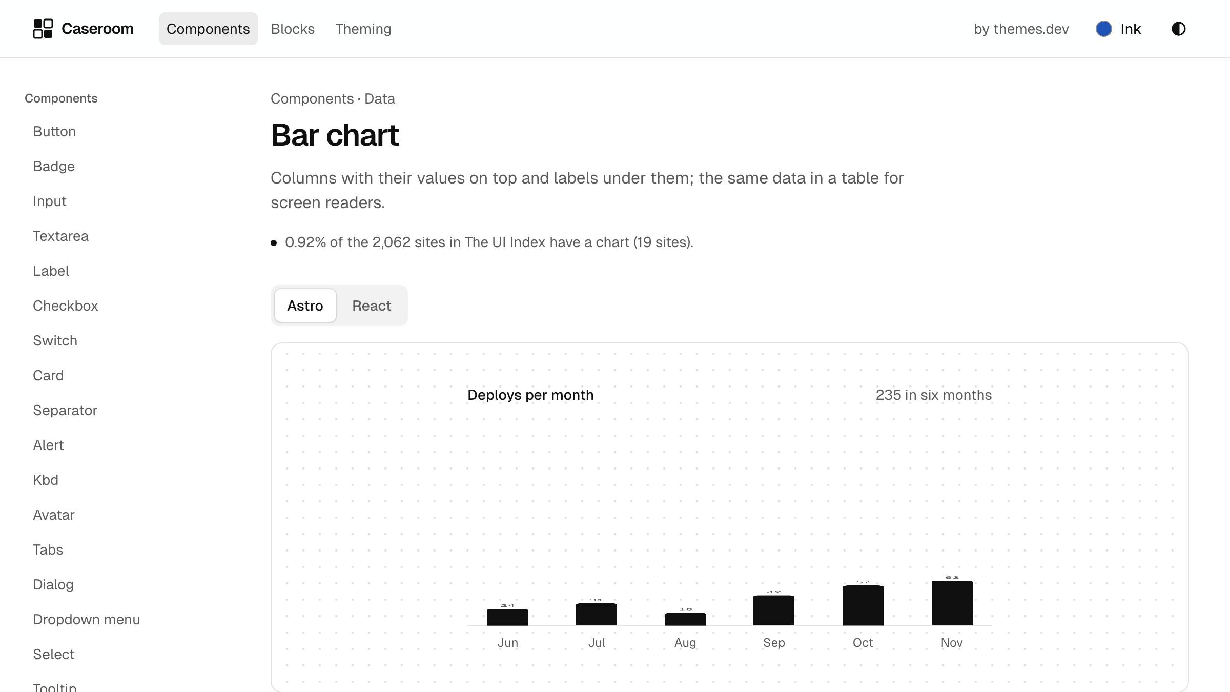
Charts you can read without colour
Values on the bars, and a table for screen readers.
Read about charts
Latest from the docs
Charts you can read without colour
Values on the bars, and a table for screen readers.
Read about charts
Both previews render the same markup; the HTML tab below is that markup without a framework.
Install
- React
- npx shadcn@
latest add https:// www.themes.dev/ ui/ r/ card-carousel.json - Astro
- npx shadcn@
latest add https:// www.themes.dev/ ui/ r/ astro/ card-carousel.json
Or copy the files below into your project. They need clsx, tailwind-merge and the components they import, and the themes.dev UI theme. The HTML needs only the compiled CSS.
/** A card carousel: a row of image cards, each with a title, a line and a link, that scrolls sideways. The row,
 *  the Previous and Next buttons (they turn off at the ends) and the keyboard and swipe behaviour are the carousel
 *  item's, so this block only dresses the slides. The picture is cropped to 4:3, so keep the subject in the middle.
 *  Titles stay on one or two lines; the links line up at the bottom whatever the text's length. */
export const cardCarousel = {
  root: 'bg-background px-6 py-12 text-foreground',
  inner: 'mx-auto max-w-6xl',
  // The carousel item's slide width: one card and a bit of the next on a phone, more as the row widens.
  slide: 'w-[min(18rem,80%)] shrink-0 snap-start',
  card: 'flex h-full flex-col gap-3',
  frame: 'aspect-[4/3] overflow-hidden rounded-xl border bg-muted',
  image: 'size-full object-cover object-left-top dark:brightness-[.85]',
  body: 'flex flex-1 flex-col items-start gap-2',
  title: 'line-clamp-2 text-base font-semibold text-balance',
  text: 'text-sm text-pretty text-muted-foreground',
  link: 'mt-auto w-fit self-start pt-1.5',
};

export type CardCarouselCard = {
  /** One line, under about 28 characters. */
  title: string;
  /** At most 100 characters. */
  text?: string;
  /** The picture. `alt` says what it shows; use "" only when the title already says it. */
  image: { src: string; alt: string };
  href: string;
  /** The link under the text, at most 22 characters; make it differ from the other cards' ("Read the tabs guide"). */
  linkLabel: string;
};

export type CardCarouselContent = {
  /** The heading over the row, also the region's name. */
  title: string;
  id: string;
  cards: CardCarouselCard[];
};import { Carousel } from '@/components/ui/carousel';
import { Link } from '@/components/ui/link';
import { cn } from '@/lib/utils';
import { cardCarousel as c, type CardCarouselContent } from './card-carousel.classes';
export type CardCarouselProps = CardCarouselContent & { className?: string };
/** A row of image cards with a title, a line and a link, that scrolls sideways; Previous and Next turn off at the ends. */
export function CardCarousel({ title, id, cards, className }: CardCarouselProps) {
return (
<div className={cn(c.root, className)}>
<div className={c.inner}>
<Carousel id={id} title={title}>
{cards.map((card) => (
<li key={card.title} className={c.slide}>
<article className={c.card}>
<div className={c.frame}>
<img src={card.image.src} alt={card.image.alt} width={640} height={480} className={c.image} loading="lazy" decoding="async" />
</div>
<div className={c.body}>
<h3 className={c.title}>{card.title}</h3>
{card.text ? <p className={c.text}>{card.text}</p> : null}
<Link href={card.href} variant="standalone" className={c.link}>{card.linkLabel}</Link>
</div>
</article>
</li>
))}
</Carousel>
</div>
</div>
);
}---
import Carousel from '@/components/ui/carousel.astro';
import Link from '@/components/ui/link.astro';
import { cn } from '@/lib/utils';
import { cardCarousel as c, type CardCarouselContent } from './card-carousel.classes';
type Props = CardCarouselContent & { class?: string };
const { title, id, cards, class: className } = Astro.props;
---
<div class={cn(c.root, className)}>
<div class={c.inner}>
<Carousel id={id} title={title}>
{
cards.map((card) => (
<li class={c.slide}>
<article class={c.card}>
<div class={c.frame}>
<img src={card.image.src} alt={card.image.alt} width="640" height="480" class={c.image} loading="lazy" decoding="async" />
</div>
<div class={c.body}>
<h3 class={c.title}>{card.title}</h3>
{card.text ? <p class={c.text}>{card.text}</p> : null}
<Link href={card.href} variant="standalone" class={c.link}>{card.linkLabel}</Link>
</div>
</article>
</li>
))
}
</Carousel>
</div>
</div>/** A card carousel: a row of image cards, each with a title, a line and a link, that scrolls sideways. The row,
* the Previous and Next buttons (they turn off at the ends) and the keyboard and swipe behaviour are the carousel
* item's, so this block only dresses the slides. The picture is cropped to 4:3, so keep the subject in the middle.
* Titles stay on one or two lines; the links line up at the bottom whatever the text's length. */
export const cardCarousel = {
root: 'bg-background px-6 py-12 text-foreground',
inner: 'mx-auto max-w-6xl',
// The carousel item's slide width: one card and a bit of the next on a phone, more as the row widens.
slide: 'w-[min(18rem,80%)] shrink-0 snap-start',
card: 'flex h-full flex-col gap-3',
frame: 'aspect-[4/3] overflow-hidden rounded-xl border bg-muted',
image: 'size-full object-cover object-left-top dark:brightness-[.85]',
body: 'flex flex-1 flex-col items-start gap-2',
title: 'line-clamp-2 text-base font-semibold text-balance',
text: 'text-sm text-pretty text-muted-foreground',
link: 'mt-auto w-fit self-start pt-1.5',
};
export type CardCarouselCard = {
/** One line, under about 28 characters. */
title: string;
/** At most 100 characters. */
text?: string;
/** The picture. `alt` says what it shows; use "" only when the title already says it. */
image: { src: string; alt: string };
href: string;
/** The link under the text, at most 22 characters; make it differ from the other cards' ("Read the tabs guide"). */
linkLabel: string;
};
export type CardCarouselContent = {
/** The heading over the row, also the region's name. */
title: string;
id: string;
cards: CardCarouselCard[];
};<div class="bg-background px-6 py-12 text-foreground mx-auto max-w-3xl">
<div class="mx-auto max-w-6xl">
<section data-carousel aria-labelledby="ex-card-carousel-title" aria-roledescription="carousel" class="relative w-full">
<div class="mb-4 flex items-end justify-between gap-4">
<h2 id="ex-card-carousel-title" class="text-lg font-semibold tracking-[-0.02em]">Latest from the docs</h2>
<div class="flex gap-2">
<button type="button" data-carousel-prev aria-controls="ex-card-carousel-track" aria-label="Previous" disabled class="inline-flex size-9 cursor-pointer items-center justify-center rounded-full border border-input bg-background transition-[background-color,transform] hover:bg-accent active:scale-95 active:bg-pressed disabled:pointer-events-none disabled:opacity-40 [&_svg]:size-4">
<svg viewBox="0 0 16 16" fill="none" stroke="currentColor" stroke-width="1.5" stroke-linecap="round" stroke-linejoin="round" aria-hidden="true"><path d="M10 3.5L5.5 8l4.5 4.5"></path></svg>
</button>
<button type="button" data-carousel-next aria-controls="ex-card-carousel-track" aria-label="Next" class="inline-flex size-9 cursor-pointer items-center justify-center rounded-full border border-input bg-background transition-[background-color,transform] hover:bg-accent active:scale-95 active:bg-pressed disabled:pointer-events-none disabled:opacity-40 [&_svg]:size-4">
<svg viewBox="0 0 16 16" fill="none" stroke="currentColor" stroke-width="1.5" stroke-linecap="round" stroke-linejoin="round" aria-hidden="true"><path d="M6 3.5l4.5 4.5L6 12.5"></path></svg>
</button>
</div>
</div>
<ul id="ex-card-carousel-track" data-carousel-track class="-mx-2 flex list-none snap-x snap-mandatory scroll-px-2 gap-4 overflow-x-auto scroll-smooth px-2 pt-2 pb-2 [scrollbar-width:none] motion-reduce:scroll-auto [&::-webkit-scrollbar]:hidden">
<li class="w-[min(18rem,80%)] shrink-0 snap-start">
<article class="flex h-full flex-col gap-3">
<div class="aspect-[4/3] overflow-hidden rounded-xl border bg-muted">
<img src="/ui/demo/stories/tabs.jpg" alt="The themes.dev UI tabs page in light mode" width="640" height="480" class="size-full object-cover object-left-top dark:brightness-[.85]" loading="lazy" decoding="async">
</div>
<div class="flex flex-1 flex-col items-start gap-2">
<h3 class="line-clamp-2 text-base font-semibold text-balance">Tabs that keep their place</h3>
<p class="text-sm text-pretty text-muted-foreground">Arrow keys, Home and End, and a panel that follows.</p>
<a href="#" class="rounded-sm font-medium text-foreground underline-offset-4 transition-[color,text-decoration-color,background-color] active:bg-accent [&_svg]:size-3.5 [&_svg]:shrink-0 [&_svg]:transition-transform group inline-flex min-h-6 items-center gap-1.5 hover:underline active:decoration-2 hover:[&_svg]:translate-x-0.5 mt-auto w-fit self-start pt-1.5">
Read the tabs guide
<svg viewBox="0 0 16 16" fill="none" stroke="currentColor" stroke-width="1.5" stroke-linecap="round" stroke-linejoin="round" aria-hidden="true"><path d="M3 8h10M9 4l4 4-4 4"></path></svg>
</a>
</div>
</article>
</li>
<li class="w-[min(18rem,80%)] shrink-0 snap-start">
<article class="flex h-full flex-col gap-3">
<div class="aspect-[4/3] overflow-hidden rounded-xl border bg-muted">
<img src="/ui/demo/stories/dialog.jpg" alt="A rename dialog open over the themes.dev UI docs in dark mode" width="640" height="480" class="size-full object-cover object-left-top dark:brightness-[.85]" loading="lazy" decoding="async">
</div>
<div class="flex flex-1 flex-col items-start gap-2">
<h3 class="line-clamp-2 text-base font-semibold text-balance">Dialogs on the native element</h3>
<p class="text-sm text-pretty text-muted-foreground">Focus stays inside and returns where it came from.</p>
<a href="#" class="rounded-sm font-medium text-foreground underline-offset-4 transition-[color,text-decoration-color,background-color] active:bg-accent [&_svg]:size-3.5 [&_svg]:shrink-0 [&_svg]:transition-transform group inline-flex min-h-6 items-center gap-1.5 hover:underline active:decoration-2 hover:[&_svg]:translate-x-0.5 mt-auto w-fit self-start pt-1.5">
See the dialog notes
<svg viewBox="0 0 16 16" fill="none" stroke="currentColor" stroke-width="1.5" stroke-linecap="round" stroke-linejoin="round" aria-hidden="true"><path d="M3 8h10M9 4l4 4-4 4"></path></svg>
</a>
</div>
</article>
</li>
<li class="w-[min(18rem,80%)] shrink-0 snap-start">
<article class="flex h-full flex-col gap-3">
<div class="aspect-[4/3] overflow-hidden rounded-xl border bg-muted">
<img src="/ui/demo/stories/bar-chart.jpg" alt="A bar chart of deploys per month" width="640" height="480" class="size-full object-cover object-left-top dark:brightness-[.85]" loading="lazy" decoding="async">
</div>
<div class="flex flex-1 flex-col items-start gap-2">
<h3 class="line-clamp-2 text-base font-semibold text-balance">Charts you can read without colour</h3>
<p class="text-sm text-pretty text-muted-foreground">Values on the bars, and a table for screen readers.</p>
<a href="#" class="rounded-sm font-medium text-foreground underline-offset-4 transition-[color,text-decoration-color,background-color] active:bg-accent [&_svg]:size-3.5 [&_svg]:shrink-0 [&_svg]:transition-transform group inline-flex min-h-6 items-center gap-1.5 hover:underline active:decoration-2 hover:[&_svg]:translate-x-0.5 mt-auto w-fit self-start pt-1.5">
Read about charts
<svg viewBox="0 0 16 16" fill="none" stroke="currentColor" stroke-width="1.5" stroke-linecap="round" stroke-linejoin="round" aria-hidden="true"><path d="M3 8h10M9 4l4 4-4 4"></path></svg>
</a>
</div>
</article>
</li>
<li class="w-[min(18rem,80%)] shrink-0 snap-start">
<article class="flex h-full flex-col gap-3">
<div class="aspect-[4/3] overflow-hidden rounded-xl border bg-muted">
<img src="/ui/demo/stories/command-menu.jpg" alt="The command menu open with a search typed" width="640" height="480" class="size-full object-cover object-left-top dark:brightness-[.85]" loading="lazy" decoding="async">
</div>
<div class="flex flex-1 flex-col items-start gap-2">
<h3 class="line-clamp-2 text-base font-semibold text-balance">A command menu in one keystroke</h3>
<p class="text-sm text-pretty text-muted-foreground">⌘K, type, Enter.</p>
<a href="#" class="rounded-sm font-medium text-foreground underline-offset-4 transition-[color,text-decoration-color,background-color] active:bg-accent [&_svg]:size-3.5 [&_svg]:shrink-0 [&_svg]:transition-transform group inline-flex min-h-6 items-center gap-1.5 hover:underline active:decoration-2 hover:[&_svg]:translate-x-0.5 mt-auto w-fit self-start pt-1.5">
See the command menu
<svg viewBox="0 0 16 16" fill="none" stroke="currentColor" stroke-width="1.5" stroke-linecap="round" stroke-linejoin="round" aria-hidden="true"><path d="M3 8h10M9 4l4 4-4 4"></path></svg>
</a>
</div>
</article>
</li>
</ul>
</section>
</div>
</div>