Blocks · Display
Split card
A card with a photo on one side and a heading, a short text and a primary button on the other; the photo goes on top on a narrow card.
74% of the 2,073 sites in The UI Index have a card (1,540 sites).
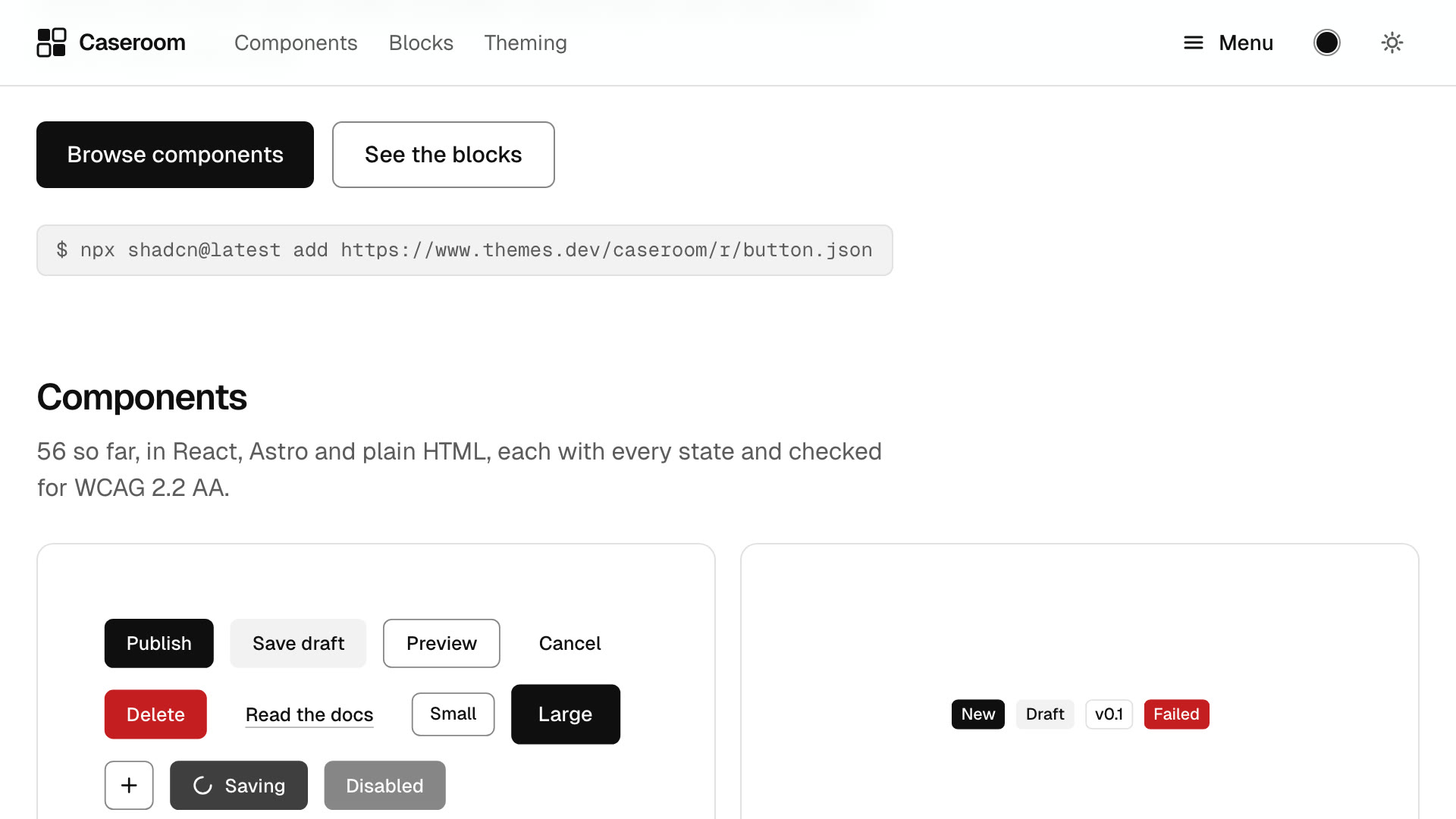
Start with the quick tour
Watch the five-minute walkthrough, then copy your first component into a project.
Watch the tour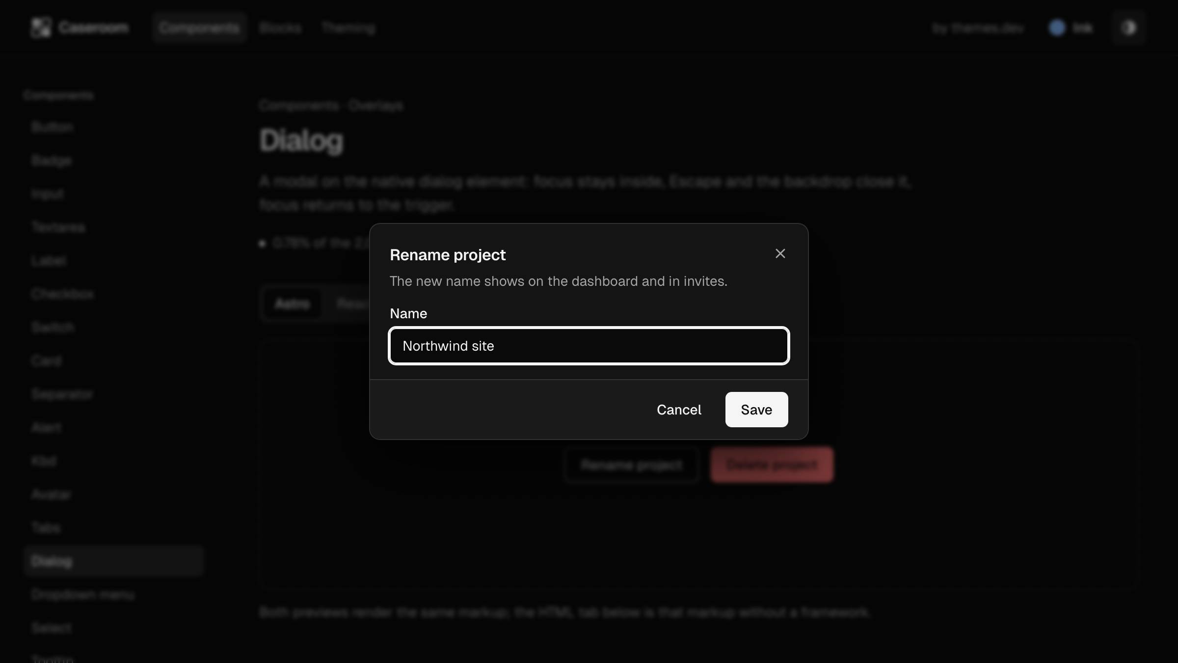
Start with the quick tour
Watch the five-minute walkthrough, then copy your first component into a project.
Watch the tour
Both previews render the same markup; the HTML tab below is that markup without a framework.
Install
- React
- npx shadcn@
latest add https:// www.themes.dev/ ui/ r/ split-card.json - Astro
- npx shadcn@
latest add https:// www.themes.dev/ ui/ r/ astro/ split-card.json
Or copy the files below into your project. They need clsx, tailwind-merge and the components they import, and the themes.dev UI theme. The HTML needs only the compiled CSS.
/** A split card: a photo on one side, a heading, a short text and one primary button on the other. On a narrow
 *  card (a phone) the photo sits on top; from 36rem of card width it goes beside the text. The card sizes itself
 *  (a container), so it also folds when it sits in a narrow column of a wide page. The photo is decorative next to
 *  the heading (alt ""), unless `image.alt` says otherwise. */
export const splitCard = {
  list: 'm-0 flex list-none flex-col gap-6 px-6 py-12',
  item: '@container',
  card: 'grid overflow-hidden rounded-xl border bg-card text-card-foreground @xl:grid-cols-[minmax(0,9fr)_minmax(0,11fr)]',
  media: 'relative aspect-[2/1] max-h-72 overflow-hidden border-b bg-muted @xl:aspect-auto @xl:border-e @xl:border-b-0 @xl:max-h-none @xl:min-h-64',
  image: 'absolute inset-0 size-full object-cover object-left-top dark:brightness-[.85]',
  body: 'flex min-w-0 flex-col items-start gap-4 p-6 @3xl:p-10',
  title: 'text-2xl font-semibold tracking-[-0.02em] text-balance',
  text: 'max-w-prose text-pretty text-muted-foreground',
  action: 'mt-auto',
};

export type SplitCardItem = {
  /** At most 60 characters. */
  title: string;
  /** One or two sentences, at most 200 characters. */
  text?: string;
  image: { src: string; alt?: string };
  action: { href: string; label: string };
};

export type SplitCardContent = {
  /** One to three cards, one under the other. */
  cards: SplitCardItem[];
  /** Names the list of cards for assistive tech. */
  label?: string;
};import { Button } from '@/components/ui/button';
import { cn } from '@/lib/utils';
import { splitCard as c, type SplitCardContent } from './split-card.classes';
export type SplitCardProps = SplitCardContent & { className?: string };
/** Cards with a photo on one side and a heading, a short text and a button on the other; the photo goes on top on a narrow card. */
export function SplitCard({ cards, label = 'Cards', className }: SplitCardProps) {
return (
<ul aria-label={label} className={cn(c.list, className)}>
{cards.map((card) => (
<li className={c.item} key={card.title}>
<article className={c.card}>
<div className={c.media}>
<img src={card.image.src} alt={card.image.alt ?? ''} width={1280} height={720} className={c.image} loading="lazy" decoding="async" />
</div>
<div className={c.body}>
<h2 className={c.title}>{card.title}</h2>
{card.text ? <p className={c.text}>{card.text}</p> : null}
<Button href={card.action.href} className={c.action}>{card.action.label}</Button>
</div>
</article>
</li>
))}
</ul>
);
}---
import Button from '@/components/ui/button.astro';
import { cn } from '@/lib/utils';
import { splitCard as c, type SplitCardContent } from './split-card.classes';
type Props = SplitCardContent & { class?: string };
const { cards, label = 'Cards', class: className } = Astro.props;
---
<ul aria-label={label} class={cn(c.list, className)}>
{
cards.map((card) => (
<li class={c.item}>
<article class={c.card}>
<div class={c.media}>
<img src={card.image.src} alt={card.image.alt ?? ''} width="1280" height="720" class={c.image} loading="lazy" decoding="async" />
</div>
<div class={c.body}>
<h2 class={c.title}>{card.title}</h2>
{card.text ? <p class={c.text}>{card.text}</p> : null}
<Button href={card.action.href} class={c.action}>{card.action.label}</Button>
</div>
</article>
</li>
))
}
</ul>/** A split card: a photo on one side, a heading, a short text and one primary button on the other. On a narrow
* card (a phone) the photo sits on top; from 36rem of card width it goes beside the text. The card sizes itself
* (a container), so it also folds when it sits in a narrow column of a wide page. The photo is decorative next to
* the heading (alt ""), unless `image.alt` says otherwise. */
export const splitCard = {
list: 'm-0 flex list-none flex-col gap-6 px-6 py-12',
item: '@container',
card: 'grid overflow-hidden rounded-xl border bg-card text-card-foreground @xl:grid-cols-[minmax(0,9fr)_minmax(0,11fr)]',
media: 'relative aspect-[2/1] max-h-72 overflow-hidden border-b bg-muted @xl:aspect-auto @xl:border-e @xl:border-b-0 @xl:max-h-none @xl:min-h-64',
image: 'absolute inset-0 size-full object-cover object-left-top dark:brightness-[.85]',
body: 'flex min-w-0 flex-col items-start gap-4 p-6 @3xl:p-10',
title: 'text-2xl font-semibold tracking-[-0.02em] text-balance',
text: 'max-w-prose text-pretty text-muted-foreground',
action: 'mt-auto',
};
export type SplitCardItem = {
/** At most 60 characters. */
title: string;
/** One or two sentences, at most 200 characters. */
text?: string;
image: { src: string; alt?: string };
action: { href: string; label: string };
};
export type SplitCardContent = {
/** One to three cards, one under the other. */
cards: SplitCardItem[];
/** Names the list of cards for assistive tech. */
label?: string;
};<ul aria-label="Featured guides" class="m-0 flex list-none flex-col gap-6 px-6 py-12 mx-auto max-w-4xl">
<li class="@container">
<article class="grid overflow-hidden rounded-xl border bg-card text-card-foreground @xl:grid-cols-[minmax(0,9fr)_minmax(0,11fr)]">
<div class="relative aspect-[2/1] max-h-72 overflow-hidden border-b bg-muted @xl:aspect-auto @xl:border-e @xl:border-b-0 @xl:max-h-none @xl:min-h-64">
<img src="/ui/demo/media/poster.jpg" alt width="1280" height="720" class="absolute inset-0 size-full object-cover object-left-top dark:brightness-[.85]" loading="lazy" decoding="async">
</div>
<div class="flex min-w-0 flex-col items-start gap-4 p-6 @3xl:p-10">
<h2 class="text-2xl font-semibold tracking-[-0.02em] text-balance">Start with the quick tour</h2>
<p class="max-w-prose text-pretty text-muted-foreground">Watch the five-minute walkthrough, then copy your first component into a project.</p>
<a href="#tour" class="inline-flex shrink-0 cursor-pointer items-center justify-center gap-2 rounded-md text-sm font-medium whitespace-nowrap transition-[color,background-color,border-color,transform] select-none active:scale-[0.97] aria-busy:cursor-progress disabled:pointer-events-none disabled:opacity-50 aria-busy:disabled:opacity-80 aria-disabled:pointer-events-none aria-disabled:opacity-50 [&_svg]:pointer-events-none [&_svg]:size-4 [&_svg]:shrink-0 bg-primary text-primary-foreground hover:bg-[color-mix(in_oklab,var(--primary)_var(--hover-amount),var(--background))] active:bg-[color-mix(in_oklab,var(--primary)_var(--press-amount),var(--press-mix))] h-9 px-4 mt-auto">
Watch the tour
</a>
</div>
</article>
</li>
<li class="@container">
<article class="grid overflow-hidden rounded-xl border bg-card text-card-foreground @xl:grid-cols-[minmax(0,9fr)_minmax(0,11fr)]">
<div class="relative aspect-[2/1] max-h-72 overflow-hidden border-b bg-muted @xl:aspect-auto @xl:border-e @xl:border-b-0 @xl:max-h-none @xl:min-h-64">
<img src="/ui/demo/stories/dialog.jpg" alt="A rename dialog open over the docs in dark mode" width="1280" height="720" class="absolute inset-0 size-full object-cover object-left-top dark:brightness-[.85]" loading="lazy" decoding="async">
</div>
<div class="flex min-w-0 flex-col items-start gap-4 p-6 @3xl:p-10">
<h2 class="text-2xl font-semibold tracking-[-0.02em] text-balance">Dialogs on the native element</h2>
<p class="max-w-prose text-pretty text-muted-foreground">Focus stays inside and returns to where it came from.</p>
<a href="#guide" class="inline-flex shrink-0 cursor-pointer items-center justify-center gap-2 rounded-md text-sm font-medium whitespace-nowrap transition-[color,background-color,border-color,transform] select-none active:scale-[0.97] aria-busy:cursor-progress disabled:pointer-events-none disabled:opacity-50 aria-busy:disabled:opacity-80 aria-disabled:pointer-events-none aria-disabled:opacity-50 [&_svg]:pointer-events-none [&_svg]:size-4 [&_svg]:shrink-0 bg-primary text-primary-foreground hover:bg-[color-mix(in_oklab,var(--primary)_var(--hover-amount),var(--background))] active:bg-[color-mix(in_oklab,var(--primary)_var(--press-amount),var(--press-mix))] h-9 px-4 mt-auto">
Read the guide
</a>
</div>
</article>
</li>
</ul>