860 shadcn blocks, each one its own design
A block is a whole page section, hero to footer, built from shadcn/ui parts and Tailwind CSS v4. Ours are numbered items: hero-12 is a different design from hero-13, not the same layout with another prop. Pick one, install it by its number and it lands in your components folder.
- blocks
- 860
- section categories
- 74
- on real shadcn/ui parts
- 97%
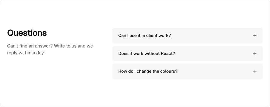
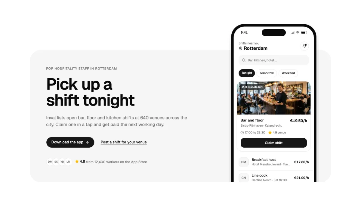
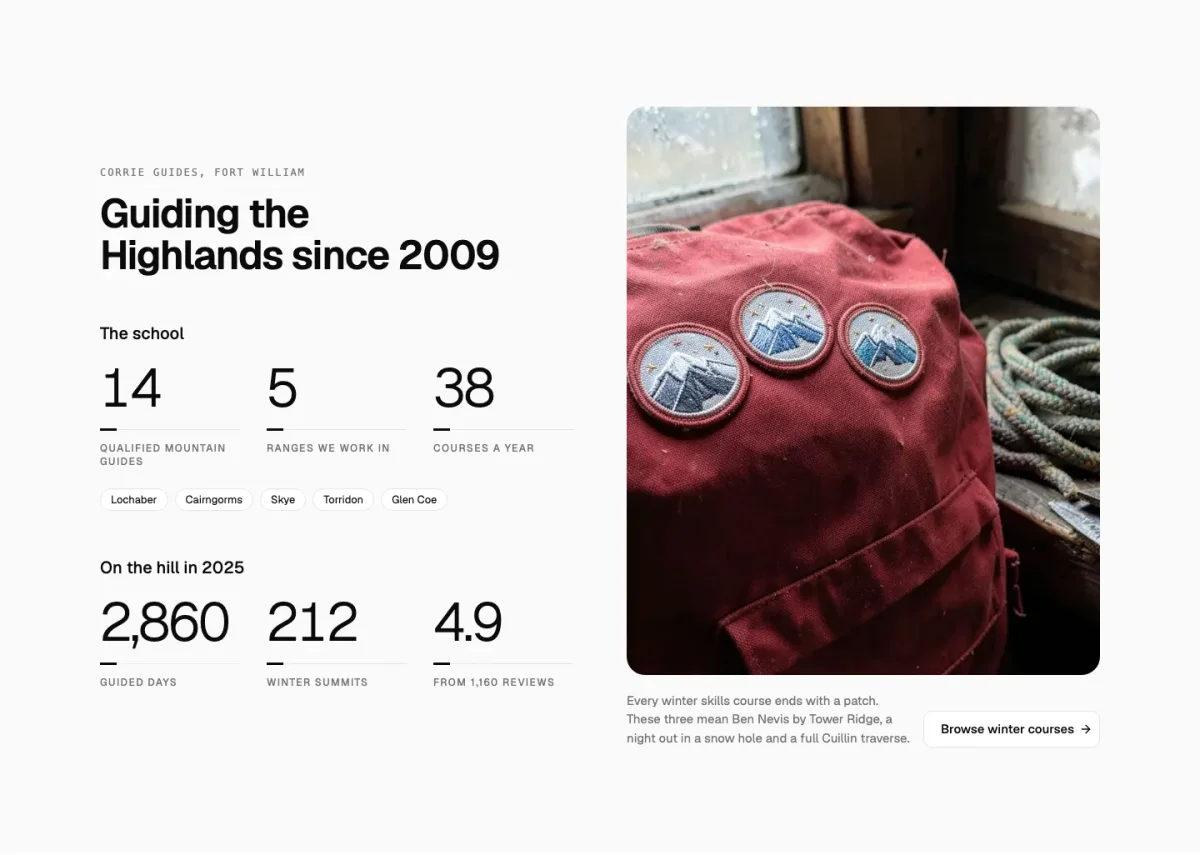
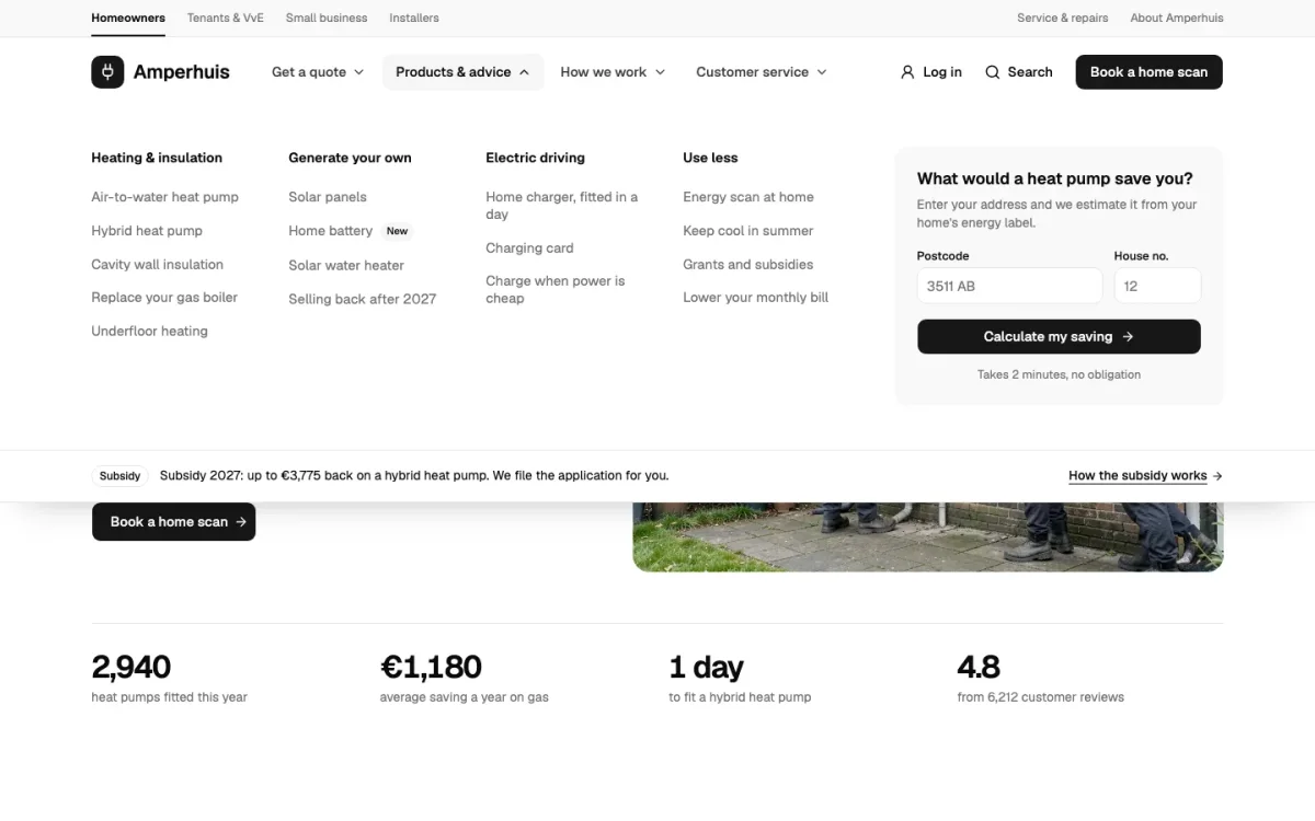
One from each of the big categories
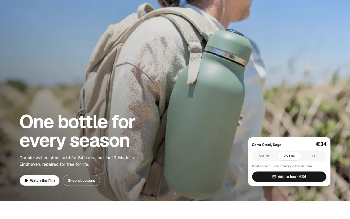
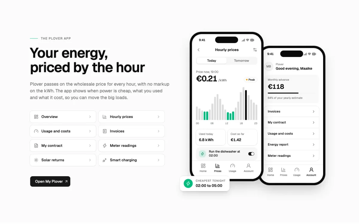
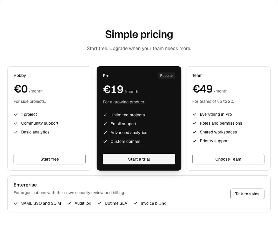
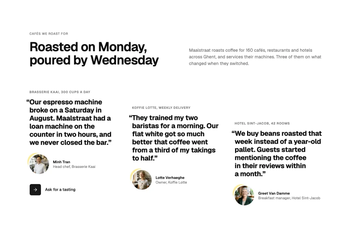
The first Pro block from nine of the categories people use most. Each sits in a made-up business with its own copy and photos, so you judge the design and not a grey placeholder.
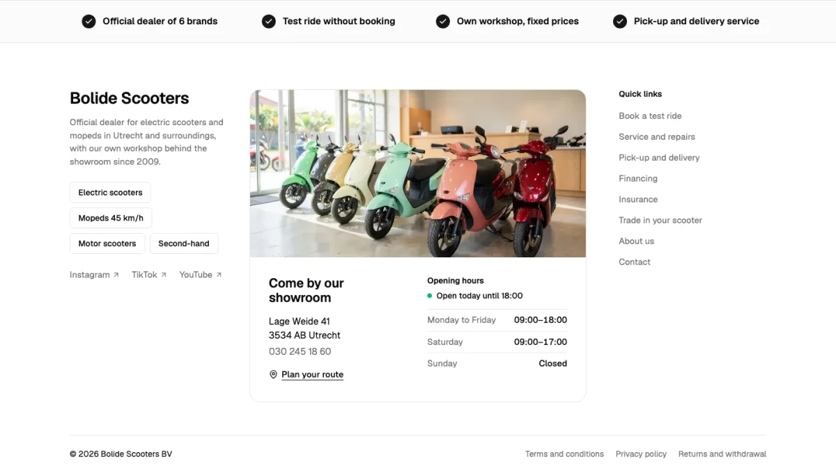
Every section category
- Hero 47
- Page header 11
- Case header 6
- Features 48
- Feature tabs 7
- Split 10
- Call to action 17
- Pricing 32
- Comparison 17
- Stats 14
- Logo wall 15
- Testimonials 20
- Integrations 4
- FAQ 18
- Newsletter 11
- Steps 6
- Rate card 6
- Banner 5
- Long text 16
- Blog posts 15
- Changelog 5
- Media 11
- Gallery 13
- Carousel 10
- Timeline 5
- Specimen 1
- Article 8
- News front page 6
- Docs page 6
- Events 6
- Content cards 18
- Story cards 22
- Collection cards 15
- Hover cards 7
- Team 16
- Values 5
- Careers 5
- Services 11
- Work and cases 10
- Locations 16
- Case study 4
- Contact 13
- Help center 10
- Product grid 8
- Product card 7
- Product page 10
- Product gallery 3
- Buy box 2
- Cart 6
- Checkout 6
- Reviews 6
- Incentives 4
- Promo banner 4
- Product compare 4
- Calculator 10
- Plan picker 8
- Availability check 6
- Coverage check 6
- Booking 10
- Header 33
- Navigation 18
- Sidebar 10
- Breadcrumb 5
- Pagination 7
- Footer 36
- Forms 28
- Sign in and sign up 19
- Search 9
- Data table 14
- Dialog 12
- Onboarding 10
- Search results 6
- Status page 3
- Error page 2
What a shadcn block is, and what it isn’t
shadcn/ui gives you parts: Button, Card, Tabs, Input. A block is what you make from them: a pricing section with a monthly switch, a footer with a newsletter card. The parts stay shadcn’s; the layout, copy slots and spacing are the block. Across our catalogue the parts used most are button, badge, label, input and separator.
Because a block only imports parts from your own components/ui folder, it takes on your theme. Change --primary or --radius in your CSS and every block follows.
Why numbered items instead of variants
Many kits ship one hero with twenty props. That works until two of your pages need heroes that differ in more than a colour. We make each design its own file with its own number, so the code you install is short and reads top to bottom, with no branches for layouts you never use.
How it works with shadcn
From the catalogue to your components folder
Add the registry
Once per project: the @themesdev entry in components.json, with your API key read from THEMESDEV_TOKEN. Making a key takes a UI Pro license.
components.json { "registries": { "@themesdev": { "url": "https://www.themes.dev/r/ui/{name}.json", "headers": { "Authorization": "Bearer ${THEMESDEV_TOKEN}" } } } }Install by number
Every item has a store number. This one is testimonials-06 (Quaybank); the CLI adds the shadcn/ui parts it needs first.
terminal npx shadcn@latest add @themesdev/testimonials-06Edit it as your code
The file lands in components/testimonials/ in your project. No package, no runtime, no lock-in: change the markup, the copy and the classes like anything else you wrote.
See it on the item’s own page: testimonials-06 (Quaybank). Set up your key in your account.
About shadcn blocks
Asked by people who were looking for the same thing. Something missing? Send us a message; we answer every one ourselves.
Are these the official shadcn/ui blocks?
No. shadcn/ui publishes a small set of its own blocks on ui.shadcn.com. themes.dev is independent: these blocks are ours, built on top of shadcn/ui parts, and install through the same CLI from our own registry.
Which shadcn/ui parts do I need first?
None by hand. Each block lists its parts as registry dependencies, so `shadcn add` installs any you are missing, such as button or tabs, before it writes the block.
Do the blocks work with Tailwind CSS v3?
They are written for Tailwind CSS v4 and the current shadcn/ui tokens (OKLCH colours, @theme). On a v3 project, upgrade first; the shadcn docs have a guide for it.
Can my AI assistant install them?
Yes. Besides the shadcn registry there is a themes.dev MCP server: add it to Claude Code, Cursor or another MCP client with your API key, and the assistant can search the catalogue and install blocks by number.
How many blocks can I use?
As many as you like, in unlimited projects for yourself and your clients. UI Pro is all 860, from €199 once, including the ones we add later.

Not sure it fits?
Tell us what you are building and we tell you honestly whether these blocks are a good fit.
UI Pro
Build it from finished shadcn/ui blocks
Every block, page template and website theme from €199, paid once, with every update and everything we add later. Not ready? The free blocks are open to everyone.
- blocks
- 860
- page templates
- 14
- website themes
- 26
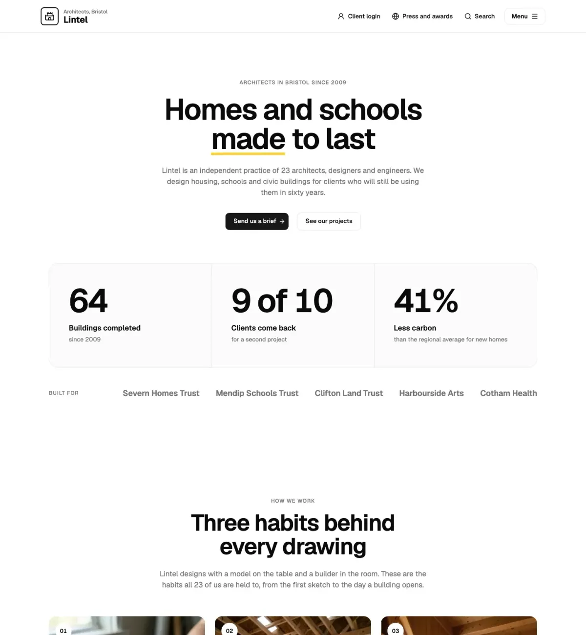
This page is built from UI Pro blocks: Straalnet (faq-10), Rooilijn (call-to-action-07).